
Sometimes, it’s the dark colors that brighten up our lives!
Isn’t it?
One such instance is Sherwin-Williams Iron Ore, which is a pure and very rich, dark gray charcoal paint color that continuously proves its sophistication and elegance over and over again!
It is clean and crisp with apparently no undertones at all!
Oozing the utmost luxury in a space, Iron Ore is a shade lighter than Sherwin-Williams Tricorn Black, Caviar, Black Magic, and Inkwell.
If you are looking for a perfect dark gray neutral with charcoal shade, I must say there is no better option than Sherwin-Williams Iron Ore.
I absolutely LOVE the look of Iron Ore on walls.
However, it is one of the dark and most daring colors on my list.
Regardless of the glam and luxe, this color has its own baggage of repercussions and conditions.
You simply can’t use it ANYWHERE and HOWEVER, you feel like!
But you need not worry.
I have got your back!
I am going to be sharing some major secrets of using Iron Ore in your homes that will definitely make you go “wow”!
So, are you ready?
Let’s get started!
Click to see 30+ color palettes you can use with Iron Ore!
Sherwin-Williams Iron Ore SW 7069 Details and Specifications

Each color comes with its own theories and schemes!
If you are new here, let me tell you – there are quite a few facts and scientific terms that you would want to acquaint yourself with.
It is important to analyze these values and then determine where, when, and how to use these wall paints!
First and foremost, one of the most important terms that I usually see getting ignored is Light Reflectance Values (LRV)!
Every color has an associated Light Reflectance Value!
For Iron Ore, the LRV is 6!
Which is whopping dark!

Remember, the lower the value, the darker the paint color is!
And vice versa!
This is almost a soft black with dark gray undertones – so, most of the light is absorbed by this color, and little is reflected away – thus, leaving the color to be very dark!
Oh, if you want to just try Iron Ore you easily can with a peel-and-stick sample from Samplize. Order some samples now!
Moving ahead, let’s discuss the RGB and HEX Values of the color.
Red = 67
Green = 67
Blue = 65
HEX Value = #434341
I am not going to bore you with these scientific details anymore, I promise.
Now, let’s talk about the practical aspects of this amazing color.
How Does Iron Ore Feel in a Space?
Iron Ore as a focal point makes your space feel elegant and sophisticated
I must say, DARK and DINGY!
Provided that you don’t properly use the color!
Long story short, this color has quite a few terms and conditions. When used in accurate amounts, it will never disappoint you.
Due to its low reflectivity, the color may seem very dark in a space.
So, if you want to make a space look smaller, Iron Ore could be your best solution.
It is a NO-NO if you are already struggling in a small space! But if you would still like to use it, try to pair it with lighter tones and make it an accent!
BTW, this color is a great option for creating a focal point!
How Does Light Affect the Color?

Blogger Leanna from Life by Leanna paints one wall in Iron Ore to create a perfect contrast
It is true that light highlights the actual saturation and shade of the color!
The more natural or artificial light entering the home, the brighter your space will be (regardless of the LRV of the wall paint)!
For Iron Ore, most of the color is absorbed while very little of the color is reflected away.
So what this does is make your room feel darker and smaller.
So, even if you don’t have ample natural light, try to incorporate artificial lighting to balance out the proportion!
Here’s how different lighting can end up changing the way this paint color actually appears. This is important stuff!
Natural Daylight:
In a room with ample natural daylight, Iron Ore may appear lighter and more of a soft gray rather than a deep black.
I’ve personally found that the quality of the daylight, whether it’s the warm light of early morning or dusk, or the bright midday sun, can also influence this color’s undertones, potentially bringing out subtle brown or cooler blue notes.
Direct Sunlight:
When directly illuminated by sunlight, Iron Ore can lose some of its intensity and depth, appearing more like a dark gray than a near-black. I’m ok with that in most cases!
The direct sun can highlight any underlying hues, which, in the case of Iron Ore, might make it seem slightly warmer.
Indirect or Ambient Light:
In spaces with indirect light, such as more interior areas that receive diffused light through sheer curtains or are lit by reflected light, Iron Ore will maintain more of its depth and richness, staying true to its dark, charcoal essence.
Artificial Light:
The type of artificial light can dramatically affect how Iron Ore looks to our eyes.
Warm or soft white LED lights can bring out the warmer tones, making it appear more brownish. Conversely, cool white or daylight LED bulbs might make it appear more stark and closer to a true black.
Different Angles and Textures:
The angle of both natural and artificial light can also play a role in how Iron Ore is perceived.
I’ve learned over the years that light hitting a painted surface at a sharper angle can create shadows and highlight texture, which can make any paint color appear more dynamic and varied.
On smoother surfaces with less texture, the color may look more uniform. It gets a little “sciency” here, but hopefully you get the point!
One way to help find out how this color looks in your home is to buy some temporary wall samples and put them up wherever you want to paint. You can get these easily from Samplize.
What are the Coordinating Colors Sherwin-Williams Iron Ore?

Sherwin-Williams Iron Ore is a soft black color that is definitely not the truest form of black but may have the potential to look one – only under certain lighting conditions.
And well, it’s a given that this paint is quite versatile – which is why it’s easier to pair it with other coordinating hues.
To name a few, SW Iron Ore will best complement clean as well as creamy whites, all shades of blues, all shades of greens, pinks, mauves, greiges, beiges, grays, and golden yellows.
In terms of metallic accents, I highly recommend that you consider satin or antique brass, copper, oil-rubbed bronze, and even chrome.
Here are the following two color palette suggestions – monochromatic and coordinating (cool and warm)!
Monochromatic Color Palette

The complementary colors for the monochromatic palette are as follows –
- SW 7068 Grizzle Gray
- SW 7067 Cityscape
- SW 7066 Gray Matters
This monochromatic palette is bold and pretty darn dark! So, remember to add soothing off-whites to break the drama and monotony of the palette.
You can best add metallic tints of satin brass or antique copper to go with this palette!
Contrasting Cool Color Palette

The complementary colors for the contrasting palette are as follows (cool) –
- SW 7006 Extra White
- SW 9148 Smoky Azurite
- SW 6798 Iceberg
This cool-toned palette is where you can have a lot of fun – especially pairing the blues with icy whites and soft blacks.
You can choose from a variety of different shades of blues to add a sense of soothing and weight to the room!
Lastly, pick from satin brass or chrome finishes to go!
Contrasting Warm Color Palette

The complementary colors for the contrasting palette are as follows (warm) –
- SW 7008 Alabaster
- SW 6108 Latte
- SW 9132 Acacia Haze
This warm-toned palette is not only very welcoming and joyous but also EARTHY in its forms.
You can best add textures like rattan, wicker, and cane to add the ultimate warm and soothing character to the room.
Don’t hold back from styling with matte black fixtures as well.
Color Combinations – Monochromatic
For monochromes, I highly recommend choosing the following paint colors to create a cohesive look!
- Ice Cube SW 6252 – see my full review here
- Pure White SW 7005 – see my full review here
- Colonnade Gray SW 7641 – see my full review here

These colors will promise a bold and authentic look, for sure!
Here are some of the great accessories in this color palette to go with Iron Ore:

- Windmill Sculpture Set (Buy Here)
- Tufted Armchair (Buy Here)
- Square Pillow Cover (Buy Here)
- Graphic Canvas Art (Buy Here)
- Geometric Area Rug (BuyHere)
- Multi-tiled Table Lamp (Buy Here)
Color Combinations – Contrasting Hues
However, if you are looking for a touch of pop in your space and not everything too black, gray, and white, I recommend adding shades of yellow, orange, and red to balance the temperature!
Some of them are –
- Toile Red SW 0006
- Butter Up SW 6681
- Copper Wire SW 7707

Remember to use only one of these accents with the above monochromatic palette!
For the trims and moldings, I recommend choosing Sherwin-Williams High Reflecting White!
More Color Palettes!
For a ton more color pairing options, check out my gallery of hand-picked color palettes Iron Ore works beautifully with:


Sherwin-Williams Iron Ore Vs. Similar Colors

This is one of the hardest questions.
There are so many colors that look exactly like Iron Ore that I myself get caught up in the confusion sometimes.
Even though they look similar, they still can make great alternatives.
Sherwin-Williams Peppercorn and Sherwin-Williams Urbane Bronze are the closest cousins of Iron Ore!
Iron Ore Vs. Peppercorn

A shade lighter than Iron Ore, Peppercorn has an LRV of 10! (See my Peppercorn review here).
With grey undertones, this color could make for a perfect lighter alternative in your home.
Peppercorn is more like a dark-gray shade that hardly looks black unlike the Iron Ore that frequently tends to look Black!
Screens could be deceiving, so I recommend you buy real-time swatches and samples to experience the actual color differences in natural light.
Order a wall-stick sample of Peppercorn here to help you compare colors in your own space.
Iron Ore Vs. Urbane Bronze

Recently color of the year, Urbane Bronze, has a perfect crisp look that every home craves. (See my full guide on Urbane Bronze here!)
With an LRV of 8, this color, too, is a lighter shade of Iron Ore!
This color has slightly deep green undertones, which can be very well visible in ample light!
Regardless of the design style, it is a given that Urban Bronze will never disappoint you.
Order a wall-stick sample of I.O. here to help you compare these colors in your own space.
Coordinating Decor

This soft black is easy to work with! Whether it’s the fabrics, materials, or colors, SW Iron Ore is one color that will not disappoint you!
However, the major task is to first finalize the vibe you’re aiming at! Do you crave a warm and welcoming feel or crisp and cool?
Depending upon that, you can best choose the coordinating items as well as hues.
From furniture to decorative accessories and materials, I am going to pick the best ones for you that will perfectly vibe with SW Iron Ore.

Here are the links to the flooring that works well with Iron Ore –

Here are the links to the decorative accents that work well with Iron Ore –

Here are the links to the furniture that works well with Iron Ore –
Where to Use Iron Ore in Your Home?

Whether you have a Farmhouse, Contemporary, Modern, or Glam design style, Iron Ore can definitely make up to it at every level.
But are you wondering where to use it?
Well, I can say ANYWHERE!
As long as you pair it with opposite lighter shades and materials, there is no harm in using the color.
Let’s discuss how to incorporate Iron Ore in your living spaces.
Iron Ore in Living Rooms
SW Iron Ore is a fabulous recommendation for an accent paint color on the focal walls of your living room.
Whether you have wall paneling, built-in shelves, or a focal fireplace wall, this color will never disappoint you!
It’s bound to exhibit a modern and contemporary touch in any space. Isn’t that amazing?
Also, if you’re afraid of the bold black color, this is one soft black to have an eye on!
You must add a satin brass and crystal chandelier for the ultimate luxe and dramatic look!
Iron Ore on Cabinets
View this post on Instagram
This color is a great recommendation for the cabinets as well – especially for the mudrooms.
You can add a sense of depth with this color and further pair it with satin brass pull handles for a “wow” look.
If you pair it with whites, you’ll see SW iron Ore come out as a bold black color – but soft indeed.
If there’s a black color to compare with, this color will, anyway, exhibit a soft appearance.
Iron Ore in Kitchens

Shelby from Farmhouse Living styles her Farmhouse style kitchen using Iron Ore on the island cabinets
There have been quite a few times that I have recommended this paint color for the walls of my client’s kitchen.
If you have an open concept, spacious kitchen – why not?
Paint the cabinets in pure white and use grey or white backsplash alongside white marble to neutralize the look!
For further accents, you can use gold or brushed steel pull handles and black focal lighting!
Iron Ore in Bedrooms

Katie over at Little House of 4 shows off her incredible bedroom makeover
Like I say, bedrooms are the most personal spaces you have!
If you prefer a charcoal type dark gray paint, go for Iron Ore and pair it with golds and whites to receive the best appearance!
You can use distressed style white furniture frames or walnut polished furniture!
To create harmony, make sure your upholstery is white or off-white!
Iron Ore on Exteriors
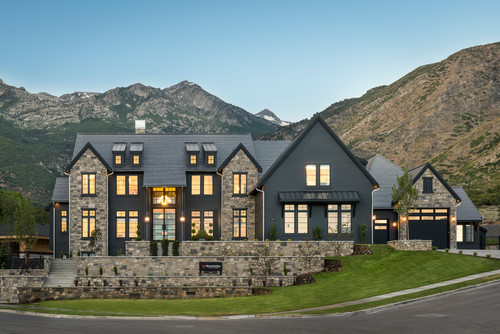
Iron Ore is going to look lighter in the exterior façade of your home.
Many homeowners up in the north do use the color on their home’s shiplap walls!
And you too can.
Pair them with white or off-white trims and decorative moldings!
How to Best Sample This Color?
Here’s my favorite tip when it comes to testing out a color like Iron Ore – go and order a peel-and-stick sample from Samplize.
These guys figured out a great way to sample colors much more easily. Simply stick it up instead of having to get a small can of actual wet paint.
For a few bucks you get a nice sized square to throw up temporarily anywhere you want to “try” on a paint color and any possible coordinating hues you like. Too cool!
Test Iron Ore in the Right Wall Locations
When sampling Sherwin-Williams Iron Ore, placement matters more than people expect.
I always test it on a wall with direct sun because this deep charcoal softens and reveals subtle warmth.
Put another sample on a dim wall or hallway corner where Iron Ore can read heavier and moodier.
Also check large open wall areas, spots beside trim, flooring, cabinets, and angles you walk past daily.
Check the Color in Multiple Lighting Conditions
Time of day changes Iron Ore more than many mid-tone paints.
Morning daylight usually shows its cleaner charcoal side, while bright afternoon sun adds noticeable softness.
At night under warm lamps it deepens dramatically, especially beside white trim or light cabinetry.
I always check cloudy daylight and cooler LEDs too because Iron Ore can look crisper there!
Notice How Surroundings Shift the Color
Surroundings also push this color around guys!
Oak floors, warm cabinets, and tan rugs pull Sherwin-Williams Iron Ore slightly warmer.
Green trees outside windows or concrete city views can shift the charcoal cooler or even slightly greenish. So test, test, test!
Use Large Samples Instead of Tiny Swatches
Tiny paint chips rarely show how a saturated shade like Iron Ore actually behaves.
Larger movable samples such as Samplize reveal its depth across light, shadows, and nearby materials.
Live With the Sample Before Deciding
After placing samples, live with your Sherwin-Williams Iron Ore sample for a couple full days.
Walk by during normal routines, morning coffee, evening lighting, and busy family traffic.
That slow observation prevents expensive repainting and confirms whether Iron Ore truly works!
My 7 Key Tips for SW Iron Ore
1. Use the right finish to bring out Iron Ore’s richness
Iron Ore is a deep, inky charcoal that reads differently depending on the finish.
In most interior spaces, I recommend an eggshell or satin finish on walls—it keeps the color bold without looking flat.
On cabinetry or exteriors, try satin or even semi-gloss to add a little sheen and depth.
Matte can work too, but only if the surface is super smooth!
2. Pair it with warm-toned wood floors for balance
This color looks stunning against the right flooring.
Medium to light warm-toned wood floors—like white oak or natural walnut—help keep the space grounded and inviting.
Stay away from floors that are too cool or gray—they can make Iron Ore feel heavy or overly cold.
I always look for contrast and warmth when pairing a dark color like this!
3. It’s a bold move for exteriors—but totally worth it
Iron Ore is one of my favorite dark exteriors!
But here’s the thing—don’t pair it with a bright white trim unless you’re going for super high contrast.
Instead, try softer whites like SW Alabaster or even warm grays like SW Dorian Gray for a more seamless look.
It brings out the richness of the color and still feels fresh.
4. Watch how your lighting affects the depth
Iron Ore shifts a lot depending on light.
In bright, natural light, it can soften and take on a deep gray look.
In lower light or shaded rooms, it leans almost black.
Test large swatches in different spots before committing—it’s worth the extra step!
5. Avoid pairing it with blue-gray cabinets or walls
If you’re thinking of using Iron Ore with other colors, skip anything with a heavy blue-gray undertone.
That combo tends to clash or make Iron Ore read dull.
Instead, pair it with creamy whites, warm taupes, or deep greens for a look that feels rich and intentional.
6. Perfect for moody powder rooms or dramatic offices
I love using Iron Ore in small spaces where you want that wow factor.
It works beautifully in powder rooms with brass fixtures or home offices with leather and wood accents.
Just add layered lighting and texture so the space doesn’t feel boxed in!
7. Keep cabinetry hardware in mind
If you’re painting cabinets in Iron Ore, choose the hardware carefully—it’ll stand out!
Brushed brass, matte black, or antique bronze all work beautifully.
Avoid high-shine chrome—it can feel too stark and disconnected against the depth of this color.
It’s all in the details!!!
It is timeless so, regardless of the type of stone finish – your makeover projects are going to look FABULOUS!
So, are you excited to paint some Sherwin-Williams Iron Ore in your home?
Well, do let me know in the comments below as I would love to hear from you!

FAQs
1. What Is the Undertone of Sherwin-Williams Iron Ore?
Sherwin-Williams Iron Ore has a deep tinge of green to it – but it’s only visible under certain lighting conditions or surrounding landscape criteria.
2. Is SW Iron Ore Black?
SW Iron Ore is definitely a SOFT black paint color. It may also look dark charcoal gray at some points of the day! But it’s definitely not too darn black like SW Tricorn Black.
3. Is SW Iron Ore Warm or Cool?
SW Iron Ore has a warm touch to it! The deep warm green undertones make this color a warmer and more welcoming one!


What a well written article. It’s not often you find an piece that describes how a color works with light, contrasting tones, other paint colors, in various environments, etc. All I ever read are articles with links to bloggers and nothing really explaining their choices. This really explains how and why different black colors work in different spaces!
Hi!,
We are building a new house and will leave the walls all white. However, we are considering painting the interior doors Iron Ore as a bold statement. Our kitchen cabinets will be dark gray with a white countertop. What do you think of this color for all doors?
Hi Maria, that’s surely not a bad idea! Just remember to play with your furniture and fabrics to induce some contrast and interest.
Hi! I love Iron Ore and is the top pick for all my kitchen cabinets – not just an accent. Trim is pure white and I love dove white for the walls. White subway tile for back splash. What are your thoughts on that? Struggling with going bold – I always play it safe.
Hi Allison, I can never say no to that combination! For knobs and pull handles – you can choose gold or brushed brass for a bold as well as luxe look.
I’m trying to choose between Iron Ore and Urbane Bronze for our a-frame cabin. We have a brown metal roof already and there are 2 windows with white casing. I really want the body and trim to contrast each other and love the idea of the French doors and trim to be a harvest gold color. I’m just afraid that it won’t go well with the metal roof.
Hi Audra, I totally believe that you should use SW Iron Ore on the walls. It will work great. 🙂
Hi I’d like to use Iron Ore or Urbane Bronze for the siding of my modern house. The other exterior is a dark brick called midnight (by cloud ceramics). Will this work? I’m trying to down play the siding a little as opposed to using a lighter color. Also, what to do for fascia? Eves of the overhang? What accent color for the front door?
Hi Sandra, I doubt that the combination of Iron Ore/Urbane Bronze would look fabulous with dark tile. Since there’s no contrast or something that gives depth to the exteriors. It truly depends upon the style you’re aiming to create. You could choose lighter gray/creamy off-white for fascia, trims, and overhangs too! For the front door, red or walnut tones would look good.
Which sheen do you prefer of the Iron Ore for furniture?
Hi Maureen, I have a personal choice for matte or egg-shell 🙂
Hi Maureen, Generally, semi-gloss or egg-shell works the best for furniture.
Hi there,
I have a red brick home and I’m looking to add paint to the trimming/siding. I would like to use iron ore for the trimming, door & windows. What contrasting gray would you recommend for the siding?
Aaron-
Hi Aaron, SW 7653 Silverpointe would be a recommended paint to work with SW Iron Ore!
Hello! I’m wondering if you would recommend iron ore or urban bronze for exterior monochromatic painting?
ps with stained timber posts and bronze fixtures
Hi,
We recently painted our house accesible beige with white trim. We chose iron ore for our door. Now we’re struggling with a deck stain that would compliment the door. Any ideas please?
Hi Preethi, Sure! You can either pick something lighter like SW 7028 Incredible White or SW 7504 Keystone Gray (depending upon your preference).
Hello Ronda,
Thanks for your question! I believe both the colors would do okay – but, SW Iron Ore is the one to go with stained timber posts and bronze fixtures. This quiet black paint will help stand out those bronze fixtures and posts without blending them all together! Do let me know if you have any further questions! All the best painting your home 🙂