

Classic and Timeless – Sherwin-Williams Colonnade Gray
What comes to your mind first when I say, “Gray”?
I am sure there is a picture of gray that is usually the color of concrete or sometimes slate, light or dark, right?
Well, that’s what generic ‘gray’ looks like. It is a cool appearance with slightly blue or green undertones.
But that is definitely not the case with Colonnade Gray!
It is an unusual kind of gray that appears more like soft beige and brown. Unlike the others that you pictured in your head, which are slightly blue, green, or purple.
Sherwin-Williams Colonnade Gray is a soft, warm gray with beige undertones. It also appears to be very slightly green – if you observe carefully.
This gray has its roots back in major historical structures like, for example, the gray-green-greige concrete you see in Roman or Greek buildings in those Corinthian pillars – well, this is the gray you see!
With a greige background, this color seems to be more inclined towards beige than actually gray. And this is the most unique characteristic of this color.
Colonnade Gray exhibits a warm touch to your walls.
Since the undertone of this color is quite confusion, you must note the color you pair it with.
It might change its appearance – very easily!
Sherwin-Williams Colonnade Gray SW 7641 Details and Specifications

Before you paint the walls of your home or office, you must consider the underlying theories associated with the color.
Not only will it help you finalize the best option but also help you decide on the best color to pair it with.
Whether it’s an accent wall or the moldings and trims, the RGB Values and LRV (Light Reflectance Value) are important to know.
The LRV of Colonnade Gray is 53.

And that makes it a mid-shade color with neither too dark nor too bright.
Because paint colors can change in different environments, I recommend you also just try Colonnade Gray out at home with a peel-and-stick sample from Samplize. Order some samples now!
Now, since you have this information, you know you can use it in larger or mid-sized rooms. Wait, did I blur out the secret already?
There are quite a few more to go!
But let’s first talk about the associated RGB Values,
Red = 198, Green = 192, Blue = 182
HEX Values = #c6c0b6
How Does Colonnade Gray Feel in a Space?
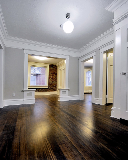
In the photo above, you can see how Colonnade Gray complements rich hardwood floors and stark white moldings really well.
Colonnade Gray promises a crisp, warm, and cozy touch.
It is neither too dark nor too light to have a lot of restrictions imposed.
When exposed to Natural light, this color definitely proves to be a lighter shade color. It makes your room look bigger and brighter!
Pair it with white trims and you will further feel more into the color.
So, long story short – with no light – the color aligns itself towards gray but with light – the color is comparatively more soft, beige-shaded hue.
Isn’t that a good option if you are bored with the walls looking alike all the time?
Yes, use classic Colonnade Gray!
How Does Light Affect the Color?

When paired with whites, SW Colonnade Gray showcases a perfect soft and smooth feel.
I must say -A LOT!
The chameleon-like feature of this color makes it quite confusing to understand what the color actually looks like.
If you have a south or west-facing room, the color will apparently look lighter but if it is painted in north-facing rooms, the color may appear dark!
This color is most commonly used in living and family rooms to give an extra tinge of comfort and warmth.
But a plus point – there are no hard and fast rules for this color – so you’re good!
I’ll say this again – get some wall samples to try on this color in your own home and confirm if it’ll work or if you need to try something else.
What are the Coordinating Colors for Sherwin-Williams Colonnade Gray?
If you are planning to use this color in your home, there are a few recommendations I would like to offer.
I personally love Monochromatic style – and if you have a similar design thought, here is the list of colors you should incorporate aside from Colonnade Gray.
- SW Modern Gray (see my complete review here!)
- SW Skyline Steel
- SW Pussywillow (see my complete review here!)
However, if you like more pops of colors and contrasts, try a complementary theme. Some of the colors I would recommend are:
- SW 0023 Pewter Tankard
- SW 9044 Little Blue Box
- SW Origami White (see my complete review here!)

However, for the trim and moldings, I highly prefer using White Reflectance White or Pure White (It is personally my favorite, which well complements most of the colors)!
This color is definitely a win-win for wooden textures as well. So, if your dining room has a farmhouse touch with rustic tables and chairs, Colonnade Gray could be considered.
More SW Colonnade Gray Color Palettes


Sherwin-Williams SW 7641 Colonnade Gray Vs. Similar Colors
If you are looking for other alternatives, there are quite a few options you could refer to.
From light to dark and cool to warm-undertones, every color has viable other options. One such great option is Skyline Steel. And another option to be is BM Revere Pewter!
I also mentioned this color to be one of the counterparts of monochromatic shades, but it also has great alternative potential.
Colonnade Gray Vs. Skyline Steel

With an LRV of 52, the color shares the same scale of brightness.
With a clean, crisp, and warm touch, this color is a perfect alternative to Colonnade Gray.
However, this color has a slightly reddish-brown undertone! Do you see the difference?
Trust me, you will see the difference.
Order some wall-stick samples here to help you better compare these colors in your own house.
Colonnade Gray Vs. Revere Pewter

One of Benjamin Moore’s most common grays is Revere Pewter. Classical and crisp, it is a perfect alternative to Colonnade Gray.
These two colors share the same brightness and depth! They both are neutral with a greige touch and green undertones – just like Colonnade Gray.
Rather, Revere has an earthy touch – thus, ideal for farmhouse, rustic, and contemporary interior design style homes.
Also, if you have lush hardwood floors, there is no doubt that either of the two colors will work for your space.
Just pair them with white door/window frames and enjoy the warm touch!
Also, don’t forget about buying real-time samples to determine the tonality of the paint in your home’s lighting. Pick samples up from here.
Where to Use Sherwin-Williams Colonnade Gray in Your Home?

Use this color anywhere – the hallways, living room, bedroom, kitchen and even exteriors.
But be careful what you want to pair it with.
With a perfect set of accents, neutrals, and bases, the color might look absolutely amazing!
Let’s see what this color has to offer in the specific areas of your room!
Colonnade Gray in Bedrooms

Jennifer from A Place 2 Call Home absolutely loooves painting with this color.
Blogger Jennifer paints her bedroom in Sherwin-Williams Colonnade Gray
Bedrooms are the most personal spaces – so if you are a preacher of subtleness, smoothness, and serenity, this color is highly recommended.
Just pair it with a wooden headboard, side tables, and a rustic-styled floor lamp to attain perfection in your room.
However, if you have a Scandinavian or Minimalist style, this color is absolutely a no-no!
Using in Living Rooms
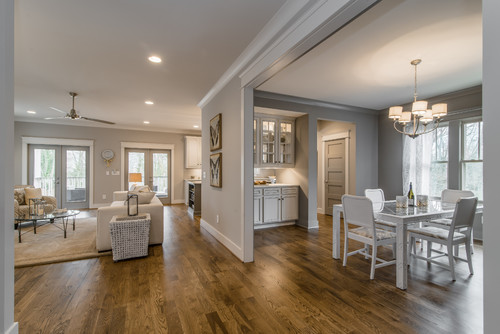
Want a cozy and comfortable space to relax and have a cup of coffee with your family in the evening?
Living Room walls in Colonnade Gray will give you exactly what you want.
Black modern fireplaces are to go; however, if you have an exposed brick fireplace, do not use colonnade gray – it will be a blunder that you should absolutely avoid!
Colonnade Gray in Kitchens
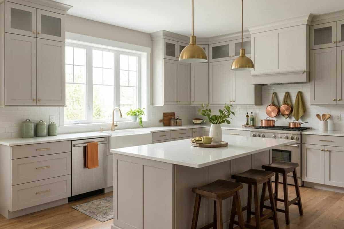
If you need a subtle-looking kitchen, crisp and clean Colonnade gray is a good option. However, if you like artsy backsplashes, try avoiding this color.
But a plus point here is if you are planning to use distressed exposed wooden shelves – this color is definitely a yes-yes!
Colonnade Gray on Exteriors

Like I always say, any color would look lighter when used on exteriors.
This color appears to be clean and a shade that would most likely be used in the northern states!
Just pair them up with white frames, trims, and moldings to get the perfect look. Stone wainscoting is not an issue here – thankfully!
I Recommend Sampling Colonnade Gray!
If you’re on the fence and need a bit of convincing, try this color on for size by ordering a peel-and-stick sample from Samplize.
These are my favorite way to test colors in a space and to see how they work with other coordinating colors.
It doesn’t cost all that much, and you can temporarily place these handy 12″ x 12″ squares that are true to color around your house. I love them!
What Not to Pair with This Color
Color Pairings That Fight Against Colonnade Gray
Warm, heavily saturated colors are a tough match for Colonnade Gray.
Deep terracottas, burnt oranges, and rich mustard yellows clash against its cool, reserved undertones and make the whole room feel disconnected.
Overly warm beiges placed directly next to it will also pull out any cool qualities in this color in an unflattering way.
Decor Styles That Work Against This Color
Colonnade Gray doesn’t play well with heavily rustic or farmhouse-style spaces that rely on raw, warm wood tones and distressed finishes.
The contrast between its refined coolness and that earthy warmth creates a tension that never fully resolves.
Maximalist or boho-layered styles with lots of warm, clashing patterns tend to overwhelm what makes this color work so well!
Trim and Accent Colors to Keep Away From Colonnade Gray
Avoid cream or ivory trims with yellow undertones next to this color.
I’ve seen those warm-toned whites make Colonnade Gray look unexpectedly dull and slightly dingy rather than crisp and polished.
Stark cool whites can also be too harsh against it, so the trim choice here genuinely matters.
Furniture Tones That Clash with This Color
Heavy, orange-toned wood furniture is one of the most common mismatches I see with Colonnade Gray.
Honey oak pieces in particular fight directly against their cool neutrality and create an awkward visual tension in the space!
Exterior and Interior Finishes That Don’t Suit Colonnade Gray
Warm brick, terracotta tile, and yellow-toned stone finishes are difficult pairings for this color outdoors.
Inside, brass or gold hardware with strong orange undertones can also undercut the clean, understated quality that makes Colonnade Gray so appealing.
My 7 Key Tips for SW Colonnade Gray
1. Test Colonnade Gray in different lighting
Colonnade Gray can look warmer or cooler depending on natural light and artificial lighting.
I always paint a large sample swatch on multiple walls to see how it shifts throughout the day.
This saves headaches later, especially in rooms with lots of windows or southern exposure!
Even one wall can look dramatically different in morning versus evening light.
2. Pair with white or light wood cabinetry
This color pops beautifully against crisp white cabinets or soft, light oak finishes.
I recommend testing it with your cabinetry sample or a small section of built-ins first.
The contrast brings out Colonnade Gray’s subtle warmth without making the room feel cold.
It’s especially stunning in kitchens and bathrooms where cabinetry is a focal point.
3. Coordinate with mid-tone or gray-toned flooring
Colonnade Gray works best with neutral flooring like medium oak, light walnut, or gray laminate.
I avoid pairing it with very dark floors unless there’s ample natural light, or it can feel heavy.
For DIYers, bringing a small paint sample to your flooring space helps ensure harmony.
This tip prevents the room from feeling unintentionally gloomy!
4. Consider it for exteriors on traditional or modern homes
This gray has a timeless quality that complements both classic brick homes and modern siding.
I’ve seen it shine with white trim and black shutters, creating a crisp, clean curb appeal.
Avoid pairing it with overly warm or yellow-toned bricks, which can clash.
Colonnade Gray can also highlight architectural details beautifully when used outside.
5. Use in living areas for a calming backdrop
I love Colonnade Gray in living rooms and bedrooms because it creates a serene canvas.
Soft furnishings in blues, creams, or muted greens pair exceptionally well.
Try accenting with natural textures like linen or jute for added warmth!
It’s perfect if you want the walls to fade subtly behind furniture and art.
6. Mind your trim and ceiling colors
Colonnade Gray looks best with pure white or very light off-white trim.
I always paint a small trim sample nearby to avoid any color clash.
This step prevents the gray from appearing too muddy or flat against your moldings.
7. Test before using as a whole-house color
This versatile gray can work throughout a home, but small spaces may feel cooler.
I suggest painting a hallway or powder room first to see its effect in tighter areas.
This helps you adjust lighting or accents to keep the color feeling open and inviting!
Even experienced DIYers benefit from this simple step before committing to gallons of paint.
The bottom line is, if you like warm gray, Colonnade Gray is at least worth considering. It doesn’t restrict you much or bind you down to hard and fast rules!
So, are you excited to paint your home in Colonnade Gray? Do share your experiences in the comments below!