

It’s not a cliché but an actual subtle blue that is definitely worthy of admiration – Sherwin-Williams North Star!
It is personally one of my favorites as the crisp and cool effect of the color is definitely bound to take your Monday Blues away.
If you are planning to use this paint for your new or existing home, I would definitely recommend you go for it!
However, other than the aesthetic beauty and serenity that the color exhibits, there are definitely many factors associated with this color that would make you want this color even more.
But, BEWARE! Pairing it up with a color not appropriate can result in an absolute blunder!
And nobody can afford to make that mistake in their home, right?
So, before you actually finalize on using this color, consider these basic theories behind the color that would further help you in deciding if this is REALLY the blue you are looking for.
I promise – in no time, you’ll be an expert!

Sherwin-Williams North Star SW 6246 Color Details and Specifications
North Star pairs best with hardwood floors and stark white frames
One of the basic color theories is linked back to the concept of tints, tones, and shades. Yes, there are hundreds of blues out there. But how do we decide the best one?
You need to answer these few questions:
Light shaded or Dark Shaded? Warm, Cool or Neutral?
Well, yes! If you are new to color theory, it’s surprising to see the deep explanations behind each color.
Talking about North Star, it looks more like a grey, but is eventually a BLUE!
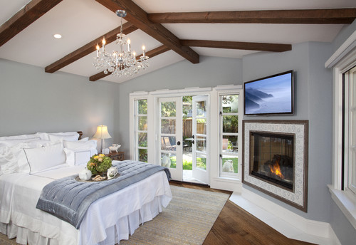
North Star is a light-shaded blue with a tinge of crispness and a grey feel to it.
Falling on the lighter end of the scale, the color proves to be an ideal solution for the north-facing rooms.
On the contrary to Bold Midnight Blues, this color is an absolute definition of calm, peace, and tranquility.
Let’s have a look at some of the specifications of this color that are quite vital to know:
First and foremost, the most important – Light Reflectance Value (LRV) of the color helps you decide if the color is going to reflect away the light or absorb it!
The greater the value, the lighter the color is, and so, the more light will be reflected.
In this case, the LRV of North Star is 62.

Which absolutely makes it more aligned towards the lighter end of the scale, i.e. not dark or too light!
Now, using this information, you exactly know where to use the color!
Oh, if you want to just try North Star you can do so easily with a peel-and-stick sample from Samplize. Order some samples now!
Another important factor to consider is the RGB Values and HEX Values, which are as follows:
Red = 202, Green = 208, Blue = 210
HEX Value = #cad0d2
How Does North Star Feel in a Space?
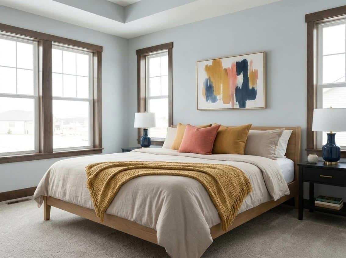
Once you start applying the paint, you’d be surprised to see the clean and crisp effect of this paint color on the walls.
Well, if you are residing in one of the southern states or if it is a tropical or warm climate, typically throughout the year, there is nothing better than subtle blues to soothe your mind.
I would highly recommend using this color for your bedroom walls, bathrooms, kitchens, living and family rooms and even exteriors.
Long story short, this color has the ability to outshine almost anywhere and everywhere!
The cool-toned soft texture helps brighten up the room interiors.
And due to these properties, the color proves to be an ideal solution to make small spaces look larger.
This color also has a modern appeal to it:
I highly recommend painting your walls in North Star if you have a contemporary, modern, or even a minimalist setting.
And for all your coastal vibe lovers, your beach house craves a blue like North Star!
Whether it’s painting the walls or placing a huge blue rug or adding a ‘cozy’ factor with throw pillows, North Star will definitely prove to amaze you!
How Does Light Affect North Star?

Rachel from Small-town Idaho Life shows off North Star in natural lighting
Surprisingly, depending on the daytime or the night, this color may absolutely exhibit a different finish look.
So, I would highly recommend visiting the nearest store to buy swatches or paint samples!
Well, in the daytime, North Star appears to be this light, cool blue-grey color with immense brightness.
However, during the night under the influence of artificial lighting, this color may appear to be comparatively darker-shaded with grey highlights!
With the direct sunlight hitting the interior wall, this color seems brighter and lighter!
So, remember to use the appropriate light temperature and warmth to enjoy the most of this color.
I personally would recommend cool whites or warm whites for a dramatic experience at night!
To truly see what your home’s environment and lighting will do here, try out a real paint sample. It takes out the guesswork!
What are the Coordinating Colors for North Star?

Sherwin-Williams North Star is predominantly a gray paint color with a tinge of blue to it. Yes, just like those blue-grays that we have been discussing!
Choosing coordinating colors for this color category can be quite a challenge for obvious reasons.
First and foremost, they are big-time chameleons and can either reflect a tinge of blue or gray (depending upon the lighting conditions).
So, the coordinating colors might have to be very specific.
In general, you can best pair with the hues of clean whites, off-whites, darker grays, midnight or cobalt blues, beige, and blush pink.
In terms of metallic accents, you can either choose satin brass for a rich and luxe look or even textures of wood for a modern farmhouse and rustic look.
The most subtle is matte black, which will never disappoint you.
Here are the following two color palette suggestions – monochromatic and coordinating (cool and warm)!
Monochromatic Color Palette

The complementary colors for the monochromatic palette are as follows –
- SW 6247 Krypton – see my review here!
- SW 6248 Jubilee
- SW 6249 Storm Cloud – see my review here!
This is an ideal color palette for coastal, modern, and contemporary design styles. Of course, when you add a clean white to it!
You can further break the monotony and add shades of satin brass or matte black to the lighting fixtures, artwork frames, and furniture frames.
In this palette, allow black to play its fundamental role on the window frames.
Contrasting Cool Color Palette

The complementary colors for the contrasting palette are as follows (cool) –
- SW 7005 Pure White
- SW 9178 In The Navy
- SW 9161 Dustblu
A cool color palette embraces the use of cooler hues such as crisp whites, soft blues, navy blues, and clean grays.
I highly recommend that you mix and merge the above-mentioned colors in the form of wall paints, accent wall, furniture fabrics, and decorative accents to create a cohesive appeal.
Along with this, you must choose satin brass or matte black to go with it.
Contrasting Warm Color Palette

The complementary colors for the contrasting palette are as follows (warm) –
- SW 7004 Snowbound – see my review here!
- SW 7641 Colonnade Gray – see my review here!
- SW 6057 Malted Milk
This warm color palette balances the crispness of the cool color to make the home feel extra welcoming and inviting.
You must choose matte black for the lighting fixtures and artwork frames. Satin brass would be a big no here!
And this is the time to understand the theory behind pairing up the best-suited colors!
When specifying North Star, the best-suited colors for trims and moldings are SW High Reflective White or SW Pure White!
Because your wall color needs to protrude out.
However, if you are wondering about accents and bases while adding pops of colors, the most suitable colors for North Star are:
- SW Dover White – see my Dover White review here!
- SW Bee’s Wax
- SW Quicksilver

Of course, creativity matters and that’s when you incorporate all the elements of the room to exhibit cohesiveness.
More SW North Star Color Palettes


