

Sherwin-Williams Dover White is a white paint and yet not-a-white.
Well, yes! There are quite a few considerations that make this paint color even more mysterious and unique.
However, if you are planning to use this for New Construction or Makeovers for your home, there are a few details you might want to educate yourself on before embellishing your walls with it.
There is no doubt that all the whites and off-whites, warm whites and cool whites look the same depending on the light or your screen, right?
I always find myself confused looking at my iPad screen and wondering about the differences between all these shades!
And that is when I realize there is no better way to compare colors than ordering their physical samples and comparing them in natural light.
And that’s when you see their utmost beauty.
But short of doing that, I’ll give you my full review of this color here.
Let’s call it the next best thing to evaluating if this is what you want to use in your home.
White paint collections do have their own shades, tints, and tones.
And trust me on this, the day you understand that, choosing colors is going to be 10 times easier.
So, are you excited? Let’s read below to find out what this one has for us!
Sherwin-Williams Dover White SW 6385 Color Details and Specifications

This shade is undoubtedly more inclined towards the softer tones. SO, it is definitely a WARMER tone of the authentic Whites.
Since this one has a yellow tint to it and is considered warmer, you might have to be very careful when painting your home or DIY furniture with it – especially focusing on what will pair up with Dover White.
You don’t want your space to end up looking too warm and unbalanced!
I must say, “Creamy White” should be an alternative name here. Although not to be confused with the actual paint color “Creamy” from Sherwin-Williams.

A perfect fit for Country and Farmhouse Interiors, as shared by Kelly Nan on her blog.
The creaminess within gives your space a nice, warm look, so I highly recommended for all you “cozy-look” lovers!
Before getting on to design ideas, let’s read through some basic specifications that hold a lot of importance.
First and foremost, you can never afford to ignore the Light Reflectance Values (LRV) – it helps you decide how light or dark the color is, which later will help you in deciding which room it probably should be in!
In this situation, the LRV of Dover White is 83.
And that is an ideal situation if you want your space to look bright and light! Remember, the more the LRV, the brighter your walls are.
In simpler terms, it is warm with yellow undertones and a light shade.

Moving ahead, the colors have associated RGB values and HEX values that typically define the scientific details and preparation.
Here, we have:
Red = 240, Green = 234, Blue = 220
HEX Value = #f0eadc
If you’re not quite sure how this color will work in your home, you should definitely try it on for size by ordering a peel-and-stick sample from Samplize.
How Does the Dover White Feel in a Space?
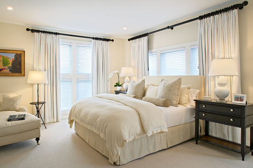
Well, the warmth that it imparts as a white paint is likely to make your space feel cozy and comfortable.
I would highly recommend using this for all the North state dwellers. Trust me, you will see the cozy magic in winter.
The yellow undertones have an energetic yet serene vibe to it that even makes your room feel much more spacious!
So, if you have a congested space or a small room that you may want to look brighter and spacious – here is the answer for you – Dover White.
A great trick, isn’t it?
However, if you want a huge, cozy living room and you’re thinking of painting it in DW, do it only if your furniture is well placed.
Fill up your space with end tables, vases, sectionals, and lamps.
This way, you don’t have to compromise.
How Does Light Affect It?

Another important aspect of choosing the best paint color for your home is studying and analyzing the impact of light on it.
The artificial light that needs to be considered is warm whites, cool whites, warm yellows, and colored; meanwhile, natural light and sunlight are primary as well.
Some colors really act as chameleons!
They change their looks instantly – and DW is a perfect example of it!
Now remember, natural light and falling sunlight can make white paint color look yellow-ish! Not LEGIT yellow – but still – a lighter tone of it.
Similarly, sconces and pendant lights with warm whites can tend to add a tinge of beige-yellow to it!
However, don’t worry! If you pair it up with the best options available, your space might look absolutely warm and stunning.
I wouldn’t recommend using cool-whites or colored light here!
A cohesive room is a cozy room!
As I mentioned before, you can try out this color with real paint, (but without the mess) using stick-on samples from Samplize.
What are the Coordinating Colors?

Sherwin-Williams Dover White is a creamy white that may DEFINITELY and DOMINANTLY look yellow!
So, if you’re in search of that off-white with a tinge of ‘yellow’ undertone, this is one creamy white to have an eye on.
However, when you look to pair this color with other coordinating and contrasting hues, just remember to consider the undertones of the adjacent hues!
Pairing with tan and greige will further bring the yellow to this color.
Majorly, this creamy off-white paint can best complement the icy tones of blue, teal, true white, beige, and tan!
Simultaneously, the metallic accents that will best create contrast are matte black and oil-rubbed bronze!
I know satin brass is my absolute favorite but believe me, it wouldn’t work here.
Here are the following two color palette suggestions – monochromatic and coordinating (cool and warm)!
Monochromatic Color Palette

The complementary colors for the monochromatic palette are as follows –
- SW 6386 Napery
- SW 6387 Compatible Cream
- SW 6388 Golden Fleece
This monochromatic palette would be too warm to implement! Hence, you must be very careful about where you intend to use it.
And just in case you do (in the bedrooms and playrooms), ensure to pair this palette with matte black or oil-rubbed bronze texture on the lighting fixtures.
Contrasting Cool Color Palette

The complementary colors for the contrasting palette are as follows (cool) –
- SW 6251 Outerspace
- SW 7005 Pure White
- SW 6224 Mountain Air
If too much warmth of this creamy color bothers you, it’s ideal to choose contrasting cooler hues that will create a subtle experience.
You must pair the creamy off-white with a bold blue color on the accent wall.
Furthermore, add metallic accents such as matte black or satin brass to complete the look of your space.
Contrasting Warm Color Palette

The complementary colors for the contrasting palette are as follows (warm) –
- SW 7036 Accessible Beige
- SW 7513 Sanderling
- SW 9051 Aquaverde
This warmer color palette embraces the use of warmer tones such as beiges and taupes to create an ultimate cozy experience.
It’s ideal for traditional interior design styles – only when you add a sense of contrast with the help of turquoise or teal!
You must choose matte black fixtures to go with this palette.
So, in this case, the one I absolutely love for the trims is SW High Reflective White.
And the reason behind using a clean white is to protrude out the actual hue of your walls – in this case, DW will apparently look its real shade if paired with bright white.
The best way to pair up here is to blend it with deep blues and subtle oranges.
In this case, I highly recommend SW 9141 Waterloo as an accent and SW 9023 Dakota Wheat as the base, or vice versa!

Other than that, using this with grays and greiges is an absolute NO-NO!
You can also pair DW with warm greens! That look, I would say, is balanced!
More SW Dover White Color Palettes


Sherwin-Williams SW 6385 Dover White Vs. Similar Colors
Well, there are other great options as well, in the world of warm whites.
I understand we are never satisfied with one option, and that is why I present other similar paint colors from the same and other manufacturers that you might want to consider.
SW Dover White Vs. SW Alabaster
Alabaster is soft, warm, and creamy – just like DW – but with an LRV of 82.
Well, too close!
The major difference lies in the undertones – unlike this white paint that is actually more yellow, this is more of an off-white creamier shade!
However, exhibiting the same properties in natural light, it’s quite likely for one to get confused between the two!
Review some other key differences in my article on SW Alabaster.
