
Sherwin-Williams Creamy is exactly like it sounds – warm and creamy!
Ever thought why do the walls of your home feel cool and uninviting? Maybe you are craving a cozier touch? Well, let me introduce you to one of the kings of warmer hues on the palette.
It is a neutral and extremely light-toned paint color that makes a great warm backdrop in your home.
It is quite likely for you to find inspiration for this paint color as it is also one of the most famous warm-toned paint colors.
It exhibits a creamy-like texture when applied to the walls with a subtle focus on making your home look larger and more spacious.
So, it is not only aesthetically beautiful but also makes up as a great space-saving hack!
Unlike other paint colors, this timeless beauty doesn’t have many cons and restrictions when using it in homes; however, I will still throw some basic information about the color and how you can best optimize it!
However, remember – just like how I recommend you be careful around dark and daring shades, you should keep in mind that the lighter hues too need to be used appropriately!
Don’t worry – keep reading below to be a MASTER in this color!
Sherwin-Williams Creamy SW 7012 Details and Specifications

If you flip through the swatches of this manufacturer, you are quite likely to observe various pastels and off-whites that are similar to SW Creamy.
And how do you identify between them?
Well, that is because of the underlying theories and specifications related to the paint color.
So, to get started, I would recommend you analyze the Light Reflectance Value or the LRV’s of the paint color.
This value helps in determining how light or dark the paint color is!
So, the value here is 81 – which means it is pretty light-toned! (Remember, greater the value – lighter the paint color)

Wondering where will you find this value? Just look at the back of the paint swatch!
Now, if you want to try out Creamy on your walls ahead of time, you can easily with a peel-and-stick square from Samplize. Give them a try now!
Secondly, it is important to get acquainted with the RGB and HEX Values – which are as follows!
Red = 239
Green = 232
Blue = 219
HEX Value = #efe8db
Now that we have read through the color specifications, let’s read on to some of the practical aspects and applications of this timeless neutral paint color.
How Does this Color Feel in a Space?
SW Creamy is bound to add a warm, cozy, and inviting feel in your space. It helps make your space look more fresh, welcoming, and homey at all times.
So, I would highly recommend using this paint color in colder regions or states and especially those areas that face dark, long winters for most of the time in the year.
Since this color will add warmth to your home, it is a great way to feel lively and homey in extreme climates.
Secondly, if you are struggling in a small-sized apartment in the city or if a room in your home is weirdly small – you can make use of this paint color to brighten it up!
With ultra-high reflectivity, this paint color will create an illusion of setting apart your walls!
How Does Light Affect the Color?
Light has some role to play with this color. Remember, light is an important aspect when choosing paint colors for your homes.
So, just in case, if you have ample light – You can either consider using this paint color or even go for a shade darker!
But, on the other hand, if your space doesn’t receive ample daylighting – this paint color is absolutely good to go!
Since, it will anyway make your space feel bright – you can definitely use this.
Secondly, you can even play with artificial lighting here – maybe add a cool-toned light to neutralize the warmth of the paint on the walls.
If you further add warm-white lighting, it will tend to look yellowish.
Want to see what Creamy looks like in your own living space? Pick up a wall sample now from Samplize!
What are the Best Coordinating Colors?

Sherwin-Williams Creamy is a lighter-toned, off-white color that is quite fresh, airy, and also has a tinge of yellow to it!
But don’t worry – it isn’t too yellow to overwhelm your space so it is a win-win situation.
This color is a great recommendation if you’re aiming for a warmer look in your home without going too dark or deep.
Wondering what best pairs with SW Creamy?
Well, you must pair this color with true whites (warm base), beige, greige, taupe, brown, black, charcoal gray, rust, and dark blue greens.
In terms of metallic accents, you must add matte black for a bolder and transitional look or satin brass for luxe and elegant.
Here are the following two color palette suggestions – monochromatic and coordinating!
Monochromatic Color Palette

The complementary colors for the monochromatic palette are as follows –
- SW 6386 Napery
- SW 6387 Compatible Cream
- SW 6388 Golden Fleece
This monochromatic palette can be too overwhelming!
So, I highly recommend that you restrict this palette to only kids’ rooms and play areas.
You must add interesting terrazzo patterns on the floor to make it even more appealing.
Lastly, I highly recommend that you choose matte black finish for the furniture frames and lighting fixtures here.
Contrasting Color Palette (Cool)

The complementary colors for the contrasting palette are as follows –
- SW 9165 Gossamer Veil – see my full review
- SW 9179 Anchors Aweigh – see my full review
- SW 6212 Quietude – see my full review
This cool-toned palette is an ideal way to introduce a sense of boldness and freshness indoors.
This creamy paint color can be best paired opposite bold blues on the accent wall and tinges of green here and there.
In terms of metallic accents, I recommend that you choose matte black or satin brass.
Contrasting Color Palette (Warm)

The complementary colors for the contrasting palette are as follows (warm) –
- SW 7549 Studio Taupe
- SW 6004 Mink
- SW 0054 Twilight Gray
This warm and welcoming palette is quite recommended for modern, contemporary, and neoclassical interior design styles.
You can use the various shades in the form of the wall color, curtains, furnishings, and decorative accents to make your home feel elegant and modern.
Don’t forget to further style with matte black to help complete the palette.
On the other hand, if you are looking for a contrasting theme, I would highly recommend incorporating greys, blues, browns (the best), greiges, and taupe.
You can also use rusty oranges as an accent!
So, to enlist a palette, I would recommend the following paint colors:
- SW 9173 Shiitake (see my full guide here!)
- SW 6043 Unfussy Beige
- SW 6047 Hot Cocoa

In the case of ceilings, trims, and moldings – I would recommend using SW Alabaster to further exhibit a refined look.
SW Creamy Vs Similar Colors
There are quite a few similar paint colors to SW Creamy!
Whether you prefer a cool-toned neutral or a warm-toned neutral, or else a neutral with specific undertones – looking for similar colors are a great way to finalize the paint.
Let me brief two closely related paint colors – SW 7013 Ivory Lace and SW Dover White.
Creamy Vs Ivory Lace

SW Ivory Lace shares quite some similarities with SW Creamy! With an LRV of 79, this paint color tends to slightly have a dark tone as compared to the former.
You are also quite likely to detect a pink undertone in excessive natural light conditions.
Order a stick-on sample of Creamy and Ivory Lace to see what works best in your home.
Creamy Vs Dover White

SW Dover White is creamier and brighter than Creamy. If you compare all three, this paint color is the warmest and brightest of them all.
It also has an LRV of 83 – making it a perfect neutral or base for most homes.
Since digital screens can be deceiving, I highly suggest you get some actual samples of these two colors from Samplize. Buy here!
Coordinating Decor

Sherwin-Williams Creamy is quite a popular paint color and knows that the following information can be quite helpful to you!
Yes, especially when you’re picking the best furnishings to go with the palette.
In general, you can use this color with various fabrics such as velvet, suede, leather, linen, as well as silk and cotton.
Just stick to the warmer hues to create a sense of cohesiveness.
In the form of cooler accents, remember to go bold and contrast with deep blues and greens.
For the materials, you must choose rattan, wicker, cane, ample wooden textures, black marble, and chic glass.
Here are the links to the furniture that work well with SW Creamy –

Here are the links to the flooring that work well with SW Creamy –

Here are the links to the decorative accents that work well with SW Creamy –

Where to Use Creamy in Your Home?
Creamy is a good fit for any and every home. I myself have this paint color on the walls of my living room.
This paint color makes a great option for traditional, transitional, French country, farmhouse, and Bohemian interior design styles.
Let’s discuss how to incorporate this paint color in your home!
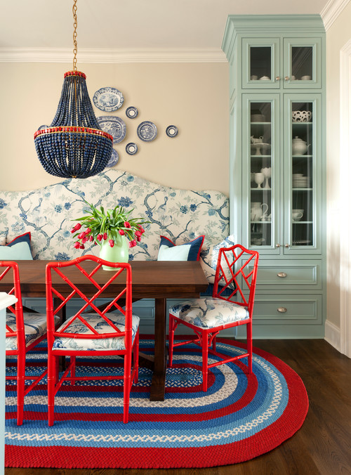
Creamy in Living and Dining Room
Creamy is a great option for the living and dining room along with the hallways.
It exhibits a warm feeling in your space so, if you are craving for a cozy environment – this color is good to go.

The best hue and materials to go with this paint color are walnut woods.
They make a great pair with SW Creamy so if you are planning to refurbish the floors – you can definitely choose hardwood floors.
You can choose a brown leather couch along with off-white accent chairs and throw a large pile rug to further add a cozy touch.
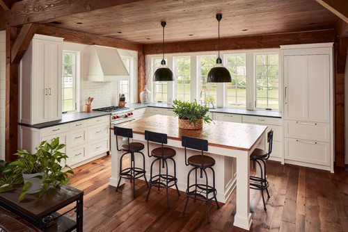
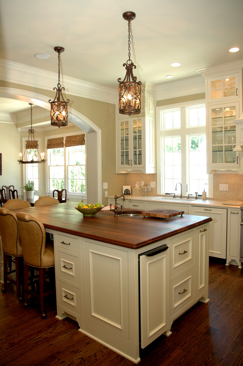
Using in Kitchens
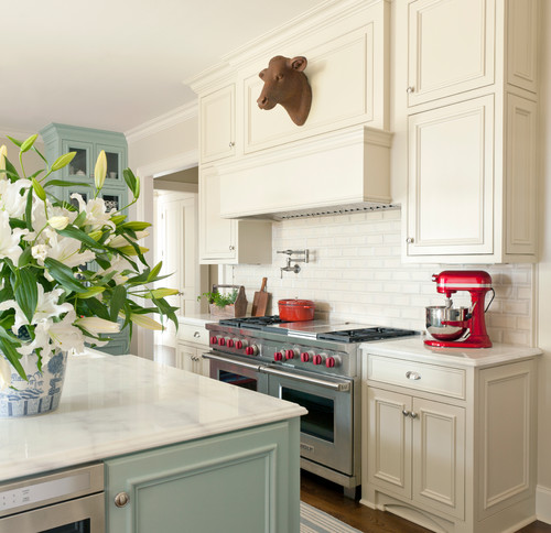
Definitely yes! Yes!
You can either paint the cabinets in SW Creamy or choose oak or walnut hardwood cabinets along with creamy neutral walls.
Furthermore, add wooden pull handles and chrome finish fixtures. For the island countertop, you can add a brown coated countertop and a black industrial style chandelier or pendant lighting.
Creamy in Bedrooms and Bathrooms
Bedrooms deserve a subtle paint color like SW Creamy. You can pair it with black metal or wooden frame beds and a wooden headboard focal wall.
If you want a contrasting palette – you can paint the focal headboard wall in either browns or rusts!
To further feel fresh and bright, you can add some indoor plants to the sides of your beds or on the nightstands.
Creamy in Bathrooms
View this post on Instagram
SW Creamy is a great color to be used in a bathroom! Especially if you have a smaller-sized one.
You can consider using the color on the backdrop wall or the cabinets as well!
Pick matte black pull handles and lighting fixtures to go with this off-white color.
Also, avoid yellow saturated lighting since it can make your bathroom walls appear too yellow!
Choose warm whites for a sense of balance.
Using on Exteriors
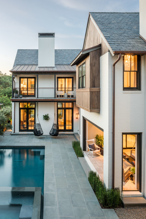
This paint color is a great alternative for exteriors. You can pair it with either grey or brown trims, moldings, and door and window frames.
For Spanish-styled Southern homes, this color is definitely going to look majestic!
It somehow will appear yellow outdoors due to extreme natural daylight – but don’t worry! You can absolutely paint the exterior walls in SW Creamy.
How to Best Sample This Color?
Here’s my favorite tip when it comes to testing out a color like Creamy – go and order a peel-and-stick sample from Samplize.
This little company has nailed down the best way to sample colors much more easily. Simply stick on a 12″ x 12″ square instead of having to get a small can of actual wet paint on your walls.
For a few bucks you get a big enough sample to evaluate anywhere you want to “try” on a paint color and any possible coordinating hues you like.
It’s temporary, so move it around and test location and lighting options.
The Best Wall Locations to Test Creamy
Testing Creamy in multiple spots is genuinely important because this color shifts noticeably depending on where it sits in a room.
Place your sample on a wall that gets direct sunlight, a wall with little natural light, and a darker corner or narrow section.
Also test it next to your trim, flooring, and cabinetry, since Creamy’s warm yellow base reacts strongly to surrounding tones.
When to Observe Your Creamy Sample
Evaluating Creamy at different times of day is one of the most valuable things you can do before committing.
Check it in morning daylight, bright afternoon sun, and under cloudy conditions to see how its warmth shifts across those changes.
Evening lighting matters too, and warm bulbs will intensify Creamy’s yellow quality while cooler LEDs can flatten it significantly!
How Surrounding Elements Influence Creamy’s Appearance
Wood flooring, rugs, and cabinet tones all pull on Creamy in ways that can either enhance or undermine its warmth.
In open floor plans, nearby wall colors can bleed into Creamy and shift how it reads across a larger space.
Even outdoor views matter here, as greenery visible through windows can cast a cool reflection that subtly alters this color’s warm character.
Why Larger Samples Give You the Full Picture
Small paint chips simply can’t show you how Creamy behaves across a real wall surface in your actual lighting conditions.
A larger movable sample like Samplize (link above) lets you test this color in every location and light condition without committing to a full paint job!
Why Living with Your Sample Matters
Leaving your Creamy sample up for a couple of days lets you observe it during normal daily life rather than a single rushed evaluation.
This color’s warm, creamy yellow quality can look quite different on a Tuesday morning than it does on a Saturday afternoon, so give it real time before you decide.
My 7 Key Tips for SW Creamy
1. Test the lighting before committing
I always check Creamy under different lighting conditions.
Morning sunlight, afternoon light, and artificial lighting can all change how warm this shade feels.
A room with mostly north-facing windows can make Creamy feel cooler, while southern exposure can make it glow beautifully.
Testing on a large poster board can save you from painting an entire wall and regretting it later.
2. Pair Creamy with natural wood floors
I love how Creamy pairs with honey oak or light maple flooring.
The warm undertones of the paint complement the wood’s natural warmth without looking too yellow.
For a more modern vibe, I sometimes mix it with wide-plank walnut floors for a soft contrast.
This combination makes spaces feel cozy yet open at the same time.
3. Match with neutral cabinetry in kitchens
Creamy works wonderfully with white, off-white, or soft gray cabinets.
I often recommend adding warm-toned hardware like brass or bronze to pull the look together.
Avoid pairing it with very stark, bright whites as Creamy’s warmth can clash and look dull.
This approach gives kitchens a timeless and inviting feel.
4. Use in bedrooms for a calming atmosphere
I frequently paint bedroom walls Creamy because it creates a soft, soothing backdrop.
It pairs beautifully with blush, taupe, or soft blue bedding and accents.
I also like adding layered textures like linen curtains and wool rugs to enhance the cozy effect.
5. Consider trim and ceiling contrasts
I often paint trim a crisp, clean white to make Creamy pop on walls.
For ceilings, a slightly lighter cream tone keeps the space feeling airy and open.
This subtle contrast prevents the room from feeling flat while keeping the palette cohesive.
6. Use Creamy on exterior accents
I love using Creamy on porch ceilings, shutters, or window trims against a darker siding color.
It softens the exterior look while still providing contrast and charm.
If your home has brick or stone elements, Creamy complements them beautifully without competing for attention.
7. Mind undertones with furniture choices
I always consider furniture when painting with Creamy.
Warm-toned sofas, leather chairs, or natural wood tables harmonize with the paint’s soft yellow-beige undertones.
Cool-toned furniture like stark gray or black can feel slightly off unless balanced with warm textiles or accents.
This saves headaches in matching decor and keeps the room feeling intentional and cohesive.
So, excited to have the beautiful SW Creamy in your home? Trust me, it is a must-have! Do let me know your thoughts and reviews in the comments below!

Hi I live in Texas just paint my house interior walls sw7012 creamy and ceiling flat white….can’t decide to pick for my interior doors between Turkish coffee and French roast my house is 3500 square footage with 18 doors all together for closets bathrooms and rooms and I also have to color five bathrooms cabinets with the same color please help😊thanks
Hi, there! SW French Roast has a touch of mahogany red to it whereas SW Turkish Coffee is drawn towards browns. Painting all the doors in either of these colors wouldn’t be ideal! You must only use a focal or accent door in this paint color and let the remaining be a subtle white like SW Pure White.
I have Aged White Trim, what wall color would you recommend. I like my walls to be a creamy color or light tan or gray – not yellow.
I highly recommend that you avoid SW Creamy in that case since it may appear yellow sometimes. Are you looking for a contrasting bold color or an off-white to paint that wall?
Hello, all of the trim, built in, and bathroom vanities in my house are painted creamy and current have a light tan walls that feel dated. What would you suggest for wall colors to go with creamy? Can I go with a lighter wall that the trim? I’ve always felt the trim should be darker. I have a lot of East facing windows with a lot of sun. Thank you.
Choosing lighter to medium-toned beige, taupe, or greige would be a nice idea to pair with SW Creamy. If you’re considering a lighter color on the walls, you can choose from SW High Reflective White or SW Greek Villa. Although it wouldn’t make much difference here!
Love the review on creamy. Is there a soft greenish color that would work well with creamy for my kitchen? I have north facing rooms mostly and I am going to get a sample of creamy and try on the walls. I was thinking adding an additional color to provide some definition to my open floor plan. I do like warm nature colors. Looking for Sherwin Willillam trim and ceiling match too. Thank you!
Hi Sharla, The soft green color you can consider using is SW Evergreen Fog! For trims and moldings, either stick to creamy or choose SW Pure White.
I painted our kitchen cabinets SW creamy and plan to paint the walls in the kitchen and adjoining living room the same color soon.