

Navy blue is having a serious moment in interior design right now, and honestly, it never should have left.
There’s something timeless about this color category that traces back to Victorian and Colonial interiors, yet it translates beautifully into today’s contemporary spaces when it’s handled with intention.
Sherwin-Williams Anchors Aweigh is one of those shades that sits at the deeper, more dramatic end of the navy spectrum, and I’d actually place it a step beyond Sherwin-Williams Naval in terms of depth and intensity.
In certain lighting conditions, it can look so dark it reads almost blue-black, which is part of what makes it so striking and worth understanding before you commit.
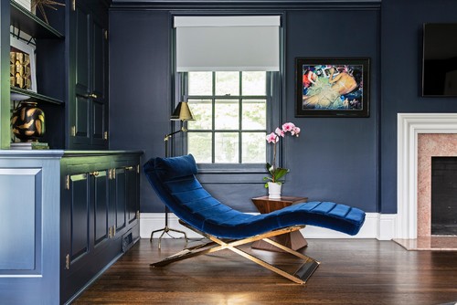
This is genuinely a color that rewards preparation.
Because it’s so rich and saturated, it can feel overwhelming in the wrong context, and that’s not a flaw so much as it is a characteristic you simply need to know how to work with.
The good news is that when Anchors Aweigh is used thoughtfully, it delivers some of the most dramatic, polished results you’ll find in any color family.
This guide is here to walk you through everything, from how this color behaves in different lighting conditions to where it works best and what to pair it with, so you can move forward feeling genuinely confident about this color choice.
Sherwin-Williams Anchors Aweigh SW 9179 Details and Specifications

Do you know what makes this specific shade of navy blue different from the other blues? Well, apart from appearances, there are tons of other considerations to keep an eye on.
And yes, it’s the details and specifications.
Yes, you might have to go through various decisions, comparisons, and discussions to make informed decisions.
After all, not every blue is alike. And there are considerable differences in each color that you observe on a swatch.
If you are new here, let me tell you that there are quite a few facts and scientific terms that you would want to acquaint yourself with. (Before choosing a paint color for your home)
It’s important to analyze these values and then determine where, when, and how to use these paints!
So, first and foremost, one of the most important terms that I usually observe getting ignored is Light Reflectance Values (LRV)!
Every color has an associated Light Reflectance Value!
For Sherwin-Williams Anchors Aweigh, the LRV is 3!

Which falls on the darker end of the scale. Yep, we’re nearing black!
Remember, the lower the value, the darker the paint color is! (On a scale of 0-100)
Most often, it’s best to sample a paint color in your home to confirm it’s going to work how you expect. You can do this easily using Samplize. Grab one now for Anchors Aweigh!
And vice versa!
Moving ahead, let’s discuss the RGB and HEX Values of the color.
Red = 43
Green = 52
Blue = 65
HEX Value = #2b3441
Now that I am concluding, I promise not to bore you with these scientific details anymore.
Let’s talk about the practical aspects of this popular navy blue paint color.
How Does This Color Feel in a Space?
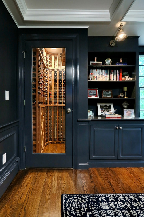
Sherwin-Williams Anchors Aweigh feels quite modern, crisp, elegant, unique, and glamorous when used in a space.
However, it depends upon the total amount of color you plan to use in your space.
The more navy blue in your room, the more glam and rich your room will appear.
On the other hand, the less navy blue (as an accent) – the more transitional and quirky your room will appear.
You see – there are many tips and tricks to play navy blue with.
Secondly, this color can truly create an illusion in your space – by making it look smaller and confined.
So, you can paint all the walls in SW Anchors Aweigh and make your room feel more glam and warm.
Furthermore, if you want to make a wall come closer to foster a sense of balance in the room – just paint an accent wall in SW Anchors Aweigh.
And yes – you can use this color in any climate!
How Does Light Affect the Color?
Natural light is a must in the room where you plan to use SW Anchors Aweigh.
Yes, only then will this color come out refined and elegant.
And do you know the best part? This color will look almost alike in all the compass directions – whether it is north, south, east, or west!
You must note that without natural light, this color in a room will appear quite dull and dingy.
(And especially a big no-no in smaller-sized spaces)
Furthermore, you can always play with artificial lighting in the form of pendant lights, wall sconces, and recessed or cove lights.
About saturation, prefer choosing warm whites or neutral whites!
Again, I really recommend you try out some wall samples because colors will look different in every location.
What are the Best Coordinating Colors?

Creating color palettes can be quite a fun task to do. (I absolutely love it)
And this is mostly what I am consulted for!
So, it’s crucial for you to choose the best complementary colors in order to define a palette that looks appealing and well-balanced.
SW Anchors Aweigh can be best paired with creamy whites, crisp whites, lighter yellows, mustard, sage greens, lighter blues, and grays.
Regarding metallic accents, I like the feel of brushed brass, chrome, or golden!
However, you have to be careful about what vibe you need in your space for a perfect color combination.
So, I’m going to list the two most popular color schemes here: monochromatic and contrasting.
So, here are a few of the colors I would recommend for a monochromatic palette!
- SW 6537 Luxe Blue
- SW 6536 Searching Blue
- SW 6535 Solitude

On the other hand, here are a few of the colors I would recommend for a contrasting color palette!
- SW 7023 Requisite Gray
- SW 6203 Spare White
- SW 6191 Contented – see my full review here!

For your ceilings, trims, and moldings – SW Extra White or SW Pure White will help produce a true hue of SW Anchors Aweigh.
SW Anchors Aweigh Vs Similar Colors

Although you must know that even though the following colors look similar, they might still differ in the undertones or reflectivity!
So, one of the closely related colors is SW 6244 Naval and BM HC-154 Hale Navy!
Let’s see how all of them differ.
Anchors Aweigh Vs Naval

Let’s say SW Anchors Aweigh is a deeper navy blue than SW Naval. Yes, in a way, a true naval!
With an LRV of 3, this color is equally dark, though.
Generally, you can best choose SW Naval with tinges of gold and gray to create a cohesive palette.
Don’t worry – you won’t regret either!
Order a wall-stick sample of Anchors Aweigh here to help you better compare these colors in your own house.
Anchors Aweigh Vs Hale Navy

Benjamin Moore Hale Navy is another navy blue paint color that feels more inclined towards the neutral blues (comparatively).
With an LRV of 8, this color is quite lighter as compared to the former navy blue paint colors.
So, if you want a tinge of blue that is not too bold and daring like the former colors, this is something to look forward to!
Also, don’t forget about buying real-time samples to determine the tonality of the paint in your home’s lighting. Pick samples up from here.
Where to Use Anchors Aweigh?
SW Anchors Aweigh is a paint color that can be used everywhere in your home – from kitchen cabinets to bedroom accent walls, bathrooms, home offices, furniture frames, and exteriors.
However, you have to be careful how and what you pair it with!
So, let’s have a look at these spaces where this color is bound to look flabbergasting!
Anchors Aweigh in Living and Dining Rooms
Why not?
Well, this color is bound to look bold and astonishing on the walls of your living and dining room.
You can choose to paint all the walls (if the size is large or you have an open concept plan) or simply paint an accent wall.
This color pairs beautifully with crisp white on the adjacent wall and ceiling, beiges on the linen upholstery, and accents like mustard, lemon yellow, or sage green on the accessories.

Don’t hold back from a tinge of gold on the lighting fixtures, artwork frames, and furniture frames.
Even a touch of a medallion multicolored vintage area rug wouldn’t be a bad idea.
Using in Bedrooms
Painting a fresh coat of SW Anchors Aweigh on the accent wall of your bedroom is something that you must look forward to.
You can further add white on the adjacent wall, white sheer curtains, and crisp linen bedding for a clean and refined look.
Don’t shy away from flaunting an indoor plant or two in the corner of your room.
Lastly, you have the opportunity to style a golden-tinted bed frame for a luxe look or something wooden for a farmhouse or rustic look.
A faux fur rug would totally complement this backdrop.
Anchors Aweigh in Kitchens
Navy blue kitchens are quite in trend!
And the best way to use SW Anchors Aweigh is on the kitchen cabinets.
You can choose to let the backdrop wall be in crisp white with white backsplash tiles and a white marble countertop for a refined look.
For backsplash – you can even choose vintage patterned tiles.
Lastly, don’t hold back from brushed brass or gold accents on the pull handles and knob.
Using on Exteriors
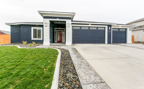
Whether you have a traditional style or Craftsman, Ranch, or transitional, Sherwin-Williams Anchors Aweigh makes a wonderful, transitional, and bold statement.
You can paint the shiplap walls in this color and choose to paint the trims and moldings in pure white. Furthermore, you can choose gray for the shutters, door and window frames.
Do you want to make your home look even more interesting? Well, add cherry red, mustard yellow, or burnt umber on the front door to make it stand out.
My Favorite Way to Sample Colors
I can’t say enough about how easy it is to use a peel-and-stick paint sample to give a color like Anchors Aweigh a try. The absolute best way is to order a sample from Samplize.
You can check it out right on your wall and move it around. Also, try it along with another couple of colors to test pairing possibilities.
This is WAY easier than having to open up little cans of paint and rolling/brushing on. Forget the mess and use these helpful temporary sample squares to test location, lighting options, etc.
The Best Wall Locations to Test Anchors Aweigh
Place your sample on walls that receive direct sunlight, walls in shadowed corners, and walls that sit across from windows where reflected light bounces in.
I’ve seen Anchors Aweigh look noticeably different on a bright south-facing wall versus a darker interior wall in the same room.
Also test it directly next to your trim, flooring, and cabinetry since this color’s warm, creamy character responds strongly to surrounding tones.
When to Observe Your Sample Throughout the Day
Morning light, afternoon sun, cloudy midday light, and evening lamp or recessed lighting all reveal different sides of this color.
Warm bulbs tend to deepen Anchors Aweigh’s creamy quality, while cooler LED bulbs can push it toward a slightly grayer appearance.
Checking it under every condition you’ll actually live with is genuinely worth your time!
How Surrounding Elements Shift This Color
Wood flooring, warm-toned rugs, and natural cabinet finishes all interact with this color’s soft undertones in meaningful ways.
If your windows face greenery outside, that reflected natural green light can subtly influence how Anchors Aweigh reads on the wall.
Why Sample Size Genuinely Matters Here
A small paint chip simply can’t show you how this color behaves across a large wall area.
Samplize (link above) lets you move larger samples around the room to test every location easily!
Give Your Sample Time Before Deciding
Leave it up for at least two full days and observe it during normal daily activity.
With Anchors Aweigh specifically, you’ll want to notice whether that warm, creamy tone feels inviting or slightly yellowed in your particular lighting conditions.
Be sure to check out other Sherwin-Williams blues for more ideas!
Should there be any questions or thoughts, let us know in the comments below!

Leave a comment