
Absolutely luxe and full of splendor, the beautiful Sherwin-Williams Naval is a blue paint color that exhibits utmost richness and luxury.
Darker in tone and bold in appearance – this cool-hued paint is a must-have in your home if you are craving an authentic yet artistic touch.
This paint is also one of the most popular blues across the interior design industry.
And you know why?
Well, that is because it is extremely pretty with a deep, bold, and eye-catching backdrop that can seamlessly enrich areas in your homes with flowing positivity.
This is one of my favorite blues because it offers great aesthetics while adding depth to any and every space.
Symbolic of royalty and magnificence, this color ranks number one if you are trying to achieve that look.
So, just in case you have stopped by here to learn if this is the right paint for your home project – I would say, absolutely yes!
In this article, I am going to brief you about what the color has to offer, where and how to best place it, what best complements it, and the possible beautiful color schemes.
So, are you excited?
Well, in no time, you’ll be a naval color expert!
Sherwin-Williams Naval SW 6244 Details and Specifications

Okay, it is time to start with the backlog information and specifications about Sherwin-Williams Naval. Remember, knowing this information is primary when it comes to choosing a paint color.
Every color is unique and has its own story to tell. And we are here to unveil that story to truly understand if our requirements align with what the color has to offer.
Thus, let’s first begin with the Light Reflectance Values or the LRV of this color. This value helps in determining how light or dark the paint is, which, therefore, in return will help us decide where to use the color.
So, the LRV of Sherwin-Williams Naval is 4. And that means it is a pretty dark color.

(Remember, the lesser the value, the darker the paint)
Also, if you are wondering where to find that value, well, simply look at the back of the paint swatch!
One GREAT way to test a paint color to see what it’ll do in your own home is to order a sample from Samplize. You can pick one up for Naval!
Secondly, other important associated terminologies are the RGB and HEX Values that further tell us what the color is made of.
Red = 47
Green = 61
Blue = 76
HEX Value = #2f3d4c
Now that we have discussed enough about the technical and scientific information, let’s get started with the practical aspects of this blue Sherwin-Williams paint.
How Does this Color Feel in a Space?
This color feels absolutely bold, luxurious, royal, and refined when used in an interior room.
Hence, I would recommend using this color in any and every climate – whether warm or cold, since the color doesn’t target a specific undertone.
Moreover, its timelessness is a reason why I would recommend this color irrespective of the geography or even the interior design style.
You can use this color in spaces that are either large or mid-sized. For very small areas – try ignoring this color – but if you really want to use it – well, simply use it in tinges.
Don’t worry! I have some tricks to use that later in the blog.
How Does Light Affect the Color?
Light doesn’t have a major role to play here since the color has such a dark tone.
Hence, another recommendation is to analyze the incoming light in your space. Is it too much? Do you have a lot of windows? Or is it too small with no windows?
Well, depending on this information, should we finalize if we want to use the paint or not.
In the absence of light, this paint will feel almost blue and black and much darker than it already is. Whereas in the presence of ample light, it may feel slightly lighter than it is.
To further admire a specific aura, try playing with artificial lighting through chandeliers, pendant lights, and wall sconces.
If you want to really see how this color will play in your space and with other colors, get some wall samples from Samplize.
What are the Best Coordinating Colors?

Just how important is analyzing the paint in choosing the best complementary colors?
Remember, if you mess up with these palettes and schemes, you end up messing with your home. Hence, I will recommend a few options that you could consider.
First and foremost, you could choose from a contrasting or a monochromatic color palette. In the case of contrasts, you could choose to pair with mustards, yellows, Sakura pinks, off-white and creamy whites, lighter greys, and cool neutrals.
Well, here are a few of the colors I would recommend for a monochromatic palette!
- SW 6242 Bracing Blue
- SW 6249 Storm Cloud (see my article on SW Storm Cloud here)
- SW 6243 Distance
On the other hand, here are a few of the colors I would recommend for a contrasting color palette!
- SW 7661 Reflection (see my article on SW Reflection here)
- SW 6099 Sand Dollar
- SW 9023 Dakota Wheat

For your ceilings, trims, and molding, I would recommend using SW Pure White to further achieve a creamier look, or else if you want a crisp look, choose SW High Reflectance White.
SW Naval Vs Similar Colors

In this case, I would say there are tons of similar-looking options – even though they will differ a little, whether it is the undertones or the lightness.
So, the two most similar-looking hues are SW 9178 In The Navy and SW 9179 Anchors Aweigh.
Naval Vs In The Navy

Sharing the similarities of appearances, SW In The Navy has an LRV of 4, making it a comparatively darker-toned paint.
It is luxurious and royal – just like any other navy blue that is used for high-end purposes. You can absolutely consider this option in your homes regardless of the climate and geography. However, this color feels more weighty and bold when observed in natural light.
Order a wall-stick sample of Naval here to try this color on for size.
Naval Vs Anchors Aweigh

With a slightly blue and purple undertone, this dark-toned color has an LRV of 3, making it the darkest of all.
However, you have to be very careful around using this dark tone – so, try to avoid it in smaller spaces.
Grab a temporary stick-on sample of Anchors Aweigh here to see how the color will look in your living spaces.
Where to Use Naval in Your Home?
There are a few times I have recommended this color to my clients. Especially for the interior design styles such as Minimalistic, Mid-Century Modern, Modern, Glam, Contemporary and Modern Farmhouse – this color is absolutely good to go!
Hence, whether it is the hallways, family or living rooms, bedrooms, and exteriors, you can undoubtedly make the most of this color.
Let’s see where and how to incorporate this beautiful bronze color in your homes.
Naval in Living Room and Dining Room
I would personally recommend this color in dining and living rooms that are comparatively larger in size and with particularly higher ceilings.
Since the color exhibits a luxe and splendor touch, I would recommend using it as an accent in your spaces.

To complement this beauty, try pairing it with neutral upholstery (probably linen materials on the sofa), grey, white, and mustard patterned throw pillows, rugs, and blankets and white or grey sheer curtains.
Moreover, add a chandelier that is either matte black or golden-tinted. Just in case you have a fireplace, try to use black shiny marble stone to add a touch of royalty.
Using in Bedrooms
Bedrooms are one of the most personal spaces. So, if your design style allows, try to paint only a single wall in this color. And that could be your headboard wall!
Moreover, pair it with off-white upholstery, gray and mustard accents through pillows and rugs. You can also add a nice pair of golden-tinted pendant lights to further refine the looks.
In some cases, you can also play with wooden textures through TV Consoles and nightstands to add a sense of depth to your bedrooms.
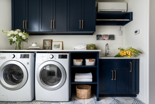
Naval in Kitchens
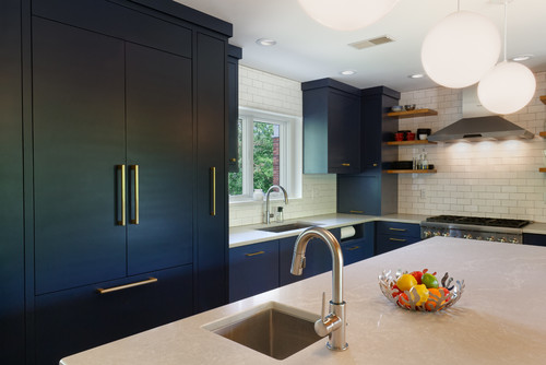
Absolutely my favorite.
Naval kitchens are probably the best – they are refined, luxurious, and very pretty!
You could either paint the cabinets in this color and let the backdrop wall be white and grey or choose vice versa.
In both cases, try to pair either gold or rose gold pull handles and fixtures. Moreover, use a white marble countertop to attain the utmost beauty.
Using on Exteriors
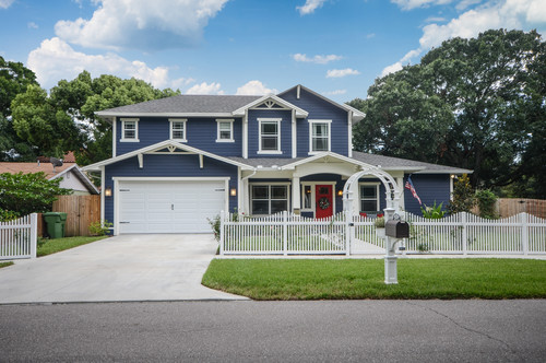
Especially for Mid-Century and Contemporary exteriors, this color is a great option for your exterior walls. However, it can be pretty bold and daring that way!
You can either pair it with white or grey accents through trims, moldings, and door and window frames.
If you are planning to use Naval on the exterior façade, it will tend to appear much lighter than it already is! (of course, due to excessive natural light)
How to Best Sample This Color?
When it comes to colors like Naval, which can show in many different ways, you should definitely order a peel-and-stick sample from Samplize.
These folks came up with a genius way to sample real pain without having to go to the store, pick up a can, then paint it on.
For not much money you get a good sized square to put up anywhere in your house where you want to “try” on a paint color along with any possible coordinating hues you like. Love this!
What Not to Pair with Naval
Color Pairings That Work Against SW Naval
Naval is a deep, inky navy, and pairing it with other cool, dark tones like charcoal gray or dark forest green creates a heavy, suffocating feel that robs the color of its character.
Warm browns and muddy beiges are equally problematic, since they clash directly with Naval’s cool blue base and make the whole space feel off.
3 Decor Styles That Don’t Belong with Naval
Overly rustic farmhouse decor with heavy distressed wood and burlap tones fights against Naval’s polished, deep character.
Ultra-minimalist spaces with stark white and cold concrete finishes strip this color of its warmth and richness.
Bohemian styles loaded with warm terra cotta and orange-toned textiles pull directly against Naval’s cool navy base in ways that feel unresolved!
Trim & Accent Colors That Clash with Naval
Warm cream or ivory trim is one of the most common pairing mistakes I see with this color.
The yellow undertones in warm whites fight Naval’s cool base and make both colors look like they belong in different rooms.
Avoid greige or tan accent colors for the same reason; they simply don’t have the contrast or coolness to hold their own next to this deep navy.
Furniture Tones That Undermine Naval
Heavy orange-toned wood furniture like honey pine or golden oak clashes sharply with Naval’s cool depth.
I’ve seen warm caramel leather sofas pull this color in a direction that feels unintentional and visually uncomfortable!
7 Interior & Exterior Finishes That Do Not Work with Naval
Flat finishes make Naval look dull and chalky rather than rich and commanding.
Warm brass in large quantities overwhelms rather than complements this color’s cool base.
Gold-toned grout, terracotta tile, bronze fixtures, copper accents, warm wood paneling, and yellow-toned stone all compete with Naval’s cool navy character in ways that create visual tension throughout the space.

Planning on using naval for a large wall with high ceiling and lots of natural light I’m trying to pair it with a soft linen shade,not to beige,not to creamy Very open floor plan with white trim and white kitchen cabinets and island. Black railings and black accent furniture. Appreciate your help and love your articles
Sounds beautiful – Thank you, Rose!