

Sherwin-Williams Peppercorn is a dark gray tone sharing high similarities with classic charcoal.
It looks almost black but is actually a very dark shade of gray. Surprisingly, this dark neutral is not associated with any undertones!
When implemented in perfect amounts, this gray can exhibit as a great accent for your room interiors.
Let’s check it out in all it’s wonder!
Sherwin-Williams Peppercorn SW 7624 Details and Specifications

This shade of gray is highly popular among homeowners around the world.
Used mostly in high-end residential and custom-designed homes, they tend to add the ‘luxurious’ factor to any space.
Their minimalistic characteristics make them the number one option to be used in contrast to brighter and lighter hues.
Inclined more towards the cooler side of the scale, this peppercorn shade is also bold and daring!
You might want to think twice before specifying this color – yes, keep a note of that!
But before we jump on to the tips and tricks, let’s discuss a few characteristics of the timeless color.
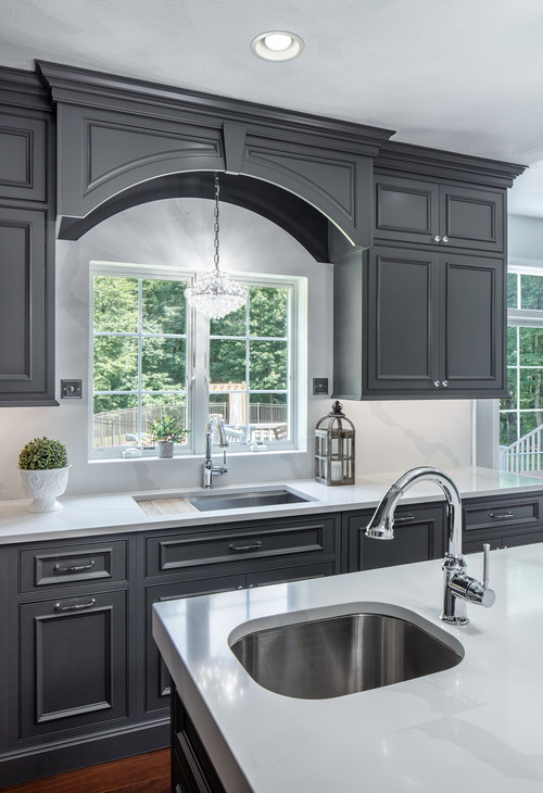
Peppercorn Light Characteristics
Due to this darker tone, the LRV (Light Reflectance Value) is only 10. Not surprising, right?
Designers around the world often tend to ignore this value – but I highly suggest you consider it.
This is especially true when the LRV of a paint color leans to one end of the scale. You want to know based on what your light sources are and how big of space you’re painting, among others!

Remember, the higher the LRV value of your paint, the more light it will tend to reflect, making your rooms brighter and more spacious.
Speaking of understanding the details of the colors, they have RGB values associated with each.
It’s more to help the manufacturers differentiate but you can use them too when comparing colors you might be considering for your project.
It is surprising to know that for the color Peppercorn – the Red, Green and Blue values are all 88. It’s this combination that makes up a color of course.
Let’s look at a few noteworthy examples of how crisply the color has been used.

Lizzy from LizzyDesignsBlog shows the interior of an entrance door embellished in elegant Peppercorn


Here, you can see how Cheri from Cheri Quite Contrary used it in her bedroom. Contrasting white elements is oh so nice!
The Effects of Light on Peppercorn

If you start applying Peppercorn on the wall, it will give you a smooth and seamless, elegant look.
As a matter of fact, Peppercorn is highly used on exteriors due to the crispness in its finish. Most of the Farmhouse Style and Pole Barn Homes are known to specify this majestic shade.
If you want to see how Peppercorn will look in your unique environment, I highly suggest ordering a peel-and-stick paint sample from Samplize here!
The Light Reflectance Value of 10 proves how minimized this color has to be used, especially in areas with inadequate lighting, as your space might look dull without ample amount of indirect lighting.
And you don’t want that!
So, be careful when painting your walls with Peppercorn and only go for it if there is ample space and natural lighting falling in to show off this color.

Bottom line: sufficient light will make it look a much softer and brighter tone.
Isn’t it exciting how lighting can play an absolutely important role in changing the hue of your wall paint?
Peppercorn vs Similar Colors
You may likely confuse this hue with its surrounding shades.
And that’s completely normal!
To make it easier for you, I have compiled a few similar shades and their potential characteristics that set them apart – or maybe integrates them as well.

Peppercorn vs Tricorn Black
When looking at the full color swatch, Peppercorn is the color lighter than Tricorn Black with the latter basically the darkest.
Well, they do look different on these swatches. But the main challenge is to define them on your real-time walls.
As I mentioned, lighting does play a major role in your interior spaces.
And here is the biggest example of all – Insufficient lighting may result in your peppercorn looking like Tricorn Black!
Diving deep into the details, Peppercorn is much lighter and brighter with a more gray and softer appearance.
Grab a temporary stick-on sample of Tricorn Black here to see how the color will look in your space.
Less light will tend to make Peppercorn look more like Tricorn Black – since it’s another dark neutral with underlying blue-purple undertones.
From the comparison above, imagine if one of your rooms portrayed this dark a color. A bit too much, right?
SW Peppercorn vs BM Kendall Charcoal

I really love both of these colors, from the two leading manufacturers.
They both fall under an almost carbon color depending on how you look at them; natural, deep, and strong without looking black.
You can see that Peppercorn is slightly darker but both are considered a dark gray.
What you get with Benjamin Moore “KC” is a slightly warmer version, which in most cases is going to give your space a tad bit of coziness. Check out my full review here!
SW Peppercorn vs BM Almost Black
It’s also very common to become confused between Peppercorn and Benjamin Moore’s “Almost Black (2120-30) due to their LRV values and similar cool undertones.
I have been asked many times about how to differentiate the two, and frankly, it has been a difficult question as it’s hard to distinguish both.
Of course, side-by-side on a screen, you can see enough of a difference between the two. Get each on a wall…good luck!

The one major characteristic is that Almost Black slightly exhibits a lighter blue tone than Peppercorn. (I find this same thing when comparing with Behr Cracked Pepper – another very similar color).
Yes, they both have an inclination towards cooler shades but Almost Black is definitely less of a neutral than Peppercorn.
Get a stick-on sample square of Almost Black to test in your home.
Another one worth comparing is Sherwin-Williams Iron Ore vs Peppercorn (see this one reviewed here). And if you want to check out another
Peppercorn Coordinating Colors

Choosing coordinating colors for SW Peppercorn can be quite fun and an easy task!
First and foremost, you must take into consideration the aspects of light reflectivity and also, the total amount of space that you have in a room.
Since Peppercorn is bold, dramatic, and extremely moody, you must choose lighter tones to balance the depth of the paint color.
In general, you must pick off-whites, shades of creamy whites (without a yellow undertone), baby blues, mustard, blush pink, lighter grays, lighter to medium greige, and sage greens.
In terms of metallic accents, choose satin brass for a glam and luxe look or polished chrome for a subtle and modern look. You can even choose antique brass for modern farmhouse backdrops!
To name a few, here are the following two color palettes – monochromatic and coordinating (warm and cool)!
Monochromatic Color Palette
The complementary colors for the monochromatic palette are as follows –

- SW 7066 Gray Matters
- SW 7067 Cityscape – see my full review here
- SW 7068 Grizzle Gray – see my full review here
This monochromatic palette is bold, daring, and moody!
So, if you have a masculine design style or continuously prefer the dark aura, choose this palette.
To further create a cohesive appeal, choose matte black finish for the lighting, artwork, and furniture frames.
Cool Contrasting Color Palette
The complementary colors for a contrasting palette (cool) are as follows –

- SW 6212 Quietude – see my full review here
- SW 7045 Intellectual Gray
- SW 6203 Spare White
If you prefer the tones of cooler colors, choose this palette to achieve a crisp environment.
I highly recommend that you either choose chrome or satin brass finish lighting and furniture to go with this palette.
You must choose SW Extra White for the ceiling and trims with this color palette.
Warm Contrasting Color Palette
The complementary colors for the contrasting palette (warm) are as follows –

- SW 7029 Agreeable Gray – see my full review here
- SW 7031 Mega Greige
- SW 7005 Pure White
A blend of SW Peppercorn with warmer hues is never a bad idea! If you like it cozy and welcoming in your home – this is the palette to look forward to!
I highly recommend choosing matte black or chrome finish to go with it!
You can even choose a blend of various wooden textures to best pair with this warm-toned palette.
So far if you are liking it and thinking of using this shade, it would absolutely be a bold move to do that.
However, from the Color Specialist and Interior Designer point of view, I highly recommend being careful around choosing your color palette that involves Peppercorn.

If you are going for a cooler side of the palette, specify Peppercorn as the accent.
I would definitely recommend:
- SW 7628 Windfresh White
- SW 7741 Willow Tree
- SW 7063 Nebulous White
These colors can play the best neutrals and bases.

On the other hand, it is not really a good option to use this shade with warmer hues – it doesn’t complement quite as well!
So, for example. for an off-whit