
Luxurious and organic, Benjamin Moore’s Kendall Charcoal is a perfect definition of opulence, coziness, and sophistication.
It is a dark gray paint color with deep brown and green undertones!
This color seriously mimics nature’s hues of soil and Mother Earth.
It is a seamless blend of creaminess and darkness; it falls on the warmer end of the scale.
I have to say, the beauty of this color can absolutely be felt through its utmost eye-catching texture and lends to a flair of luxury!
And let me tell you, this color is definitely in trend.
More and more homeowners are choosing to use this majestic shade of gray in their homes.
So, are you too excited to learn everything this color has to offer?
Well, I am going to give you the full low-down.
But before we get into that – I want to help you understand the true specifications behind the paint color, its looks, aesthetics, and primarily – if this is the right paint for your home or not!
So, sit back and relax!
I am going to throw out some very interesting insights about this one that you will absolutely love.
Benjamin Moore Kendall Charcoal HC-166 Details and Specifications

Something to always remember – before picking a paint color for your home, you should always ensure to read through the basic specifications and details.
So, every color has a story to tell – and that is what makes it so unique and distinctive!
Even though two colors appear similar, they will never be the same ‘property-wise’!
They might look alike, but can be very different based on the undertones and reflectivity.
For example, when you compare “KC” with BM Blue Note (another almost black from BM but which has blue undertones!).
So, let’s cook up some of the details here!
First and foremost, look towards the end of your Benjamin Moore paint swatches to determine the Light Reflectance Values or the LRV’s of the paint color.
This value helps in determining how light or dark the paint is – and you must know this value to make some informed decisions.
Remember, the lesser the value, the darker the paint and vice versa!
So, the LRV of Benjamin Moore Kendall Charcoal is 12.96.

On a scale of 1-100, 1 being the darkest!
And that means it is a comparatively darker-toned brownish-gray paint color.
If you want to see how Kendall Charcoal will look in your unique environment, I highly suggest ordering a peel-and-stick paint sample from Samplize here!
Secondly, other important associated terminologies are the RGB and HEX Values that further tell us what the color is made of.
Red = 103
Green = 102
Blue = 98
HEX Value = #676662
By the way, this carbon-colored paint is probably on the lighter side when you think of how dark its namesake can be. This is much prettier, I have to say.
Now that we’ve discussed the technical and scientific information, let’s get started with the practical aspects of this natural gray Benjamin Moore paint.
How Does this Color Feel in a Space?
Benjamin Moore feels absolutely warm, comfortable, cozy, and delightful when used in space.
This paint has deep green and brown undertones that help create a crisp yet energetic vibe.
Moreover, this neutral can be very well linked with nature and its forms – thus, adding to the biophilia characteristics in your space.
So, after a long day of working and sweating, you are quite likely to feel calmer and at peace when you come back home.
And that is why I highly recommend the colder and cooler northern states to incorporate this paint either in the common spaces or even the private rooms.
Furthermore, there is another magic this color majorly plays – the magic of creating an illusion.
Well, it will help in bringing your walls together – hence, making your space look and feel smaller than it already is.
How Does Light Affect the Color?
Light has some role to play in this gray neutral paint!
With ample natural light flourishing indoors, it is bound to look larger and brighter!
Hence, here is something you must take care of: Always observe the amount of incoming natural light in your room.
If it is ample and your space is large enough, you can absolutely use this paint and especially on all the walls.
Furthermore, you can always pair with artificial lighting in the form of chandeliers and pendant lights in the case of lesser natural light.
On the other hand, you must ensure to use this color in the north or south-facing rooms, due to the neutralization of incoming heat with this warm-toned base.
As I said, the best way to see this color in action before you paint is to buy some paint samples you can easily stick on your wall. It’ll definitely give you some clarity if you’re unsure!
What are the Best Coordinating Colors?

Just how important is analyzing the paint to choose the best complementary colors.
With a warm color like BM Kendall Charcoal, it is best to choose either creamier or cooler tones!
Since they tend to look brown, gray, and green under certain lighting conditions, it becomes quite a difficult task.
First and foremost, you could either choose from a contrasting or a monochromatic color palette – depending upon your interior design style.
In the case of contrasts, you can pick from creamy whites, beiges, blacks, lemon and mustard yellows, and crisp whites.
So, check out these few colors I would recommend for a monochromatic palette!

- 2112-60 Cement Gray
- AF-700 Storm
- 1484 Ashwood Moss
On the other hand, here are a few of the colors I would recommend for a contrasting color palette!
- OC-7 Creamy White
- 193 Dijon
- OC-17 White Dove

Good tip: You can definitely pair these with BM Chantilly Lace on the trims, moldings, and other decorative architectural features to really make the colors stand out!
BM Kendall Charcoal Vs Similar Colors
There are quite a few similar-looking options to choose from!
However, remember that even though they look similar, they might differ in undertones or reflectivity values.
So, to name a few, the two most similar-looking color options are CSP-60 City Shadow and CSP-120 Burnt Ember.
Kendall Charcoal Vs City Shadow

With an LRV of 12.64, this beautiful gray paint color tends to add a dashing statement to your space.
You can easily pair it with creamy whites, yellows, lighter grays, and ample indoor plants.
Furthermore, remember that it appears slightly cooler – so use it in either the east or west-facing rooms.
Buy some wall samples of each of these colors to easily compare them right in your home.
Kendall Charcoal Vs Burnt Ember

Timeless and sophisticated, this beautiful gray paint color is a perfect alternative.
With an LRV of 14.49, this paint is bound to make your space look darker, so be careful and pair it with creamy whites and crisp whites to create a sense of balance and harmony.
See how these colors compare in real time with stick-on wall samples from Samplize.
Where to Use Kendall Charcoal?
Benjamin Moore Kendall Charcoal makes a great statement everywhere in your home – whether it is the hallways, kitchens, living and formal rooms, bedrooms, or home offices.
Furthermore, you can absolutely incorporate this paint in the mid-century modern, contemporary, modern, bohemian, country, farmhouse, and Hollywood glam interior design styles.
Let’s see where and how to incorporate this beautiful gray paint color in your home.
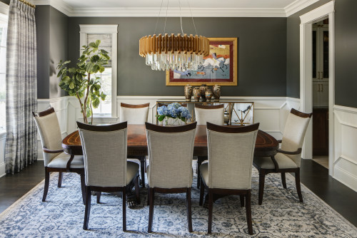
Kendall Charcoal in Living and Dining Rooms
I would say – absolutely yes!
You should definitely use this paint in your living and dining rooms – either as an accent wall or vice versa!
However, to truly enjoy this paint, I recommend using it if you receive ample natural light or the space is large enough to play with the depth.
Furthermore, try blending the paint with creamy whites and neutral-toned upholstery to create a striking balance.
You can also incorporate macrame, rattan baskets, and tons and tons of natural plants to invite a wholesome vibe.
Using in Bedrooms and Bathrooms
Your bedrooms indeed seek utmost serenity and calmness.
You can paint the backdrop wall in this paint and let the neutral beige or gray fabrics speak the tonality of your space.

I also recommend choosing brass or gold-tinted chandelier and table lamps in this case. Also, not to forget, the bed frames and nightstands.
About flooring, wooden parquet or wall-to-wall carpeting can both work well with this sample.
Kendall Charcoal in Kitchens
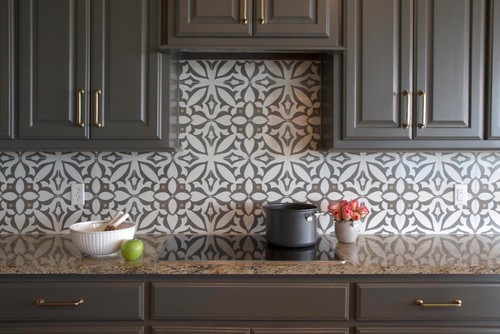
Especially for the open concept living and kitchen, if you like a nice tint of gray hue in your kitchen, you can absolutely incorporate this on the cabinetry or the backdrop wall.
Try pairing it with a white marble countertop, white hexagonal glossy backsplash, and nickel-tinted fixtures and pull handles. (Avoid matte black)
You can also choose the other way around by painting the backdrop wall in this color and letting the cabinets be in Crisp white.
If you have lush hardwood floors installed, it is a plus point!
Using on Exteriors
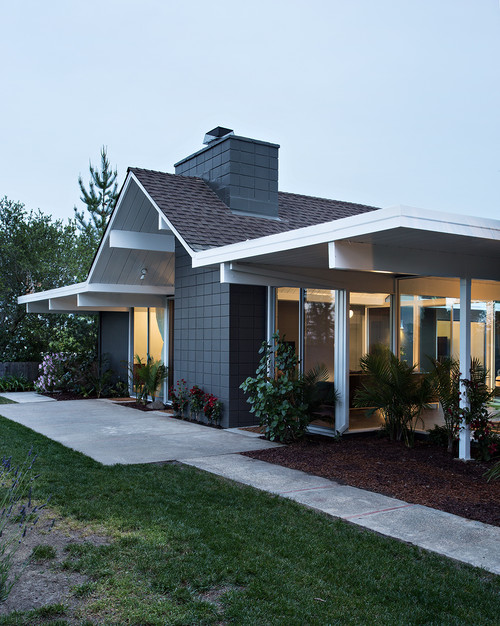
Kendall Charcoal on exteriors will further make the color look lighter than it is.
I recommend using this paint on the Mid-Century Modern, Modern, Craftsman, and Modern Farmhouse-styled homes.
Pair it with white, gray, or off-white shaded trims and moldings!
Yes – that way you make a great contrast in your home exteriors!
Also, you can do the other way round, by using whites on the decorative moldings!
You Should Order Samples of Kendall Charcoal
Let’s face it, good paint isn’t cheap. While painting is a relatively inexpensive, good bang-for-your-buck project, picking colors can be hard. You don’t want to buy a whole can of something until you know for sure.
So together with the info here, you can literally “see” what this color will look like in your home before you commit.
Getting a peel-and-stick sample from Samplize is the best thing since paint rollers!
If you don’t know yet, you can order a 12″ x 12″ square sample with the real paint color on it. Stick it on your wall multiple times and in multiple places to find out exactly if the color is for you.
BM Kendall Charcoal Undertones
The Three Undertones Hiding Inside Kendall Charcoal
Kendall Charcoal carries three undertones that quietly shape everything about how this color reads in a room.
The most dominant is a blue undertone that gives this color its cool, moody depth.
The second is a subtle green undertone that surfaces in certain lighting conditions and genuinely surprises people when they notice it.
The third is a soft purple undertone that appears most noticeably in the evening under warm artificial lighting.
How Lighting Pulls These Undertones in Different Directions
Natural daylight tends to bring out the blue quality in Kendall Charcoal, keeping it feeling crisp and intentional.
Cloudy or north-facing light is where that green undertone becomes more visible, sometimes pushing the color in a direction people weren’t expecting.
Evening light with warm bulbs is where I’ve seen the purple undertone surface most dramatically, giving the color a completely different personality after dark!
This is exactly why observing your sample across different times of day during the sampling process is so important with this color.
How Your Room’s Surroundings Activate These Undertones
Warm wood tones in flooring or furniture can neutralize the cooler undertones in Kendall Charcoal and make it feel more balanced.
Cool-toned metals or gray tile can intensify the blue and green undertones significantly.
If your room gets strong reflected light from outdoor greenery, that green undertone can become far more pronounced than you’d anticipate!
Understanding all three undertones in this color before you commit is genuinely one of the most valuable things you can do.

Leave a comment