

We all know how important it is to pick the right paint colors for our home, right? Well, choosing colors for the exteriors of our home is no exception!
As they say…the first impression is the last.

So, what is it that your guests first observe? I’m sure it’s not the living room and even the entryway inside the front door – rather, it’s the many elements and surfaces of your home’s exterior.
Just like in the picture above – it’s the entry door, outdoor lighting, color of the shiplap, window mullions, and the trim work.
But how do you pick the right colors for all these pieces?
In this article, we’ll dive deep into Sherwin-Williams exterior paint colors and how to best use the popular choices available.
Choosing a paint color for the exteriors can be quite intimidating – for obvious reasons.
You need to first analyze your exterior design style, the climatic conditions, geography, and also the curb appeal and nearby homes.
Sometimes, there are rules and restrictions involved in maintaining the color theme of your neighborhood – but either way, we’re going to help you discover the best paint colors for exteriors.
Remember, a fresh coat of paint and a cohesive exterior palette will drastically enhance the appearance of your property’s overall curb appeal.
From a quirky and contrasting theme to something sophisticated and minimalist, your exteriors are there to truly define the character of your home.
So come on, it’s time to bring a classical or modern appeal to your home! Or, something absolutely timeless, versatile, and stable but with a touch of inspiration and plenty of invitation.
Two Exterior Color Schemes – Light and Dark

To start simply, there are two major color schemes to follow when picking the paint colors for your exteriors.
Light and dark!
Depending upon your design style, geography, and climate – you must pick a likewise paint that plays seamlessly, cohesively, so as not to feel out of place.
Picking lighter colors will exhibit a soothing, calm, and subtle look.
Since it’s a common scheme to choose from, your home will not stand out and rather merge with the existing neighborhood as it should. A collective sense of design on your street is just as important to maintain as it is within your own property’s design qualities.
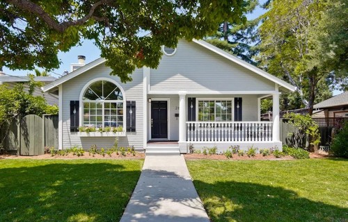
Secondly, if you pick a dark color scheme, your home is bound to bring a sense of dram, look dashing and eye-catching!
Yes – the choice is yours.

Ok, there’s another aspect you must consider – the geography.
So, I want you to participate in an exercise here! Well, you’re living by the sea – somewhere across the shores of the Gulf of Mexico.
How do you imagine your home to be? Like a coastal bliss that goes along with the prevailing mood, right?
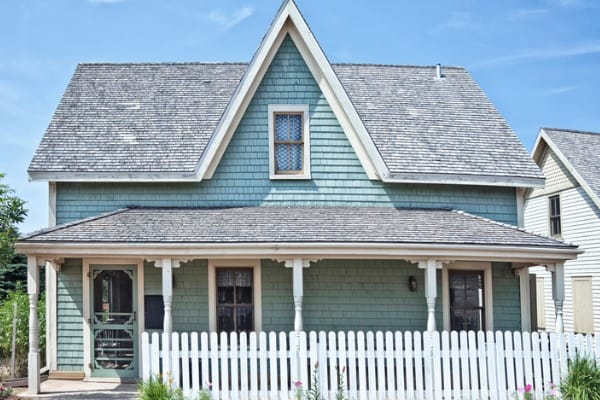
Well, in such cases, it’s better to pick lighter color tones to align with the climate and theme – and at the same time, reflect the heat and make the interiors feel cooler and calmer.
(White reflects light and black absorbs it)
Meanwhile, in the colder regions of Canada and Michigan, New York, etc. Darker colors on your exteriors will truly soothe your home and go ‘in place’!
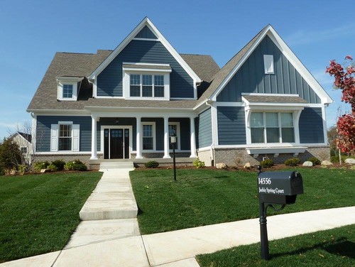
You see, it’s all interconnected!
However, there’s no hard and fast rule when picking paint colors. If you have the creative spirit and soul for it – you must go ahead and splash some fun!
Later in the article, I will reveal the best lighter and darker color options for you.
Other Considerations for Choosing Exterior Paint Colors
Now that you have roughly figured out a color scheme in your head – it’s time to have an eye on the other important considerations.
It’s true that picking the best paint color for exteriors can be challenging. And especially if you have an existing roof, wall cladding, and surrounding landscape in place.

You must consider the color of your existing roof – whether it’s a tile or stone, this consideration is important when picking the paint color.
For instance, the creamy beige perfectly ties with the gray interlocking tiles and black window frames.
However, at some points of the day, the reflection from the swimming pool and the lush greenery can hit the off-white walls to showcase a slight undertone.
Or, in case you have stone or brick cladding – it’s best that you pop them out!

For instance, in this picture above, the exposed brick doesn’t really stand out against the brown roof, garage door, and shutters.
Rather a blend of black and deep bronze will make a great pair with exposed brick – just like in the picture below.
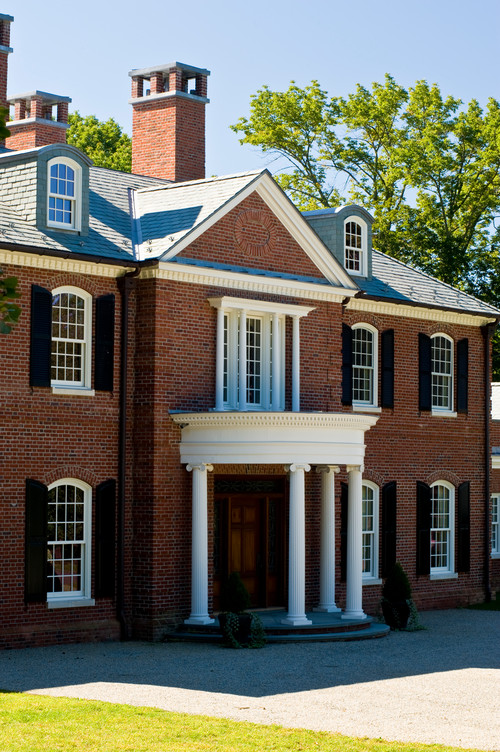
Moreover, if you have a neutral tone like gray or black on the roof – you can pair it with any color.
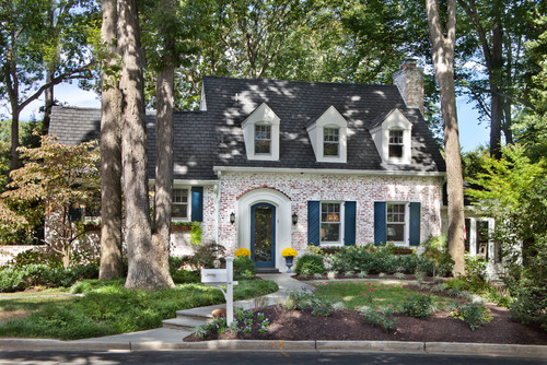
The deep gray on the roof perfectly complements with teal on the shutters and rustic exposed brick.
But in the case of shingles with deep red, green, or blue undertones – you’re probably restricted.
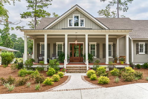
Generally, it’s best to pick the colors likewise. For example, the beach-style exteriors display a sage green tone with brown accents – which truly make a great match (since both align towards a warmer tone).
Secondly, you must take into aspect the paint color on your doors, railing, window frames, and shutters.

For instance, the icy blue accent on the doors and shutters make a remarkable statement.
And don’t ignore the contrasting bold red on the lighting fixtures and Christmas decoration!

On the other hand, choosing a deep blue and black paint for the doors and shutters will play a great contrast against the crisp white walls.
Also, the pots and outdoor planters lend a lot of color to the exteriors of your home.
Lighting Matters
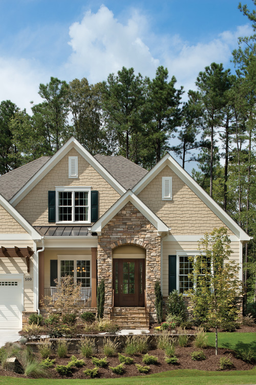
I often say that lighting plays a major role in the paint colors. It further tends to overpower the true undertones with its saturation – whether warm or cool.
Generally, too much natural light tends to wash away the color and its undertones. So, remember to pick a shade that is a tone or two darker!
Moreover, you must know that natural light can drastically make your exterior paint color appear cooler – hence, pick a tone slightly warmer to balance the overall appeal.
Time For Some Accent Fun
Now I have to admit, half the fun of painting the outside of a house is how to add splashes and pops of color.
It’s not necessary that you choose a single color theme for all the siding, trim, gutters, shutters, railings, and doors.
You even have the opportunity to pick from a monochromatic or contrasting palette.
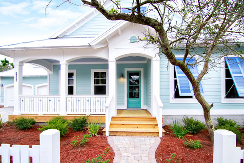
Have a look at the monochromatic palette in the image above. The various soothing shades of aquamarines and cyans make a fun-loving statement.
In such a case, you can pick lighter tones for the exterior walls and a shade darker for the main door. (To pop it out)
On the other hand, if you have lighter tones on the siding, why not pick a contrasting bold statement on the front door?

This bold, deep red stands out and creates a stunning and inviting element to the front of this home.
Trust me, this is quite a trend and you must not hold back from making your home appear stylish and dramatic from the outdoors.
Other than reds, you can pick some intriguing hues like yellows, teals, and purples as well.

Yellow works amazingly with bronze, grays, and off-whites. Isn’t this truly eye-catching?
Trust me, the residents walking by your home would love to gaze at this door!

Lastly, another color that I truly love is the rich plum and purple.
What are your thoughts on this beautiful combination of cherry, white, and pumpkins?
Looking for some notable examples to incorporate in your home?
Let’s have a look at these classic Sherwin-Williams Accent paint ideas for the doors, shutters, and railing!
Sherwin-Williams Antique Red
Trust me – you can never get bored of the beautiful red front door!
This color pairs beautifully with a rustic brick wall, natural travertine stone, and even subtle white paint. (To name a few – pick SW Snowbound or SW Natural Choice)
With this color palette, you can have gray or black roof tiles, true white moldings, and black iron railing.
Learn more about Antique Red in my full guide.
Sherwin-Williams Butter Up
Isn’t this yellow truly mesmerizing?
Well – this will never disappoint you! The quirky and friendly look of this yellow door will warmly invite your guests.
Sherwin-Williams Butter Up can best pair with deep browns and gray (Sherwin-Williams Urbane Bronze) and crisp whites.
You must avoid beiges with this paint color.
Sherwin-Williams Dried Thyme
This soothing green deserves to be on your exterior front door, isn’t it?
I highly recommend pairing it with crisp whites on the walls and darker beiges on the moldings.
You can even add matte black framed outdoor lighting and white tile on the roof.
Learn more about SW Dried Thyme!
Sherwin-Williams Waterloo
Especially with your exposed brick and white shiplap walls, Sherwin-Williams Waterloo would look flabbergasting.
You can even have this particular hue on the accent doors of your Coastal-style homes.
Sherwin-Williams Loveable
Perfect for a feminine backdrop, isn’t it?
Especially for Victorian, Contemporary, and modern exteriors – this color makes a fabulous statement.
It’s generally best to pair this shade of pink with darker grays or even blues.
Popular Sherwin-Williams Exterior Paint Colors
Now comes one of the most awaited topics to talk about! Isn’t this what you’re waiting for?
So, here I will be discussing some of the popular Sherwin-Williams exterior paint colors that range from light to dark and can be confidently used in the design industry.
5 Most Popular
Sherwin-Williams Alabaster
Absolutely creamy and soothing – this extremely light off-white paint is definitely a recommendation if you’re aiming for a warm and welcoming appeal.
And it plays quite versatile and one for all – especially, for traditional, farmhouse, and Spanish revival exterior design styles.
And the best feature is that you can almost use this paint with any material and hue – natural woods, natural stone, dark metal, and even exposed brick.
Sherwin-Williams Urbane Bronze and Sherwin-Williams Iron Ore would make a great couple.

Also, in the case of stone wainscoting – you’re free to pick any hue and material with SW Alabaster (that’s the true beauty of the color).
If not stone, you can infuse colors like deep blues for the shutters, front doors, and window mullions.
Moreover, it is important to understand the associated RGB, LRV, and HEX Values that are as follows:
Red = 237
Green = 234
Blue = 224
HEX Value = #edeae0
LRV = 82
Get the full rundown on SW Alabaster!
Sherwin-Williams Accessible Beige
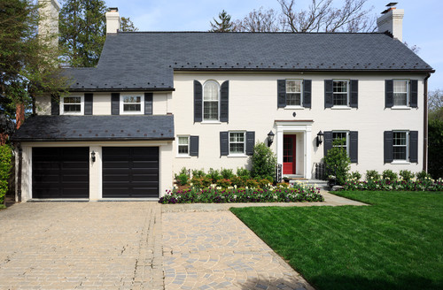
Another versatile and timeless medium to light paint color in the row – Sherwin-Williams Accessible Beige.
Comparatively, this is a slightly darker and bolder tone – hence, you need not worry about the undertones fading away or the walls appealing cool blue.
You must know that this paint color has deep beige and gray undertones – hence, depending upon the compass directions can the undertones differ.
It majorly feels beige or gray – but definitely not yellow!

It’s a great match for farmhouse paint colors, as well as ranch-style, traditional, and Spanish-style exteriors.
This paint color equally works well with SW Urbane Bronze and SW Pure White for the trims, moldings, and special architectural features.
Moreover, this color is bound to look flabbergasting with gray metals and warm woods.
I recommend understanding the associated LRV, RGB, and HEX Values to know more about the color specification!
Red = 209
Green = 199
Blue = 184
HEX Value = #d1c7b8
LRV = 58
Here’s my full review of SW Accessible Beige!
Sherwin-Williams On the Rocks
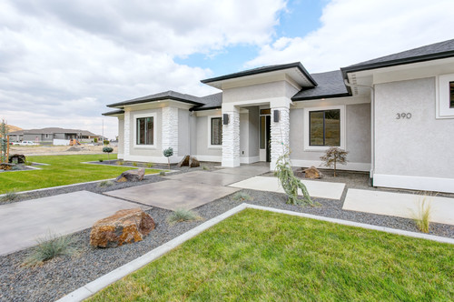
Deviating from warmer tones to something slightly cooler – Sherwin-Williams On the Rocks is clearly a lighter gray with deep cool undertones.
It exhibits a clean and crisp look while making your home appear modern, Scandinavian, contemporary, or transitional.
Without a doubt, you can best pair this tone with warmer exposed stone, darker tiles on the roof, and gray or black paint on the mullions, railings, and door and window frames.
With this tone, you have the opportunity to pick SW Extra White for the trims, moldings, and wainscoting.

With a lush, green landscape – expect a slightly greener undertone in the west or south-facing homes.
Even more than woods – gray metals are something to look forward to!
It is now time to look through the color details and specifications to know more about it!
Red = 208
Green = 206
Blue = 200
HEX Value = #d0cec8
LRV = 62
Check out my complete guide for SW On the Rocks now!
Sherwin-Williams Tricorn Black
Let me introduce y