

Sherwin-Williams Repose Gray is one of the most popular Sherwin-Williams paint colors!
And do you know why?
Well, because of its immense versatility and cohesiveness with so many styles and color palettes.
Ever looking for that perfect gray paint that can make your space feel warm but with that modern gray quality to it?
Yes, you’re at the right spot.
This isn’t some cool and icy gray paint color. Rather, a gray with absolute warmth and coziness to it – while offering the benefits of gray, in general.
Repose Gray is a warm gray, neutral paint with hidden taupe and violet undertones.
Not very dominant, though – but at certain times, you can definitely detect the always sneaky undertones!
And this is something I’ve experienced again recently in a couple of my E-Design and Color Consultation projects!
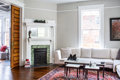
And while I do highly recommend this one, always remember to analyze your interior design style and the size of the space.
Even though it’s quite versatile and can play seamlessly with most color schemes, you must be careful about what and how you pair it with!
Don’t worry! I have got your back.
In this color review, we’ll have a detailed look at what this color has to offer! From inspirational images to do’s and don’ts – you’ll know it all!
Let’s get started!
Sherwin-Williams Repose Gray SW 7015 Details and Specifications

There’s a difference between Sherwin-Williams Repose Gray and its close relative, Sherwin-Williams Passive!
And do you know what that is?
Well, it’s the saturation and undertones.
Each color comes with its own theories, specifications, and schemes!
If you’re new here, let me tell you – there are quite some facts and scientific terms that you would want to get to know. (Before choosing any paint color for your home)
It’s important to analyze these values and then determine where, when, and how to use these paints!
So, first and foremost, one of the most important terms that I usually observe getting ignored is Light Reflectance Values (LRV).
Every color has an associated Light Reflectance Value – for Sherwin-Williams Repose Gray, the LRV is 58.

Which falls on the medium end of the scale – and somehow aligns on the lighter end!
Remember, the higher the value, the lighter the paint color is!
And vice versa!
Moreover, this color has deep taupe/brown undertones, making it a warmer version of gray.
Moving ahead, let’s discuss the RGB and HEX Values of the color.
Red = 204
Green = 201
Blue = 924
Because paint colors can change in different environments, I recommend you also try Repose Gray out at home with a peel-and-stick sample from Samplize. Order some samples now!
HEX Value = #
Now that I’m wrapping up, I promise not to bore you with these scientific details anymore.
Let’s talk about the practical aspects of this popular gray paint color.
How Does This Color Feel in a Space?
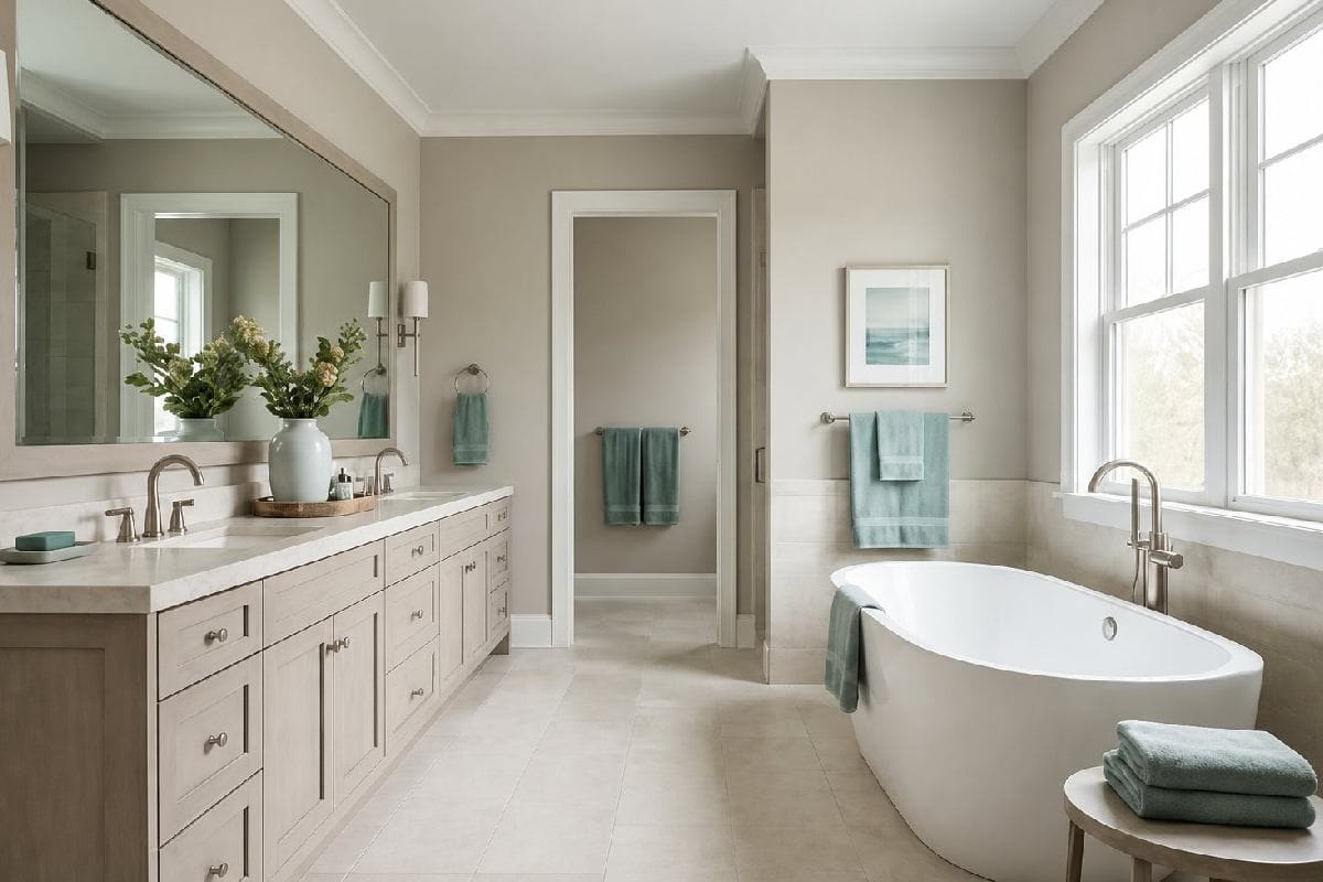
Repose Gray is a soft and warm paint color but might look cool in various situations and lighting conditions.
So, if you’re neither looking for gray nor beige – but a blend of both – this is one color recommendation to have an eye on!
But all in all, this color is bound to make your space feel soft, cozy, comfortable, and welcoming.
It feels balanced and can add an appropriate amount of depth to the walls.
Even though it is a warm-toned gray paint with a greater light reflectance value, it will always offer the best of both worlds!
And that’s why – it proves majestic over and over again.
So, I recommend using this paint as a base as well as a neutral! Yes, you can paint all the walls in this color.
How Does Light Affect the Color?
Light has a considerable role to play here!
The more natural or artificial light entering the home, the brighter your space will be (regardless of the LRV of the wall paint)!
And since this paint has a typical brown or taupe undertone, I recommend using it in a room with ample natural light pouring!
And moreover, you would be surprised to know that a color may appear different in different rooms facing different compass directions.
For instance, in the north-facing rooms, this color may typically appear slightly on the ‘grayish’ end of the scale.
On the other hand, in the west- or south-facing rooms, it will reflect a deep brown or taupe undertone.
The violet undertone is typical in a room with sufficient natural light.
Nevertheless, you can always play with artificial light in the form of pendant lights and wall sconces!
Here, you can also use warm whites to perfectly neutralize the saturation!
I’ll say this again – get some wall samples to try on this color in your own home and confirm if it’ll work or if you need to try something else.
What are the Best Coordinating Colors?

Creating color palettes can be quite a fun task to do.
So, it’s crucial for you to choose the best complementary colors in order to define a palette that looks eye-catching and cohesive.
Warm grays, in general, can look fabulous with blues, bronze, creamy off-whites, and even emerald greens.
And other than that, you have a wide plethora of color opportunities and options to pair with!
However, you have to be careful about what vibe you need in your space for a perfect color combination.
So, I am going to list the two most popular color schemes here – monochromatic and contrasting.
Monochromes are generally great for modern and contemporary setbacks.
On the other hand, Eclectic, Mid-Century Modern, and Farmhouse play well with contrasts.
So, here are a few of the colors I would recommend for a monochromatic palette!
- SW 7016 Mindful Gray
- SW 7017 Dorian Gray
- SW 7018 Dovetail

On the other hand, here are a few of the colors I would recommend for a contrasting color palette!
- SW 6177 Softened Green
- SW 6006 Black Bean
- SW 7004 Snowbound – see my review here!

For your ceilings, trims, and moldings – SW Extra White or SW Pure White will help bring out a true hue of SW Repose Gray.
SW Repose Gray Vs Similar Colors

You must know that even though the following colors look similar, they might still differ in the undertones or reflectivity!
So, one of the closely related colors is SW 7029 Agreeable Gray and BM AF-680 Wish!
Let’s see how all of them differ.
Repose Gray Vs Agreeable Gray

Sherwin-Williams Agreeable Gray is a greige paint color that offers the benefits of both gray and beige paint. I review it in full here!
With an LRV of 60, this color will feel equally light and airy!
You can best pair this color with shades of blue, white, and taupe! Moreover, it’s so versatile that you will absolutely love it.
Order a wall-stick sample of Repose Gray here to help you better compare these colors in your own house.
Repose Gray Vs Wish

Benjamin Moore Wish is a warm neutral that has a dominant pink undertone.
With an LRV of 58.58, this ultra-versatile gray paint will always make your space feel cohesive, warm, and comfortable.
I highly recommend this color in Japandi, contemporary, modern farmhouse, contemporary, and traditional interior design styles.
Also, don’t forget about buying real-time samples to determine the tonality of the paint in your home’s lighting. Pick samples up from here.
Where to Use Repose Gray?
This beautiful and versatile gray color is a must-recommend for your home.
The soothing and subtle backdrop makes a great statement in modern Farmhouse, Bohemian, Traditional, Transitional, Modern, and contemporary settings.
So, whether it is the walls or kitchen cabinets, this color is quite good to go for your home!
Let’s have a look at where and how to incorporate this paint color in your home.
Repose Gray in Living and Dining Rooms
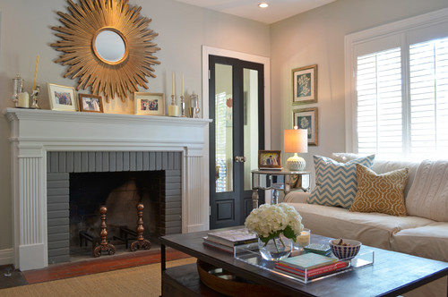
Whenever in doubt, choose this warm gray paint color for the walls of your living and dining rooms.
It blends well with the hardwood floors and wooden furniture as well as the metals and satin brass!
Quite versatile, right?

Moreover, to infuse a sense of visual interest, add shades of blue, plum, or sage green on the decorative accents.
This color also looks quite elegant with glam and contemporary design backdrops.
And if you have wall moldings, I highly recommend painting the walls in this color.
Using in Bedrooms
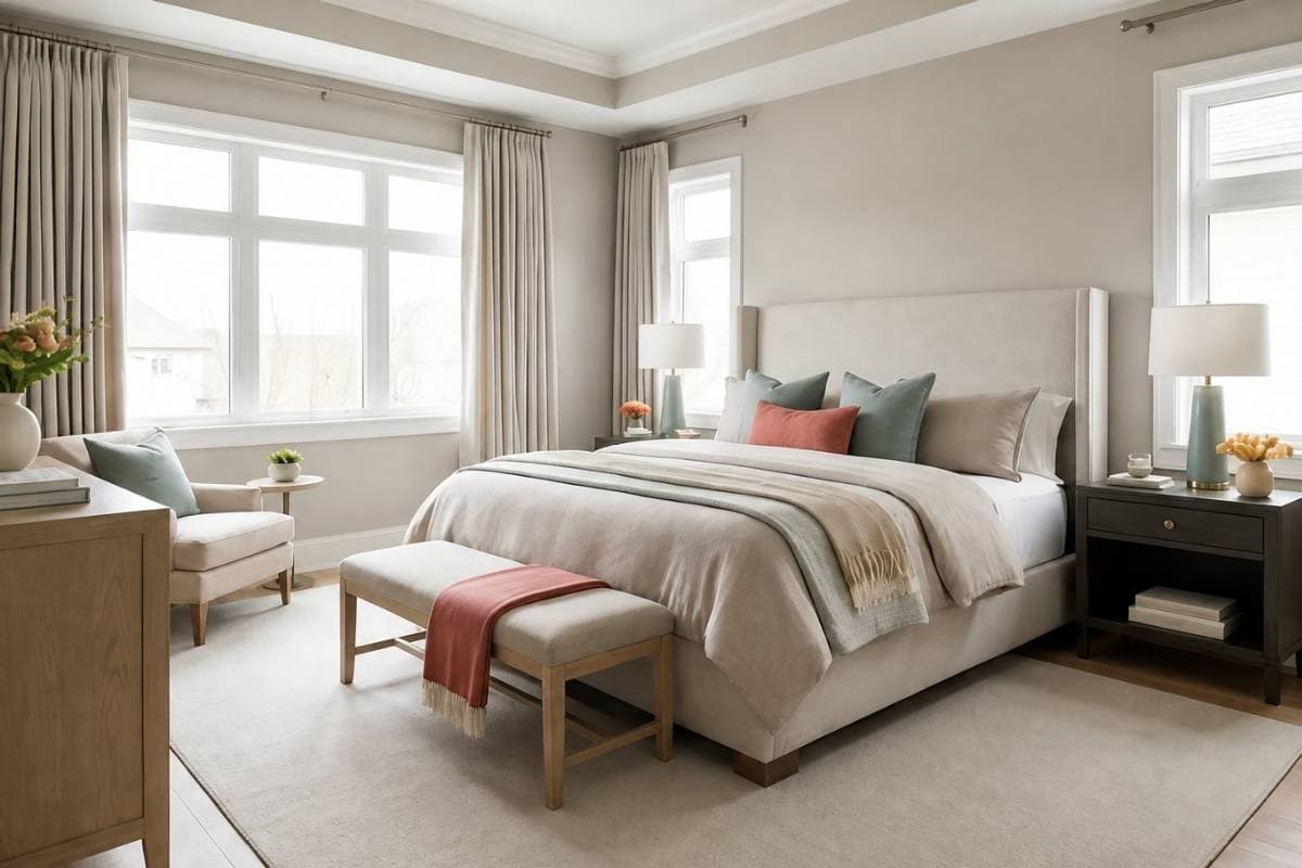
Using SW Repose Gray in the bedrooms is something to look forward to.
You can paint all the walls in this specific color and choose a clean white for door and window frames and ceiling and moldings.
Try pairing this paint color with whites, blues, and certain tones of greiges on decorative accents.
Lastly, for a cozier vibe – add shag, faux, or fur rugs for a welcoming experience.
Repose Gray in Kitchens
View this post on Instagram