

Sherwin-Williams Tricorn Black is a lush, elegant, and saturated version that will make you fall in love with blacks all over again!
Black can really have a graceful touch to it, can’t it?
After all, it has the potential to drive in sophistication like no other color and act timeless with absolutely anything and everything on the planet.
And it does so without screaming at you.
Similarly, Tricorn Black from Sherwin-Williams is one such hue that will act as a perfect backdrop to most of the shades and accents out there.
So, if you are planning to use this color for your home interiors, or even exteriors, I must say…
Keep it going, and you will love the perfect haven that your house gets transformed into from this absolutely MAJESTIC black.
But, beware…
I understand the color is timeless and stylish and classic – but since it’s quite a bold tone, you don’t want to mess it up using it just ANYWHERE.
Yes! It has limitations and underlying theories that you may want to know before painting that living room wall or bedroom accent with it.
I assure you will know exactly how and where to use this color after reading this article.
So, let’s get started!
Sherwin-Williams Tricorn Black SW 6258 Color Details and Specifications

You see that mysterious look that TB – that is due to the absence of colors!
This black is a neutral color that is void of any undertones! It’s for all intents and purposes – “Just Black.”
So, leave aside all of the confusion and doubts about undertones and tints and tones.
In the above photo, you can see how this dark color pairs with stark white on the Stairway to create a perfect balance.
This color is pure, refined, and unblended.
Which, let me give you a hint, is going to get easier to pair against the opposites.
Moving ahead with the details, first and foremost, one of the most important terms in color psychology is Light Reflectance Value (LRV).
It helps you in deciding which room and, in particular, which wall you require the paint to be on.

So, the LRV for Tricorn Black is 3!
And WOAH.
That’s it.
If you want to see how Tricorn Black will look in your unique environment, I highly suggest ordering a peel-and-stick paint sample from Samplize here!
The lower the Light Reflectance Value, the darker and bolder the shade is.
And with this limitation, Tricorn Black raises a major concern regarding where it should be used.
But before that, let’s discuss the other important terms associated with the color.
Red = 47, Green = 47, Blue = 48
HEX Value = #2f2f30

Let’s be clear, Tricorn is not a pure black color. You can see in the gradient demo above how it compares to a completely black color.
By this time, you know that this color really has a lot to offer you.
Whether it’s the bedroom or the living and family room, there are various creative ways to incorporate this color in your space.
And they are really unique and flabbergasting to say the least.
How Does Tricorn Black Feel in a Space?
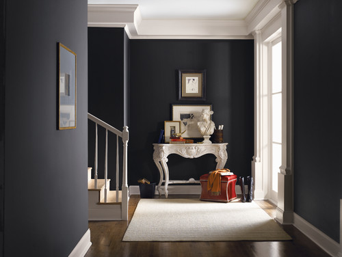
Tricorn Black promises a bold, authentic, and charismatic feel.
Due to its low reflectivity and ultra-darkness, this color may make your living space feel suffocated and congested if used in smaller apartments or spaces with small sizes.
Let’s not to get caught up in a situation like that!

Blogger Shauna from The House of Silver Lining remodels her home in herringbone patterns and SW Tricorn Black (Photo credit: Shauna Beltramo)
However, all the city dwellers and apartment owners don’t feel demotivated.
I know you love black and that’s why I have a trick for you – go ahead and use it in your small spaces – but as ACCENTS!
Maybe try painting just a single wall or a backdrop with TB – and leave the rest with Pure White or Stark White.
This way, you immediately get the best of both worlds!
Do not try this color out on North-facing rooms – an absolute no-no.
Due to the absence of natural light, it’s quite possible that your room will look dull and dark. (Not too inspiring…unless you want that specific theme!)
However, the crispness of TB is bound to make your space look elegant, sophisticated, and timeless when used the right way.
Especially now that black is admired by almost everyone, it is quickly being counted as a trend now and for the upcoming years.
How Does Light Affect the Color?
To be honest, not a lot!
Due to low reflectivity, this color appears almost the same with or without natural light (of course, darker when there is no light at all.)
However, depending on the type of lighting (natural, warm-white, warm-yellow, or colored), the color exhibits a tinge of yellow, white, and color.
But doesn’t affect a lot!
Also, if you have plenty of natural light falling in the rooms, I recommend using this black. It will showcase smooth, crisp and refined character.
To truly see what your home’s environment and lighting will do here, try out a real paint wall sample. It takes out the guesswork!
What are the Coordinating Colors for Sherwin-Williams Tricorn Black?

Sherwin-Williams Tricorn Black is the truest form of black you could ever imagine!
At least in my books, I consider this black the ultimate “BLACK” you would ever want in your home.
And since it’s true to the undertones, it’s comparatively easier to pair with coordinating and contrasting hues.
To name a few, Sherwin-Williams Tricorn Black can easily pair with hues on the palette. Yes, you name it and can have it!
And truly speaking, it all depends upon your design style and color palette preference.
This true black can beautifully pair with crisp and clean whites, beiges, taupes, tans, mauves, rust, blush pink, greige, and gray.
In terms of metallic accents, you must either choose satin brass, wood, or even chrome and copper.
Here are the following two color palette suggestions – monochromatic and coordinating (cool and warm)!
Monochromatic Color Palette

The complementary colors for the monochromatic palette are as follows –
- SW 6257 Gibraltar
- SW 6256 Serious Gray
- SW 6255 Morning Fog
This dramatic monochromatic palette is definitely something to look forward to for design styles like modern and contemporary.
You must add textures such as satin brass and antique copper to complement this palette.
Lastly, ensure there’s ample natural light in the room you intend to use, and ample blacks and dark blues.
Contrasting Cool Color Palette

The complementary colors for the contrasting palette are as follows (cool) –
- SW 6252 Ice Cube
- SW 9141 Waterloo
- SW 9005 Coral Clay
This quirky and cool color palette is bound to gain a ton of attention! Whether it’s in the form of accent throw pillows or wall colors, never hold back from this palette. (Especially for the Eclectic design style)
You can choose to style with satin brass lighting fixtures and artwork frames.
Lastly, remember to even add tan to this palette – especially in the form of fabrics.
Contrasting Warm Color Palette

The complementary colors for the contrasting palette are as follows (warm) –
- SW 6126 Navajo White
- SW 9113 Mudslide
- SW 9156 Gris Morado
This warm and welcoming palette showcases a beautiful blend of beiges with black to create an outstanding look for traditional and transitional design styles.
I highly recommend you choose satin brass and antique copper to make the palette further protrude.
However, try to avoid a lot of bright and warmer hues. It may tend to make the space feel too energetic, which, on a daily basis, could be harmful to perceive.
These days, neutral monochromatic shades are quite trendy. And if you’re considering one, here is a list you may want to blend –
- Inkwell SW 6992 – learn more here!
- Black of Night SW 6993
- Dovetail SW 7018
- Dorian Gray SW 7017

The best paint options for trims and moldings, whether exteriors or interiors, are Pure White or High Reflectance White.
This will further enhance the color and help in protruding the Tricorn Black!
Sherwin-Williams SW 6258 Tricorn Black vs Similar Colors
Many other colors are possible alternatives for this deep color.
However, keep in mind that if you need something specific, some may display a warmer tone and some a cooler.
But one of the colors that shares the most similarity is Caviar!
Tricorn Black vs SW 6990 Caviar
With a similar LRV of 3, these colors share quite a lot in common.
Meanwhile, Caviar is not exactly ‘Black’ – it’s very dark but has a brownish tinge to it. Learn more about SW Caviar in my article here.
In short, it is somewhere between brown and black.
For even more accurate results, I highly recommend buying real-time samples and swatches to compare the two.
Screen colors could get deceiving sometimes!

Order a wall-stick sample of Tricorn Black here to help you compare these colors in your own space.
Tricorn Black vs SW 6991 Black Magic
With an LRV of 3, Black Magic (see my review here), too is a product of Black but with a lesser black feel than TB.
Again, if observed closely, it is not true black, which makes it slightly aligned with various other neutral undertones – basically, dark blue.
Light has a major effect on these colors, so, it is highly recommended to apply a sample of paint on a bare wall!
Trust me on this, they will look absolutely different – and that will help you in deciding which color to choose from.

Test these colors side-by-side to see the differences in “real life” INSIDE your home, with some wall-stick samples. Order here!
If you want to check out other similar colors, please see my article on choosing from the many other SW black paints.
More SW Tricorn Black Color Palettes

