

Sherwin-Williams Canvas Tan is an absolutely beautiful, antique beige that will make you want to consider SW beiges and tans for your new home.
Or if you are already planning to use SW Canvas Tan for your home’s New Construction or Remodeling, there are a few details about this intriguing color that you might want to know before painting that wall in Canvas Tan.
However, one sure thing is that it gets totally confusing to choose the perfect shade when you are surrounded by similar colors from different as well as the same manufacturers.
Light or Dark? Cool or Warm? Beige or Grey? Or Greige?
Yes, I understand – I have been at that spot multiple times!
And you know what helped?
Thorough research of the color’s undertones, tones, tints, and shades.
Confused about what those last four words exactly mean? Don’t worry!
I have elaborated a detailed review on this color below that will help you know exactly if Canvas Tan is the beige you are looking for!
I promise, in no time, you’ll be an expert!

Sherwin-Williams Canvas Tan SW 7531 Color Details and Specifications
Canvas Tan is a warm-toned color with a tinge of creaminess to it. Falling on the lighter end of the scale, this color proves to be an ideal solution for your North-facing rooms.
Because you don’t get ample sunlight there, it helps brighten the aura!
Below, you can see how Canvas Tan embellishes the walls of the staircase with contrasting wooden balusters and white trim.

But before moving into further details, let us look at the basic specifications that the color has to offer.
A Pro Tip:
Always consider the Light Reflectance Values (LRV) before deciding on paint colors for your home. It helps you figure out its reflectivity (brightness or darkness)!
And using that information, you know much better where to use it throughout your home.
In this situation, LRV for Canvas Tan is 64.
Woah! That’s good enough.
In simpler terms, it’s mid-toned and not too dark or too light. We’re talking flexibility here with this one.
Not as heavy as say a Charcoal gray and not as bright as Pure White (one of Sherwin-Williams’ most popular off-whites – find out more here).
Another tip: If you want to easily try out Canvas Tan, you can with a peel-and-stick sample from Samplize. Pick up your samples here!
Moving ahead, the colors have associated RGB and HEX Values that you might want to be familiar with:
Red = 220, Green = 209, Blue = 191
HEX Values = #dcd1bf
Now, if you are wondering if Canvas Tan is associated with blue or green undertones, the answer would actually be NONE!
This color surprisingly has a neutral backdrop with a slightly warm touch to it.
However, if sunlight directly falls on a painted surface, the color may exhibit as golden-ish!
Nevertheless, it also depends on which room and which particular wall you want to paint.
Also, choosing its perfect partners (complementary colors) can help this color shine even further.
How Does the Canvas Tan Feel in a Space?
Monochromatic shades of Canvas Tan
Well, due to the warmth that the color exhibits, it’s quite likely for you to feel comfortable and cozy.
If you are dwelling in those northern states, I would highly recommend using this color for most of your common areas – living, dining and family rooms.
The creamy texture helps in brightening up the space while defining a relatively smoother and softer look.
Due to these properties, the color tends to make your room look spacious and larger (a bit of a trick, isn’t it?).
Meanwhile, if your room is too large and you want to make it look smaller, I would not actually recommend this color.
But if you still are enticed to use it, consider filling up empty spots with rugs, extra pairs of furniture such as bold side tables, ottomans, and larger artwork.
This way, you get the best of both worlds. The illusion of a more cozy space AND Canvas Tan!
And that’s all we want when tucked up next to the fireplace while it’s snowing outside, right?

Canvas Tan showing off its golden qualities in this formal living room setup.
How Does Light Affect the Color?
So there is quite a broad spectrum of individualistic characteristics this color takes on in various light sources.
Lighting may seem to be an overlooked matter of concern when playing with colors and paints, but in reality, it is quite crucial.
Depending on the type of lighting – natural, warm-white, cool-white, and colored, your paint color changes and can become different characters so to speak.
It’s not quite like a chameleon but it’s enough that you want to consider it before paint hits your brushes and rollers.
So, remember, Canvas Tan appears to be brighter and golden-ish beige when direct sunlight falls on it.
Specifying it in a north-facing room is highly encouraged as it’s bright and will tend to keep up with its originality.
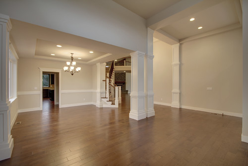
Meanwhile, using wall sconces and pendant lighting with warm-whites will definitely make your space look warmer – not bad if you reside in a cooler place.
I wouldn’t recommend using cool-white tones for lighting as it doesn’t align with the color theme and can eventually give a vague direction of feeling in that space.
You see, it all aligns.
Now, if you are looking for similar-shaded hues from the same and other paint manufacturers, continue to read below about the possible alternatives.
I’ll have to say again, the most awesome way to check a color like this out in your home is with a wall sample from Samplize. Buy yours here.
Sherwin-Williams SW 7513 Canvas Tan Vs. Similar Colors
Everybody needs a second option and third options, right!? That’s human nature, and it’s perfectly fine.
So, here I have enlisted a few Similar colors that you might want to consider as well, and distinguished the Canvas Tan from them.
Canvas Tan Vs. Grecian Ivory

Oh yes. This is one of the most asked questions!
Sharing almost a similar LRV of 63, Grecian Ivory is an off-white creamier solution with slightly green undertones.
Unlike the Canvas Tan that has neutral tones, these colors together may seem quite similar in a generic, broad natural lighting but may play differently with different lights.
However, I highly recommend you order stick-on samples of Canvas Tan and Grecian Ivory here to help you compare these colors in your own living spaces.
Canvas Tan Vs. Neutral Ground

No matter how similar you may want the colors to look, there are still slight changes in undertones, shades and temperatures that may end up with no two colors being alike.
Lighter and brighter – Neutral Ground differs from Canvas Tan in terms of undertones.
Greige it is! Neutral Ground appears to have a creamy backdrop in natural light but when observed closely, it appears to be grey-beige!
One more similar color that is on the warm side is SW Kilim Beige. It’s worth checking out if you want to go even “deeper” into the beiges.
Try out each of these colors with some temporary wall samples. You can find them here!
What are the Best Coordinating Colors?

Canvas Tan has remarkable magic to it that gets it flexible with most of the shades when blended together in a space.
Sherwin-Williams Canvas Tan is a warm-toned off-white/beige paint color with a tinge of pink and yellow to it.
And due to these confusing undertones, pairing with complementary hues can be quite a task.
Since SW Canvas Tan is quite a creamy color, you might not want to overwhelm your space.
And so, you must pair with balanced neutrals such as whites and grays to create a cohesive appeal.
For instance, remember to pair this creamy color with clean whites, medium-toned grays, bronze, midnight blues, and rust.
In terms of metallic accents, I highly recommend that you either pick matte black or oil-rubbed bronze to complement the off-white and beige on the walls.
Here are the following two color palette suggestions – monochromatic and coordinating (cool and warm)!
Monochromatic Color Palette

The complementary colors for the monochromatic palette are as follows:
- SW 7532 Urban Putty
- SW 7533 Khaki Shade
- SW 7731 San Antonio Sage
Especially for interior design styles like Japandi, traditional, and French Country – this color palette is something to have an eye on.
You must add matte black lighting fixtures and metallic accents to play focal and contrasting!
Also, don’t hold back from styling with wooden textures.
Contrasting Cool Color Palette

The complementary colors for the contrasting palette are as follows (cool) –
- SW 7757 High Reflectance White
- SW 6207 Retreat
- SW 7668 March Wind
Consider this palette if you like a bold statement in your home. Choose a focal wall in SW Retreat and let the remaining walls be soothing and subtle.
Choose satin brass fixtures or oil rubbed bronze finish to go with this palette.
Contrasting Warm Color Palette

The complementary colors for the contrasting palette are as follows (warm) –
- SW 7757 High Reflectance White
- SW 9080 Hushed Auburn
- SW 6075 Garret Gray
This warm-toned palette is something to definitely consider for your home.
Choose satin brass for the lighting fixtures and artwork frames.
Now, if you’re wondering what works best with Canvas Tan, here is a short list of my faves:
- Mineral Gray (SW 2740)
- Avenue Tan (SW 7543)
- Shoji White (SW 7042) – see my review here!
- Favorite Jeans (SW9147)

For your trims, there is no better option than Pure White, High Reflective White, and Alabaster (find out more here!).
You want them to protrude out and act timeless for any and every shade!
Meanwhile, Canvas Tan could also be paired with opposite greiges, soft-cream tones, and dark and daring deep blue or grey tones.
Of course, depending on the bases and accents!
More SW Canvas Tan Color Palettes


