
Sherwin-Williams Kilim Beige is a warm-toned neutral paint with no inclinations to a specific undertone.
This color has been used by painters, homeowners, and builders all over again and again – and do you wonder why?
Because of the independence of the color! It doesn’t change its appearance that easily – thus, making it an ideal beige to be used literally, anywhere.
With the evolution of the greiges, greys and off-whites, there is beige somewhere in the middle that adds the “warm” factor to your space.
With a slightly creamy texture, this color somehow looks like the latte, oh yes – maybe it’s more relatable when you have it tomorrow morning before work!
Even though the color falls on the warmer end of the wheel – it still looks quite neutral – making it one of the many neutral beiges provided by the manufacturer.
You definitely don’t have to worry much while using the color as it stays true to itself and won’t really change much due to the surrounding hues.
In the big picture, there is nothing to worry about, but you might still have to look at the little bits while painting your walls in Kilim Beige!
Sherwin-Williams Kilim Beige SW 6106 Color Details and Specifications

Kilim Beige complements the best with off-whites and stark whites
Color theory is a broad topic – and there are hidden mysteries behind each and every color!
These theories help in deciding if you should use a specific color in a specific room or how will the light affect the overall appearance of the color in a room!
Well, Kilim Beige is like no other!
But you may still need to consider a few details when choosing it.
First and foremost, always remember to check the Light Reflectance Value (LRV) of the color. This value is dependent on how reflective or light the color is.
In this situation, the LRV of Kilim Beige is 57.
Which is pretty good (Or I must say – lighter shade).

So, you can undoubtedly use the color in small rooms to make them look bigger and brighter!
Other considerations associated with the color are RGB and HEX Values!
Red = 215, Green = 197, Blue = 174
HEX Value = #d7c5ae
This color neither has a golden touch nor an orange or pink touch (unlike all other generic beiges)!
If you want to see how Kilim Beige will look in your unique environment, I highly suggest ordering a peel-and-stick paint sample from Samplize here!
Okay, as now you have the basics of the color – let’s discuss more about the inspirations and what the color has to offer you.
How Does Kilim Beige Feel in a Space?
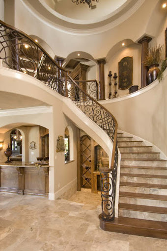
Classic Wooden Touch complements the Kilim Beige
It is quite likely for your space to look much lighter, brighter, and spacious!
It definitely doesn’t add a bold statement so there are no issues regarding your space looking messy or congested.
Instead, the freshness imbibed by this color is likely to transform your space into an airy haven!
In this case of beige, you might want to avoid very energetic warm colors – perhaps try bold neutrals and whites or off-whites to let this color outshine.

Kilim Beige feels lighter in this renovated home by blogger Lisa from Texas Decor.
Beware if you are living in southern warmer states or by the humid regions – this color is warm for your walls and even though the weather outside is not so warm – you might still feel over 80 degrees with this color on the wall!
Rather use in smaller amounts in specific areas to enjoy the color while not making the space look ‘too-warm’!
But if you are looking for a nice, creamy warm touch – don’t hold back from Kilim Beige!
How Does Light Affect the Color?

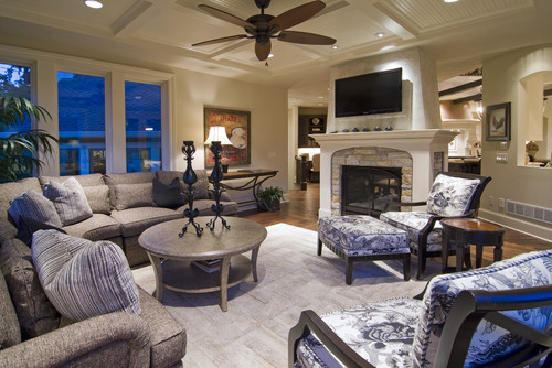
Vidya from What’s UR Home Story, shows off her family room in her favorite beige color.
Like I previously said – not too much!
This is not one of those chameleon colors I keep talking about.
Kilim Beige is quite true to itself! I highly recommend using this color in rooms that you don’t plan to update quite much.
When used in south-facing rooms or rooms that get direct afternoon light, this color appears to be warmer with a creamier texture!
Despite the whites, blues or browns surrounding the color – the property of this color may never change!
To truly see what your home’s environment and lighting will do here, try out a real paint sample. It takes out the guess work!
What are the Coordinating Colors for Sherwin-Williams Kilim Beige?

This extremely WARM beige color is unexpectedly sneaky and also tricky to play with!
And yet again – the common reasons being the chameleon-like UNDERTONES.
Well, yes! Don’t confuse the name of this paint color.
It’s actually a beige but with a deep orange and pink undertone.
So, you might have to be slightly thoughtful about pairing hues and material contrasts with this warm beige paint color.
Generally, SW Kilim Beige works wonderfully with clean and neutral whites, deep midnight blues, teals, black, bronze, and lighter beiges. You can also use darker sage greens!
In terms of metallic accents, you can either choose matte black, oil-rubbed bronze, or antique brass.
Here are the following two color palette suggestions – monochromatic and coordinating (cool and warm)!
Monochromatic Color Palette

The complementary colors for the monochromatic palette are as follows –
- SW 6107 Nomadic Desert
- SW 6108 Latte
- SW 6109 Hopsack
This monochromatic palette is ideal for colder regions since there’s ample warmth to it.
To break the monotony, you must add dark wooden textures and clean whites to create a cohesive appeal.
In terms of metallic accents, don’t hold back from matte black and antique copper!
Contrasting Cool Color Palette

The complementary colors for the contrasting palette are as follows (cool) –
- SW 7005 Pure White
- SW 6249 Storm Cloud
- SW 7668 March Wind
This cool yet contrasting palette will definitely make your space feel much cooler and calmer!
Generally, blue-grays work wonderfully with such warmer beiges – since they also neutralize the peeking orange undertone.
Else, you can also choose matte black and satin brass for lighting fixtures, furniture frames, and artwork frames.
Contrasting Warm Color Palette

The complementary colors for the contrasting palette are as follows (warm) –
- SW 7005 Pure White
- SW 6101 Sands of Time
- SW 7671 On the Rocks
This palette is WARM but definitely not TOO warm to overwhelm your space.
You must use this paint color with creamy whites and lighter grays to create a sense of balance – and also break the monotony!
Lastly, remember to choose matte black finish for helping the accents create focus in the room.
Whether it’s a dark-shaded couch in the front of a lighter-shaded wall or a darker coffee table placed exactly in the center of light-shaded surroundings – monochrome Kilim Beiges are bound to add drama to your space.

So, I also have a few recommendations if you are not a big fan of monochromes and would rather paint your home with some contrasts. Here is the list:
- Latte SW 6108
- Storm Cloud SW 6249 (see my full review here)
- Divine White SW 6105
If you closely observe, this color goes well with either greiges, neutrals or cooler shades(blues and greens). Other reds, oranges and yellows are absolutely no-no!
More SW Kilim Beige Color Palettes


Sherwin-Williams SW 6106 Kilim Beige Vs. Similar Colors
Just in case if Kilim Beige is too warm for you, I have a few other options you could refer to!
Looking at the other way, maybe you like greiges but when it comes to beiges, the most similar yet subtle ones are Fresco Cream and Canvas Tan.
Kilim Beige Vs. Fresco Cream

With a similar LRV of 57, the two colors share quite a few similarities and one of them being the brightness.
But the latter is not too-warm or too-creamy! Instead has an orange tinge to it. I personally would use this one on the exteriors if the local context allows it!
To see how these look in your home, get some large rectangular samples and try on your walls with different lighting sources.
Kilim Beige Vs. Canvas Tan

Canvas Tan is not really similar to Kilim Beige because they highly differ in looks but the reason, I recommend Canvas Tan here is that it is a perfect sober pastel.
If you are looking for a similar family with a color that is equally clean, crisp and timeless – I would highly recommend painting your walls in Canvas Tan.
Canvas Tan is comparatively lighter with an LRV of 64. You can read more about it here!
Try out the looks of these colors in your own home with a some temporary wall samples. You can find them here!
Coordinating Decor

Sherwin-Williams Kilim Beige is an orange-pink base beige color that can do wonders – if you pair it with the right pair of decorative accents.
It’s generally not very difficult to create material and fabric palettes for this color – but I am still going to recommend a few.
From furniture to decorative accessories and materials – I am going to pick the best ones for you that will perfectly vibe with SW Kilim Beige.
In terms of wooden accents, don’t forget to style with finishes like ebony, walnut, and mahogany! Yes, choose a shade darker!
Meanwhile, for lighting fixtures and artwork frames, choose matte black, polished chrome, or a deep wooden finish.

Here are the links to the flooring that works well with SW Kilim Beige –

Here are the links to the decorative accents that works well with SW Kilim Beige –

Here are the links to the furniture that works well with SW Kilim Beige –
Where to Use Sherwin-Williams Kilim Beige in Your Home?

Kilim Beige is a perfect soft and creamy beige that is inclined towards browns and lighter tans.
It is a perfect solution to homes with hardwood flooring and wooden-textured cabinets and media units.
You could use this color absolutely anywhere as far as the pairing colors are a ‘go’!
Kilim Beige in Living Room
What I love the most about this color is that it simply doesn’t look yellow – with or without light!
So, if you are looking for a warm and cozy living room – try Kilim beige.
In that case, paint your trims and moldings in alabaster and use grey accent chairs with midnight blue throw pillows.
To add a touch of coziness, you could also add white fur throw blankets and stool upholstery.
Another alternative is blue-green shades and patterns that would look flabbergasting with Kilim Beige.
Kilim Beige in Bedrooms and Bathrooms

The bedroom is the most personal space in your home. There is no good and bad here – except that the mood created by the room should be able to engage you and highlight a soothing experience.
Well, in that case – Kilim Beige is really not a bad option. It is calm, soothing, and tranquilizing.
However, ensure that the bed headboard, side tables, and your media unit should have a wooden textured look.
Kilim Beige in Kitchen
Do not use Kilim Beige in the kitchen unless it is moderately larger-sized.
Or else you’ll be stuck with a little congested space!
But there is a loophole right here – If you use stark white cabinets – you can achieve a minimalist and transitional look.
If it is a larger kitchen and you want to make it look smaller – you could use a wooden textured finish on these cabinets.
Kilim Beige on Exteriors
Now that you have an idea about the interior palette, let’s discuss how this color adds to the exteriors of your home.
Well, this color is likely to get lighter outdoors due to excessive natural light.
But there is absolutely no harm in using this color on the exteriors.
A dark brown trim or Alabaster trim is good. Isn’t it? Also if you have stone cladding – it is like cherry-on-the-top!
Best Way to Try Out This Color?
I have to share one of my favorite tips when testing out colors like Kilim Beige – go and order a peel-and-stick sample from Samplize.
This company has an amazing way to sample colors super conveniently with real paint.
Simply stick up a temporary square sample of it and avoid the whole paint and roller mess (at least until you’re ready!).
For a small amount of money you get a giant “”sticker”” you can place up in the space you’re painting. You can also try out coordinating colors as well. It’s great!
My 7 Key Tips for SW Kilim Beige
1. Test Kilim Beige in natural light first
I’ve found that Kilim Beige can look warmer or cooler depending on the room’s natural light.
Before committing, paint large swatches on multiple walls.
Observe them at different times of day to catch subtle shifts in tone!
This step can save you from regretting a color that feels too muted or too yellow in certain lighting.
2. Pair Kilim Beige with white oak or maple floors
This color works beautifully with light to medium wood tones.
I often pair it with white oak or maple floors to create a warm, inviting space.
It brings out the subtle golden undertones in the wood.
Avoid very dark floors, which can make the room feel heavy and the beige appear dull.
3. Match with warm-toned cabinetry for kitchens
Kilim Beige pairs best with warm, creamy, or honey-toned cabinets.
I’ve seen it enhance traditional or shaker-style cabinetry beautifully.
It softens the contrast while keeping the space feeling cohesive.
Avoid cool gray or stark white cabinets, as they can clash with the warmth of this beige.
4. Use Kilim Beige for exterior siding accents
This beige has subtle warmth that complements brick, stone, or wood exteriors.
I like using it for shutters, trim, or porch accents to make homes feel approachable and timeless.
It resists looking flat in sunlight and works especially well in neighborhoods with earthy palettes.
Try pairing it with darker trim for a sophisticated, layered look!
5. Prep walls carefully for even coverage
Kilim Beige can show streaks if applied over uneven or patched surfaces.
I always sand and prime any patched areas before painting.
It helps the color go on smooth and consistent.
Taking this step saves a lot of frustration and repainting later!
6. Ideal for living rooms and bedrooms
This color creates a cozy, relaxed vibe that works especially well in living rooms and bedrooms.
I’ve used it to make these spaces feel calm and welcoming without being too dark.
Layering with cream or soft taupe furnishings really brings out the depth of the beige.
It’s less suitable for spaces where you want a very bright or crisp feel, like laundry rooms.
7. Test accent colors before committing
Kilim Beige is versatile, but not every accent color complements it.
I always try throw pillows, rugs, or paint swatches of trim colors first.
Warm greens, muted blues, and terracotta shades work beautifully with this beige.
This small test saves big headaches and ensures your color scheme feels intentional!
———-
So, how do you feel having found out a bit about this color? Are you going to use it anywhere in your home? Do let us know about your experiences in the comments below!
FAQs
What Undertone Does Kilim Beige Have?
Sherwin-Williams Kilim Beige has a deep orange and pink undertone! In the north-facing rooms, it can also play neutral!
Is Kilim Beige Too Dark?
Yes, SW Kilim Beige has considerable depth to it and can appear medium-dark in rooms that have less incoming natural light. Also, it has an LRV of 57 which is why it’s a given!
What Colors Are in Kilim Beige?
You can dominantly catch a tone of orange in SW Kilim Beige paint color.
Does Kilim Beige Go with Honey Oak?
Yes, SW Kilim Beige can absolutely complement the Honey Oak cabinets and trims! Try and you’ll know.


Leave a comment