
Could I say – this color category is absolutely one of my favorites from the Sherwin Williams palette?
Symbolizing a perfect balance between comfort, practicality, and style, this SW green paint color is bound to take you on a rollercoaster ride of absolute serenity!
It is calm and relaxing, thus a great way to introduce nature to your indoors.
There have been a number of times I have recommended this paint to my clients who were either big admirers of nature or, on the other hand, craving for a tinge somewhere among the busy streets of New York!
So, Sherwin Williams Retreat is a mid to darker-toned green paint color that has deep green-gray undertones – making it more subtle and muted than bright green.
So, if you are planning to use this based on the above – I would say – definitely, yes!
You can use this color in any or every corner of your home – whether it is the hallways, kids’ rooms, nursery, bedrooms, living rooms or the bathroom – this color will definitely add a tranquilizing vibe in your home.
And if you are planning to add one – keep reading ahead to learn exactly how and where!
So, let’s get started!
Sherwin Williams Retreat SW 6207 Details and Specifications

Before you pick this paint to be used in your home, you must understand the underlying theories and specifications.
Most of the homeowners generally look at how the color looks and feels, but the fact is that you should always understand what the color is truly made of.
I have generally observed homeowners saying that a certain white reflects pinkish undertones or is comparatively not blending in with their wooden parquet flooring!
Hence, ignoring the basics will lead to some mess in your home – and who wants that right?
So, first and foremost, analyze the importance of Light Reflectance Values or the LRV’s that help in determining how light or dark the paint is.
In this case, the LRV of Retreat is 21.

And that means it falls on the middle to the darker end of the scale.
(You can easily find this value at the back of the paint swatch)!
One GREAT way to test a paint color to see what it’ll do in your own home, is to order a sample from Samplize. You can pick one up for Retreat!
Secondly, other important associated terminologies are the RGB and HEX Values that further tell us what the color is comprised of.
Red = 122
Green = 128
Blue = 118
HEX Value = #7a8076
Now that we have discussed enough about the technical and scientific information, let’s get started with the practical aspects of this green-gray Sherwin Williams paint.
How Does this Color Feel in a Space?
Sherwin Williams Retreat feels calming, soothing, and at the same time, extremely bold when used on the walls!
(Of course, due to its low reflectivity)
You can absolutely use this paint in larger areas to make them feel smaller, closer, and more confined.
I recommend that any and every climate use this color (and especially warmer and tropical regions).
This color exhibits a neutral vibe – hence, after a long day at work, this will feel absolutely welcoming and relaxing.
For very small spaces, I recommend using this color as an accent and pairing it with stark whites that have a reflective value over 82.
How Does Light Affect the Color?
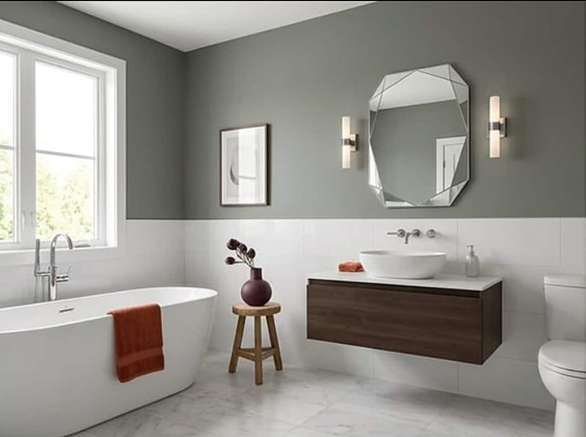
Light – whether natural or artificial, has a role to play here!
So, here is a little exercise I want you to perform in case you want to use this paint!
Do you have ample natural light? What are the compass directions of your room?
If there is ample natural light, you must use this paint since it will neutralize the boldness with the refreshing light!
Otherwise, you can always play with artificial lighting to create the desired aura.
Furthermore, know that this paint will feel absolutely cool and kind in the north and south-facing rooms, whereas a little warmer on the east and west-facing rooms!
If you want to really see how this color will play in your space and with other colors, get some wall samples from Samplize.
What are the Best Coordinating Colors?

Choosing an eye-catching complementary scheme is important.
Hence, you can either choose a contrasting or a monochromatic color palette – depending on your interior design style.
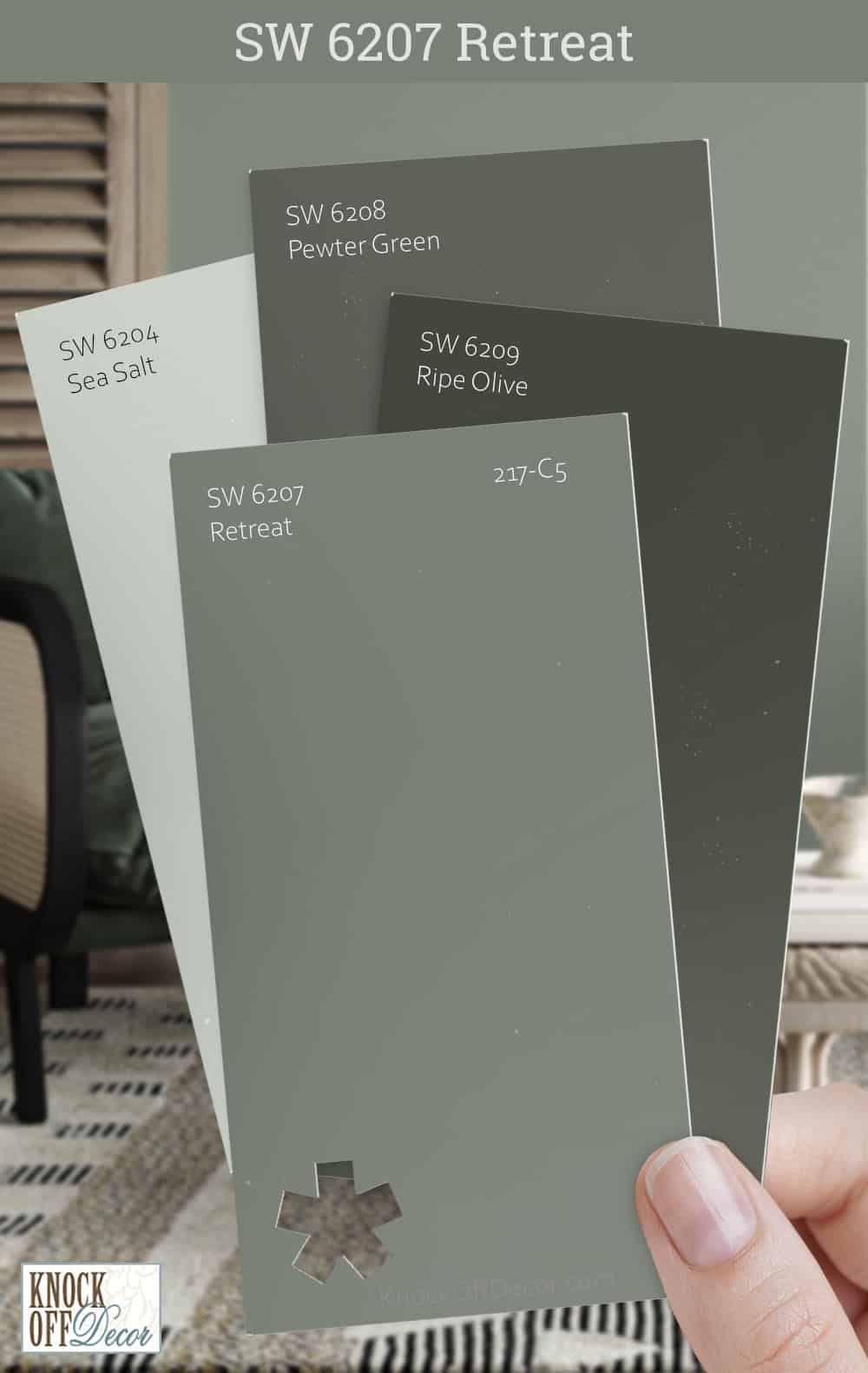
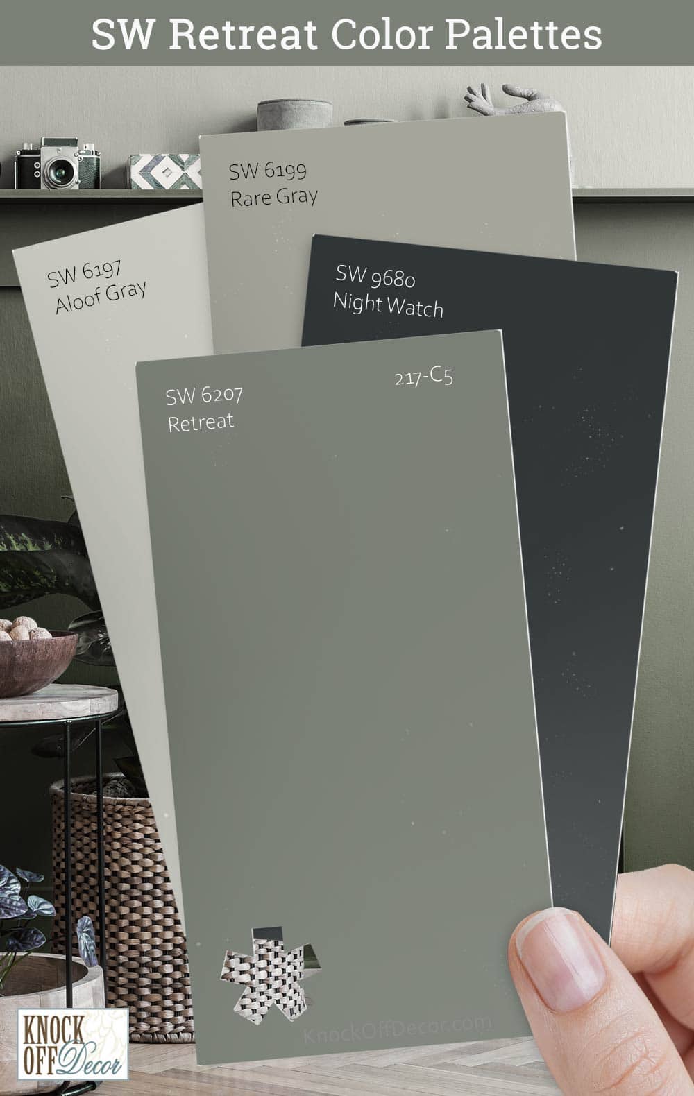
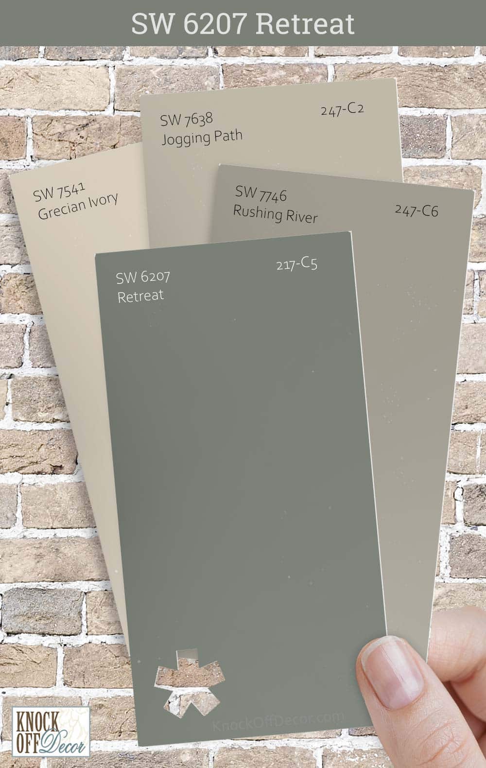
So, with such a soothing green aligns either darker or lighter greys, creamy or crisp whites, black, greiges, burnt oranges, and lighter and brighter yellows.
Well, here are a few of the colors I would recommend for a monochromatic palette!
- SW 6205 Comfort Gray (find out more in my review here)
- SW 6206 Oyster Bay (see my full review here)
- SW 9132 Acacia Haze

On the other hand, here are a few of the colors I would recommend for a contrasting color palette!
- SW 6395 Alchemy
- SW 7008 Alabaster (see my full review here)
- SW 7604 Passive

For your ceilings, trims, and moldings, I would recommend using SW Pure White to further achieve a creamier look, or else if you want a crisp look, choose SW Extra White or SW High Reflectance White.
More Retreat Color Palettes
SW Retreat Vs Similar Colors

There are quite a handful of greens you can play with here!
And let me tell you, if you are looking for alternatives – the best options to choose are either grayish-greens or the greenish-grays!
To name a few, there are SW 7060 Attitude Gray and SW 6200 Link Gray!
Let’s see how all of these differ!
Retreat Vs Attitude Gray

Sherwin Williams Attitude Gray is a greenish-gray that feels absolutely natural and organic in your home.
With an LRV of 20, this paint falls on the medium to darker end of the scale.
You should pair it with lighter and creamier whites to create a balance!
Get a stick-on sample of Retreat and Attitude Gray to test in your home.
Retreat Vs Link Gray

Another pretty paint from the green collection, Sherwin Williams Link Gray is a dark-toned paint color with a slightly crisp texture.
However, you must note to pair it with lighter and warmer off-whites for a perfect backdrop!
It has an LRV of 21, so remember to be careful around using it in smaller spaces.
For another amazing hue that’s just a bit lighter, be sure to check out Evergreen Fog.
They might look very similar on the screen, but the biggest secret is to order samples of the color and then assess the brightness and tones in the environment you’re painting in.
Pick up peel-and-stick samples now from Samplize!
Where to Use SW Retreat in Your Home?
A beautiful warmer green paint like SW Retreat should be used literally anywhere and everywhere in your home.
Since this organic dark sage green will easily neutralize with the yellow incoming sunshine, you can use it in south or west-facing rooms.
Especially for interior design styles such as traditional, transitional, coastal, Bohemian, and contemporary – this color is good to go!
Let’s see where and how to incorporate this beautiful green color in your home.
Retreat in the Living and Dining Room
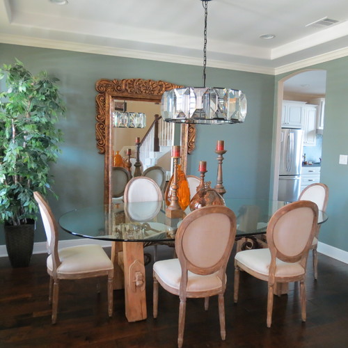
SW Retreat is a great hue to be used in the living or dining rooms!
Although it plays a great accent – so I recommend using it on the accent walls! Avoid painting all the walls in this specific paint.
You can pair it with beautiful creamy whites to create a stark contrast while maintaining a sense of harmony.
And just in case if you have wooden parquet flooring, it is definitely a plus point!
Using in Bedrooms
Absolutely yes!
You should definitely use SW Retreat on the accent wall behind the headboard.
You can further pair it with mustard yellows and some burnt oranges on the throw pillows and blankets.
To create a contrast – you can also add some brass-tinted fixtures on the chandelier or the fan!
I recommend keeping your base neutral with creamy whites to let the paint stand out from the rest of the décor.
Retreat in Kitchens
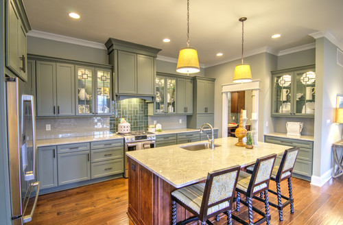
Quite trendy – don’t hold back from using this green paint in the kitchen.
You can add this paint on the cabinets or use it on the backdrop wall of your kitchen.
Try pairing with brass fixtures in the form of pull handles and majestic pendant lights to add a stark contrast in your kitchen!
Try pairing it with a white marble countertop and white hexagonal glossy backsplash!
Using on Exteriors
Exteriors are a great way to flaunt this beauty!
Retreat on exteriors is bound to look lighter than it already is.
I recommend using this paint on Cape Cod, Craftsman, and Caribbean-styled homes!
Pair it with creamy or crisp white, gray, or off-white shaded trims and moldings!
Yes – that way you make a great contrast on your home exteriors!
Also, you can do the other way round, by using pure whites on the decorative moldings!
An Easy Way to Sample This Color!
Instead of picking up a small can, or worse, an entire gallon can, to “test” out Retreat, you can order a peel-and-stick sample of it from Samplize.
The company is genius – they provide a 12″ x 12″ stick-on square you can put up anywhere in your home to try out a paint color.
For a few bucks, it’s definitely worth the small investment so you can see what the color will do in YOUR unique space, with your own lights and shadows.
What Not to Pair with Retreat
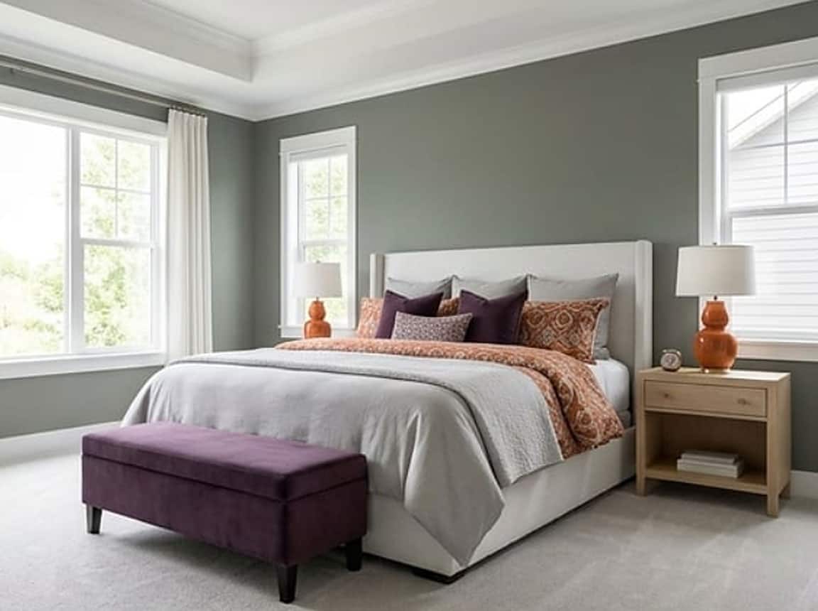
Color Pairings That Work Against Retreat
Retreat’s cool, muted blue-green character struggles most next to warm, saturated colors.
Terracotta, burnt orange, and deep rust tones create a jarring contrast that pulls this color’s quiet, serene quality completely apart.
Warm, heavily saturated yellows are another pairing I consistently see create tension with Retreat’s cool, restful base.
3 Decor Styles That Don’t Belong with Retreat
Warm rustic farmhouse styling loaded with distressed wood tones and amber accents fights directly against Retreat’s cool, spa-like character.
Traditional decor heavy in warm golds, burgundy, and antique finishes creates a visual conflict that undermines everything this color is trying to do.
Bold maximalist styles with warm, high-contrast patterns simply overwhelm Retreat’s intentionally calm and understated personality!
7 Trim and Accent Colors That Hurt Retreat
Warm whites like Navajo White and Antique White immediately clash with Retreat’s cool undertones.
Creamy ivories, warm taupes, golden yellows, orange-based reds, olive greens, warm browns, and brassy metallics all introduce warmth that directly contradicts this color’s cool, tranquil nature.
Furniture That Never Works in a Retreat Room
Honey oak, warm cherry wood, and orange-toned pine furniture pull sharply against Retreat’s cool serenity in ways that feel immediately uncomfortable.
I’ve seen warm cognac leather and heavily gilded accent pieces make this color look visually unsettled in ways that are hard to fix without starting over!
Indoor and Outdoor Finishes to Keep Away from Retreat
Warm brass fixtures and gold hardware introduce a tonal conflict that competes directly with Retreat’s cool composure.
Terracotta tile, warm brick exteriors, and golden sandstone veneers are finishes that consistently work against this color outdoors and in.
My 7 Key Tips for SW Retreat
1. Test Accessible Beige Retreat in different lighting
Before painting a whole room, I always sample Accessible Beige Retreat on several walls.
This color can look warmer in natural light and slightly cooler under LED or fluorescent lights.
Testing in morning, afternoon, and evening lighting saves headaches with unexpected tones!
2. Pair with medium-toned wood flooring
Accessible Beige Retreat works beautifully with oak, hickory, or walnut floors that are mid-toned.
The neutral undertones complement the warmth of the wood without making the room feel flat.
I often recommend adding area rugs to define spaces and enhance contrast.
3. Choose cabinetry colors carefully
For kitchens or bathrooms, this beige pairs best with white, cream, or light gray cabinets.
Dark cabinets like espresso or black can make the beige feel slightly washed out unless balanced with bright accents.
Adding brass or matte gold hardware really ties the look together!
4. Consider room function for color impact
Accessible Beige Retreat feels calming in bedrooms, living rooms, and offices!
It creates a warm, inviting backdrop that doesn’t compete with artwork or furniture.
For high-traffic areas, I like using an eggshell or satin finish for easy cleaning.
5. Prep surfaces properly for smooth coverage
I always fill cracks, sand rough spots, and prime bare surfaces before using this color.
Accessible Beige Retreat can show uneven textures or previous colors if the wall isn’t prepped.
Taking the extra time up front saves frustration later!
6. Use contrast with trim and moldings
White or soft cream trim makes Accessible Beige Retreat pop beautifully!
I find it especially striking on door frames, baseboards, and crown molding.
This creates depth and keeps the space from feeling too monotone.
7. Exterior applications need sun consideration
On exterior walls, this color holds up well in sunlight but may fade slightly over time.
I like combining it with stone or brick accents for added texture and dimension.
Accessible Beige Retreat can make porches and entryways feel warm and welcoming from the street!

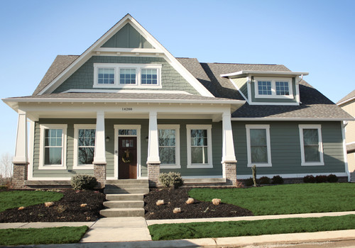
We’re thinking of painting our home this color and using white for the trim. We have a charcoal/black roof.
Do you think the color retreat as an exterior house body color would pair well with the trim color black fox? Or attitude gray is a better pairing with black fox?
Thank you!
Hi Kathie, I totally believe that you should use SW Retreat for the exterior body 🙂
I want to paint my exterior home with virtual taupe and use retreat around my windows. Will this work?
@Bev Hood, I just painted my huge house this color and it is glorious. I used it on the lower part of my house which is brick and the siding, and it looks different on both places but in a good way. Very dynamic color.
It would be too dark a combination honestly! I recommend looking for a lighter option to pair 🙂