
What strikes your mind as I call out for Oyster Bay?
I’m sure it’s seashells with pearls or any other seafood, right?
Well, have you actually tried oysters?
That green-brown color you see – Yes! That ‘green’ is where we’re going with this color, friends.
Sherwin-Williams Oyster Bay is a crisp green paint color with slight tinges of gray.
Timeless and Classic, this green has a perfect, graceful touch to it!
If you are looking for painting the walls of a Farmhouse Style home, I must say, Oyster Bay can absolutely make the cut!
However, I would recommend using it more like a mini accent! (That is my version of saying – not a bold accent, but slight tints).
Oyster Bay is not really very bold, instead, has a calm and soothing appearance.
More like a neutral and slightly aligning towards the ‘cool’ end of the scale, this color has a lot to offer to you!
But one thing is given – this color will never ever fade away!
So, if you a person who doesn’t believe in renovating your home often, Oyster Bay could be something you are looking for!
But before finalizing that, read below to know more about the timeless Oyster Bay!
Sherwin-Williams Oyster Bay SW 6206 Details and Specifications

If you are new to this field of color psychology or relatively experienced, one thing that you must know before choosing a color is the values associated with each color.
Theories such as Light Reflectance Values (LRV), RGB Values, and HEX Values are important to know!
The reason why they are important is that every color has a hidden story – Yes!
Believe me, those hidden theories will help you in deciding whether to choose the color or not, or if you are looking for that particular color, and where to actually use it!
So, are you familiar with that?
Let’s discuss the details for Oyster Bay and see if this is what you are looking for!
The LRV of Oyster Bay is 44! (1 is the darkest, whereas 100 is the lightest)

Well, this color definitely is on a darker scale!
And that means it is not going to reflect a lot of light. And rather will absorb it.
If you’re not quite sure how this color will work in your home, you should definitely try it on for size by ordering a peel-and-stick sample from Samplize.
Other associated values are: Red = 174, Green = 179, Blue = 169
HEX Value = #aeb3a9
How Does Oyster Bay Feel in a Space?
The island painted in SW Oyster Bay brightens the interiors
Undoubtedly, calm, and soothing!
Even though the LRV of the color is a smaller number, the appearances still make your room look spacious and brighter!
There is something so charismatic about this color that the moment you enter your house, you are quite likely to calm down and immediately get into your relaxation mode.
Being inspired by nature, this color has always – and will always be a trend in interior design!
Just pair them up with warm neutrals and observe the new ‘natural haven’ you created for yourself!
Now that many of us are working from home, using this color would be the best idea to reconnect with nature, once again!
How Does Light Affect the Color?

Rhoda from Southern Hospitality shares her friend Ruby’s experience of SW Oyster Bay walls in a cottage
Light does affect the color.
Depending on the artificial warm-yellows, warm-whites, and cool-whites – the color changes its appearance to be even brighter – maybe like SW Comfort Gray.
Even natural lighting affects this color by making it look light and bright.
Try this color on North-facing rooms or west evening faded sunlight.
Oyster Bay could be your possible solution both ways – now here is a trick!
In small and congested rooms, don’t hesitate to use Oyster Bay – but remember to pair it with whites and off-whites through your furnishings.
That way you can have the best of both worlds!
Meanwhile, if you have a large room, you can definitely choose Oyster Bay – alongside other bold accents.
What are the Coordinating Colors for Sherwin-Williams Oyster Bay?

Sherwin-Williams Oyster Bay is a medium-toned gray-green paint color with hints of blue in it. Yes, this calm and serene neutral paint color has truly some wonders to do!
And when choosing the best complementary hues for the palette, the task becomes somewhat easier since this is an easy color to work with.
To name a few, SW Oyster Bay can best complement the hues of creamy off-whites, beiges, taupes, greiges, midnight blue, grays, and black.
In terms of metallic accents, you must choose matte black, antique brass, oil-rubbed bronze, or even natural textures like rattan, wicker, and cane.
Here are the following two color palette suggestions – monochromatic and coordinating (cool and warm)!
Monochromatic Color Palette

The complementary colors for the monochromatic palette are as follows –
- SW 6207 Retreat
- SW 6208 Pewter Green
- SW 6209 Ripe Olive
This palette is a great way to bring nature indoors. Using the monochromatic hues of greens, this palette will undeniably make your space feel calmer and more composed.
I highly recommend that you break the monotony and choose natural textures like woods and rattan in the form of lighting fixtures and floating shelves.
Contrasting Cool Color Palette

The complementary colors for the contrasting palette are as follows (cool) –
- SW 6203 Spare White
- SW 9178 In The Navy
- SW 6218 Tradewind
This cool-toned palette embraces the use of cool sage greens and cool blues to create a calming and subtle experience.
You can further break the monotony and style with metallic accents such as matte black and satin brass to play a sense of focus.
Contrasting Warm Color Palette

The complementary colors for the contrasting palette are as follows (warm) –
- SW 7008 Alabaster
- SW 6108 Latte
- SW 9165 Gossamer Veil
Generally, it’s best to use SW Oyster Bay in a warmer-toned color palette. This way, you can achieve a warm and welcoming experience and make your room feel closer to nature.
You can also play with natural textures like rattan and cane on the baskets and lighting fixtures.
Lastly, don’t hold back from decorating with pampas grass here.
Not to worry!
I have a few tips and tricks and suggestions to choose the perfect pair for this color.
I am going to have perfect suggestions for you – both monochromatic and contrasting themes.
If you are more like a minimal person with monochromes, Oyster Bay best pairs with-
- Sea Salt SW 6204 (see my full paint guide here)
- Retreat SW 6207 (see my full paint guide here)
- Pewter Green SW 6208 (see my full paint guide here)

However, if you are more drawn towards contrasts and pops of shades and colors, pair it with the following-
- Warm neutrals like Pearly White or Pure White
- Natural Wooden Textures
- Subtle grays like Olympus or the calm and cool SW Reflection
For the trims and moldings, use SW High Reflectance White to enjoy the most of Oyster Bay!
More SW Oyster Bay Color Palettes


Sherwin-Williams SW 6206 Oyster Bay Vs. Similar Colors
There are endless alternatives to Oyster Bay!
Ok, just kidding! It is hard to find the exact same color (As I said before, they all have their own stories).
But it is still possible to find the nearest one.
Some of the similar shades are SW Escape Gray and SW Contented.
Oyster Bay Vs. SW 6185 Escape Gray

Comparatively darker but extremely similar, LRV for Escape Gray is 41.
Escape Gray is a more subtle version of Green-gray with highly cool background.
Since digital screens can be deceiving, I highly suggest you get some actual samples of these two colors from Samplize. Buy here!
Oyster Bay Vs. SW 6191 Contented

With an LRV of 52, this is a much brighter alternative to Oyster Bay!
This is more like sage green with a slightly creamy texture – that is bound to enhance your space.
Contented makes your space look lighter and much brighter than Oyster Bay.
Also, light plays a major factor here!
Contented is highly affected by the temperature and color of the light source.
To see how these look in your home, get some large peel-and-stick samples and try on your walls with different lighting sources.
By the way, if you want or more subtler green-gray definitely check out SW Silvermist – a fantastic choice that tends to appear more gray but includes some green/blue undertones.
Coordinating Decor

Sherwin-Williams Oyster Bay is the gray-green paint color that works phenomenally with natural textures like rattan, wicker, and cane.
This palette also works with matte black, antique copper, and satin brass accents.
It’s generally not very difficult to create material and fabric palettes for this color – but I am still going to recommend a few.
From furniture to decorative accessories and materials – I am going to pick the best ones for you that will perfectly vibe with SW Oyster Bay.

Here are the links to the flooring that works well with SW Oyster Bay –

Here are the links to the decorative accents that works well with SW Oyster Bay –

Here are the links to the furniture that works well with SW Oyster Bay –
Where to Use Sherwin-Williams Oyster Bay in Your Home?

Many homeowners across the world have used this color to add a farmhouse touch to their homes.
I would recommend using this color absolutely anywhere you feel like!
It has no rules and restrictions!
And since the color is admired by nature and kind of mimics it too – you should be obliged to use it wherever it is required to feel good!
And even the Exteriors!
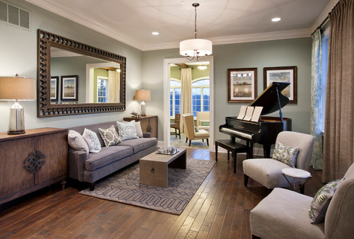
Oyster Bay in Living Rooms
Oyster Bay in the living room pairs opposite wooden textures and stark whites.
The living room should be a welcoming space. It should be able to drive the attention of your guests as soon as they pay a visit!
Oyster Bay could be used for sure – just pair it with whites, off-whites, and natural hardwood textures.

If you have wooden plank flooring or any type of gray colored floor, it is a plus!
Use white marble stone around the fireplace or simply white painted exposed brick to add a perfect rustic farmhouse touch!
Using OB in Bedrooms
Sherwin-Williams Oyster Bay best complements the whites, which is pulled off well in bedrooms.
Bedrooms are your most private spaces.
They demand to be soothing and relaxing. Well, here is another victory for Oyster Bay as all these characteristics align with what Oyster Bay has to offer.
You could use white distressed headboards with side tables, or even matte-black tinted floor lamps to attain cohesiveness!
Off-white and Browns are highly recommended too! Maybe try wooden-finish furniture?
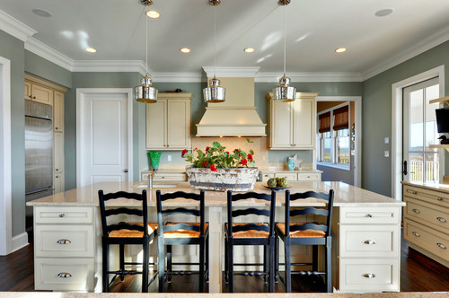
Using in Kitchens

Blogger Nancy from Artsy Chicks Rule® remodels her kitchen and paints the cabinets in SW Oyster Bay
Use Oyster Bay in kitchen areas for both ways.
If you paint your walls in Oyster Bay, then leave the cabinets in stark white or off-white and countertops in white marble or granite!
The story another way round is-
If you plan on painting your cabinets in Oyster Bay, paint the walls in white or off-white neutral with a glossy backsplash.
Use white marble countertop as well!
SW Oyster Bay in Bathrooms
Sherwin-Williams Oyster Bay is a much-recommended paint color for the bathrooms since it can further add a sense of serenity and poise.
You can either choose to paint all the walls in this color or just use it as an accent on the wall paneling, vanity, or entryway door.
Furthermore, you must consider adding natural textures like rattan and wicker on the lighting fixtures, baskets, and decorative accents.
When choosing the best white to pair, consider SW Pure White.
Oyster Bay on Exteriors
Sherwin-Williams Oyster Bay also has the potential to make a great statement on the exterior of your home.
Whether on the exterior walls or the entryway door and shutters, this color will make a great palette for the Coastal and traditional design style.
You can pair it with creamy whites on the walls and choose lemon yellow for the entryway door as well!
How to Best Sample This Color?
I can’t say enough about how easy it is to use a peel-and-stick paint sample to give a color like Oyster Bay a try. The absolute best way is to order a sample from Samplize.
You can check it out right on your wall and move it around. Also, try it along with another couple of colors to test pairing possibilities.
This is WAY easier than having to open up little cans of paint and rolling/brushing on. Forget the mess and use these helpful temporary sample squares to test location, lighting options, etc.
The Wall Locations That Matter Most for Oyster Bay
Don’t just test Oyster Bay in one spot and call it done.
This color reads differently across walls, so test it where direct sunlight hits, on walls with little natural light, and in darker corners where its cool, muted character can deepen noticeably.
Also sample it next to your trim, flooring, and cabinetry, because those relationships reveal a lot about how Oyster Bay will actually feel in your finished space.
When to Actually Look at Your Sample
Timing your observations matters enormously with this color.
I’ve seen Oyster Bay look like a completely different color between morning daylight, bright afternoon sun, and evening lamp light.
Check it under warm bulbs and cooler LEDs too, because this color’s blue-green undertones can shift in ways that genuinely surprise people under artificial lighting!
Surrounding Elements That Quietly Change Oyster Bay
Wood flooring, rugs, and fabric tones all influence how Oyster Bay reads on your walls.
In open floor plans, nearby wall colors can cast a tonal influence that pulls this color in unexpected directions.
Even outdoor views matter, since greenery outside a window can amplify Oyster Bay’s cool, natural quality in a way worth knowing about before committing.
Why a Small Chip Will Mislead You Here
Tiny swatches can’t show you how Oyster Bay behaves across a large wall area or under changing light conditions.
Samplize (link above) lets you move a large, realistic sample around the room to test every location that matters!
Give Yourself Time Before You Decide
Leave your sample up for at least two full days before deciding.
Oyster Bay’s cool, layered character means it genuinely needs to be observed through different times of day and different lighting conditions before you’ll see its full range.
My 7 Key Tips for SW Oyster Bay
1. Test Oyster Bay in natural and artificial light
Oyster Bay can read differently depending on the time of day.
I always swatch it on multiple walls and check it in morning sunlight, afternoon light, and under warm indoor lighting.
This helps me avoid surprises where the color might look too gray or too green.
Seeing it at different times ensures consistency throughout the space!
2. Pair Oyster Bay with warm wood floors
This color shines against medium to light oak or maple flooring.
I find that the subtle green undertones pop beautifully without clashing with natural wood grains.
It creates a calm and welcoming vibe, especially in living rooms and hallways.
I’ve noticed darker floors can sometimes make it feel too cool or muted.
3. Match Oyster Bay with white or cream cabinetry
In kitchens, Oyster Bay pairs perfectly with classic white, cream, or soft beige cabinets.
I like how it gives a fresh, coastal-inspired look while still feeling sophisticated.
Avoid pairing it with stark black cabinets unless you want a high-contrast, dramatic effect.
Soft cabinetry tones keep the room airy and balanced.
4. Use a satin or eggshell finish for interiors
I recommend satin for most living spaces and bedrooms.
It highlights the color’s depth without reflecting too much light.
Eggshell works well for lower-traffic areas like dining rooms or master bedrooms.
Flat finishes can dull Oyster Bay, and high gloss may exaggerate any imperfections.
5. Consider Oyster Bay for exteriors in coastal settings
This color thrives on siding or trim in beach or lakefront homes.
I love how it blends with natural stone, gray shingles, and sandy landscapes.
It adds charm without feeling overly bold.
Make sure to test on a large exterior panel first because sun exposure can shift the undertones.
6. Coordinate with soft neutrals and muted blues
I often layer Oyster Bay with gentle grays, warm taupes, or faded navy accents.
Throw in some natural textiles and it really feels cohesive and intentional.
Avoid pairing with overly bright or neon tones—they can clash with its subtle sophistication.
This is especially effective in bedrooms and family rooms for a relaxing atmosphere.
7. Prep surfaces carefully to maintain the true color
Oyster Bay shows uneven surfaces more than some shades. I always sand, prime, and fill imperfections before painting.
This step prevents patchiness and ensures a smooth, uniform look.
Proper prep makes the color look polished and professional, even in a DIY project!
A Versatile and Soothing Accent for Your Home
Farmhouse decor or not, this shade gives you options to play with.
For example, kin a kitchen paint the walls in Oyster Bay and let the door and window frames in white – or – paint the frames in Oyster Bay and let the walls be white.
Both ways, I guarantee a charming appearance!
So, has Oyster Bay been able to win your heart? Are you going to use this color for your home interiors?
Do let us know your experiences in the comments below! We would love to hear from you!
FAQs
Is Sherwin-Williams Oyster Bay Warm or Cool?
Sherwin-Williams Oyster Bay is a cool-toned gray-green color that can feel quite chilly under certain lighting conditions. Else, this color also looks creamy in the south-facing rooms!
Can Oyster Bay Work on Cabinets?
Yes, absolutely! SW Oyster Bay can definitely work on cabinets and may look quite chic and serene.
What Is the Benjamin Moore Equivalent Color to Oyster Bay?
Benjamin Moore Misted Green is equivalent to SW Oyster Bay!


Leave a comment