
One of my absolute favorites, Sherwin-Williams Urbane Bronze, is a timeless paint color with an air of luxe and sophistication.
It is a neutral dark-toned paint with deep, warmer undertones, something like brown-gray!
Well, I can’t even count the number of times I have recommended this color to my clients – since it is so beautiful and refined.
Also one of the most popular paints by Sherwin-Williams, Urbane Bronze has been declared as the Color of the Year 2021.
Deeply rooted in nature’s textures and hues, this color defines the next level to magnificence in a space.
And another feature I love is the sense of tranquility this paint exudes.
Even though it is pretty dark in tone, it may still feel quite natural and down-to-earth when used in homes.
This color is somehow associated with the features of biophilia – mimicking the ground and nature’s hues, this color is a great option if you want to add a natural touch to your home.
Its organic appeal is definitely worthy of admiration. So, you can absolutely use this color in your home – whether small or large.
Don’t worry – I have tricks and tips to share that will help you choose the best possible ways to incorporate this color in your home.
So, let’s get started with this beautiful color.
Sherwin-Williams Urbane Bronze SW 7048 Details and Specifications

Let me first start with the where and hereabouts of this color. Mainly, what it truly is and the crucial background information that defines its substance.
Remember to always consider this section of paints when choosing one for your home. Because you don’t want to mess up with your home, right?
So, let’s first start with the Light Reflectance Values or the LRVs, that helps in determining how light or dark the paint color is.
In this case, the LRV of Sherwin-Williams Urbane Bronze is 8.

Now, if you’re wondering where to find this value, well, just look at the back of the paint Swatch.
Now, if you want to try out Urbane Bronze on your walls ahead of time, you can easily with a peel-and-stick square from Samplize. Give them a try now!
Secondly, other important associated terminologies are the RGB and HEX Values that further tell us what the color is made of.
Red = 84
Green = 80
Blue = 74
HEX Value = #54504a
Now that we have discussed enough about the technical and scientific information, let’s get started with the practical aspects of this greige Sherwin-Williams paint.
How Does this Color Feel in a Space?
This color feels absolutely organic, natural, and bold when used in a space. Moreover, due to its dark tone, it feels further weighted and luxurious in a space.
Yes! I would use the words splendor and majestic to describe the color because that is how it actually appears on the walls.
I recommend any and every climate to incorporate this color – even though it has a touch of warmth and is dark and bold – you can always pair it with subtle hues to feel balanced.
Just in case you have a smaller space – use this color very wisely – mainly using it as an accent or just in tinges!
That way you get the best of both worlds! (Don’t worry, I have a color scheme ready for you later in the article)
How Does Light Affect the Color?
Light has a major role to play here!
If your room receives ample natural light, there is no doubt you should incorporate this color as it will balance the boldness with the airiness through incoming light.
On the other hand, in the absence of natural light, it may feel very dark – a shade that you will most likely not appreciate.
Hence, it is always better to analyze the incoming light in a room – especially if you prefer to choose a dark paint.
But don’t worry – you can always play with artificial lighting in the form of pendant lights, chandeliers, and table lamps to create a great ambiance.
Want to see what Urbane Bronze looks like in your own living space? Pick up a wall sample now from Samplize!
Urbane Bronze Coordinating Colors – Best Options

Now that we have analyzed the true theory behind the color, its light reflectance values, how it truly feels, and the effects of light, let’s first look at what best suits the paint color.
You can either choose a monochromatic or a contrasting color palette in this case – depending on the interior design style.
If you like more minimalism – choose monochromatic shades or else add fun colors to touch upon a specific theme.
Since it is a timeless color, I believe you can best pair it with off-whites, yellows, mustards, and cool and crisp whites.
Coordinating Colors – Monochromatic
Well, here are a few of the colors I would recommend for a monochromatic palette and the best color combinations!
- SW 9171 Felted Wool
- SW 7046 Anonymous
- SW 7047 Porpoise – I review SW Porpoise here!

Coordinating Colors – Contrasting
On the other hand, here are a few of the colors I would recommend for a contrasting color palette!
- SW 7511 Bungalow Beige
- SW 6129 Restrained Gold
- SW 6120 Believable Buff

For your ceilings, trims, and moldings – I would recommend using SW Pure White to further achieve a creamier look or else if you want a crisp look, choose SW High Reflectance White.
SW Urbane Bronze Vs Similar Colors
Even though you really need not look for other alternatives, as this color is truly one of the best in its class.
I promise this color wouldn’t give you a reason to be disappointed, but just in case, I am going to recommend considering SW 9610 Stony Creek and SW 7020 Black Fox.
Urbane Bronze Vs Stony Creek

Solid and crisp, Sherwin-Williams Stony Creek can be a great alternative to Urbane Bronze. It has deep gray-brown undertones that help make the color look luxurious and sleek.
With an LRV of 9, this paint color is equally dark in tone. Hence, you can absolutely use this color – anywhere in your home.
However, this is only an ‘interior only’ paint so remember not to use it on the exterior walls.
Order a stick-on sample of Urbane Bronze and Stony Creek to see what works best in your home.
Urbane Bronze Vs Black Fox

Warm-toned black and brown, this paint color can be a perfect alternative to Urbane Bronze. However, it is more inclined to black than luxe browns.
With an LRV of 7, this paint color is quite dark in tone. So, you can absolutely use it if you are craving a bold and daring backdrop at home. See my full rundown of SW Black Fox here.
Since digital screens can be deceiving, I highly suggest you get some actual samples of these two colors from Samplize. Buy here!
Where to Use Urbane Bronze in Your Home?
You can use this color in all the common spaces such as family, living, and bedrooms, along with the kitchen.
Especially for interior design styles like Minimalism, Mid-Century Modern, Contemporary, Scandinavian, Transitional, and Modern Farmhouse – this color is absolutely good to go.
Let’s see where and how to incorporate this beautiful bronze color in your home.
Urbane Bronze in Living and Dining Rooms
If you are looking for a cozy and elegant touch to your home, this color is definitely a great option. You can pair it with warmer neutrals and yellows or mustards as accents.
Remember to pair it with neutral upholstery and white sheer curtains to add a bright feel to your living room. Moreover, adding mustard throw pillows, artwork, and rug would further add a pop of contrast to your living room.

You can also keep it neutral by choosing off-whites and warmer beiges along with the monochromatic shades to exhibit a modern and minimal touch to your living rooms.
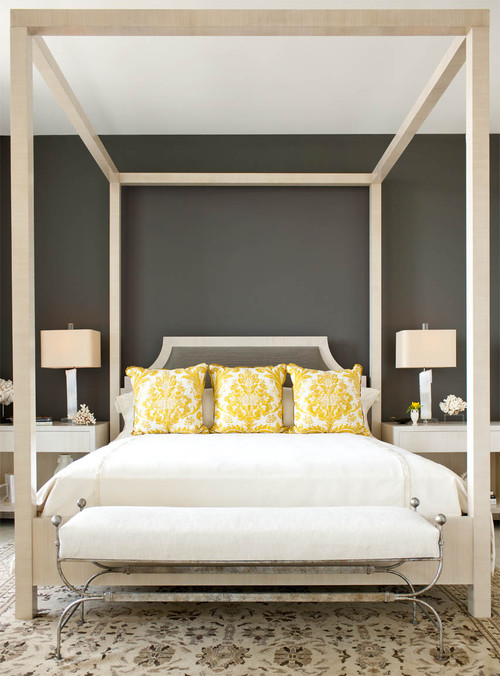
Using in Bedrooms
I would recommend using this color only on a single wall or the headboard wall to feel the most of this color.
It is definitely going to reflect a pure organic touch to your bedroom. As an addition, you can add tall fig trees or succulents to further facilitate biophilia.
In case you have a large room, use this paint on all the walls and use lighter accents to balance the saturation in the room.
Urbane Bronze in Kitchens
Urbane Bronze kitchens are the best! They are sophisticated, elegant, and totally welcoming.
You could either paint the cabinets in this color or let the backdrop wall be in Urbane Bronze. To add a pop of contrast, add golden tints through pull handles and fixtures to further add a refined touch to your spaces.
I would recommend this color in kitchens that have an open space planning – because the paint is going to add a sense of ‘weight’ in your kitchen.
Using on Exteriors
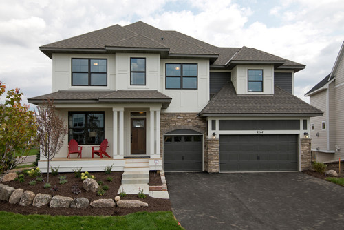
A great option for Contemporary and Mid-Century modern homes, this color is absolutely recommended for exterior walls.
If you are planning to use Urbane Bronze on the exterior façade, it will tend to appear much lighter than it already is! (of course, due to excessive natural light)
Pair it with white or off-white shaded trims and moldings!
Yes – that way you make a great contrast in your home exteriors! Also, you can do the other way round, by using pure whites on the decorative moldings!
How to Best Sample This Color?
Here’s my favorite tip when it comes to testing out a color like Urbane Bronze – go and order a peel-and-stick sample from Samplize.
This little company has nailed down the best way to sample colors much more easily. Simply stick on a 12″ x 12″ square instead of having to get a small can of actual wet paint on your walls.
For a few bucks you get a big enough sized sample to evaluate anywhere you want to “try” on a paint color and any possible coordinating hues you like.
It’s temporary, so move it around and test location and lighting options.
My 7 Key Tips for Urbane Bronze
1. Let Urbane Bronze’s Warm Undertones Guide Your Trim Selection
Urbane Bronze carries rich green and brown undertones that respond beautifully to warm off-white trim colors like Sherwin-Williams Creamy or Antique White.
Avoid bright, stark whites as trim because they create a jarring contrast that fights against this color’s warm, earthy character.
2. Pair Urbane Bronze with the Right Flooring for Maximum Impact
Medium to dark hardwood floors in walnut or espresso tones create a stunning, grounded look alongside Urbane Bronze.
I’ve seen light gray or cool-toned flooring pull this color in an unflattering direction, so warm-toned floors are genuinely the safer and more rewarding choice here!
3. Use a Satin or Semi-Gloss Finish on Exterior Applications
Urbane Bronze is an exceptional exterior color, and a satin finish helps it hold up beautifully against weathering while maintaining its deep, rich appearance.
A flat finish on exterior surfaces can make this color look dull and strip away the depth that makes it so visually impressive.
4. Consider Cabinet Color Carefully Before Committing
Urbane Bronze walls pair beautifully with natural wood cabinetry in warm oak or walnut tones, creating a layered, organic feel that feels intentional and current.
I’d steer clear of white or gray painted cabinets alongside this color, as they tend to make Urbane Bronze feel heavier and more oppressive than it actually is.
5. Test This Color in Your Specific Lighting Before Buying
Urbane Bronze shifts noticeably between natural daylight and artificial evening lighting, moving from a warm khaki-green to a deeper, moodier brown.
Testing a large sample on your actual wall is absolutely essential before purchasing full gallons!
6. Use Urbane Bronze Strategically in Open Floor Plans
In open layouts, I recommend using Urbane Bronze as an accent wall color rather than wrapping every surface, as it can visually compress larger spaces when overused.
A single featured wall lets this color make its statement without overwhelming the room.
7. Coordinate Your Metal Finishes Thoughtfully
Brushed gold, aged brass, and oil-rubbed bronze hardware and fixtures are natural partners for Urbane Bronze and reinforce its warm, earthy sophistication.
Cool chrome or nickel finishes compete directly with this color’s warmth and tend to make the overall space feel disconnected and unresolved.

Hi, I’m wondering if urban bronze exterior trim with basalt colorbond roofing and dune wall colour ? Thanks
Hi Pam, it would be an “okay” consideration. Contact me, and we can discuss other options you may like better.
Great post! I’m thinking of using Urban Bronze for my casing. I have SW Greek Villa on my walls. I’m tossing around Black Fox as well…. do you have any advise with past projects in pairing Greek Villa?
Hi Michael, SW Urbane Bronze pairs wonderfully with SW Greek Villa! So, I highly recommend that combination 🙂
Hi! I’m building a townhome, and the builder chose SW First Star for the entire home along with ‘Brite’ White trim. I have an open living/kitchen/dining on the second floor. The kitchen cabinets are bright white with matte black hardware.
I want to use Urban Bronze for an accent wall in the living and dining rooms. However, I’m concerned First Star will clash (it’s so cool toned).
What is your opinion? Will it look okay?
If I can convince the builder to pick a different color white, something more warm, perhaps, which SW white should I request?
Hi Felicia, I highly believe that you shouldn’t pair SW Urbane Bronze with SW First Star since it will simply clash the tones. Yes, you should definitely pick a warm-toned off-white.
If I was going to use urbane brown as trim for exterior or fascia and French doors what color would be good for the exterior walls of the house. I was thinking ivory or cream but maybe that is too sharp a contrast
Hi Kay, You can absolutely use an off-white like SW Alabaster or SW Neutral Ground on the major exterior walls. This contrast is worth the try 😉
Hello,
I have been struggling to find an accent color for my Front door and Shutters. My home is a taupe and greige brick with taupe vinyl accents and black roof. I have found that any color can look dated if too dusty and if too lush can be too loud and I really don’t want to have it look bland. I feel like this could be the answer from the decor gods from above. What’s your opinion? Love your blog btw!
Hi Juston, you can choose a dusty red or burnt orange paint color to spark a sense of joy to the exteriors. Particularly, SW Baked Clay or SW Rojo Dust would play flawless.
Hi – How about Shiitake on the exterior with Urbane Bronze for the trim/doors?
Hi David, I would say that this combination wouldn’t be bad. But you could also pick a lighter neutral to make the best, cohesive combo!
Hi there! I really want to incorporate this color into our modern/southwestern Arizona home. We have off white walls everywhere and tons of light. How do I pick the right accent wall when they’re all so big?
Thank you!
Hi Ann, this accent would play lovely in your home. However, how do you define big? What’s the size/dimensions of the walls?
Hi! I love your site and your info! I’m deciding between pairings: SW Peppercorn (accent wall) and SW Snowbound (per your suggestions) or SW Urbane Bronze and a white neutral. Which SW white would you suggest for contrasting walls?
Thanks!
Rebecca
Hi Rebecca, I am glad you like the content 🙂 However, I would first need to know as to where do you plan to use this combination? Interiors or Exteriors? In general, it also depends on your interior design style – so, let me know what you’re exactly looking for 🙂 And I can help you forward!
Clarification: which SW white pairs well with Urbane Bronze? :). Thanks!
Hi Rebecca, SW Shoji White will make a great pair. I have recently used that for one of my projects!
I love Urbane Bronze and plan on having my house exterior painted this color! I was thinking of painting the trim an even darker shade than the urbane bronze. Would that be a mistake?
Hi Maggie, SW Urbane Bronze on the exteriors would be lovely! However, painting a darker trim might be a mistake since it might blend with the paint! So, I recommend choosing a lighter tone there!