
Unlike many other organic compounds, Carbon comes with a wide array of colors and shades.
Do you remember something from high school?
Carbon is one of those famous members of the periodic table that has an entire branch of Chemistry associated with it.
Well, carbon is found in all living organisms.
It should come as no surprise that it’s often referred to as the King of Elements – but are you wondering, what color is carbon?
It’s Grayish black!
Sleek, shiny black.
However, it may not really feel too black as sometimes it can be inclined towards grays, browns, and blues as well.

But these variations are just the faces of this color, you see. Just above are two grades of coal from a mine in New Zealand – both are organic carbon colors!
You’ve no doubt noticed years ago – offices used carbon copies to duplicate their documents that are usually in black or blue.
You can very easily produce this color by equally mixing parts of black and white or cyan, magenta, and yellow!
Sometimes mixing browns and blue can also result in a rich shade of black and gray.
And just in case if you are wondering where the color black or gray is on a color map or wheel – well, let me tell you, it’s not included in the spectrum necessarily.
A color wheel generally expresses tints, tones, and shades of a hue.
Are you looking to add tinges of carbon black-gray in your home?
Well, it can be quite mesmerizing and sleek at the same time – but this is no doubt a timeless color as you see it used through time and even today.
So, let’s see what the carbon color has to offer!
A King of Elements – Carbon Black

Let’s first discuss the basic specifications and details of this color category!
Remember, every category is associated with certain underlying theories and facts that make it equally unique and distinctive!
Whether it is the pure blacks, brown blacks, blue blacks, or darker browns – there is some specification that differs all of them.
Yes, they are all somehow related to each other – but far different in terms of specifications.
Whether it is the undertones or the certain RGB values that describe what the color is composed of, here are certain terminologies to look upon!
Also note, light reflectance values can differ for each typology and face!
Pantone Code= Pantone 447 C
Cyan= 0%
Magenta= 0%
Yellow= 0%
Black= 80%
Red= 20%
Green= 20%
Blue= 20%
Carbon Color Code (HEX) = #333333
Blacks are symbolic of utmost timelessness, luxury, and sophistication.
And with carbon black, the result is even more shiny, glamorous, and majestic!
These above-mentioned percentages will help you in the classification of the color and how it is truly made!
The Three Faces of Carbon – Gray, Black, and Brown

There are endless ways to express the tones of Carbon.
And in this case, there are three major faces.
Furthermore, these faces can be categorized as the tints, tones, and shades of any visual color.
In some cases here, undertones play a major difference.
So, here are some basic color terminologies that I want you to read through.
‘Tones’ are basically the results formed by adding gray to a black paint color!
The result is a more muted and not true black paint – well, something like carbon black itself.
‘Tints’ on the other hand are the amalgamation of white with a black paint color.
The result is something like darker or lighter grays depending upon the amounts of proportions mixed.
Whereas ‘Shades’ are the results formed by adding some black to black paint color.
The result is a true black paint color!
Diving deeper into these details and these faces – let me acquaint you with these 3 prominent faces of carbon!
Gray Carbon

Majorly inclining towards the grays, this tone of carbon is quite timeless and authentic!
Predominantly ruling the gray background, it proves flexibility in terms of pairing with complementary shades.
Furthermore, it has very low reflectivity and very bold appearances – thus, great to be used on accent walls and accent furniture.
You can best pair Gray with yellow (Ultimate Gray and Illuminating) which is also Pantone’s color of the year 2021.
Black Carbon

A true hue black, carbon exists in one of the most interesting forms.
It symbolizes utmost glamor, sophistication, and majestic appearances – and most importantly, you can pair it with any and every hue.
However, you must know that depending upon the interior design style, you can always pair this color with the most unique tones.
And remember, this dark and bold color should only be used in tinges!
Brown Carbon

Browns in themselves have various faces!
Some are darker beiges, some bronze, and some chocolate, amber, and chestnut.
However, this tone of carbon is quite commonly used – and also available in abundance.
The best way to incorporate this tone is by simply pairing it with mustards, off-whites, wooden textures, and even certain glass metals.
Similar Colors
Now that we have discussed the three notable faces of the color Carbon – let’s get talking about the similar colors that are closely related to the faces of Carbon.
So, the first of them is Outerspace!

This grayish-brown tone of Carbon is quite royal and timeless.
The undertones here are majorly inclined towards the grays than browns or black!
Next in the line is Black.
Truly what the name represents, this is a true hue on the palette.
Reflecting neither gray nor brown undertones, this shade reflects strength, boldness, power, and mystery.
Let’s discuss the next one – Eggplant!

With slightly brownish and red undertones, this particular color reflects a very unique tone.
The hue present in the color gives it a slight character – that has the tendency to play a great accent!
And lastly, Gray is something to have an eye on.
It is beautiful, timeless, sophisticated, and absolutely charming.
You can pair it with most of the hues for a perfect contrasting look. And since it is not too dark nor too light – it offers the best of both worlds.
Coordinating Colors

Now, that we have discussed that carbon basically lacks brighter hues, it becomes even easier to create a contrasting color palette.
You can either choose a monochromatic theme and use lighter or darker grayish blacks from the same family or go for a contrasting vibe with other vivid colors!
Generally, it might differ from tone to tone but there are some hues that will complement all the shades of carbon.
For instance, colors such as whites, off-whites, yellows, pinks, and greens would look seamless and beautiful with the shades of carbon.
In the case of materials, try choosing wood, metals, glass, and even macrame or rattan for a bohemian touch.
Don’t forget to add off-whites and whites to neutralize the color saturation.
Carbon Basics
Carbon appears to be accompanied by its own color palette.
Carbon, unlike every other atom, comes in three different colors depending on where it comes from.
Carbon in color is dark and emotionless that conjures up images of dinginess, as well as formality, conservatism, and sophistication.
It’s a classic and useful color that’s typically connected with sadness or loss.

The Apache Tears stone comes to mind.
Formed in lava from volcanic ash, the obsidian-black stone was named for weeping Apache wives after they were saddened by the news of their fallen husbands in battle.
Dark charcoal gray conveys some of the mystery and intensity of black. It’s a refined color that doesn’t have the same negative connotations as black.
Carbon black, on the other hand, appears black because it reflects extremely little visible light and has an albedo close to zero.
Carbon’s color range also includes a tint called brown.
Brown carbon absorbs most of the spectrum’s blue light. It scatters sunlight, resulting in less evaporation from bodies of water.
Birth of Carbon

Humans and carbon have been together since the dawn of time.
Smoke appeared when cave inhabitants built a fire, and gets its black hue from unburned carbon particles.
Smoke may have accumulated as soot on early hunter gatherers’ cave ceilings and even inside ancient stone buildings.
Carbon black, on the other hand, is a generic term for blacks formed from the partial combustion or carbonization of natural gas, oil, wood, vegetables, and other organic matter.

Carbon fiber is being used in a variety of aircraft, from helicopters to gliders, fighter jets to microlights, to increase range and simplify maintenance.
The aircraft sector consumes 30% of all carbon fiber.
In 1864, an American procedure for creating a black that was better suitable for watercolor was invented.
The smoky flame produced by natural gas combustion was first used to cool whirling metal drums.
Scrapers were used to remove the black deposits off the sides of the drums.
The resulting powder had a finer grain than conventional blacks, which made it easier to spread in watercolor.

Carbon in Global Cultures
Carbon in amorphous forms has a wide range of applications.
Inks, pigments (paints), rubber tires, stove polish, typewriter ribbons, and phonograph records all contain black.
Activated charcoal is a type of carbon that is used to make a variety of products. The term activated refers to charcoal that has been finely powdered into a powder.
Activated charcoal, for example, eliminates color and odor from oils, water solutions and even contaminants from our teeth.

Automobiles are also increasingly using carbon fiber.
Although supercar bodywork is being manufactured presently, internal components such as instrument housings and seat frames are more likely to be used.

The result is a whole brand of style that combines both strength and prestige into one.
Using Carbon in Home Decor
Now this is something you shouldn’t wait for!
Incorporate tones of carbon in your home and feel absolutely delightful, luxe, and elegant.
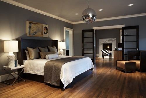
Whether it is the accent walls, base color walls, furniture upholstery, decorative accessories, or the color on the doors and windows as well – this color will always play contrast and add that bold and eye-catchy statement.

Additionally, carbon gray or carbon black are quite timeless and flexible to use.
Whether it is a bold accent for the Contemporary, Modern, or Mid-Century setback or a must contrast for Eclectic and Scandinavian – this color family will never disappoint you.
If you are looking for real-time paint samples from famous manufacturers – I am going to enlist the two examples from Sherwin Williams and Benjamin Moore!
Peppercorn by Sherwin Williams and Kendall Charcoal by Benjamin Moore are notable examples.
However, you must know that there may be some notable differences here as well.

For instance, Sherwin Williams Peppercorn feels more inclined towards the grays and has that slight steely feel to it inmost lighting situations.
And that makes it quite close to the gray carbon category for the most part.
However, add some nature colors around it (green leaves or even fall leafy hues), and it can move to a warmer appearance.
See my full SW Peppercorn guide to find out more!

On the other hand, Benjamin Moore Kendall Charcoal is darker and more refined.
Even though the two shades share quite a few similarities, they tend to still have some differences due to reflectivity.
You can also paint all the walls in this color in the case of larger or medium-sized spaces.
Otherwise, an accent wall plays the best!
See my full BM Kendall Charcoal guide to find out tons more!
Carbon on Interior and Exterior Walls
Gray carbon on the walls plays absolutely marvelously!
Depending upon the size and perspective of the room, you can paint all the walls in this specific color.
And if you really like the feel of wall moldings and panelings – try best to pair it with white or off-white accents.
Carbon is generally related to modern, mid-century modern, and contemporary styles.
Have a look at the exterior walls and facade here!
Isn’t that totally timeless?
So, if you’re looking to have carbon on the facade as well – don’t hold back!
Carbon on Furniture – Bold and Modern
This will never disappoint you!
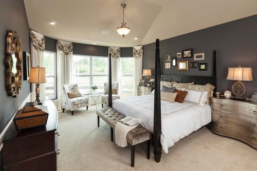
Painting the bed frames and chair frames in this particular tone will rather add depth and character to your rooms.
So, you always have the opportunity to paint the walls in a lighter tone and use this dark color for the accent furniture.
Else, let the upholstery speak.
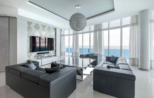
Another great way to splash carbon colors is through the upholstery.
One such classic example is the contemporary-style penthouse above!
Carbon on Cabinets
Whether in the kitchen, living room, dining room, or home office – painting cabinets in carbon is something I definitely recommend.
It will exhibit a classic, modern, and transitional appearance.
Furthermore, you can always pair it with nickel, gold, or chrome pull handles and fixtures.
Carbon on Accessories – Details and Specifications
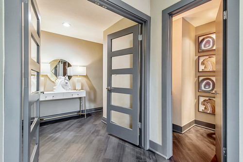
If you don’t want carbon to play a dominant character in your space – you can always add tinges of it in the accessories.
Whether it is the curtains, consoles, throw pillows, mirror frames, or rugs – carbon on decorative accents will play flawless.
For instance, have a look at the brick mold painted in tones of Carbon here!
Whether you plan to choose a monochromatic or contrasting scheme – accessories are something that you must look forward to!
Aren’t the shades of carbon absolutely stunning?
Well, let’s check out some of these pieces that would make a lovely carbon accent in your home.

Carbon curtains would definitely grab the attention of your guests while helping you have a sound sleep.
Whether it is the living room, bedrooms, hallways, and dining room – don’t hold back from curtains in a gray tone.
Secondly, another great way to infuse tones of carbon is through soft and cozy cushions and pillows.
And you know the best part?
They are timeless! And can play seamless in all the interior design styles.

Not necessary that you always use monochromatic carbon – well, sometimes you can even add metal tints in your decorative accessories.
Summing it Up
The use of Carbon in the home decor industry is endless.
Especially for the Scandinavian, Modern, Transitional, Traditional, and Contemporary interior design styles – this color is absolutely flawless.
And, let me tell you that you will always enjoy the existence of this shade in your home – whether it’s the furniture, upholstery, or lighting.
So, now that you know a bit about what color carbon is – are you excited to incorporate this tone in your own projects?
I would love to know your thoughts on this article, so please comment below!




Leave a comment