
We’ve discussed SW grays in the past, but it’s time to throw light upon a beautiful and soothing gray-green paint color.
This color is bound to enrich your homes with utmost sophistication and balance. So, here it is, Sherwin-Williams Silver Strand.
This cool-toned neutral has deep green undertones with a touch of gray, making it more subtle and soothing.
So, if you’re looking for a paint color that is mesmerizing, pretty, and green and yet not-so-green, then this is probably one of the best options!

Symbolic of peace and nature’s own hues, this color can also be incorporated in homes that crave a natural feel or a feel within the woods!
Well, this is why I recommend this color to most of my clients residing in cities and busy towns.
As it particularly creates a vision of nature, there is no doubt this paint adds serene vibes to your homes while exhibiting a perfect tranquilizing effect.
However, regardless of the beauty, I must tell you that this color could be hard to handle!
Its undertones could be confusing enough to play with the incoming light and complementary colors – and that is why I recommend reading the rest of the article very carefully!
I am spilling tons of beans here – so, sit back and relax!
Time for some fun.
Sherwin-Williams Silver Strand SW 7057 Details and Specifications

Before choosing a paint color, it is crucial to understand what the color is truly made of and what story it has to offer.
Remember, every color is different – even though they appear ‘similar’!
So, first and foremost, look at the back of your paint swatches to determine the Light Reflectance Values or the LRVs, of the paint color.
This value helps in determining how light or dark the paint is – remember, the greater the value, the lighter the paint.
So, the LRV of Sherwin-Williams Silver Strand is 59. And that means it is a mid-to-light-toned paint color.
Want to try this color out without having to paint your wall? Use some nifty peel-and-stick samples: Pick one up now from Samplize!

Secondly, other important associated terminologies are the RGB and HEX Values that further tell us what the color is made of.
Red = 200
Green = 203
Blue = 196
HEX Value = #c8cbc4
Now that we have discussed enough about the technical and scientific information, let’s get started with the practical aspects of this gray-green Sherwin-Williams paint.
How Does this Color Feel in a Space?
Undoubtedly, this paint feels airy, light, comfortable, serene, pure, and laid-back when used in homes!
Especially for the warm and tropical states – this color is absolutely good to go! Rather, it will help create a cool and tranquilizing effect that will make you feel calmer after a long hard-working day!
Moreover, you can also incorporate this paint in smaller to mid-sized areas to create an illusion of a larger space.
However, use this only if you specifically like it – else, there are plenty of other pastels and off-whites that you could use.
It is also proved that this particular type of paint tends to release stress from your minds. Well, who wouldn’t like it, right?
How Does Light Affect the Color?
Like I said, this color is pretty difficult to handle in some situations.
And those situations mainly involve the incoming natural light in a room. So, it is time to look around and observe – is there sufficient incoming light in your space? Or is it too little?
Well, I am asking this because the light tends to play a major role in this particular hue.
Since it has a blend of both green and gray, the outcome can really be confusing under specific lighting conditions.
I recommend using this paint on east and west-facing walls since the incoming warmer rays will neutralize the existing cooler vibe of the paint.
As I already mentioned, do yourself a favor and get some wall samples to test out this color and any others. The stick-on kind is a no-brainer from Samplize, and will give you some answers ahead of time. Get yours now!
What are the Best Coordinating Colors?

Choosing the best complementary colors is just as important as choosing your main paint color.
Remember, if you mess up with these palettes and schemes, it can throw off everything in your home. So, I will recommend a few options that you could consider pairing up with this green-gray paint.
First and foremost, you could either choose from a contrasting or a monochromatic color palette – depending upon your interior design style.
In the case of contrasts, you could choose to pair with emerald greens, off-white, lighter and darker greys, and in some cases, a tinge of brown.
Well, here are a few of the colors I would recommend for a monochromatic palette!
- SW 7059 Unusual Gray
- SW 9164 Illusive Green
- SW 7060 Attitude Gray

On the other hand, here are a few of the colors I would recommend for a contrasting color palette!
- SW 7004 Snowbound – see my guide on Snowbound here
- SW 6080 Utterly Beige
- SW 6003 Proper Gray

For your ceilings, trims, and moldings – I always recommend giving SW Pure White a try to further achieve a creamier look, or if you want a crisp look, choose SW High Reflectance White.
SW Silver Strand Vs Similar Colors
Sherwin-Williams offers tons of other gray-green paints – however, there may still be some variants that set all of them apart from each other.
To name a few, the two most similar-looking color options are SW 6197 Aloof Gray and SW 7651 Front Porch.
Silver Strand Vs Aloof Gray

With an LRV of 58, this cool-toned green paint color shares similar reflectivity values but differs majorly in undertones and depths.
This color reflects more green and that is why it is not as confusing as SW Silver Strand! So, you can simply pair it with neutrals and off-whites to create a perfect contrasting palette.
You can also use this as an accent!
Buy some wall samples of each of these colors to easily compare them right in your home.
Silver Strand Vs Front Porch

One of my favorites, SW Front Porch, is another gray-green paint that you might want to consider in your home.
It has an LRV of 60 – making it the lightest of them all – and simply, one worthy to be used in subtle and relaxing homes and spaces.
See how these colors compare in real time with stick-on wall samples from Samplize.
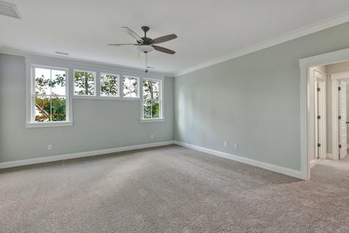
Where to Use Silver Strand in Your Home?
You can use this paint anywhere in your home, even in private spaces such as bedrooms and common spaces such as balconies and living rooms.
Another magic played by the paint would be in Coastal, Cape Cod, Scandinavian, Modern Farmhouse, and Contemporary-styled homes.
Let’s see where and how to incorporate this beautiful gray-green color in your homes.
Silver Strand in the Living and Dining Room
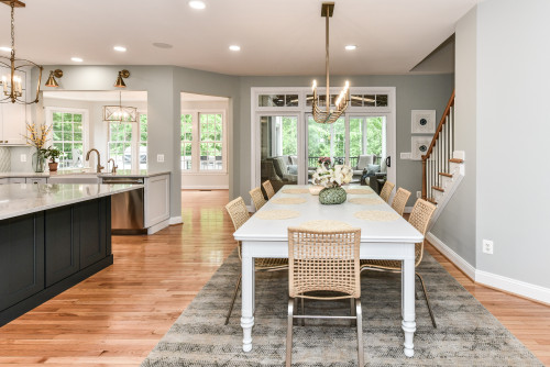
If you want a serene environment in your common spaces, this color is highly recommended!
You can either use it as an accent and paint your entire walls in this paint, or use molding and paneling to highlight this paint on a specific section of your wall.
I would highly recommend using this paint with creamy whites and off-whites. Furthermore, you can add glossy granite or marble around your fireplace and mantel and leave the base and neutrals in warmer whites.
In terms of furniture, you can either add traditional-style wooden dining tables and sofas or something extremely sleek, like a glass coffee table with clean edges.

Using in Bedroom and Bathrooms
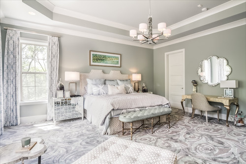
Bedrooms are spaces where this paint definitely leaves a great impression.
You can either choose to paint all the walls in this or simply choose the focal wall or the headboard wall in this color. Pair with white and gray upholstery and place a few mirror pieces to further add charm.
Also for the material of your bed frames, you can choose beige or gray velvet and suede to add a touch of glam.

Plus, to create a cohesive touch, you can also continue this hue in the bathrooms and pair with some darker hardware and dark finished wood.
Silver Strand in the Kitchen
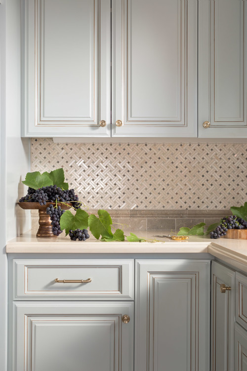
Who loves soothing kitchens? Or should I say kitchens embellished in green?
Well, let me introduce you to this beautiful hue on your kitchen cabinetry! It is subtle, smooth, and extremely cheerful when used in kitchens.
You can always add white, darker greens, and grays along with brushed nickel for your kitchen equipment and fixtures.
This paint is also good for hardwood floors, as well as ceramic tiles. I especially like this as a wall color for gray flooring.
Using on Exteriors

Especially for Contemporary and Cape Cod exteriors, this color is a great option for your exterior walls.
You can either pair it with white or grey accents through trims, moldings, and door and window frames.
If you are planning to use Silver Strand on the exterior façade, it will tend to appear much lighter than it already is! (of course, due to excessive natural light)
Want to Sample This Color Easily?
Grab a sample of Silver Strand at Samplize to quickly and easily try it out in your living environment.
You Should Order Samples of Silver Strand
Let’s face it, good paint isn’t cheap. While painting is a relatively inexpensive, good bang-for-your-buck project, picking colors can be hard. You don’t want to buy a whole can of something until you know for sure.
So together with the info here, you can literally “see” what this color will look like in your home before you commit.
Getting a peel-and-stick sample from Samplize is the best thing since paint rollers!
If you don’t know yet, you can order a 12″ x 12″ square sample with the real paint color on it. Stick it on your wall multiple times and in multiple places to find out exactly if the color is for you.
My 7 Key Tips for Silver Strand
1. Watch for the green shift in south-facing rooms
Silver Strand is famous for being a chameleon color that shifts between gray, blue, and green.
In rooms with warm southern light, I always see that green undertone become much more prominent.
If you want it to stay a true silvery blue, save this color for your north-facing spaces.
2. Pair it with crisp white cabinetry
When using this color in a kitchen or bathroom, you have to be careful with your cabinet choices.
Creamy whites or off-whites will look dingy next to the cool crispness of this paint.
I highly recommend pairing it with a pure, stark white cabinet to make the wall color look incredibly fresh!
3. Avoid warm orange or red wood flooring
The cool blue and green notes in this paint clash heavily with warm flooring.
If you have traditional cherry or honey oak floors, this color will fight against them and look completely out of place.
Instead, it looks absolutely stunning next to cool-toned luxury vinyl plank, pale white oak, or very dark espresso wood floors.
4. Create a spa retreat in bathrooms and bedrooms
This is one of my absolute favorite colors for spaces meant for relaxation.
The muted cyan undertones bring a calming, coastal energy that is perfect for a primary suite.
Just keep your bedding and towels bright white to maintain that high-end resort feeling.
5. Be cautious with full sun exterior applications
If you paint your entire home exterior with this shade, the bright sunlight will wash it out.
It will end up looking like a stark, blinding white rather than a soft gray.
It works much better as an exterior accent color on shutters or painted on a covered porch ceiling.
6. Stick to daylight bulbs for artificial lighting
Warm yellow lighting will completely distort the beautiful silvery tones of this paint.
Standard soft white bulbs turn the color into a muddy, yellowish green at night.
Swap your bulbs to a crisp daylight temperature to keep the color true after the sun goes down!
7. Use a flat or matte finish to hide wall imperfections
Because this color reflects a decent amount of light, a satin or eggshell finish will highlight every bump on your drywall.
I prefer using a high-quality matte finish in living spaces to absorb the light.
This gives the walls a velvety appearance and makes the subtle color shifts look much softer.

Leave a comment