
It’s a given that you’ll need some “white” or off-white paint every time you’re planning a home update or redesign.
Well, white is definitely one of the most important and popular categories.
Whether it’s your trims and moldings or door and window frames – whites come with a full bag of tremendous opportunities.
Also, they have the potential to reflect the true hue and saturation of your adjacent accent color. This is important!
So, here’s what I have for you today…
Let me introduce you to Sherwin-Williams Eider White!
Just like any other white, this color is pure, calm, beautiful, and relaxing. And, it will do a wonderful job at playing a great base or neutral in your home.
But let me tell you – using this color might have some challenges!
(Let’s say it can be a bit tricky to use correctly)
This off-white is not clear-cut like SW Pure White (a true white), nor SW Alabaster (warm and creamy).
Rather, it’s an off-white with undertones aligning towards grays. You might sense a coolness about it as a result, but in reality it might actually look warmer in certain environmental conditions.
So, if you compare a swatch of SW High Reflectance White with SW Eider White, you’re quite likely to detect a grayish undertone.
But remember, it’s a gray that is not too cool as well.
Don’t worry, we’re going to dig in and unravel all there is to know about this color so you can decide if and how it can best work for you.
Let’s go!
Sherwin-Williams Eider White SW 7014 Details and Specifications

We’ll start with some basic technical info so you can see a bit more where this hue comes from.
Every color comes with its own theories, specifications, and schemes!
If you are new here, let me tell you, there are quite a few facts and scientific terms that you would want to acquaint yourself with. (Before choosing a paint color for your home)
It’s important to analyze these values and then determine where, when, and how to use these paints!
So, first and foremost, one of the most important terms that I usually observe getting ignored is Light Reflectance Values (LRV)!
Every color has an associated Light Reflectance Value!
For Eider White, the LRV is 73!

Which is undeniably light!
Remember, the higher the value, the lighter the paint color is!
And vice versa!
This is almost neither too cool nor too warm off-white with gray undertones.
And don’t be disappointed if you detect a pinkish undertone sometimes!
Oh, if you want to just try Eider White so you’ll know just how it’ll look, you can easily do so with a peel-and-stick sample from Samplize. Order some samples now!
Moving ahead, let’s discuss the RGB and HEX Values of the color.
Red = 226
Green = 222
Blue = 216
HEX Value = #e2ded8
Now with all that, I promise not to bore you with these scientific details anymore.
Let’s talk about the practical aspects of this tricky off-white color.
How Does This Color Feel in a Space?
Sherwin-Williams Eider White will make your space look calm, relaxed, spacious, and utterly smooth and serene.
Whether it’s a small-sized bedroom or a large living room, this color has the potential to look stunning in all of these spaces.
Apart from this, you will never be disappointed if you plan to use it as a neutral, base, or even an accent.
So, in case you want to achieve a spacious appearance, Sherwin-Williams Eider White would be a smart decision.
I wouldn’t restrict you from using this paint in different compass directions – so, feel free to incorporate it in north, south, east, or west!
However, you must know that it will appear slightly altered!
How Does Light Affect the Color?
Light (natural or artificial) indeed highlights the actual saturation and shade of color!
The more natural or artificial light entering the home, the brighter your space will be (regardless of the LRV of the wall paint)!
Hence, in the case of SW Eider White, more light means a lighter appearance of the color.
With excessive natural light in the room, this color will even tend to wash out the gray undertones!
On the other hand, in a room with little natural light, it may feel flat.
Nevertheless, you can always play with artificial light in the form of pendant lights and wall sconces!
Here, you can also use warm whites to perfectly neutralize the saturation!
To truly see what your home’s environment and lighting will do here, try out a real paint sample. It takes out the guesswork!
What are the Best Coordinating Colors?

Creating color palettes can be quite a fun task to do. (And that is one reason I love to color consult and E-Design)
So, you need to choose the best complementary colors in order to define a palette that looks eye-catching and seamless.
So, whites are apparently quite easier to deal with!
They don’t really restrict you much. (Of course, undertones can be quite a question sometimes)!
But other than that, you have a wide plethora of color opportunities and options to pair with!
However, you have to be careful as to what vibe you need in your space for a perfect color combination.
So, I am going to enlist the two most popular color schemes here – monochromatic and contrasting.
Monochromes are generally great for modern and contemporary setbacks.
On the other hand, Eclectic, Mid-Century Modern, and Farmhouse play well with contrasts.
Hence, in this case, you can pair this particular white with browns, taupes, and greiges for a transition and traditional backdrop.
Else blues, yellows, and reds for something contrasting, Mid-Century, and Eclectic!
So, here are a few of the colors I would recommend for a monochromatic palette!
- SW 7015 Repose Gray
- SW 7016 Mindful Gray
- SW 7017 Dorian Gray

On the other hand, here are a few of the colors I would recommend for a contrasting color palette!
- SW 7665 Wall Street
- SW 6009 Imagine
- SW 6120 Believable Buff

For your ceilings, trims, and moldings, SW Extra White or SW Pure White will help protrude a true hue of SW Eider White.
SW Eider White Vs Similar Colors
This is one of the hardest questions.
There are so many colors that resemble Eider White that I myself get caught up in confusion most of the time.
Although you must know that even though they look similar, they still might differ in the undertones or reflectivity!
It’s generally best to pair these off-whites with true white paints to detect the actual difference.
So, two of the closely related colors are SW Incredible White and SW Toque White.
Let’s see how all of them differ.
Eider White Vs Incredible White

There ain’t a lot of differences here!
Sherwin-Williams Incredible White is an off-white paint that has warm gray undertones.
It has an LRV of 74 – and feels absolutely creamy and welcoming!
You can definitely consider it in your home.
Order a wall-stick sample of Incredible White here to help you compare colors in your own space.
Eider White Vs Toque White

Another similar alternative, Sherwin-Williams Toque White, is greatly inclined towards warmer grays and browns in certain cases – see more on this paint color here.
With an LRV of 76, this off-white neutral makes a great bold statement for bases and neutrals.
However, it may feel slightly pinkish in some cases.
Do yourself a favor and grab some stick-on sample sheets of these two colors and see what looks best in your home.
Where to Use Eider White?
This color is a great specification for Modern Farmhouse, Rustic, Industrial, and Modern setbacks.
With its deep gray undertones, it will rather add an extremely charming vibe.
Whether it is the trims, kitchen cabinets, or the walls – this paint, if used carefully, can do wonders!
Let’s see where and how to incorporate it in your home.
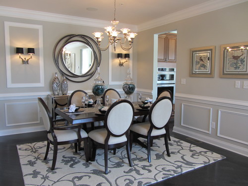
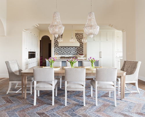
Eider White in Living and Dining Rooms
Pair it with wooden textures and see the magic for yourself!
So, yes, you can absolutely use this color in your living and dining room as long as you pair it with the best opposites.

Mainly, you have the option to choose something rustic like the exposed wood and exposed bricks or even something more sophisticated like linen or cotton upholstery and metal frames.
Choose an accent wall to add depth and character to your common space!
Using in Bedrooms
Like I say, bedrooms are the most personal spaces you have!
If you prefer an airier and coastal-like bedroom, this color will help create a perfect illusion!
You can use distressed-style brown furniture frames or walnut polished furniture!
To create harmony, make sure your upholstery is contrasting – mainly, blues, mauves, patterned linens, or even velvet!
Eider White in Kitchens
Painting the kitchen cabinets and walls in SW Eider White will result in an overall spacious experience.
I believe the best way to make use of this color is by painting the cabinets in this specific color.
You can let the backdrop wall in true whites and observe how beautifully the color shines.
Furthermore, you can use brass or chrome-finished pull handles with a white-veined marble countertop and glossy backsplash tiles.
Using on Exteriors
Especially for the Ranch-style and Mediterranean homes, this paint on the exteriors is bound to add a perfect vibe.
You can play with Spanish interlocking tiles on the roof and crisp white paint for the trims and moldings, door and window frames.
Furthermore, if you have porches and columns, either choose greige, gray, or beige paint or natural stone wainscotting.
Great Paint Sample Tip!
Here’s my favorite tip when it comes to testing out a color like Eider White – go and order a peel-and-stick sample from Samplize.
These guys figured out a great way to sample colors much more easily. Simply stick it up instead of having to get a small can of actual wet paint.
For a few bucks you get a nice sized square to throw up temporarily anywhere you want to “try” on a paint color and any possible coordinating hues you like. Too cool!
What NOT to Pair with This Color
Color Pairings That Ruin the Look of Eider White
Eider White has a delicate warm-gray balance that falls apart quickly with the wrong color pairings.
Cool, stark whites placed directly next to it will make Eider White read dingy and yellow in comparison.
Heavily saturated colors like deep navy or bold emerald overwhelm its quiet, understated character completely.
3 Decor Styles You’ll Regret Pairing with Eider White
Industrial-style decor with raw concrete, dark steel, and exposed metal clashes with Eider White’s soft, warm nature.
Ultra-modern, high-contrast black and white interiors strip away everything that makes this color feel special.
Heavily rustic decor with dark, rough-hewn wood and leather pulls out the wrong qualities in Eider White’s undertones!
Trim & Accent Colors That Do NOT Work with Eider White
Bright, cool-toned whites on trim will fight directly against Eider White’s warm gray base.
Avoid yellow-toned creams as accent colors since they amplify the warmer qualities of this color in unflattering ways.
Gray-toned trim with blue or purple undertones creates an uncomfortable tension against Eider White’s warmth.
Never Put This Furniture in a Room Painted with Eider White
Orange-toned wood furniture like honey pine or unfinished oak pulls the warm undertones in Eider White in an unflattering direction.
Stark white upholstered pieces make Eider White look unintentionally off-white rather than the refined warm neutral it truly is!
7 Interior & Exterior Finishes That Never Work with Eider White
Cool gray stone or tile flooring intensifies the gray side of Eider White in ways that feel cold and disconnected.
Warm brass fixtures can push its subtle warmth too far, making the overall look feel dated rather than intentional.
Outdoors, cool-toned brick or gray stone exteriors conflict with Eider White’s warm character and create an uneasy visual tension.

Hi, I just sent a comment asking for suggestions (Paula Watkins). I failed to mention we are using galvanized tin on front porch roof (only) and we will be using sherwin williams paint. Thanks