
I am often asked by my clients about the best creamy off-white from the Benjamin Moore collection.
And there has never been a time that I haven’t recommended this classic and warm beauty.
Well, Benjamin Moore Linen White is a warm, beige (off-white) paint color with deep yellow undertones.
In some cases, you can slightly detect a golden touch as well – but mostly, it falls on the beige end of the scale.
Trust me, you can never go wrong with this off-white neutral. It feels cozy, comfortable, and extremely welcoming – so inviting for your guests.
This lighter-toned paint realistically feels like a fresh piece of linen you would truly adore e in your home. Especially in those places you want to curl up and relax.
And the best part is that you can pair very beautifully with wooden textures, wall-to-wall carpeting, and hardwood floors.
So, just in case you have oak floors and staircases, and wooden cabinetry systems – this color is quite good to go.
It is also a great solution for brick molds and wooden door and window frames.
Are you excited to have this beautiful, light creamy paint in your home? Trust me, you will love the feeling!
So, sit back and relax!
Let’s get on board with this beautiful linen white journey!
Benjamin Moore Linen White 912 Details and Specifications

Color theory and specifications are quite unique from color to color.
After all, there is something that differs this particular off-white from all of the others, right?
So, when choosing a paint color, you must understand the underlying theories and facts that are related to each one of them.
And that will truly help you understand what that specific color is composed of.
So, first and foremost, let me introduce you to the concept of Light Reflectance Values or the LRV’s that determine how light or dark the paint color is.
Here, in this case, the LRV of Benjamin Moore Linen White is 82.9.

And that means it falls on the extreme light end of the scale – hence, clearly a recommendation for bases and neutrals!
(Remember, the greater the value, the lighter the paint – on a scale of 1-100)
Want to try this color out without having to paint your wall? Use some nifty peel-and-stick samples: Pick one up now from Samplize!
Secondly, other important associated terms are the RGB and the HEX Values.
- Red = 242
- Green = 235
- Blue = 218
- HEX Value = #f2ebda
Since we have discussed the technical and scientific information, let’s get started with the practical aspects of this creamy off-white Benjamin Moore paint.
How Does This Color Feel in a Space?
Benjamin Moore Linen White feels like those fresh pairs of linens on your bed and couch!
Yes, that’s how mesmerizing and refreshing this color is.
Well, this color will make your space feel joyful, warm, cozy, comfortable, and extremely light (due to high reflectivity, of course).
Furthermore, this color also has the potential to make your room feel spacious and bright.
(Thus, a great solution to small city apartments and lofts)
In the north-facing rooms, this paint color is an absolute bliss.
How Does Light Affect the Color?

Natural as well as artificial light has a major role to play in this paint color.
With the help of more natural light, this color is bound to feel extra light and extra refreshing.
However, you must be careful when using it in certain compass directions.
For instance, the southern or western incoming warm light will make your room look extra warm (can be uncomfortable too).
It might also show tinges of gold in certain cases!
So, I recommend using it in the north-facing rooms as the cool incoming light will neutralize with the warm paint color.
Other than that, you always have the opportunity to play with artificial lighting! (I recommend a cool white saturation tone here).
Remember to use white light for task-focused activities!
As I already mentioned, do yourself a favor and get some wall samples to test out this color and any others. The stick-on kind are a no-brainer from Samplize, and will give you some answers ahead of time. Get yours now!
What are the Best Coordinating Colors?

You must pair Benjamin Moore Linen White with commendable cool-toned opposites to feel the true hue of this color.
And that is why you have to be careful when choosing complementary color schemes!
After all, who doesn’t like the feel of a well-complementary palette, right?
So, analyze this color scheme and the whole idea of pairing colors!
You can best pair this off-white hue with true whites (in the case of trims, etc.), blues, mauves, mustards, black, grays, taupes, and even bronze, browns, and greiges!
You can also incorporate any of the metallic tints as accents here – like nickel, gold, or chrome!
Furthermore, you can either choose from a monochromatic or a contrasting color palette, depending upon the interior design style and your preference.
So, here are a few of the colors I would recommend for a monochromatic palette!
- 254 Woven Jacquard
- HC-15 Henderson Buff
- AF-430 Wasabi

On the other hand, here are a few of the colors I would recommend for a contrasting color palette!
- 2136-50 Colorado Gray
- 2072-20 Black Raspberry
- AF-440 Urban Nature

For your ceilings, trims, and moldings, you can use BM Chantilly Lace as it is a true white paint and will further enhance the original adjacent hue.
BM Linen White Vs Similar Colors
Looking for similar colors can be equally challenging! There might be a slight alteration in the undertones or the reflectivity.
So, what is it that makes you want to replace BM Linen White?
Is it the undertones or the reflectivity?
Well, in either of the cases, let me tell you – it’s difficult to find something exactly the same.
So, here are the two colors closely related to Linen White are CSP-245 Stoneware and AC-41 Acadia White.
Let’s see how they differ.
Linen White Vs Stoneware

Almost looking exactly the same, Benjamin Moore linen white shares a lot of similarities with stoneware.
With an LRV of 83.57, this color is extremely light and can be definitely used as neutrals and bases!
I recommend a similar color palette with this paint as the BM Linen White.
They might look very similar on the screen, but the best way to tell is to order color samples and then assess the brightness and tones in the environment you’re painting in. Pick up peel-and-stick samples now from Samplize!
Linen White Vs Acadia White

Another similar color from the off-white collection, this one feels lighter and more soothing.
With an LRV of 85.1, this is the lightest of them all!
It doesn’t feel too yellow so you can absolutely use it in the west or east-facing rooms.
Buy some wall samples of each of these colors to easily compare them right in your home.
Where to Use Linen White?
Benjamin Moore Linen White is a must-use paint in the home!
Whether you have a traditional style or transitional, modern, contemporary, farmhouse, and bohemian – this color is quite good to go!
Let’s see where and how to incorporate it in your home.
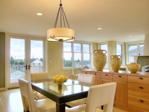
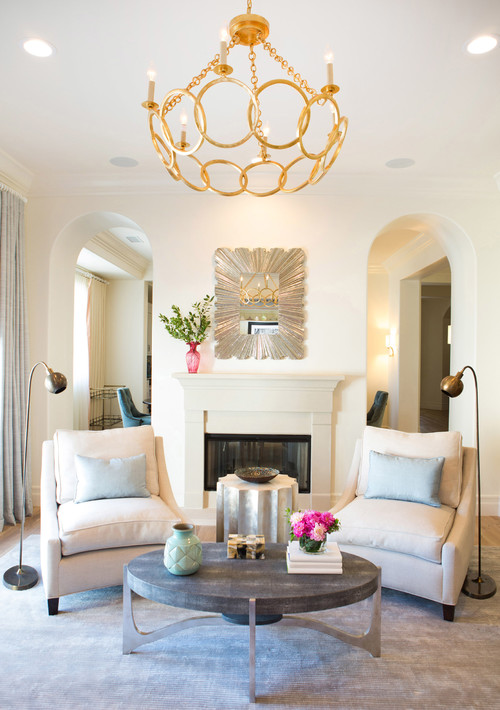
Linen White in Living and Dining Rooms
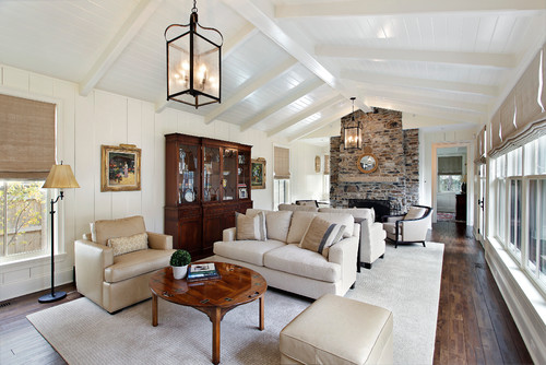
This creamy paint color is undoubtedly a great recommendation for common spaces such as the living and dining rooms.
You can either choose to go for an all-white theme and pair it with wooden textures only.
Otherwise, choose contrasts like mauves, purples, blues, and grays to splash some color.
Especially for interior design modern farmhouse or bohemian style living rooms – this color is quite good to go!
In the case of furniture, you can add linens (of course), cotton, faux leather, flannel, and even velvet!
Using in Bedrooms
Since this color offers two great advantages – a sense of spaciousness and utter warmth, you can definitely use it as an addition to an accent wall.
Browns and bronze go great together, on the accent wall, though.
Let the headboard wall be in a focal brown or bronze paint color, and the rest of the walls in this creamy white paint color!
You can’t use this color on the ceiling unless you are pairing it with darker paint.
Other than that, try pairing it with some dark gray accents, brighter rugs, and curtains to create an airier living experience.
Linen White in Kitchens
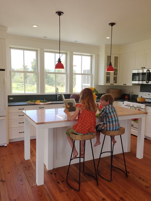
All-white kitchens are timeless.
Undoubtedly, it will offer a great experience and make your kitchen look light and bright.

You can choose wooden textured floating shelves, hexagonal glossy white backsplash tiles, and golden or bronze pull handles for drawers.
You can also infuse color by splashing some hues like greens and blues on the lower cabinets (blue is a great option)!
Using on Exteriors
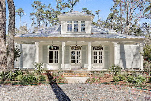
Whether you have a Ranch-style, Mid-Century Modern, Victorian, Contemporary, or Modern style, this off-white paint will never disappoint you!
You can either add blacks and darker grays, or even a tinge of wood-themed textures as an accent, or go vice versa for the trims, moldings, and door and window frames.
In the case of columns on the patio and porch, you can use natural stone wainscotting to add a detailed character to this facade!
You Should Order Samples of Linen White
Let’s face it, good paint isn’t cheap. While painting is a relatively inexpensive, good bang-for-your-buck project, picking colors can be hard. You don’t want to buy a whole can of something until you know for sure.
So, together with the info here, you can literally “see” what this color will look like in your home before you commit.
Getting a peel-and-stick sample from Samplize is the best thing since paint rollers!
If you don’t know yet, you can order a 12″ x 12″ square sample with the real paint color on it. Stick it on your wall multiple times and in multiple places to find out exactly if the color is for you.
So, how do you want to use this color in your homes? Interiors or Exteriors?
Now that you have all the secrets – are you excited about painting your home in Linen White?
Should there be any questions or thoughts, let us know in the comments below!
Linen White Undertones
The Warm Yellow Undertone That Changes Everything
Linen White carries a warm yellow undertone that’s subtle in some lights and surprisingly prominent in others.
In rooms flooded with warm incandescent lighting, this yellow undertone can push the color toward a buttery, creamy feeling that reads less “crisp white” and more “aged warmth.”
If your space already has warm wood tones or golden accents, this undertone will deepen and become much more noticeable than you’d expect.
The Sneaky Pink Shift You Need to Watch For
I’ve seen Linen White surprise homeowners when a soft pink undertone surfaces in north-facing rooms or under cool daylight bulbs.
This happens because cooler light strips away the yellow warmth and lets the pink pigments come forward instead.
If your bathroom or bedroom faces north, this is the undertone that will catch you off guard!
It’s worth holding your sample swatch in that exact room at different times of day before committing.
A Greige Whisper That Appears in Low Light
In dimmer conditions or shadowed corners, Linen White can take on a faint greige quality that feels almost taupe-adjacent.
I’ve noticed this shift most in hallways and rooms with limited natural light, where the color loses its warmth and reads as slightly cool and muted.
This isn’t necessarily a bad thing, but it’s definitely something to anticipate so you’re not caught off guard!
Linen White is a nuanced color, and understanding these three undertones before you sample is honestly the most valuable thing you can do before buying.
My 7 Key Tips for BM Linen White
1. Test Linen White in different lighting
Benjamin Moore Linen White can shift dramatically depending on natural and artificial light.
I always test a large swatch on each wall before committing.
Morning light brings out warm creamy undertones, while evening light can make it feel softer and more muted.
This step saves a lot of headaches and ensures the color feels just right in each room.
2. Pair Linen White with warm wood flooring
This color shines against medium to light oak floors.
I like how the warmth of the wood complements Linen White without making it feel too stark.
It creates a cozy, inviting feel in living rooms and kitchens.
Be careful with very dark floors as they can make the walls feel dull if the lighting is limited.
3. Coordinate Linen White with cabinetry styles
Linen White works beautifully with shaker-style cabinets in soft gray or muted taupe.
I love how the subtle contrast adds depth to kitchens without overwhelming the space.
It also pairs nicely with natural wood cabinets for a balanced, timeless look.
4. Use Linen White for trim and ceilings
This color is perfect for brightening trim and ceilings while keeping walls soft and warm.
I often use it in bedrooms and living areas to create an airy feel.
It can also unify rooms with varied wall colors, tying the whole home together seamlessly.
5. Consider Linen White for exterior accents
This is a surprisingly versatile color for exteriors, especially on siding or shutters.
I like using it with darker brick or stone for a fresh, clean contrast.
It can make porches and entryways feel welcoming without looking too stark.
6. Avoid using Linen White in very small, dim rooms alone
In tiny or north-facing rooms, it can appear slightly flat.
I usually pair it with warmer accent walls or layered textures like wood or fabric to keep spaces lively.
This approach prevents rooms from feeling cold or washed out.
7. Prep your surfaces carefully for Linen White
This color shows imperfections more than darker shades.
I always sand, prime, and patch walls meticulously before painting.
Taking the extra time upfront ensures a smooth, flawless finish that looks professional and polished.

Leave a comment