

Beautiful, calm, and soothing – this pretty and cozy neutral is bound to add a touch of warmth and welcomeness to your environment.
Well, let me introduce you to a warm white paint color that is one my favorite go-to cozy colors!
Sherwin-Williams Natural Choice is a pastel and off-white paint with warmer tones that is very light in tone.
If you’re looking for a paint that could be played as a neutral or a base in your home – this could be your top option.
It’s also a great choice if you desire a warm paint that looks creamy yet feels oh-so-cozy!
View this post on Instagram
Since this color has a timeless appeal, I would recommend any and every space to incorporate it – whether small or large. More on this later.
While again, I love this cozy neutral, there are a few other options that you could look into – mainly SW Alabaster and SW White Duck.
But what makes SW Natural Choice different?
Well, it’s definitely the undertones and the feel of this paint on your walls.
It tends to exude a very light tone of beige in certain lighting conditions.
But, don’t worry! I am here to help you figure out if this is the right paint for your home or not!
So keep reading to become an expert!
Sherwin-Williams Natural Choice SW 7011 Details and Specifications

Before choosing a paint color, it’s important to understand the background theories and specifications. Remember, every paint color is different.
A good practice is to check the following scientific terminologies, which truly define the characteristics of any paint.
So, first and foremost, read through the Light Reflectance Values or LRV’s of paint color. This value helps in determining how light or dark the paint is.
In this case, the LRV of Sherwin-Williams is 73. And that means the color falls on the lighter end of the scale.

Remember, the greater the value – the lighter the paint color.
Secondly, other important associated terms are the RGB and the HEX Values.
Red = 227
Green = 222
Blue = 208
HEX Value = #e3ded0
Oh, if you want to just try Natural Choice so you’ll know just how it’ll look, you can easily with a peel-and-stick sample from Samplize. Order some samples now!
Now that’s enough with the technical and scientific information, let’s get started with the practical aspects of this pretty Sherwin-Williams paint.
How Does this Color Feel in a Space?
Sherwin-Williams Natural Choice feels absolutely warm, bright, cozy, and enlightening.
Also, if you’re looking to make your space look larger and warmer at the same time, this would be a great option!
Due to high reflectivity, this paint tends to reflect away most of the incoming light to push away the walls.

Additionally, you can use this paint in either colder regions like the northern states, or typical high-rise apartments where space is a major issue.
When using in the interiors, I will recommend using this paint in north-facing or south-facing rooms to balance out the color saturation in space.
How Does Light Affect the Color?
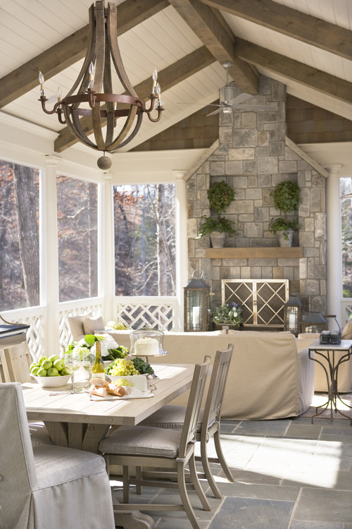
Light affects the appearance of the paint color. Believe it or not, colors are chameleons.
If your room receives ample natural lighting, the paint may appear even more light and airy whereas, in the case of the absence of natural light in a room, the paint appears a little darker! (not much though)
This is a recommended paint color for smaller-sized spaces, mainly.
However, you could also add some artificial lighting such as warm-whites and warm-yellows to add a specific mood to your space.
A pro tip: Try placing the paint swatch in different light conditions – indoors and outdoors, to determine the true hue.
Like I said, the best way to see this color in action before you paint is to buy some paint samples you can easily stick on your wall. It’ll definitely give you some clarity if you’re unsure!
What are the Best Coordinating Colors?

Sherwin-Williams Natural Choice is a warm-toned off-white paint color that belongs to the yellow hue family and may sometimes look like one.
So, if you’re sensitive to the yellow unexpectedly peeking from the walls, be aware when using this paint color.
However, if you already have SW Natural Choice on the walls – you can best pair it with other colors to feel cohesive and calm.
To name a few, SW Natural Choice can be best paired with clean whites, brown, taupe, greige, teal blue, teal green, and charcoal gray.
In terms of metallic accents, you must choose antique brass, oil-rubbed bronze, and matte black.
Here are the following two color palette suggestions – monochromatic and coordinating!
Monochromatic Color Palette

The complementary colors for the monochromatic palette are as follows –
- SW 7050 Useful Gray
- SW 7051 Analytical Gray
- SW 7052 Gray Area
This monochromatic palette is calm, poised, and extremely subtle. So, if you have a design style like modern, contemporary, or modern farmhouse – this palette is definitely something to have an eye on.
You must choose matte black or wooden fixtures and furniture frames to go with this palette.
Also, ensure there’s ample natural light entering the room to make this color feel further refreshed and airy.
Contrasting Color Palette (Cool)

The complementary colors for the contrasting palette are as follows –
- SW 7005 Pure White
- SW 7611 Tranquil Aqua
- SW 7550 Resort Tan
This cool-toned palette will not only make your room feel calm and tranquilized but also create a soothing sensation.
You must choose bronze or matte black fixtures to go with this palette.
Also, don’t hold back from styling with fresh indoor plants in this space since that will further complete the look of your room.
Contrasting Color Palette (Warm)

The complementary colors for the contrasting palette are as follows (warm) –
- SW 7051 Analytical Gray
- SW 6166 Eclipse
- SW 6162 Ancient Marble
This warmer palette is rather EARTHY and eye-catching!
The beautiful warm sage greens can best complement the existing off-white paint color to create a soothing calming effect indoors.
That also means you can style with rattan, wicker, cane, and various wooden textures in the form of decorative accents and furniture pieces.
On the other hand, here are a few of the colors I would recommend for a contrasting color palette!
- SW 6148 Wool Skein (see my full review here)
- SW 7664 Steely Gray
- SW 6229 Tempe Star (see my full review here)

For your ceilings, trims, and moldings – I would recommend using SW Pure White to further achieve a creamier look, or if you want a crisp look, choose SW High Reflectance White.
More Natural Choice Color Palettes


SW Natural Choice Vs Similar Colors
Even though no two colors are exactly the same, there may still be similar-looking options that I will be sharing below.
So, the two colors closely related are SW 7637 Oyster White and SW 7010 White Duck.
Let’s see how they differ.
Natural Choice Vs Oyster White

With an LRV of 72, this paint color shares many similarities with SW Natural Choice.
A beautiful and timeless piece of off-white, you can definitely use this color as a base and neutral in your homes.
Plus, you should know that this color may not appear as cozy and warm as Natural Choice and you can absolutely use it anywhere in your homes.
See how these colors compare real time with stick-on wall samples from Samplize.