
Even though this color tends to strongly showcase a deep minty blue appearance, it’s basically a white and pastel paint color.
But not just any white. It’s extremely cool, crisp, soothing, and comforting.
This one definitely offers a lot of benefits for what it is! But before I share these goods, let’s discuss the nitty-gritty.
Sherwin-Williams Mountain Air is a beautiful white paint color that feels clean and crisp with deep gray and blue undertones.
This super pretty color tends to complement every decor element in your home.
It’s quite light and can be responsible for making your room look airy, larger, and extra spacious.
These are the reasons why this color has become so popular.
Of course, it’s a pretty pastel that tends to positively play with your minds – but also, exhibit extremely motivating and relaxing vibes.
Don’t worry! You can absolutely coat fresh paint of SW Mountain Air in your homes.
But with this soothing paint, you might have to consider the appearances of adjacent architectural elements, structural considerations, materials, textures, and fabrics.
Don’t worry – I will help you figure that all out.
But before I do that, let’s discuss the basic terminology associated with a paint color.
Sherwin-Williams Mountain Air SW 6224 Details and Specifications

Understanding and analyzing a paint color is primary.
And especially if you have a wide array of paints to choose from.
After all, there’s something that helps distinguish this particular white from the other cool whites, right?
Well, it all depends upon the reflectivity and undertones.
So, first and foremost, one of the most important terms that I usually observe getting ignored is Light Reflectance Values or (LRV)!
Every color has an associated Light Reflectance Value.
For Sherwin-Williams Mountain Air, the LRV is 73!

Which falls on the lighter end of the scale – almost as light as a white with undertones (not specifically, true white).
(Place it against a swatch of SW High Reflective White and you would know)
Remember, the higher the value, the lighter the paint color is!
And vice versa!
And since this color has deep cool gray and blue undertones, it will further tend to look lighter and crisper. (Yes, that’s another trick)
Because paint colors can change in different environments, I recommend you also just try Mountain Air out at home with a peel-and-stick sample from Samplize. Order some samples now!
Moving ahead, let’s discuss the RGB and HEX Values of the color.
- Red = 216
- Green = 224
- Blue = 223
HEX Value = #d8e0df
Now that I am concluding, I promise not to bore you with these scientific details anymore.
Let’s talk about the practical aspects of this cute and calming pastel paint color.
How Does This Color Feel in a Space?
Sherwin-Williams Mountain Air will undoubtedly make your space feel cooler and colder than ever.
And do you know why that is so? Well, all thanks to the cool blue undertones that tend to play a major role.
Secondly, this color also offers benefits in making your room appear larger than it actually is.
The high reflectivity value and deep cool undertones help achieve that look.
Moreover, don’t forget that this color will ultimately transform your home into a coastal and beachy haven!
How Does Light Affect the Color?
Light – whether artificial or natural – will play a tremendous role, and at the same time, not tend to wash away.
Yes, first and foremost, the light will further tend to make your room appear lively, bright, and airy.
And secondly, depending upon the compass directions and the time of the day, the vibe of your room will alter.
For instance, I wouldn’t recommend this cool-looking color in the north-facing rooms since it will further tend to appear crisp and chilly!
On the other hand, a tinge of this paint on the south or east-facing rooms wouldn’t be a bad thing to do.
Lastly, you can always achieve the desired look with artificial lighting on board.
I’ll say this again – get some wall samples to try on this color in your own home and confirm if it’ll work or if you need to try something else.
What are the Best Coordinating Colors?

Creating color palettes and schemes is something I absolutely love!
And trust me, it’s simply so much fun.
So, it’s crucial for you to choose the best complementary colors in order to define a palette that looks stunning and eye-catching.
In general, this color can look really good coordinated with darker blues and navy blues, sage greens, crisper whites and grays (especially Sherwin-Williams cool gray colors!)
However, you have to be careful as to what vibe you need in your space for a perfect color combination.
So, I am going to enlist the two most popular color schemes here – monochromatic and contrasting.
Monochromes are generally great for modern, minimalist, coastal, and contemporary setbacks.
On the other hand, the contrasting palette looks phenomenal with Eclectic, Farmhouse, and other interior design styles.
So, here are a few of the colors I would recommend for a monochromatic palette!
- SW 6225 Sleepy Blue
- SW 6226 Languid Blue
- SW 6227 Meditative

On the other hand, here are a few of the colors I would recommend for a contrasting color palette!
- SW 7008 Alabaster – see my full guide here
- SW 9070 Baby Blue Eyes
- SW 6120 Believable Buff

For your ceilings, trims, and moldings, SW Extra White or SW Pure White will help protrude a true hue of SW Mountain Air.
SW Mountain Air Vs Similar Colors

Although you must know that even though the following colors look similar, they might still differ in the undertones or reflectivity!
So, one of the closely related colors is SW 6217 Topsail and BM 2122-50 Iceberg!
Let’s see how all of them differ.
Mountain Air Vs Topsail

Don’t they look the same?
Well, yes! They have quite a few similarities – not majorly the undertones, but the reflectivity.
With an LRV of 75, this color is comparatively lighter and can be used as bases and neutrals. Find out all about Topsail in my review here!
Both these colors have a minty appearance – hence, cool, calm, and quite composed.
Order a wall-stick sample of Mountain Air here to help you better compare these colors in your own house.
Mountain Air Vs Iceberg

Another similar alternative, these two majorly differ in the undertones.
The latter feels more blue than gray unlike the other – which feels less of a blue.
With an LRV of 72.88, this paint is comparatively deep and bold. Also, you can paint all the walls in this specific color.
Also, don’t forget about buying real-time samples to determine the tonality of the paint in your home’s lighting. Pick samples up from here.
Where to Use Mountain Air?
Sherwin-Williams Mountain Air can be used in most of the places in your home – let’s say, the bedrooms, living rooms, kitchens, and exterior shiplap.
Furthermore, this paint can be used in coastal, Caribbean, contemporary, and modern interior design styles.
However, note the chilly vibes of this color – and that’s why it has to be carefully used.
So, let’s see where and how to incorporate it.
Morning Air in Living and Dining Rooms
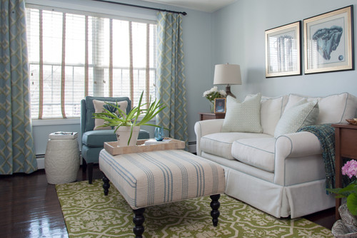
Your coastal living rooms deserve a soothing and cool paint color like SW Mountain Air.
To invite a cool and breezy vibe, you can choose to paint all the walls in this color. Furthermore, you can pair it with creamy whites on the adjacent walls and upholstery.
Wooden textures align really well – especially bleached wood and off-white linens.
You can further add patterns and textures through decorative accents like throw pillows, curtains, and even rugs!
Lastly, you can add a sense of contrast and beachy vibe when you pair crisp white on the wall panelling.
Using in Bedrooms
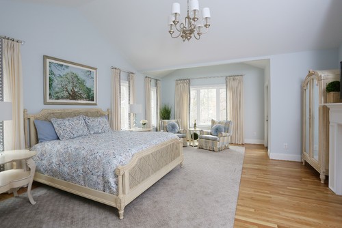
Bedrooms (especially sea-facing) would embrace the true beauty of this color.
Here, you can choose to use dark gray room-darkening curtains to have a healthy and sound sleep.
Soothing rooms are beyond necessity – and there’s no way to achieve the look better than this paint color.

Don’t forget to introduce various shades of blues on your materials, textures, and fabrics.
Lastly, for a cozier vibe – add shag, faux, or fur rugs for a welcoming experience.
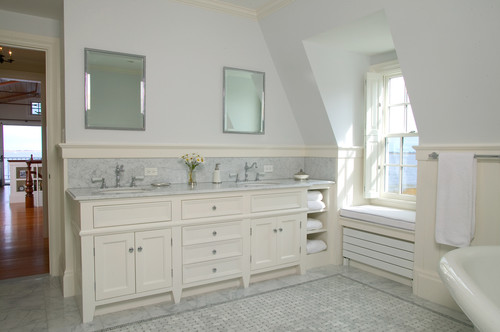
Mountain Air in Kitchens
To make your kitchen appear larger and enhanced, you must use this paint on either the cabinets or the backdrop wall.
Personally, I feel this color makes a great statement in the coastal kitchens.
And when you especially paint them on the cabinets, it becomes super stunning!
When talking details, use matte black pull handles, industrial pendant lighting, and black and white patterned backsplash tiles to complete your palette.
You can also infuse color by adding interesting hues to the crockery, dinnerware, and display items.
Using on Exteriors
Especially for the Coastal, Craftsman, Caribbean, Ranch-style, and Contemporary homes, this paint on the exteriors is bound to add a beachy vibe.
You can play with black or gray roof tiles and bold gray or black for the trims and moldings, door and window frames.
For a contrast, you can even add deep blue or gray on the entry door for a focal touch!
Furthermore, if you have porches and columns, either choose gray or black paint or natural stone wainscotting.
I Recommend Sampling Mountain Air!
If you’re on the fence and need a bit of convincing, try this color on for size by ordering a peel-and-stick sample from Samplize.
These are my favorite way to test colors in a space and to see how they work with other coordinating colors.
It doesn’t cost all that much, and you can temporarily place these handy 12″ x 12″ squares that are true to color around your house. I love them!
Mountain Air Undertones
The Cool Blue Undertone That Defines Mountain Air’s Character
Mountain Air carries a noticeable cool blue undertone that gives it that crisp, airy quality most people fall in love with on the chip.
This undertone becomes especially dominant in north-facing rooms or spaces where natural light is limited.
I’ve seen this blue quality intensify significantly under overcast daylight, pushing the color into territory that feels much cooler and crisper than expected.
The Green Undertone That Catches People Off Guard
There’s a soft green undertone sitting beneath Mountain Air’s surface that doesn’t always reveal itself on a small paint chip.
I’ve seen this undertone surface strongly in rooms with warm natural light or next to wood tones, and it genuinely surprises people every time!
If your space has warm flooring or cabinetry, this is the undertone worth watching most carefully before you commit to this color.
The Gray Shift That Shows Up in Specific Lighting
Mountain Air also carries a subtle gray undertone that tends to surface under cool LED lighting or in rooms with limited warm light sources.
This is the undertone I find most unpredictable because it can quietly flatten the color’s airy quality and make it feel more neutral than you bargained for.
Evaluating your sample across morning light, afternoon light, and evening artificial light is the smartest way to catch this shift before it surprises you on fully painted walls!
Why Surrounding Colors Activate These Undertones
Warm wood tones and earthy decor can pull Mountain Air’s green undertone forward faster than you’d expect.
Cool gray or blue furnishings tend to amplify the blue and gray shifts and push this color into much cooler territory.
Knowing what’s already in your space before sampling is one of the most valuable steps you can take with this color.

Leave a comment