
Pastels are timeless! Pastels are beautiful! Who doesn’t like pastels, right?
Well, one such pretty example is Sherwin-Williams City Loft, a light-toned paint color with deep red-pink undertones.
So, if you’re looking forward to adding a feminine touch in your space, choosing City Loft with a blush, rose, or pink base or accent would be a great move to make!
It’s a soft hue that also exhibits extreme warmth and a cozy vibe.
Well, this is absolutely ONE of my favorites – and I constantly recommend this one to all those who have an admiration for soothing, subtle paint colors.
But how do you know which pastel to use out of a million pastels out there in the market?
The answer is simple! Study the undertones and the textures.
Also, since this CL is extremely light, you have to be careful about using it in specific areas in your home.
You also need to be careful about how, where, and when to use these types of colors!
This color review will help you figure out the answers to all the questions stated above.
So, let’s get it started!
Sherwin-Williams City Loft SW 7631 Details and Specifications

First and foremost, it’s important to analyze the basics of this shade. Remember, each color is different and there are no two colors that are exactly the same.
Well, color specifications and theories are important to consider.
Before choosing a paint color, it’s important to read through some of the theories and values linked with the color.
So, one of the most important terminologies is the Light Reflectance Value or the LRVs. It’s basically the value that determines how light or dark the color is.
So, the LRV of City Loft is 70.

And that means CL falls on the lighter end of the scale. (Remember, the greater the value, the lighter the paint color)
Other associated terms are the RGB and HEX Values are as follows:
Red = 223
Green = 218
Blue = 209
HEX Value = #dfdad1
Another tip:
If you want to easily try out City Loft to see how it will look, you can with a peel-and-stick sample from Samplize. Pick up your samples here!
Now enough with the technical and scientific information, let’s get started with the practical aspects of this beautiful pastel.
How Does this Color Feel in a Space?
This color feels absolutely light, warm, and inviting when used in a space.
Due to the high reflectivity of the paint color, it tends to absorb only a little natural light while reflecting most of it, making the color extremely light.
This color also plays the magic of making a space look larger by pushing away the walls.
So, if you’re stuck in a city apartment, this color is a great way to make your space look enhanced.
I often recommend to clients that they use this paint color if they’re situated in either colder regions or areas with temperate climates.
How Does Light Affect the Color?
Light tends to make a paint color look brighter and lighter.
So, in the case of pastels like Sherwin-Williams City Loft, the paint is bound to look even lighter in the case of excessive natural light.
On the other hand, in the absence of light, this one wouldn’t go too dark or dull!
So, right here is a bonus point!
I would recommend using this in either the north-facing rooms or the east-facing rooms, as long as you pair it with cooler tones to balance the saturation.
If you want to create a specific mood, you can always add artificial lighting in the form of warm whites and warm yellows!
To truly see what your home’s environment and lighting will do here, try out a real paint sample. It takes out the guesswork!
What are the Best Coordinating Colors?

Now that you’re confident about using this specific paint color in your home, it’s important to pair it with the best opposites.
Well, color schemes are extremely important. Because trust me, if you mess that up, you end up messing your home!
With a pastel-like City Loft, the best possible options to pair are browns, taupes, beiges, blues, and deep grays.
You could choose from a monochromatic or a contrasting color palette.
Let’s see what makes the best match!
So, here are a few of the colors I would recommend for a monochromatic palette!
- SW 7043 Worldly Gray
- SW 7044 Amazing Gray
- SW 7045 Intellectual Gray

On the other hand, for a contrasting color palette, I would recommend the following paint colors that you could incorporate:
- SW 7036 Accessible Beige
- SW 7053 Adaptive Shade
- SW 7674 Peppercorn – see my full Peppercorn review here

For your ceilings, trims, and moldings – I recommend using SW Pure White to further achieve a creamier look, or else if you want a crisp look, choose SW High Reflectance White.
More City Loft Color Palettes


SW City Loft Vs Similar Colors
Before I disclose the two closest paint colors, let me tell you, no two colors are exactly the same.
They may either differ in the undertones or the lightness and reflectivity of the paint.
So, the two most similar colors are SW 7570 Egret White and SW 7628 Windfresh White.
Let’s see how the two differ!
City Loft Vs Egret White

With an LRV of 70, the two colors share the most similarities when it comes to reflectivity.
This pastel has deep red-pink undertones and exhibits a sense of welcome.
It’s extremely creamy in texture and you can best pair this one with browns and taupes.
Check out more on Egret White now!
Since digital screens can be deceiving, I highly suggest you get some real samples of these two colors from Samplize. Buy here!
City Loft Vs Windfresh White

Comparatively darker, this paint color has an LRV of 69. You can absolutely use this paint color in your living environment to exhibit a crisp texture.
This color shares extreme similarities with City Loft – so either of these three colors, you can prefer to choose any.
To see how these look in your home, get some large rectangular samples and try them on your walls with different lighting sources.
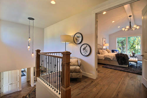
Where to Use City Loft in Your Home?

Daniela shares this beautiful and welcoming living room setup with SW City Loft over at her site DanielaPpluviati.com
City Loft is a great option to use in your home. And I’ll confess that I end up recommending this paint color to a lot of my clients.
Especially for homes with styles rooted in Scandinavian, Modern Farmhouse, French Country, and Modern Bohemian – this is absolutely good to go!
So, don’t hold back from incorporating CL in your home – whether it’s the hallways or the kids’ rooms.
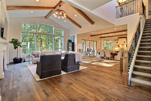
City Loft in Living Rooms
City Loft is a great option for common rooms such as dining, living, and family rooms. To make the best use of the color, make sure to pair it with neutral upholstery and brown or blue accents.
This color is bound to add a cozy touch to your spaces! So, don’t hold back from incorporating white sheer curtains, grey upholstery, and some taupe or blue accents through rugs and throw pillows.
Furthermore, if you have a fireplace in these common spaces, make sure to choose either taupe-hued granite or exposed brick to add a refined look.
Using in Kitchens

As we all know, the kitchen is one of the most loved spaces in our house.
So, you can either choose a monochromatic kitchen with shades of City Loft!
Remember to paint the cabinets in this neutral color or the backdrop walls.
Furthermore, choose chrome-finish pull handles to create a contrast!
City Loft in Bedrooms
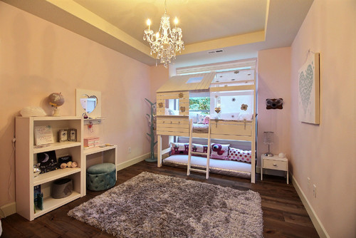
Bedrooms deserve to be calm and soothing!
And City Loft makes a great option in the bedrooms.
If you prefer to paint an accent wall, I recommend choosing the taupe or blue on the bed headboard wall.
You can even paint all the walls in this specific paint color!
And let the upholstery be pretty neutral taupes, blues, or greys.

Using on Exteriors
Sherwin-Williams City Loft is a great wall paint color for exteriors as it tends to look even lighter when used on these walls.
You can pair it with darker browns and greys in the trims, moldings, and door and window frames or do vice versa.
You Should Order Samples of City Loft
Let’s face it, good paint isn’t cheap.
While painting is a relatively inexpensive, good bang-for-your-buck project, picking colors can be hard. You don’t want to buy a whole can of something until you know for sure.
So together with the info here, you can literally “see” what this color will look like in your home before you commit.
Getting a peel-and-stick sample from Samplize is the best thing since paint rollers!
If you don’t know yet, you can order a 9″ x 14.75″ sample with the real paint color on it.
Stick it on your wall multiple times and in multiple places to find out exactly if the color is for you.
Test City Loft in the Right Places
Start by placing City Loft on a wall with direct sunlight, because bright afternoon exposure can pull out its subtle peachy warmth in a way a small chip never shows.
Then test it in darker corners and narrow wall sections, since I’ve seen City Loft look noticeably heavier when shadows settle in.
Be sure to check a large uninterrupted wall too, because that’s where its soft greige undertone becomes easier to read.
Don’t skip walls across from windows, where reflected light can either brighten it beautifully or make it feel slightly washed out.
Always compare it next to trim, flooring, cabinetry, and large furniture, since warm wood can amplify its warmth while crisp white trim can make it look cleaner.
Watch It Change Throughout the Day
City Loft tends to feel calm and balanced in morning light.
By late afternoon, especially in sunny rooms, it can appear warmer and a touch creamier.
Cloudy days often reveal its true neutrality, while evening lamps and recessed lighting can completely shift the mood!
Compare warm bulbs and cooler LEDs carefully, because artificial lighting makes a noticeable difference with this color.
Why Bigger Samples Matter
A tiny paint chip cannot show how City Loft reacts to your exact lighting, viewing angles, and surrounding finishes.
Larger peel and stick samples like Samplize (link above) make it easy to move the color around and test all five key spots before committing.
Live With It Before Deciding
Leave your City Loft samples up for several days and observe them during your everyday routine, not just when you’re studying the wall.
I’ve seen this color feel just right in one moment and slightly warmer the next, so giving yourself time helps you choose with total confidence!
My 7 Key Tips for SW City Loft
1. Test City Loft under different lighting
City Loft can shift from a soft taupe-gray to a warm greige depending on the light in your space.
I always test a large swatch on both north- and south-facing walls before committing!
Seeing it at different times of day saves you from surprises later.
2. Pair City Loft with warm wood flooring
This color looks amazing with medium to dark oak or walnut floors.
I love how the gray undertones pop against rich, warm wood without feeling cold.
It creates a cozy, sophisticated vibe that works in living rooms or dining areas!
3. Match with light or painted cabinetry
City Loft pairs beautifully with white or cream cabinets for a crisp contrast.
For a more modern look, try it with soft gray or even muted blue-green cabinets.
I’ve found that this combination keeps kitchens feeling fresh while still grounded.
4. Use on exteriors for a timeless facade
This shade can give brick, stucco, or siding a contemporary but classic look.
I like to pair it with white trim to highlight architectural details.
It’s particularly effective on front doors painted black or deep charcoal for extra punch!
5. Watch for undertones in bedrooms
City Loft can pull slightly purple or pink in low light bedrooms.
I always test it with the bedding and artwork I plan to use.
This step helps me avoid a room feeling colder or moodier than intended.
6. Use accent colors wisely
This color pairs nicely with muted greens, warm blushes, and soft metallics.
I often use these accents in throw pillows, rugs, or small décor to add dimension.
It keeps the room feeling layered without overwhelming the walls!
7. Prep surfaces thoroughly for a smooth finish
City Loft shows imperfections more than darker shades, so sanding and priming is key.
I make sure to fill holes and use a quality brush or roller to avoid streaks.
Doing this upfront saves hours of touch-ups later and ensures a professional-looking result!

HI! Thinking of using City Loft in our shore house. It is a cute little place with lots of light. Thinking of lightening up City Loft a little… thoughts?
PS: have used city loft in my home and love it just thinking we may need it to be a little lighter for the shore
Yes, why not? You can absolutely try this pretty color on the walls!
Hi! I’m getting a house built and they are using City Loft for the walls and ceiling. I love the color but want to break it up. If I keep City Loft on my ceilings, what is a good choice for the walls?
Hi Kelvin, it really depends upon the size of your room. Well, you can be as creative as you want! So, if you have a larger room, you can even consider a color with depth (like SW Alpaca) for the walls. Remember not to go beyond 2 colors!
I am in the middle of a hall bathroom Reno. North facing but no window.
My contractors want to do Citi Loft for the walls and trim and Pussy Willow for the cabinets. My floor tile is a white wood with grey and beige. Counter tops will be white with a grey and beige runs. Crime white tub tile.
Hi Michele, sure! May I know what your question is specifically? Happy to help.
Hi. I just painted my kitchen City Loft and still debating if I like it. I have dark cabinets and Uba Tuba Granite and beige with gray tile for a backsplash. We get a lot of sunlight in the morning. There are times I see a cool gray and times I see a warm beige. I am looking to coordinate this color with a very open floor plan in my family room and foyer. Any advice is appreciated.
Yes! This color is quite contradictory – so you are quite likely to observe gray and beige both! You can choose tones that are more true to its hue – like true grays and beiges to feel a sense of balance.
I am considering using this as an exterior paint, for a Modern Farmhouse Style home, with black windows, black roof, stone accents. Perhaps some Dark wood accents as well. Now I’m feeling a little nervous about the pink undertone. I didn’t notice the pink either. The house is in a shady area so perhaps the pink is not showing up. What do you think?
@Jacine Harrington, I painted City Loft throughout my house and have never seen a pink hue. My sister and mother are repainting their homes with City Loft because they love it so much. Check out Pinterest for City Loft exteriors. I honestly don’t think you could go wrong with City Loft.
Hi Jacine,
Since you are pairing this paint with darker colors and accents – I doubt the pink would protrude out. But rest assured, this is a beautiful color and the palette you mentioned would look great for the exteriors!
I plan on using City Loft as my main color in our new home. I am looking for a light, soft, warm grayish color….if that makes sense and City Loft was the closet to what I was looking for. I have used a sample of it in multiple spaces in our home and I did not see any pink undertones in it. However the fact that it contains more red in it than any other color is making me VERY nervous.
Hello Karen,
Thanks for reaching out! SW City Loft is a beautiful pastel paint with slightly pink undertones! So, generally, these colors are played by a lot of surrounding factors – sunlight, the local building facade, and even your interior curtains, floors, and rugs in some cases. So, that is good to know if you didn’t detect any pink in it – but if you place it against a pure white shade – you are quite likely to observe some!! So, I recommend if you are choosing a white or any other paint from the warmer palette, this may slightly look pink! But it shouldn’t be an issue if you plan on using darker paints! I hope it is much clearer now 🙂 Do let me know if you have any further questions! Happy painting 🙂