
Ever wanted to come back to a relaxing and quiet space after a long and hectic day at work?
Well, this paint color is exactly what you need!
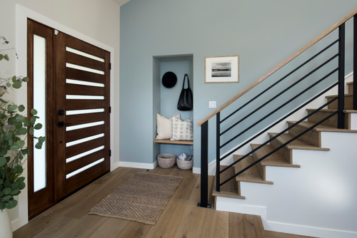
Benjamin Moore Smoke is a soothing, pale gray color with deep cool blue undertones.
Just like a dream, this sophisticated gray infuses your space with the utmost calmness, comfort, and tranquility.
But at the same time – offering the benefits of soft gray as well as cool and calm light blue and a little green (in certain lighting conditions).
Don’t worry, the overall result is absolutely blissful and dreamy!

And since this paint color injects cool vibes into the room, it’s definitely a must in warm and humid spaces.
Well, color psychology is a whole new aspect when choosing a paint color for your home.
So, are you looking to incorporate this pretty gray color in your home?
Absolutely, go ahead. But ensure to keep in mind the few associated do’s and don’ts, pros and cons, and inspiration and color palette.
Yes, I will help you figure out how to best use this color in your home, what best colors to pair with, and how to make space feel more dreamy and delightful.
Let’s get started.
Benjamin Moore Smoke 2122-40 Details and Specifications

Believe it or not, these kinds of pastels are the new upcoming cool.
They will neither go out of trend nor make your space feel bored and monotonous (if paired well).
However, when choosing that perfect shade of gray neutral with deep blue undertones – there is a wide array of color specifications involved.
Yes, and you simply can’t ignore that – since this is what will help you choose and know the right color.
So, first and foremost, let me introduce you to the concept of Light Reflectance Values or the LRV’s that determine how light or dark the paint color is.
You can easily find that value at the end of your Benjamin Moore paint swatch or even the website!
Here, in this case, the LRV of Benjamin Moore Smoke is 56.49.

And that means it falls on the lighter end of the scale – but not too light.
(Remember, the greater the value, the lighter the paint – on a scale of 1-100)
Now, if you want to try out Smoke on your walls ahead of time, you can easily do so with a peel-and-stick square from Samplize. Give them a try now!
Secondly, other important associated terms are the RGB and the HEX Values.
Red = 186
Green = 200
Blue = 201
HEX Value = #bac8c9
Since we have discussed the technical and scientific information, let’s get started with the practical aspects of this gray Benjamin Moore paint.
How Does This Color Feel in a Space?
Benjamin Moore Smoke will feel absolutely like a fairytale.
With embedded blue undertones, this color has the potential to exhibit cool and calm vibes.
And thus, make your space feel quite soothing, tranquilizing, and blissful.
And especially if you reside in the coastal areas, this color is definitely something to look forward to.
Moreover, this medium smoky blue will add utmost sophistication and character to your space.
And not to forget, the light-toned paint color will undeniably create an illusion of a larger space – thus, making it more airy, refreshing, and breathable.
Yes, you can also consider painting all the walls of your room in this absolutely delightful beauty.
How Does Light Affect the Color?
Light tends to play a major role in this paint color. And due to a high reflectivity value, more and more light will be reflected.
Apart from this aspect, the undertones play a chameleon equally here.
They tend to look slightly blue and green in various lighting conditions – and that’s why I highly recommend you examine the paint swatch at different times of the day.
On the other hand, ensure to allow ample natural light in the room – so you can truly feel the beauty of the paint.
Secondly, you must get your hands on the compass directions when applying a coat of this paint in your room.
It definitely appears softer and creamier in the south and west-facing rooms, whereas extremely chilly in the north-facing rooms.
You see – there are tons of color aspects to consider!
Want to see what Smoke looks like in your own living space? Pick up a wall sample now from Samplize!
What are the Best Coordinating Colors?
Benjamin Moore Smoke is comparatively a tricky paint color to deal with.
Well, you can’t choose something too bright or too subtle. Yes, that can totally mislead the vibe of your room.
You can best pair this soft gray paint with creamy whites (in the case of trims, etc), soft and fluffy beiges, dark grays, shades of taupe, something coral or pink, orange, and certain shades of dark blue.
You can also incorporate any of the metallic tints as accents here – like brass and gold. Glossy, brushed, and matte!
Do you know one of the best palettes? Well, simply pair this soft gray with warm woods, clean whites for linen, and creamy furniture.
Furthermore, you can either choose from a monochromatic or a contrasting color palette, depending upon the interior design style and your preference.
So, here are a few of the colors I would recommend for a monochromatic palette!

- 2122-30 Cloudy Sky
- 2122-20 Steep Cliff Gray
- 2122-10 Dark Pewter
On the other hand, here are a few of the colors I would recommend for a contrasting color palette!

- OC-17 White Dove
- 2127-40 Wolf Gray
- HC-83 Grant Beige – see my review here!
For your ceilings, trims, and moldings – you can use BM Chantilly Lace as it is a true white paint and will further protrude the original adjacent hue.
BM Smoke Vs Similar Colors
This gorgeous gray paint tends to share tons of similarities with blue-grays and other gray blues.
Whether it’s the undertones or reflectivity, BM Smoke can be compared to a couple of other BM and SW hues.
So, if BM Smoke is a little too gray or blue for you, these subsequent colors can be considered as an option.
So, let’s discuss the major ones: BM 1585 Wales Gray and SW 6218 Tradewind.
And see how they all differ.
Smoke Vs Wales Gray

Benjamin Moore Smoke is an equally enchanting gray, but with deep green undertones.
The little blue undertone in this paint is submissive and can only be observed in certain lighting conditions.
You can best pair this with another soothing color, creamy whites, warm woods, and pops of orange or pink.
With an LRV of 54, this color is light but with a certain sense of depth and character.
Order stick-on samples of Smoke and Wales Gray to see what works best in your home.
Smoke Vs Tradewind

Sherwin-Williams Tradewind is a calming cool blue paint that feels utmost delightful and dreamy.
However, at the same time, it can also appear slightly green – thus, connecting your space with nature.
With an LRV of 61, this paint color is the lightest of them all. You can also check out Glass Slipper from Benjamin Moore for a similar hue but that is much lighter.
Lastly, you can pair this paint color with warm woods, creamy and fresh whites, and shades of dark blue.
Since digital screens can be deceiving, I highly suggest you get some actual samples of these two colors from Samplize. Buy here!
Where to Use BM Smoke?
Benjamin Moore Smoke is a gorgeous gray paint color that can be used in any corner of your home.
Whether it is the kitchen cabinets, walls of your bedroom, exterior entryway door, or the furniture frames, this color can play one for all.
However, you have to be slightly careful when playing this color with other adjacent hues. (Don’t worry – I will help you out)
So, let’s see where and how to incorporate this gray paint color in your home.
Smoke in Living and Dining Rooms
Definitely a must!
You can consider painting all the walls in this specific paint color and further pair it with creamy whites on the built-in cabinetry, media units, and trims and moldings.
Do you have a fireplace? Well, in that case, choose white marble or gray tiles around!
Secondly, you can always infuse a pop of interest with the help of orange, coral, or pink through throw pillows, decorative accessories, and artwork.
For a monochromatic vibe, you can also consider adding darker grays and lighter cool blues on the rugs and curtains.
Blissful, right?
Using in Bedrooms
Your bedroom deserves a cool, calm, and composed environment.
And there’s no better way to achieve that than using this utmost tranquilizing paint color.
You can consider painting all the walls in this color and further adding creamy whites on the furniture frame, rugs, curtains, and the fresh linens.

When it comes to wooden textures, don’t hold back from pine, maple, or white oak.
This color opposes the warm shades of orange on the color wheel – and that’s why you must infuse that tone as an accent through pillows and throw blankets.
Smoke in Kitchens

Benjamin Moore smoke in the kitchen is an absolutely eye-catching and stunning idea to incorporate.
I highly recommend painting all the cabinets in this paint color with a clean and crisp white on the backdrop wall.
Choose brushed brass, chrome, or vintage gold on your pull handles and knobs.
Lastly, don’t feel shy about using matte-finish white backsplash tiles to go with your light gray or white granite countertop.
Using on Exteriors

This color can be used on the exterior walls with white or light wooden textures on the shutters, trims, and moldings.
If not the walls, you can also pick this color for the focal entry door and paint the shiplap walls in pure white or an extreme light gray color.
On the other hand, if you choose this paint color on the exterior shiplap, choose red for the focal entryway door.
Lastly, don’t hold back from using natural stone wainscoting (in a cooler base)!
How to Best Sample This Color?
Here’s my favorite tip when it comes to testing out a color like Smoke – go and order a peel-and-stick sample from Samplize.
This little company has nailed down the best way to sample colors much more easily. Simply stick on a 12″ x 12″ square instead of having to get a small can of actual wet paint on your walls.
For a few bucks you get a big enough sized sample to evaluate anywhere you want to “try” on a paint color and any possible coordinating hues you like.
It’s temporary, so move it around and test location and lighting options.
My 7 Key Tips for Benjamin Moore Smoke
1. Lean Into Smoke’s Blue-Gray Versatility in Living Spaces
Smoke is one of those rare colors that feels equally at home in a living room, bedroom, or home office.
I’ve seen it create an incredibly serene, airy atmosphere in bedrooms where natural light is present throughout the day.
If you’re painting a main living area, this color rewards you with a sophisticated calm that feels intentional and curated.
2. Pair Smoke with the Right Wood Flooring Tones
Warm honey-toned or medium oak hardwood floors are a stunning match for Smoke’s cool blue-gray character.
The contrast between the warmth of the wood and the coolness of Smoke creates a beautifully balanced, designer-level result!
Avoid very dark espresso floors, as they can make Smoke feel heavy and dim rather than light and calming.
3. Choose Cabinet Colors That Complement Smoke’s Cool Undertones
White or off-white cabinetry works beautifully alongside Smoke, keeping the space feeling fresh and open.
I’ve seen warm cream cabinets pull out a slightly lavender quality in Smoke that feels unexpectedly elegant in kitchens.
Avoid yellow-toned or heavily stained wood cabinets, as they can create an uncomfortable tension with Smoke’s cool blue undertones.
4. Use the Right Sheen for Each Space
Eggshell finish is your best friend with Smoke in main living areas and bedrooms.
It softens the color beautifully and avoids the flat, chalky look that matte can sometimes produce with deeper blue-grays.
5. Test Smoke Carefully in North-Facing Rooms
North-facing rooms can push Smoke toward a noticeably cooler, almost purple-gray territory that may not be what you expected.
Always sample it on the actual wall in question and observe it at multiple times of day before committing!
6. Consider Smoke for a Striking Exterior Accent
Smoke is genuinely wonderful as an exterior shutter or front door color against a white or light gray home.
I’ve seen this combination stop people in their tracks, it’s that good.
7. Choose Warm White Trim to Balance Smoke’s Coolness
A warm white trim like Benjamin Moore White Dove softens Smoke’s cool edges beautifully.
Bright stark whites like Chantilly Lace can make the contrast feel too sharp and clinical against this color.

Leave a comment