
Benjamin Moore Grant Beige is mid-toned beige that highly reflects timelessness and utmost beauty.
This hue was unveiled in 1976 to commemorate and get inspired by America’s historic landmarks.
So, if you are planning to use this paint color in your homes – you definitely should not step back.
With a perfect creamy texture, this color is bound to give your home a timeless, historic touch while making it more cozy and comfortable.
Well, this is the true beauty of beiges from Benjamin Moore and others, right?
This color mainly makes a great option for neutrals and bases in your homes while seamlessly aligning your space.
However, let me tell you one thing – before you plan to choose a paint color – make sure to know the where, how, and when about it.
It is also wise to choose a paint color with perfect pairs, similar, and equivalent coordinating partners!
Don’t worry!
I will help you with all of that.
Make sure to read through this blog entirely for exactly have all your answers.
And in no time, you’ll be a Grant Beige expert!
I promise.
But before I spill all the beans, let’s first discuss the details and specifications of the paint color.
Benjamin Moore Grant Beige HC-83 Details and Specifications

If you are a newcomer here, let me tell you – before choosing a paint color, it is important to know the underlying theories and facts that the color is made of.
Based on this information you can derive where and how to use the paint color.
Remember, every paint color is different and unique.
Just in case if someone says these two colors are exactly the same – it wouldn’t be true as the two will differ in some sort – whether texture or undertones.
So, first and foremost, always consider the Light Reflectance Values or LRV’s of paint color.
This value helps you in determining how light or dark the paint color is. You can easily find this value at the end of the Benjamin Moore palette or sometimes at the back of the swatch.
Well, the LRV of Grant Beige is 56.65!

This means it will reflect half of the light while absorbing the remaining half!
Now that you know it’s a mid shade, you can use it in rooms that are not-too-small as these colors can’t be washed off easily.
Most often, it’s best to sample a paint color in your home to confirm it’s going to work how you expect. You can do this easily using Samplize. Grab one now for Grant Beige!
Other associated values are RGB and HEX Values that you might consider.
Red = 206
Green = 197
Blue = 176
HEX Value = #cec5b0
Let’s now discuss the practical aspects of the paint color and how it actually feels like.
How Does This Color Feel in a Space?
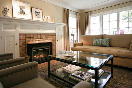
In the above photo, a beautiful formal living room in San Francisco displays the beautiful beige on walls.
Benjamin Moore GB is a true warm beige that is going to make your space feel warm and cozy.
It gives an enclosed kind of feeling – so I would highly recommend northern colder states to use this paint color as it would make you feel warm at all times.
Beige is always a timeless option – so if you are a person who likes to keep changing the looks of your space every few years – you can consider beiges!
I have seen some people love as well as hate this paint color – so you really need to understand the true personality of yourself to finally have this color in your home.
You can use beiges for extremely small spaces as well – maybe something like BM Woodland Snow or BM October Sky is great for such spaces. (Just makes sure the LRV is high enough)
How Does Light Affect the Color?
Natural as well as artificial light always has a role to play on wall paints. Beige tends to look brighter in natural light.
Light is what truly reflects the hue – I mean if there is no light in the room – it is likely that every paint color will look dark-toned like blacks, right?
So, in this case, with ample light, Grant Beige is likely to feel lighter and brighter. Meanwhile, in the absence of light – it may appear quite dark.
I would highly recommend buying paint samples and examining them in dark and light and also different times of the day to see how it may finally appear.
Again, I really recommend you try out some wall samples because colors will look different in every location.
What are the Best Coordinating Colors?
So, now that you are confident about using this paint color, let’s see how best we could pair it.
Since it is mid-toned paint color, you might want to choose lighter neutrals and off-whites, and a darker brown to create a balance. Furthermore, add some pieces of accents like pastel greens, blues, or simply grays and greiges.
Don’t use very bright colors here – instead, go for a soothing and subtle palette.
Hence, here I have a few recommendations in the case of a contrasting palette.
- Mustang 2111-30
- October Sky 2162-70
- Gray Mirage 2142-50

On the other hand, here I am enlisting a few shades that would complement a monochromatic scheme!
- White Opulence 879
- Olympic Mountains 971
- Old Salem Gray HC-94
However, in all of the above cases, choose decorator’s white as your trim and ceiling color!
Benjamin Moore Grant Beige Vs Similar Colors
It is now time to discuss similar alternatives to GB. Beiges are quite easy to pick – so mainly depending on how light or dark the paint color is – you get to choose the best possible option.
One of the closest paint options for Grant Beige is BM Inner Balance 1522 and BM Natural Linen 966.
Grant Beige Vs Inner Balance
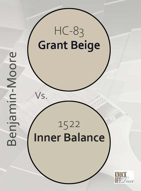
This beige is one of my favorites. This elegant color is used in many traditional styled homes – so, you can absolutely adore it!
With an LRV of 56.99, this paint color is almost similar when it comes to the lightness of the paint color.
For a slightly lighter tone alternative check out the ever-popular BM Revere Pewter. Its tends subtly more towards gray, if a warm gray is more fitting for your living spaces.
For more accurate comparisons, buy swatches and samples and put them against a pure white shade to determine the difference.
Find out what works best in your home’s environment and lighting by putting up some temporary samples and observe – Get some wall samples from Samplize.
Grant Beige Vs Natural Linen

Natural linen is another great alternate to Grant Beige. With timelessness and utmost beauty – this paint color makes a great option for homes.
It is comparatively lighter than GB with an LRV of 60.94!
So you could pick it if you want to make your home feel bigger and brighter.
Order a wall-stick sample of Grant Beige here to help you compare these colors in your own space.
Be sure to also check another similar color in BM’s Shaker Beige for an even more relaxed feel when using tans/beiges.
Where to Use Grant Beige in your Homes?
Timeless and historic, GB is a perfect option for common spaces.
Grant Beige makes a great option in homes that are located in colder regions.
For all the traditional, transitional, Farmhouse, Bohemian, and country style interior design spaces – Grant Beige is something you should be looking for!
Also, the light reflectivity is great enough to make your homes enlightened and bright.
Let’s see where and how you can best make use of this color in your homes.
Grant Beige in Living Rooms
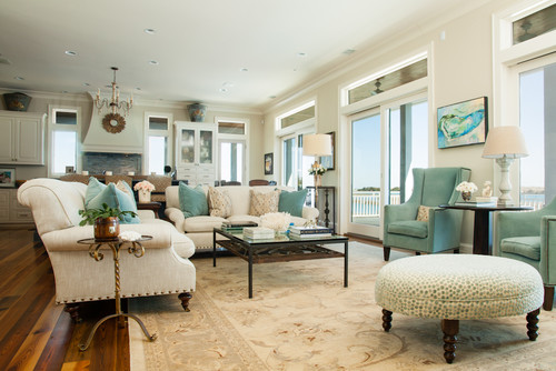
In the above photo, the transitional style living room highlights our highlighted color.
Absolutely – especially if you want to make your living room look cozy and comfortable.
You can best pair this color with browns and grays.
Well, mainly even wooden textures are good to go! Fill your space with ample wooden furniture like wooden coffee tables and wooden-legged couches and accent chairs.
Around the fireplace – again carved wood would give a lavish look or otherwise exposed brick is not a bad option too.
Using in Kitchens
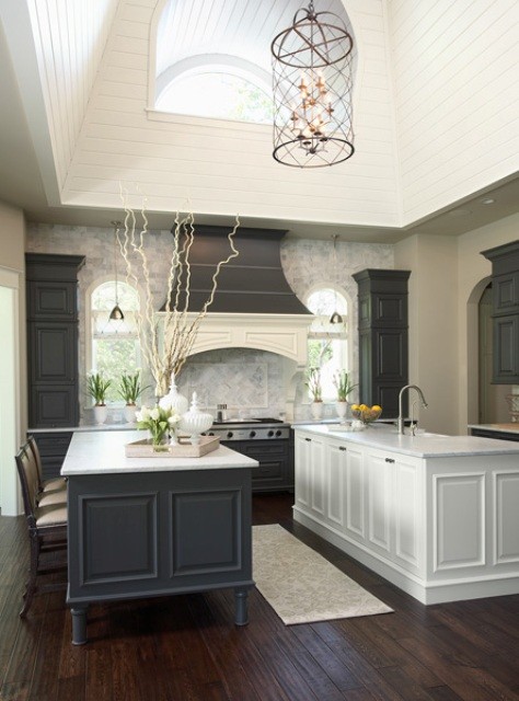
GB looks timeless in this beautiful transitional style kitchen.
Kitchens in Grant Beige are totally traditional.
Now if you like gold oak cabinetry – definitely choose a beige paint color as it will not look off.
Use wooden round pull handles to further contribute to a traditional style look.
Using in Bedrooms

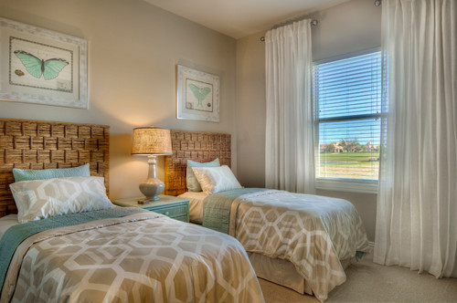
If you really like your room traditional or country style with a warm feel – definitely go for GB!
Again remember to pair with wooden beds, night stands, and warm white or off-white rugs and upholstery.
If your bedroom is north-facing – you can definitely use this color but try to avoid it in the south or west-facing rooms to not create very warm backdrops.
Grant Beige in Exteriors
A lot of homes down in southern states prefer to choose this paint color. It is warm and classy and can be sued on the exterior facades.
You can pair it with grey stone or white door and window frames or lighter beige as well.
Don’t pair it opposite cool whites. It will absolutely steal the beauty of this timeless beige.
My Favorite Way to Sample Colors
I can’t say enough about how easy it is to use a peel-and-stick paint sample to give a color like Grant Beige a try. The absolute best way is to order a sample from Samplize.
You can check it out right on your wall and move it around. Also, try it along with a another couple of colors to test pairing possibilities.
This is WAY easier than having to open up little cans of paint and rolling/brushing on. Forget the mess and use these helpful temporary sample squares to test location, lighting options, etc.
So, are you excited to have a perfect Grant Beige backdrop in your home? Do you feel confident about using it? Do let me know your experiences and reviews in the comments below as I would love to hear about them!


Wow!!!! Thank you for so much information that I needed to make the choice on Grant Beige. I have a two tone gray Barndominium that I will. Paint the doors with outside. And I have 20’ ceiling in our den that I think would be beautiful in the Grant Beige too. Lots of wood furniture and brown leather pieces. Will add lighter color rugs and accessories.
Hi. What color door would you suggest for a colonial painted grant beige?
Hi Patty, I recommend a brown paint color like BM Chocolate Candy Brown for the exterior door.
What would be the best white to go with grant beige
SW Pure White or BM Simply White are good colors to pair with!