

What is the best thing about summer?
I am sure it is definitely sand, water, and sun!
While we all wait for the summers to come around, there is a tinge of craving for all the city dwellers to taste a side of a beach!
Well, what if I say – you can have that vibe in your own home – even if you are miles away from the beach.
Yes, this is where I introduce you to this wonderful blue that is absolutely jaw-dropping when used on walls!

Sherwin-Williams Tradewind is a perfect cool blue paint color that is bound to add a refreshing vibe to your home. And in particular, it’s an ideal choice for coastal homes.
It is a clean and crisp color with a very slight grey and green touch to it – which I must say is hardly noticeable!
Mimicking the vibe of a coast, Tradewind is definitely a ‘go-to’ color if you are planning to incorporate a beachy vibe, décor, and an overall coastal theme!
Classic and timeless – this color is also highly flexible to use!
Don’t worry! I have a few tips and tricks ready for you to show how this color can be incorporated in homes and with what best counterparts the color blends in with!
Just remember – the serenity and peacefulness of the color are worth comparing to none!
Click to see 30+ color palettes you can use with Tradewind!
Sherwin-Williams Tradewind SW 6218 Details and Specifications

Every color has its own sweet story!
They all convey a message and in no time, beautify your spaces with their hidden charm!
This is the theory you must get familiar with – if you are planning to choose colors by yourself.
One such important terminology is Light Reflectance Value (LRV)!
It defines how light or dark the paint is, or how much light the color reflects! This later will help in deciding what spaces should the color be applied.
For Tradewind, the LRV is 61.

Which says that the color falls on the lighter end of the scale (Remember, the greater the number, the lighter the color is)
Now that you know that Tradewind reflects away light, you should be using it in the south-facing room or westside windows!
Now, if you want to try out Tradewind on your walls ahead of time, you can easily do so with a peel-and-stick square from Samplize. Give them a try now!
But before I blur out further details, let us discuss the RGB and HEX Values of Tradewind.
Red = 194, Green = 207, Blue = 207
HEX Value = #c2cfcf
So do you see that Tradewind has a lot to offer you?
Let’s discuss the impacts of this color in your space.
How Does Tradewind Feel in a Space?
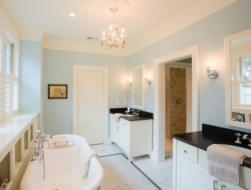
Absolutely light and bright!
First and foremost, if your space feels congested and crammed up – always look for a lighter color.
Post this, you are left with two options – either to choose a warmer or a cooler hue.
Resting aside your personal preferences and lifestyle if you are looking for either of the options – I highly recommend using cooler shades!

Blogger Carrie from The Vintage Wren proves how whites best complement SW Tradewind
A light warm color might still trigger an energetic and crammed-up vibe – but in the case of cooler hues, you can let off that stress!
Tradewind is one such light and cool shade that will maximize the feeling of airiness, spaciousness, and serenity in your space.
It will make your room look bigger and brighter.
Also if you crave a beach and coastal vibe – Tradewind is your answer!
How Does Light Affect the Color?

Design Blogger Carrie at The Vintage Wren reveals her bedroom makeover in SW Tradewind
To be honest – A LOT!
Due to high reflectivity, this color tends to reflect a lot of light, thus, making the color even lighter than it is!
Meanwhile, at night – with slightly warm-white lights – the color tends to appear a little darker than it is.
To simplify for you, it looks a lot like SW 6220 Interesting Aqua!
So, always remember to note the effect of light on paint!
It can absolutely change the overall look.
To truly see what your home’s environment and lighting will do here, try out a real paint sample. It takes out the guesswork!
What are the Coordinating Colors for Sherwin-Williams Tradewind?

Sherwin-Williams Tradewind is a soft, calm serene blue-gray paint color that also has a tinge of green to it. (Somewhere hidden though)
This cool-toned color is much admired by builders, designers, and homeowners – and that’s why you’re quite likely to find many and many inspirations online.
Since the color is quite straightforward, it’s generally easier to pair it with other hues and color palettes.
In general, SW Tradewind would best pair with either crisp or creamy off-whites, dark gray, midnight blues, lighter grays, beiges, and black.
Putting too many flashy colors will distract from the beauty of this color and that’s why I would recommend not experimenting much.
Although, if you like the vibrancy of hues, try styling with lemon yellow or sakura pink!
In terms of metallic accents, choose matte black, oil-rubbed bronze, antique brass, or even polished chrome.
Here are the following two color palette suggestions – monochromatic and coordinating (cool and warm)!
Monochromatic Color Palette

The complementary colors for the monochromatic palette are as follows –
- SW 6219 Rain – see my see more on this color here
- SW 6220 Interesting Aqua
- SW 6221 Moody Blue – see my see more on this color here
This monochromatic soft blue-green palette will definitely make your space feel extra calm and comfortable.
Especially for interior design styles such as coastal, this palette is bliss (of course, if you add off-whites to it as well).
Contrasting Cool Color Palette

The complementary colors for the contrasting palette are as follows (cool) –
- SW 7005 Pure White
- SW 7674 Peppercorn
- SW 7011 Natural Choice
This cool-toned color palette includes crisp gray to add a dashing and modern statement to your home.
You must also remember to style with satin brass and copper in this palette.
Contrasting Warm Color Palette

The complementary colors for the contrasting palette are as follows (warm) –
- SW 7051 Analytical Gray
- SW 7067 Cityscape
- SW 7551 Greek Villa
This warm-toned palette is definitely something that will create a soft and welcoming experience for your guests.
The cool saturation of SW Tradewind contradicts with the warmer beiges to create a cohesive and balanced palette.
However, if you are considering pops of color and a little depth, consider these hues-
- SW 6204 Sea Salt – see more on this color here
- SW 7653 Silverpointe – see more details for this color here
- SW 7064 Passive

Considering these paints, note that the trims and moldings need to be painted in SW Pure White and SW High Reflectance White for the best results!
More Color Palettes!
For a ton more color pairing options, check out my gallery of hand-picked color palettes Tradewind beautifully with:


