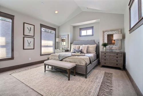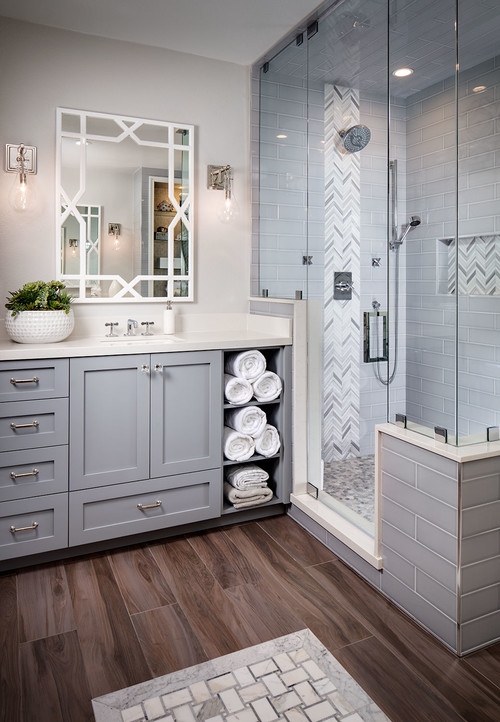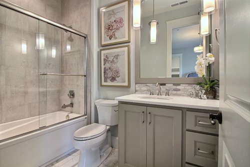
Hello there! I am back here with yet another color review. Before introducing the paint of the day, let me tell you – writing about these colors has been an absolute pleasure.
So, our today’s specialty is Sherwin Williams Silverpointe, and I will be answering one of the most asked questions – is it silver or gray?
This is a cool-toned, crisp silver paint that tends to add a soothing vibe to your homes. Although it appears like silver, but it lacks the lush shine which makes it an even solution from both silver and lighter gray.
However, if you crave that shine – well, simply use this paint in rooms that receive ample light! (Don’t worry, that’s a whole new topic that I will be discussing later)
So, Sherwin Williams Silverpointe is a beautiful light-toned paint color that plays a perfect neutral or a base in homes. It lacks the ‘creamy’ feel while aligning more towards the characteristics of a clean and crisp paint color.
However, know that the color is a chameleon! It somehow appears to have deep green or deep blue undertones in specific lighting conditions. (Which is why I always recommend my clients to analyze the space and its physical characteristics)
Don’t worry! I will help you determine if this is the right paint for your home or not!
So, let’s get started.
Sherwin Williams Silverpointe SW 7653 Details and Specifications

Like I always say, before choosing a paint color, it is crucial to understand the backlog technical terms and information that helps put forth what the color truly is.
Remember, every color has a story to tell! And no two stories are ever the same!
There are various aspects that make up a color – and this is what every homeowner needs to first analyze.
So, first and foremost, it is important to read through the Light Reflectance Value or the LRV’s of a paint color. This value helps in determining how light or dark the paint color is.
In this case, the LRV of Silverpointe is 64. And that means, it falls on the lighter end of the scale. (Remember, the greater the number, the lighter the paint)

You can easily find this value at the back of the paint swatch!
What I like to do is sample Silverpointe under different lights where I’m going to use it. I use Samplize stick-on samples. Get some samples now!
Secondly, other associated terms are the RGB and HEX Values that are important to take into consideration.
Since this is the value that determined what the color truly is made of!
Red = 209
Green = 210
Blue = 203
HEX Value = #d1d2cb
Now enough with the technical and scientific information, let’s get started with the practical aspects of this beautiful and timeless cool-toned paint color.
How Does this Color Feel in a Space?
This paint color feels extremely light, airy, cool, and tranquilizing when used in a space. It also makes a great backdrop for homes that crave a cool environment.
Moreover, this color is also believed to make your spaces look larger than it is (mainly, creating an illusion)! So, if you are an apartment or a city dweller, this color can truly solve many of your space issues as it tends to push away the walls!
You can use this color in very small spaces as well!
I recommend all the tropical and warmer regions to incorporate this color in homes.
I promise, after a long hard-working day, this color will feel tranquilizing and relaxing! On the other hand, if you want a cozy touch, this may not be the best option.
How Does Light Affect the Color?

The Northcutt Home reveals the subtle use of SW Silverpointe
Like I said before, light plays a major role in the paint colors.
It tends to make a space look lighter and brighter with the presence of excessive light. Whereas on the other hand, the absence of natural light will equally make your space look comparatively darker.
So, first and foremost, look around and observe the surroundings! Is your room receiving ample daylighting?
If yes, you may also go for a shade darker else this would be a good option.
Furthermore, artificial lighting too has a role to play. Your pendant lights and chandeliers create a dramatic effect in changing the appearances of this color.
As I mentioned before, you can try out this color with real paint, (but without the mess) using stick-on samples from Samplize.
What are the Best Coordinating Colors?

Now that we have analyzed what the color truly is and what it feels like, it is time to pair it with the best opposites.
You can either choose from a contrasting or a monochromatic color palette. Make sure to analyze carefully so as to not mess up with your space.
Depending on your interior design style, it is important to create a sense of balance and harmony in the space. So, without any delay, here are a few of the colors I would recommend for a monochromatic palette!
- SW 7659 Gris
- SW 7660 Earl Grey
- SW 7622 Homburg Gray
On the other hand, for a contrasting color palette, I would recommend the following paint colors that you could incorporate:
- SW 6258 Tricorn Black – see more details here
- SW 6276 Mystical Shade
- SW 6283 Thistle

For your ceilings, trims, and moldings – I would recommend using SW Pure White to further achieve a creamier look or else if you want a crisp look, choose SW High Reflectance White.
SW Silverpointe Vs Similar Colors

Here is yet another fact that you must note: there are no two colors that look exactly the same!
Now, I am going to list down the two most similar-looking paint colors that may be the closest in looks to Silverpointe! They are SW 9630 Moorstone and SW 7654 Lattice.
Let’s discuss what differentiates the two!
Silverpointe Vs Moorstone

An ‘interior’ only color, this paint has an LRV of 63 making it a creamy shade of silver (the main difference)!
This color may majorly exhibit green undertones and lesser or silver or gray. So, if you are looking for a gray tone in green undertones, this is probably one of the best options.
This color also appears slightly warmer – thus, good for colder and northern regions.
If you want to test the subtle differences in your house, get some wall samples of each here.
Silverpointe Vs Lattice

With an LRV of 61, this is comparatively a darker shade than the other two paints.
This color has deep warmer tones so, if you want a tinge of warmth in a gray paint – this is good to go!
Test these colors side-by-side to see the differences in “real life” INSIDE your home, with some wall-stick samples. Order here!
Where to Use Silverpointe in Your Home?
Especially if you have an interior design style such as Scandinavian, Modern, Minimalist, and Farmhouse, this color is absolutely great to go!
Let’s see how you can incorporate this color in homes – and specifically how!
Silverpointe in Living Rooms
If you are craving for a cool atmosphere in your home as soon as you enter, well, this color is definitely a great option.
You can paint all the walls in this color with a few contrasting accents that I mentioned before. Moreover, you can add some heavy dark gray blackout curtains in order to add depth to your spaces.
Just in case if you have a fireplace – you can either clad the surroundings with natural stone or use black granite.

Using in Kitchens
If you have desirability for cool-toned kitchens, I recommend using this color on the cabinetries.
You can best pair it with a white marble countertop and golden-tinted pull handles and fixtures. Moreover, you can add a nice piece of an industrial-style chandelier to further refine the looks.
Try to avoid golden-oak or pinewood cabinets with this paint color.
Silverpointe in Bedrooms
I would absolutely love those looks! Nothing is better than a quiet and serene bedroom, right?
You can paint all the walls in this color and use matte-black accents through the chandelier, bed frame, and rug pieces.
Adding sheepskin would a great way to introduce a touch of warmth and coziness in your bedrooms. Moreover, using blackout curtains will balance the overall appearance.
Using on Exteriors
Absolutely yes!
And especially if you reside in one of the tropical and warmer states – this paint color will reflect most of the incoming light – thus, making your interiors cool and calm at all times.
You can pair it with super whites, or even grays through decorative moldings, door and window frames, and trims to add a character to your home exteriors.
How to Best Sample This Color?
I need to share my favorite tip for testing out a color like Silverpointe – go over and order a peel-and-stick sample from Samplize.
These folks are nifty because they figured out a convenient way for us to sample colors way more easily. Just stick up a temporary square sample and forget the small jar of actual wet paint.
For only a few dollars you’ll receive a perfect sized square you can stick up temporarily anywhere you want to “try” on a paint color and any possible coordinating hues you like. It’s the best!
So, how do you want to use this color in your homes? Interiors or Exteriors? Now that you have all the secrets – are you excited about painting your home in Silverpointe?
Should there be any questions or thoughts, let us know in the comments below!
My 7 Key Tips for SW Silverpointe
1. Understand Silverpointe’s undertones
Silverpointe sits in that quiet zone between cool gray and silvery green.
I’ve seen it shift greener in low Northern light and cooler in spaces with bright indirect light.
Sampling on at least two walls is a must so you don’t wind up surprised!!!
2. Use warm bulbs to balance the coolness
Silverpointe can read chilly under daylight or cool LED bulbs.
Switching to 2700K warm bulbs will soften the color and make it feel more welcoming.
I like to compare bulbs at night because the shift can be dramatic.
3. Pair smartly with flooring and cabinetry
On interiors, Silverpointe flourishes alongside mid-tone natural oak floors and soft white cabinetry.
Oak warms the space while the color’s subtle green keeps things crisp.
In kitchens, creamy white shaker cabinets keep the scheme classic without feeling sterile.
4. Be strategic with sheen levels
A matte or eggshell sheen keeps Silverpointe’s understated look intact.
Higher sheens can expose drywall imperfections and push the color cooler.
I always test a small patch to see how reflections might change the mood.
5. Make the most of rooms with weaker light
This color performs beautifully in bedrooms and home offices that lack strong natural light.
The silvery undertone adds interest so the space never feels flat.
I especially like it with brushed nickel hardware to keep things cohesive.
6. Think exterior siding and stone pairings
On exteriors, Silverpointe works best with gray stone or pale limestone and crisp white trim.
Avoid pairing with overly warm brick, which can make the color look murky.
Test large boards outside at multiple times of day because skies and shadows shift things a lot!!!
7. Coordinate with cooler flooring and cabinets too
If you have charcoal tile floors or modern slab cabinets in light gray, Silverpointe harmonizes because of its refined cool side.
Just bring in a touch of warmth through décor or lighting so the room doesn’t feel too icy.
I’m always amazed how a woven rug or warm metal instantly completes the look.


Hickory kitchen cabinets.
stainless appliances and sink
Flooring just a shade darker than cabinets
want new counter top, backsplash and paint. kitchen and dining area are visible from living room so will use same wall color for all. pot shelves and vaulted ceiling..can color there very different?
Silverpointe?
2 bathrooms and 1 bedroom are conservative gray
You can best pair this color with off-whites, whites, and gray. So, consider the same color throughout the periphery in your common area – and choose likewise lighter-toned marble or granite for the countertop. When you pair it with white – there is very little opportunity for the color looking like something else!