
Unlike the blissful and calm color by the same name from Sherwin-Williams, Benjamin Moore Sea Salt brings you a sandy beach and relaxing spa massage vibe.
It’s a light gray paint color with deep brown undertones (as opposed to many popular grays with blue undertones)!
Seems a bit tricky, right?
But this attractive paint feels like a cool greige and khaki and tends to align with both warmer and cooler sides of the paint.
There are quite a few considerable differences in these two paint colors when it comes down to it!
One is truly grayish-green, whereas the other is predominantly brown and greige – the one from BM we’re discussing here.
So, primarily when I speak of BM Sea Salt, I want to convey the feel of multi-toned oysters and the afternoon reflection of sand.
And, you’ll be glad to know that this paint color is quite versatile.
Offering one solution for all, this greige color intends to highlight the beauty of both the beige and gray paint.
So, are you wondering how to best make use of this paint in your home?
Well, I have got you covered!
This color review will help you determine exactly how and where to use the paint color.
And on top of that, if you should really use it or not!
So, let’s get started.
Benjamin Moore Sea Salt CSP-95 Details and Specifications

Greiges and khaki have a certain charm. And there are various ways to differentiate them from their other cousins – browns, beiges, and tans.
And do you know how?
Well, let’s discuss the details and specifications that are one of the most important aspects when choosing a paint color.
So, when choosing a paint color, you must understand the underlying theories and facts that are related to each one of them.
So, first and foremost, let me introduce you to the concept of Light Reflectance Values or the LRV’s that determine how light or dark the paint color is.
Here, in this case, the LRV of Benjamin Moore Sea Salt is 62.93.

And that means it falls on the medium to the lighter end of the scale – hence, it can be used as a base! (You can consider painting all the walls of your room in this neutral color)
(Remember, the greater the value, the lighter the paint – on a scale of 1-100)
Oh, if you want to just try Sea Salt so you’ll know just how it’ll look, you can easily with a peel-and-stick sample from Samplize. Order some samples now!
Secondly, other important associated terms are the RGB and the HEX Values.
Red = 213
Green = 207
Blue = 195
HEX Value = #D6CFC4
Since we have discussed the technical and scientific information, let’s get started with the practical aspects of this Benjamin Moore greige paint.
Also, let me tell you, don’t confuse this paint with the Sherwin-Williams color using the same name – you can read all about that one here!
How Does This Color Feel in a Space?
Benjamin Moore Sea Salt will truly bring the vibe of sun-bathing on warm and cozy sand! For this, it’s a favorite color choice of mine and my clients.
Yes! This color is very closely related to warmth, coziness, and extreme comfort.
It is creamy and sober, thus giving your space an ultimate feeling of being calm and composed.
However, you must know that this color can tend to play tricks in some situations. Majorly, the paint has greater depths to give your walls a sense of character and identity.
Apart from that, this color wouldn’t overpower your space, and is quite good to go for medium-sized rooms as well.
How Does Light Affect Benjamin Moore Sea Salt?
This is a major point of concern when picking paint colors for your room.
Do you generally tend to overlook the aspect of incoming light or take that into consideration?
Well, in either case, let me tell you that you must analyze the incoming natural light.
Based on the amount of incoming light, you should determine the reflectivity of your paint color.
So, this color is a great recommendation for east or north-facing rooms, since it exhibits a warm appeal.
On the other hand, in a west or south-facing room, this color is slightly bound to appear golden-ish.
But don’t worry! None of them is prominent.
Secondly, you always have the opportunity to use artificial lighting in the form of chandeliers and wall sconces.
To truly see what your home’s environment and lighting will do here, try out a real paint sample. It takes out the guesswork!
What are the Best Coordinating Colors?

You must pair Benjamin Moore Sea Salt cohesively to truly feel the beauty of this color.
And that is why you have to be careful when choosing complementary color schemes!
You can best pair this greige paint with true whites (in the case of trims, etc.), blues, mauves, black, taupes like BM London Fog, and tints of yellows for a contrasting feel.
You can also incorporate any of the metallic tints as accents here – like nickel, gold, or chrome!
Furthermore, you can choose from a monochromatic or a contrasting color palette, depending upon the interior design style and your preference.
So, here are a few of the colors I would recommend for a monochromatic palette! They are all a perfect match.
- CSP-170 Greenwich Gate
- CSP-175 Kid Gloves
- 1531 Victorian Garden
On the other hand, here are a few of the colors I would recommend for a contrasting color palette!
- AC-41 Acadia White
- PM-8 Charcoal Slate
- CSP-195 Porcini

For your ceilings, trims, and moldings, you can use BM Chantilly Lace as it is a true white paint and will further protrude the original adjacent hue.
BM Sea Salt Vs Similar Colors
Looking for similar colors can be equally challenging!
However, when looking for them, you must know that there might be a slight alteration in the undertones or the reflectivity in similar colors.
And primarily, they could either be differentiated through undertones or reflectivity.
Well, in either of the cases, let me tell you – it’s difficult to find something the same.
So, here are the two colors closely related to BM Sea Salt are CSP-35 Penthouse and SW 7632 Modern Gray.
Let’s see how they differ.
Sea Salt Vs Penthouse

When closely observed, you are quite likely to notice the differences in the undertones here.
Well, Sea Salt exhibits a slightly pinkish undertone. On the other hand, BM Penthouse appears with slightly beige undertones.
And with an LRV of 63.45, it falls on the medium to the lighter end of the scale.
Order a wall-stick sample of Penthouse here to help you compare colors in your own space.
Sea Salt Vs Modern Gray

Another very close alternative, SW Modern Gray feels equally soft and creamy.
This paint color has an LRV of 62 – thus, comparatively darker than all of them!
You can best pair it with darker blues and creams!
Do yourself a favor and grab some stick-on sample sheets of these two colors and see what looks best in your home.
*Note, I purposely am not comparing Sherwin-Williams Sea Salt here as they are such different-looking colors!
Where to Use Sea Salt?
A versatile paint color like Sea Salt can be used absolutely anywhere in your home.
Whether it is the kitchen cabinets, the living room walls, or the bathrooms, this color is bound to play flawlessly.
However, note that this paint color can’t be used in the exteriors.
So, let’s see how and where to incorporate it.
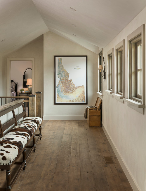
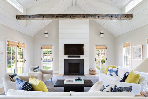
Sea Salt in Living and Dining Rooms
Especially for transitional, traditional, and farmhouse interior design styles, this tone of greige is quite good to go as a general wall color.
In case you have wall paneling and moldings, use crisp or creamy whites to help the color protrude.
Furthermore, this color best complements blues, mauves, and mustards.

Lastly, in terms of metallic accents, use matte black, chrome, or brushed brass.
Lastly, wooden textures are a must – especially when it comes to floating shelves, exposed beams, and flooring!
Using in Bedrooms
More than an accent wall, this color plays flawlessly when used on all the walls.
It exhibits a comfortable and warm appeal – and at the same time, makes your space feel confined and welcoming.
You can always add white sheer curtains and warm gray curtains to go with the overall palette.
Lastly, lay out white shag rugs to further uplift your bedroom.
Sea Salt in Kitchens
This tone of greige looks amazing in the kitchens!
But at the same time, I would recommend using it on the backdrop wall rather than the cabinets.
Furthermore, use creamy whites on the cabinets and a chrome finish on the pull handles and drawers.
Secondly, add white or warm gray backsplash tiles and a black or white granite countertop to go!
Great Paint Sample Tip!
Here’s my favorite tip when it comes to testing out a color like Sea Salt – go and order a peel-and-stick sample from Samplize.
These guys figured out a great way to sample colors much more easily. Simply stick it up instead of having to get a small can of actual wet paint.
For a few bucks you get a nice sized square to throw up temporarily anywhere you want to “try” on a paint color and any possible coordinating hues you like. Too cool!
My 7 Key Tips for Sea Salt
1. Lean into Sea Salt’s coastal character by keeping walls light and airy
Sea Salt’s soft blue-green tone thrives when it isn’t competing with heavy, dark surroundings.
Keep window treatments light and use minimal layering on the walls to let this color breathe and do what it does best.
2. Pair Sea Salt with warm white trim, not a stark cool white
This is one of the most important decisions you’ll make with this color.
A warm white trim keeps Sea Salt feeling soft and cohesive, while a cool or bright white trim can make it read more clinical than calming.
I’ve seen Benjamin Moore Chantilly Lace work beautifully here as a trim companion!
3. Choose flooring tones that complement rather than compete
Sea Salt works especially well with light to medium warm wood flooring tones like honey oak or natural maple.
Cooler gray-toned flooring can push this color in a direction that feels flat and disconnected rather than fresh and inviting.
4. Be thoughtful with cabinet colors in kitchens and bathrooms
Sea Salt is a stunning choice for bathrooms and kitchens, but cabinet color matters a lot here.
White or soft cream cabinetry is a natural partner for this color, while dark espresso or heavily gray-toned cabinets can create a visual tension that’s hard to resolve without repainting.
5. Use Sea Salt on exteriors with care in shaded conditions
On exteriors, Sea Salt reads beautifully in full sunlight but can shift toward a noticeably cooler, grayer tone in heavily shaded areas.
If your home’s exterior gets limited direct sun, test a large sample before committing because the result can surprise you!
6. Avoid overly warm or yellow-toned decor accents
Sea Salt’s cool blue-green character doesn’t play well with heavily golden or mustard-toned accents.
Those warmer tones pull against this color’s natural vibe and make the room feel unintentionally mismatched rather than collected and intentional.
7. Apply a consistent sheen level throughout connected spaces
Sea Salt is a color that moves through open floor plans beautifully, but inconsistent sheen levels between rooms can make the color read differently from space to space.
I always recommend keeping the same finish throughout connected areas so the color stays true and consistent as you move through the home!
Now that you’re armed with a bit of knowledge, are you ready to paint your home in Benjamin Moore Sea Salt?
By the way, be sure to check out some of the best BM greiges in my guide here!
Should there be any questions or thoughts, let us know in the comments below!

Leave a comment