

Benjamin Moore London Fog triggers one major confusion – is it greige? Is it taupe? Or is it beige?
Don’t worry! I’ve been in this same spot – but after studying this color in detail, I’m sure what this color is!
Taupe it is.
This perfect warm neutral is quite a versatile and timeless option to have.
However, unlike the others, this color has the potential to truly confuse you!
Apart from what this color truly is, the undertones are what is the tricky part.
So, are you looking to consider this pretty neutral for your home?
If yes, then before planning to splash that color on the wall, you must read this color review very carefully.
First and foremost, we’ll make sure you understand the undertones on this one specifically to eliminate any surprises when it comes to what you expect and which colors best coordinate with it.

Even though many taupes incline towards green undertones, in this case, the color reflects deep pink or violet undertones.
But it depends on your surrounding elements as well.
So, are you excited to find out more and see what this BM taupe has to offer!
Well, wait no further. Let’s get started with this beautiful journey to painting your home in Benjamin Moore London Fog.
Benjamin Moore London Fog 1541 Details and Specifications

How do you differentiate a greige hue from taupe?
And I am not talking about appearances here.
Well, it’s time to get hands-on with some details and specifications related to paint color.
Trust me, most of the homeowners tend to ignore this aspect – but it shouldn’t!
So, when choosing a paint color, you must understand the underlying theories and facts that are related to each one of them.
So, first and foremost, let me introduce you to the concept of Light Reflectance Values, or LRVs, which determine how light or dark a paint color is.
Here, in this case, the LRV of Benjamin Moore London Fog is 57.23.

And that means it falls on the medium end of the scale; it can be used as a potential base.
(Remember, the lesser the value, the darker the paint – on a scale of 1-100)
Most often, it’s best to sample a paint color in your home to confirm it will work as you expect. You can do this easily using Samplize. Grab one now for London Frog!
Secondly, other important associated terms are the RGB and the HEX Values.
Red = 203
Green = 198
Blue = 189
HEX Value = #CBC6BD
Since we have discussed the technical and scientific information, let’s get started with the practical aspects of this taupe Benjamin Moore paint.
How Does This Color Feel in a Space?
If you truly look at some of these inspirational images, you would find how calming and soothing this color might feel.
Even though this color has a comparatively darker tone, it somehow exhibits a creamy yet traditional look.
So, if you want to relate coziness, comfort, and warmth with your home, this shade of taupe would make an excellent choice.
You can choose to paint all the walls in this color and realize how beautifully it pulls your space together!
Whether you have a larger-sized bedroom or a medium-sized living room, don’t hold back from this color if you truly embrace a unique experience.
How Does Light Affect the Color?
Light has the potential to make your rooms feel dark and dingy or bright and motivating!
Yes, that’s the magic that natural or artificial light plays.
Moreover, the marriage between your paint and light is bound to take your space a long, long way.
So, if you are receiving ample daylight in your room throughout the day, this color is bound to look lighter.
Otherwise, it may feel overpowering if the size of your room is smaller.
Also, this paint color is highly dependent upon its surroundings. For instance, if you have an overlooking back lawn through the windows, it may slightly feel greenish.
In the north-facing rooms, this color will dominantly reflect the deep violet or purple undertones.
Again, I really recommend you try out some wall samples because colors will look different in every location.
What are the Best Coordinating Colors?

It’s important that you pair Benjamin Moore London Fog cohesively and creatively to know its utmost powers.
And that is why you have to be careful when choosing complementary color schemes!
You can best pair this taupe paint with true whites (in the case of trims etc.), blues, mauves, black, and sage greens to infuse a delightful vibe.
You can also incorporate any of the metallic tints as accents here – like nickel, gold, or chrome!
Furthermore, you can either choose from a monochromatic or a contrasting color palette, depending upon the interior design style and your preference.
So, here are a few of the colors I would recommend for a monochromatic palette!
- 1542 Himalayan Trek
- 1543 Plymouth Rock
- 1544 Waynesboro Taupe
On the other hand, here are a few of the colors I would recommend for a contrasting color palette!
- 1633 Brittany Blue
- CSP-270 Dark Chocolate
- CSP-245 Stoneware

For your ceilings, trims, and moldings, you can use BM Chantilly Lace as it is a true white paint and will further enhance the original adjacent hue.
BM London Fog Vs Similar Colors
These generic taupes tend to share tons of similarities with greiges, darker beiges, and warm grays.
Whether it’s the undertones or reflectivity, BM London Fog can be compared to a couple of other BM and SW hues.
So, let’s discuss the major ones – BM 2108-60 Abalone and SW 7022 Alpaca.
London Fog Vs Abalone

This never-fail warm gray neutral has the potential to do wonders.
It can be very closely related to the taupes – but somehow they have a deep brown mixed in as well.
With an LRV of 63.06 – this paint feels quite light (and yet bold in various circumstances).
Consider the same color schemes that I mentioned earlier in the color review.
Find out what works best in your home’s environment and lighting by putting up some temporary samples and observing – Get sample stick-on sheets from Samplize.
London Fog Vs Alpaca

This awesome Sherwin-Williams paint (learn all about it here!) is a warm gray neutral that closely relates to the former paint samples.
And it is warmer than you think!
However, when closely observing, this paint color can be categorized under the color category of taupes.
It tends to look slightly beige and slightly gray depending on the compass directions of the room.
Also, it has an LRV of 57 – that puts the color in the medium to light category.
Order a wall-stick sample of London Frog here to help you compare these colors in your own space.
Where to Use London Fog?
Benjamin Moore London Fog is a taupe paint color that can be used in your bedrooms, bathrooms, living rooms, dining rooms, and even kitchens.
This color makes a great statement, especially in the transitional, traditional, and bohemian interior design backdrops.
Let’s see where and how to incorporate this taupe paint color in your home.
London Fog in Living and Dining Rooms
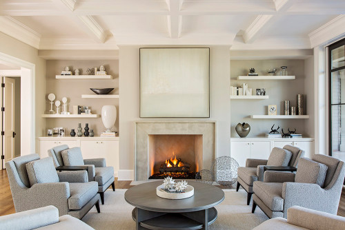
This color makes a flabbergasting statement when used in the open space plans – especially in the connected living and dining space.
One of the major reasons is that it truly reflects its true hue when used in a larger space.
You can further play with either white, beige, or gray linen curtains, shag rugs (with or without patterns), and ample tasseled faux and fur throw pillows to go!
Wooden textures pair phenomenally – so, don’t hold back from hardwood floors, floating shelves, and exposed beams.
Lastly, you can infuse a little blue and mauve to give a touch of contrast.
Using in Bedrooms
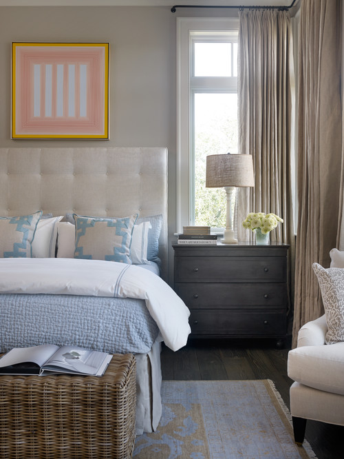
Another great place to let that taupe do wonders!
I highly recommend you paint all the walls in this color and then further complement it with creamy whites on cushions, upholstery, linens, rugs, and other textiles and fabrics.
In terms of metal accents, choose a matte black finish for the bed frame, chandelier, and even floor or table lamps.
Lastly, you must add tinges of rattan, wicker, and cane to further feel cozy, natural, and warm!
(Baskets are a must-try for temporary storage)
London Fog in Kitchens
Do you have a Farmhouse, traditional, or transitional-styled kitchen?
If yes, this color is a must-try!
It imbues a soft and creamy touch – and at the same time, makes your kitchen feel so welcoming and pretty.

You can choose to paint this color on the cabinets and leave the backdrop wall in creamy whites.
Secondly, you have the option to choose matte black or brushed brass finish for the pull handles and drawers.
Use brown or black granite countertops, mosaic tiles or patterned porcelain tiles on the backsplash, and ample indoor plants to feel refreshed as always!
Using on Exteriors
Whether you have a Spanish-style home or a Mediterranean haven, BM London Fog makes a great statement on the exterior walls.
You can pair it beautifully with creamy whites on the trims, door, and window frames.
Further, I highly recommend incorporating tints of chocolate brown as an accent on either the shutters or focal walls.
Lastly, don’t hold back from using natural stone wainscotting (in a warmer base)!
My Favorite Way to Sample Colors
I can’t say enough about how easy it is to use a peel-and-stick paint sample to give a color like London Fog a try. The absolute best way is to order a sample from Samplize.
You can check it out right on your wall and move it around. Also, try it along with another couple of colors to test pairing possibilities.
This is WAY easier than having to open up little cans of paint and rolling/brushing on. Forget the mess and use these helpful temporary sample squares to test location, lighting options, etc.
Benjamin Moore London Fog Undertones
The Three Undertones Defining London Fog’s Complex Character
Benjamin Moore London Fog carries three undertones worth knowing before you commit to it.
The first is a soft green undertone that surfaces most noticeably in rooms with natural light and neutral surroundings.
The second is a subtle purple or mauve quality that appears in lower light conditions and can genuinely shift the mood of the room.
The third is a cool gray base that ties everything together but becomes more prominent under bright white artificial lighting.
Understanding all three is what separates a confident choice from a costly one!
How Lighting Exposes London Fog’s Most Surprising Shifts
This is where London Fog tends to catch people off guard, and lighting is the biggest variable to watch.
In north-facing rooms with cool, indirect light, the green and purple undertones become far more visible and can make this color feel unexpectedly cool and complex.
In warmer artificial lighting, the gray base softens and the mauve quality pushes forward in ways that feel almost lavender.
I’ve seen this color look like three completely different shades depending purely on the light source in the room.
Surrounding Elements That Pull Out Hidden Undertones
Warm wood tones and beige furnishings tend to suppress London Fog’s green quality and bring its gray side forward.
Cooler whites in trim or cabinetry, however, amplify the green undertone significantly.
Be sure to test this color next to every major element in your space before buying, because the undertone shifts here are real and worth catching early!

Leave a comment