
A medium bright tone of pink – blush is a color that trends in many industries, especially in home decor and interior design lately.
It’s also very closely tied to the fashion industry as well – after all, the skin tones and make-up products are highly influenced by this paint color.
In home decor, you can see this color being used in various interior design styles – that are poles apart.
For instance, Eclectic and Scandinavian!
One point of consistency however is that this color can largely be connected to feminine and soft vibes within a living space.
It goes without saying that younger girls especially adore this color.
Whether it’s their bedroom or birthday party or later for wedding themes – pink or blush is highly admired.

But what really is the difference between these two and how is the blush color formed?
Well, blush is actually one of the shades from the pink color family that is more muted and soothing!
(Well, something totally opposite of saturated pink or a magenta color)
It’s formed by mixing proportions of red and white to create a playful, romantic, charming, tender, and more soothing vibe.
Think of everything feminine and cute with this color – like those soft rose patterns and cute laces!
If you’re trying to locate this color on the color wheel – you can find it somewhere between magenta, reds, and rose pinks.
Also, it’s pretty much clear that this hue is a warm tone with no cool undertones!
THINK: warm, cozy, and elegant to sum it up more accurately.
So, if your daughter has been insisting on having a blush-themed bedroom or an absolute blush-pink wedding – this article will help you learn more about this beautiful and magical tone!
So, let’s see just what’s behind this color and all that it has to offer!
The Flawless and Elegant – What Color Is Blush?

Let’s first discuss the basic specifications and details of this color category.
Remember, every category is associated with certain underlying theories and facts that make it equally unique and distinctive!
So, there is something that distinguishes blush from peach, rose pink, coral, and raspberry.
Yes, they are all somehow related to each other – but far different when you dissect their specifications.
From RGB to Undertones to Tint and Tone
Whether it’s the undertones or the certain RGB values that describe what the color is composed of, here are certain terminologies to check out:
Also note, light reflectance values can differ for each typology and variation (or face) of the color!
Pantone Code= Pantone 7423 C
Cyan= 0%
Magenta= 58.1%
Yellow= 41%
Black= 12.9%
Red= 87.1%
Green= 36.5%
Blue= 51.4%
Blush Pink HEX Code= #DE5D83
Blush is my absolute favorite too! Tints of this hue are always intriguing to me.

The multi-blush-colored Sakura flower in full bloom.
There are some that incline more towards the hot pinks whereas some more towards the lighter peach colors!
These above-mentioned percentages will help you in the classification of the color and how it is truly made.
And you know the best part?
Well, this color is a great recommendation for exhibiting soothing vibes when using in your environment!
It’s somehow associated with playing with your minds in the most mesmerizing ways!
The Six Faces of Blush Colors – Sweet, Romantic, and Timeless

Like I say – the possibilities for a color are endless.
And especially if it is blush – there are 6 primary ones, and trust me – many more!
These blush shades can be categorized as the tints, tones, and shades of that particular color.
In some cases, light reflectivity and undertones may vary too!

So, here are some basic color terminologies that you should acquaint yourself with to understand color makeup in general.
‘Tones’ are basically the results formed by adding gray to a pink paint color! The result is a more muted and subtle hue – well, something like dusty pinks that could almost feel gray with a pink undertone.
‘Tints’ on the other hand are the amalgamation of white with a pink paint color. The result is something like lighter blush or lavender-pink!
Whereas ‘Shades’ are the results formed by adding some black to pink paint color. The result is quite dark – something like magenta pinks or hot pinks!
Diving deeper into these details and these faces – let me familiarize you with these 6 faces of blush!
Remember there really is no perfect blush shade, it just comes down to context and what you’re using the color for and with.
Blush Pink

Straight out of a barbie doll house, this beautiful blush pink reminds me of everything sweet, candy floss, and of course those majestic dollhouses.
Compared to it’s siblings, this one almost feels like a peach blush.
You can very well pair this color with whites and monochromatic pinks!
Pale Blush

Very light and soothing, this certain blush pink is also quite soothing and relaxing. You can relate this particular tone with baby pinks and can use it on the walls of your daughter’s nursery or littler girl’s room!
To further achieve the best appearances, you can pair it with blues! Ah, that’s nice.
Bright Blush

Not too light nor too dark, this particular tone of pink is quite saturated (but not as much as magenta)!
Quite warm, cheerful, and feminine – you can absolutely use this color in your home – and especially on your accented accessories and components of furniture and curtain fabrics when you want to add that pop of color.
Light Blush

Another beautiful tone of pink – this lighter, almost cream blush is not very saturated so it feels a bit less bold but standing on its own all the same!
It’s a perfect blend of baby pink and brighter blush when it comes right down to it.
Despite the name, this is not quite the color you’d use for powder blushes and makeup for fair skin. Perhaps for medium skin tones or dark skin.
Light Rouge

A blend of pink and purple, this tone of blush is something that you should have an eye on.
It doesn’t feel too soothing – but you can always play in accents to achieve a pinkish and purple appearance. Can you see it already?
You can pair it with greens and pretty much any purple!
Deep Blush

One of the darkest of them all, deep shade of blush is quite a saturated and bolder tone.
Relating to the magentas and darker reds – it wouldn’t be a bad option to have this tone in your home when used in just the right way.
Similar Colors
Now that we’ve discussed the six notable faces of the flowery blush color – let’s get talking with some of the similar colors that closely relate to it.
So, the first of them is mauvelous!

It is a stunning pink color with a touch of warmth, luxe, feminine, and elegant vibes.
On the other hand, mauvelous is a similar color to blush that doesn’t feel too saturated but rather is quite sober, muted, and subtle.
Learn more about the different shades of mauve in my guide!
It feels a bit classic doesn’t it? Would a hip grandmother wear it on her fingernails without making her look like she’s trying too hard to preserve her feminine youth?
Next in line is Cotton Candy; a pale pink that absolutely feels just like those poufy, edible wispy balls!

It’s girly, light, and quite tranquilizing!
Not only should you use it in your homes but also for the wedding themes and your daughter’s birthday party!
Lastly, Pantone’s Tickle Me Pink is a delightful pink blush that is a little quirky and chic!
It’s also one of the most common pinks used in the home decor industry (more on this later!).
Coordinating Colors

I would say – there are multiple ways to flaunt off that perfect blush!
You can either choose a monochromatic theme and use lighter or darker pinks from the same family or go for a contrasting vibe!
Generally, colors such as blues, whites, off-whites (as neutral colors), mauves, greens, and grays would look seamless and beautiful with this one!
Don’t even forget to add tinges of burgundy and maroon in some cases to add a sense of visual interest!
For your girl’s bedroom – amalgamate blush with lighter baby pinks and whites with pink undertones.
Otherwise, even yellow and purple are good colors to pair with!
Moving ahead, let’s dig into some useful background information on where blush comes from, what it means in our world, and some ways on how we like to use it.
Blush – The Color of Beauty, Comfort Empathy

As a soft pale hue of red, blush is known to be one of the happiest colors of nature.
The color blush depicts affection, empathy, and support. This blend of red and white contains the passion of red while white lends intuition and retrospection.
The powerful nature of red is softened with the simplicity of the softening white.
The deeper the shade of pink, the deeper the strength it presents.
Along with that, blush links to the element of understanding and pure love. In this light, you can think of it as associating with the act nurture between a giver and receiver.
If we look at color psychology, blush is a positive color that brings out comforting sentiments.
While being an intimate and romantic color that manifests sensitivity, it’s also considered to be a symbol of optimism.
Supported by love and nurture, blush helps to bring out a feeling of relief and hope, assuring that everything will turn out to be just fine.

Perhaps this is why the original eraser remained a pale blush color – making a mistake in pencil is ok, right?
Blush is also associated with the color of healthy and attractive skin and carries sexual and sensual connotations.
It’s no wonder there is a complete category of makeup dedicated to reproducing the blush color on women’s faces!
Interestingly enough, blush can bring negative connotations such as someone who is “blushing”. It can represent a lack of self-confidence and willpower, sourcing itself on cheeks with light skin tones when we’re embarrassed.
Playing the Opposite in Our History
Blush became popular in the late 1750s when European men and women started to wear powdery colors depicting a high status and luxury.
The color was so beloved to Madame de Pompadour, the chief mistress of Louis XV that a porcelain manufacturer named the new shade Rose Pompadour, after her.

Back then, blush wasn’t associated with the female gender. In fact, it was considered more fitting for little boys. How our society and times have changed!
It was seen as a paler shade of red, so in that way, it was thought to carry more masculine undertones.
It wasn’t until the 1940s that blush got linked to the female gender with blue, of course, hooking up with boys.
The Abounding Blush in Our World
Here are some interesting facts on how blush plays a role in our societies around the world:
Blush is associated with Tuesdays on the Thai solar calendar in Thailand.
Any citizen may wear this color on Tuesdays, and anyone born on a Tuesday may adopt blush as their color.
Palermo, a soccer team based in, Italy, wears blush home jerseys.
Blush can also be seen in the world of architecture such as The City Center in Kannur, India, The Royal Hawaiian Hotel in Honolulu, Hawaii, The Georgia-Pacific Tower in Atlanta, Georgia, and many more.
Several teams at the Grand Prix incorporated pink into their liveries to support the cause of Breast Cancer Awareness month.

When it comes to marketing and branding, numerous companies have identified with the color blush.
Popular brands include Pepto-Bismol, Vineyard Vines – an American clothing brand as well as Thomas Pink – a British shirt making company.
Mary Kay cosmetics are good examples of blush-color packaged products.
In Catholicism, blush represents joy and happiness. While the color is linked to spiritual healing and friendship in Paganism.
Using Blush in Home Decor

Now is this something you have been waiting for?
Of course, yes!
So, Blush is a beautiful and soothing color that would make a great statement anywhere and everywhere in your home!
Whether it’s the accent walls, base color walls, furniture upholstery, decorative accessories, or the color on the doors and windows as well – this color will never make you worry about the looks.
Again, it’s so reassuring to know that any and every interior design style must accommodate this color.
Whether it’s the Grandmillenial, Eclectic, Scandinavian, or even Shabby Chic – this color will make a great statement.
If you’re looking for real-time examples from the famous paint manufacturers – I’m going to enlist two examples from Sherwin Williams and Benjamin Moore!
Rose Colored by Sherwin Williams and Dusty Mauve by Benjamin Moore are notable examples.
However, know that there may be some notable differences here as well.
For instance, Sherwin Williams Rose Colored feels more inclined towards the reds than the pinks.

However, not to forget its absolute beauty and calmness.
On the other hand, Benjamin Moore Dusty mauve also has a touch of pink and peach – altogether!

You can also compare this color with more fair skin tones and use it as a neutral or base when picking paints and furniture.
You can also paint all the walls in this color.
These two types are quite different from each other when it comes to undertones.
So, signifying that you have a wide array of blush colors to choose from – always!
Blush on Walls
Isn’t that totally marvelous and glamorous?
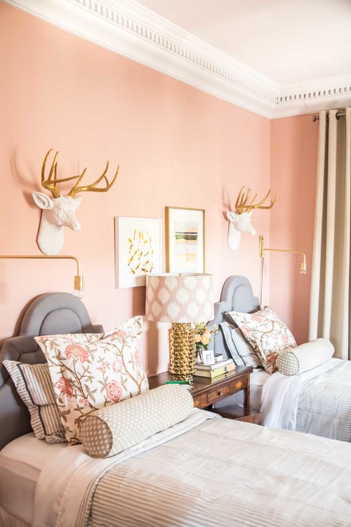
Well, you can absolutely paint all the walls in blush or even choose to paint an accent in it!
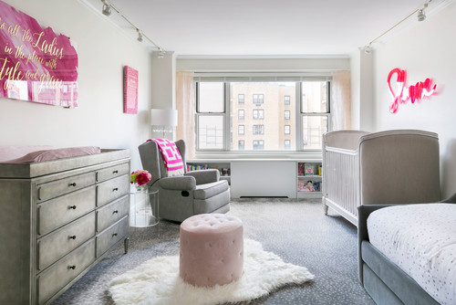
Although it is a great option in your girls’ bedrooms – you can even generally pair it with blues and grays for nursery and kids play areas!
Because, after all, the lighter or even darker tone in this color definitely has soothing vibes!
Have a look at this beautiful daughter’s room design for my E-Design client where I incorporated pinks and sea blues together!
Blush on Furniture – Shabby Chic Appearances
Quite tasteful and thoughtful – the blush on furniture needs to be carefully specified.
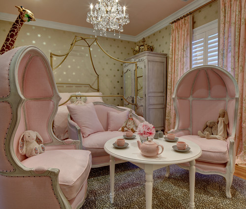
You can either use it in the kid’s bedrooms – else, use it as the focal accent furniture!
(Could be the accent chairs, headboards, and even furniture upholstery)
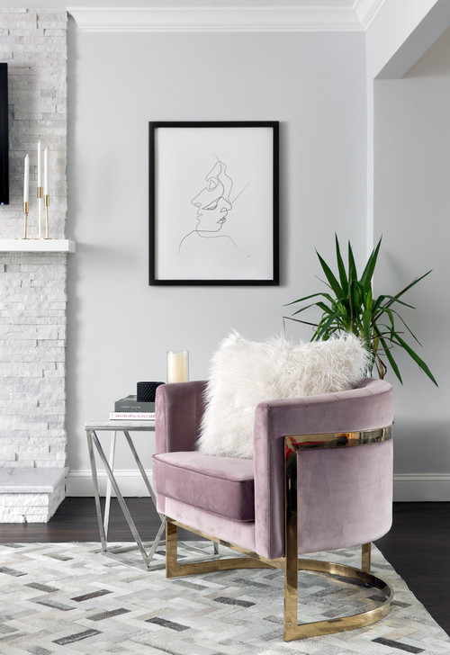
Have a look at this Mid-century Modern style chair that reflects the focal use of mauve and pink.
The effect is pulled off well using the gray and deep brown neutral tones.
A focal ottoman in blush with a grey backdrop would never do wrong with your space.
Blush on Accessories – Details and Specifications
Primarily, your curtains really have the potential to reflect your style and color scheme!
Whether you plan to choose a monochromatic or contrasting scheme – accessories are something that you must look forward to!
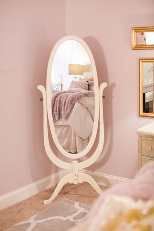
Another notable decor accessory is the mirrors! (Trust me, your daughter will love it)
Isn’t this absolutely glam?
Well, let’s check out some of these pieces that would make a lovely blush accent in your home.

Blush curtains would definitely grab the attention of your guests while giving that certain character and charm to the room.
Whether it is the living room, bedrooms, hallways, and dining room – don’t hold back from curtains in a blush tone.
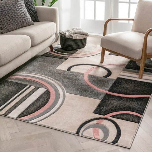
If you don’t want too much pink-pink (or should I say blush-blush), incorporating an area rug with other notable colors is a choice too.
This way, you are refining your color palette by incorporating other contrasting hues as well.

Throw a splash of color by adding in some subtle looking throw pillows and blankets!
This faux blush and rose-toned decor accessory is a way to decorate your home with a eminine and chic style.
Summing it Up
The blush color is so soft and cozy that you would not ever regret using it!
Especially for the Scandinavian, Modern, and Contemporary backdrops – this color is a plus point!
So, now that you know that it pairs well with pastels and off-whites – are you excited to incorporate blush color in your home?
I would love to know your thoughts on this article, comment below!

Leave a comment