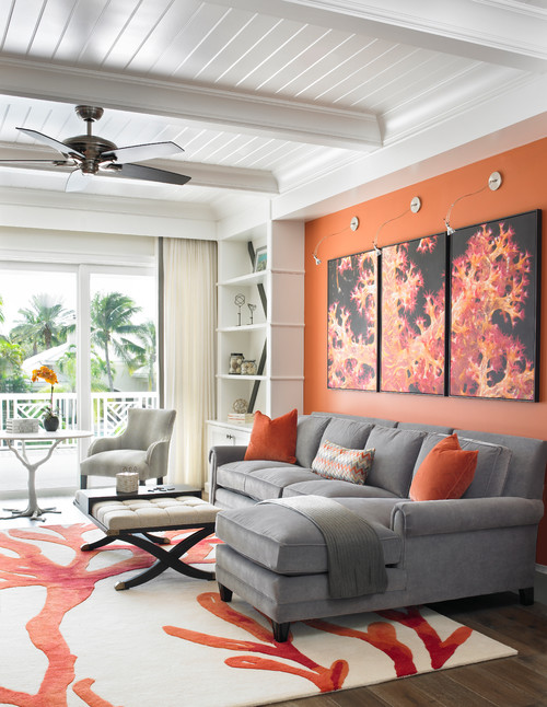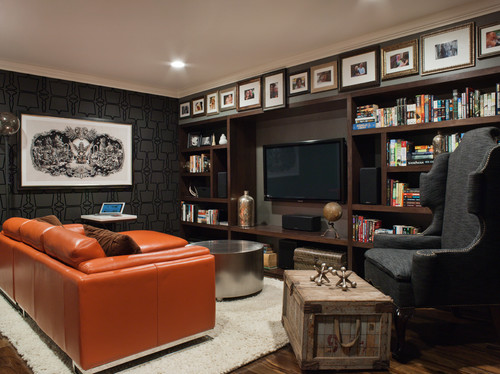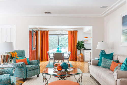
What do you first picture when thinking of a coral reef landscape?
Well, I am sure that the thought of captivating brighter colors popping through clear blue waters is what struck your mind.
Yes! One such color category is Coral.
Mimicking the marine life, a hue that will definitely intrigue you is Coral that you’re bound to observe during that deep sea dive!
So, what really is this color category all about?
Well, Coral is a representation of a pink and orange color that gets its name from marine invertebrates found in coral reefs!

Symbolizing a fresh, feminine, and invigorating vibe, this vibrant and dynamic tone is all set to cross the limits in your home!
Yes, this strong color has the potential to make a great statement in the home decor industry.
This is truly a particular shade of orange that can feel overwhelming at some points. But when you pick that desired tone and color combination – it can feel totally flabbergasting!
So, are you ready to incorporate a living coral vibe in your home?
Before I cover how to decorate your life with coral, let’s first dive deeper into the details.
If you try to locate this color on the color wheel – you will find it somewhere between the reds and oranges.
And in case you’re wondering about the composition of this bright and charming color – well, it’s simply an amalgamation of red and orange – or red and yellow for a certain proportion.
Without further delay, let’s get started!
The Vivid and Stimulating – Coral

As we move ahead with what this color has to offer, let’s first discuss the basic specifications and details of the coral color category.
Remember, every category is associated with certain underlying theories and facts that make it equally unique and distinctive!
After all, there is something that differs the corals from salmon, pink, and orange, right?
Although not too much, a certain touch of coral is going to make your space feel an extra level of refreshing and bright.
Whether it’s the undertones or the certain RGB values that describe what the color is composed of, here are certain terminologies to look upon!
Also note, light reflectance values can differ for each typology and face!
Pantone Code= 2024 C
Cyan= 0%
Magenta= 50%
Yellow= 69%
Black= 0%
Red= 100%
Green= 49.8%
Blue= 31.4%
HEX Code= #FF7F50
Trust me, this color comes with its own baggage of benefits and repercussions – so, beware and think along!
Don’t get confused – these percentages and values are just to ensure the correct details and help you in the classification of the color and how it is truly made.
The Two Faces of Coral – Blissful and Revitalizing

Every color is associated with various faces – depending upon the variance in the undertones, proportion of mixes, and reflectivity.
Further elaborating, these faces can be categorized as the tints, tones, and shades of that particular color.
In some cases these can present a wide range of hues all centered around the main one in a shared part of the color spectrum.
As we discussed previously about the variety, you must know that coral is associated with two major faces or color varieties.
Further diving into the details let’s discuss some very common color terms here.

You can see how changing up the shades and tints of coral change the color a bit.
‘Tones’ are basically the results formed by adding gray to a coral paint color!
The result is a more muted and pastel-like shade – well, something like sandstone!
‘Tints’ on the other hand are the amalgamation of white with a coral paint color.
The result is something like lighter oranges.
Whereas ‘Shades’ are the results formed by adding some black to coral paint color.
The result is quite dark – something like spice and clay!
Further discussing these details and faces – the color coral is best known for two major tones as follows.
Coral Pink

Like a feminine pink and orange, this particular tone of coral has the perfect amount of soothe and elegance in it.
One of the best colors to pair with are teals and blues – for a perfectly balanced look. Else, taupes and grays are good to go as well!
Lastly, you must ensure to only use this color in a very little amount since it feels quite saturated and bright if used unevenly.
Light Coral

Featuring a deep pink undertone, this particular shade is something that you must use in your home.
Quite soothing and muted – try introducing a tinge of this beautiful color in your decorative accents.
Further, don’t hold back from using blues and greens with it!
Similar Colors
Now that we have discussed the two notable faces of this coral – let’s get talking about the similar colors that are closely related to it.
So, the first of them is Burnt Orange!

Quite warm, cozy, and extremely welcoming – this particular tone of coral feels overwhelming if used in extremes.
However, you can absolutely blend this color with cool blues and greens for a balanced look.
On the other hand, Atomic Tangerine is a similar color to Coral.
It is light, airy, muted, subtle, and extremely soothing.
In this case, you might want to consider incorporating tons in your home!
Next in the line is the color Raw Sienna that is equally mesmerizing, muted, and sobre.

I recommend incorporating this color through throw pillows and blankets in your living room!
You can best pair it with whites and lighter grays to further feel light and bright.
Lastly, tan is a subtle tone that has deep orange, yellow, and pink undertones.
It varies in reflectivity so you can always use this color with bold paints like blues and blacks.
Coordinating Colors

Choosing coordinating colors for this specific category is quite interesting!
Well, here I am going to help you with a perfect seamless color palette!
So, regardless of the different faces of coral – colors that will definitely complement are blues, browns, taupes, grays, and whites (whether true, creamy, or crisp)!
Furthermore, you can always play with linen and cotton upholstery. Even wool is a great option!
In terms of metal accents – choose golden-tints, matte-black, and even bronze or brass finish!
How Significant Is the Color Coral in Our World?
Optimism and a Welcoming Energy Through Color

Coral is a vivid and strong hue named after the marine creatures known as polyps.
Coral reefs prefer warm water, thus the color coral has long been linked with the exotic and tropical regions.
As we’ve learned, this color is made up of varying amounts of orange, pink, and red so it’s both exciting and calming at the same time.
It combines the softness of pink with the optimism and vigor of the color orange for a warm, lively, and energizing effect.
Red-toned corals are very powerful and striking, and they may successfully integrate into masculine designs.

Polished red coral gemstone
The combination of three warm tones makes it an intensely welcoming, and emotionally astute hue.
Coral’s positivity actually strives to bring people up in spirits. According to Pantone, it’s a color of hope and optimism.
With its warm essence, coral inspires us to be more vulnerable. In other words, it increases our emotional energy.
It has a positive attitude, while also friendly, distinctive, and ahead of its time.
Coral Jewelry’s Historical Significance

The use of orange, red, and pink is more prevalent in historical documents, and the history of coral is intertwined with all three.
Coral, on the other hand, has a long history of being prized as a precious resource.
The Mesopotamian culture wore red coral jewelry as far back as 3000 BC when the earliest examples were discovered.
In the early 16th century, the hue red-pink was originally referred to as coral by the English as a term for it.
The ancient Egyptians initially collected coral for jewelry, and the Romans used it to protect themselves from evil.
While coral was extremely popular among hippies in the 1960s and 1970s, it was also highly regarded during the Victorian era when it was used to carve beautiful cameo portraits.
Coral was also frequently used in Art Deco jewelry throughout the first half of the 20th century.
A Cultural Favorite

Coral has spiritual significance in both Hinduism and Buddhism, where it is regarded as a sacred hue.
The Muladhara Chakra is symbolized in Hinduism as a deep red coral.
Coral-hued cosmetics were popularized by disco stars, who used orange-pink lips, eyelids, and nails.
The Pantone Living Coral was selected the authority’s 2019 color of the year, cementing coral’s place as a design staple.
In 2018, the Miami Dolphins redesigned their uniform incorporating coral and taking a contemporary take on the historic Miami Dolphins appearance.
The updated logo of Airbnb is also coral symbolizing friendship and courtesy.

Furthermore, the French cosmetic brand Avène’s logo is also a coral hue.
Electronic Arts’ visual identity has been sharpened and advanced since 2020’s makeover. The coral color adds a touch of modern uniqueness to the brand.
Coral is also tremendously used in interior design to create a cozy and inviting ambiance along with a sophisticated look.
The design studio Paris se quema incorporates coral widely in their set designs for companies like Sephora, and Maison Castel.
Using Coral In Home Décor

Even though coral is not a very common hue in the home decor industry – for obvious reasons of high saturation – it is still quite used and embraced!
Especially for Interior design styles like Eclectic, Grandmillenial, and Hollywood Regency – this color is good o go!
Due to its utmost bright and charismatic character, this color plays a great role everywhere in the home – living and dining room, kid’s room, nursery, bedrooms, and bathrooms.

So, first, I would highly recommend this paint (whether light or dark) on the accent walls, your accent furniture pieces, and could even be on your focal accessories such as throw pillows and vases or urns!
However, I recommend restricting the use of this bright color.
If your space is quite large and grandeur – you might be able to use tones of burnt oranges on your accessories.
But, try to avoid too much of this color on your walls!
If you are looking for real-time examples from the famous paint manufacturers – I am going to enlist two examples from Sherwin Williams and Benjamin Moore!
Smoky Salmon by Sherwin Williams and Fan Coral by Benjamin Moore are notable examples.
However, know that there may be some notable differences here as well.

For instance, Sherwin Williams Smoky Salmon is comparatively muted, subtle, and quite a pastel-like tone.
On the other hand, Benjamin Moore Fan Coral is a saturated coral with deep orange and red undertones.

They both are quite different from each other!
(Don’t worry – you can paint all the walls in the former Sherwin Williams color if your interior design and style allows)
Coral on Walls
Not a big fan of coral on the walls – but if you’re planning to use them, you have to be very careful with this tone on your walls!
It can feel quite saturated and overwhelming – almost making you feel uncomfortable in most of the situations.
So, I recommend you use this color on the accent wall.
Further, to neutralize the warmth exhibited by this color, you can always add a tinge of blue, cool teals, and some greens to feel refreshed and light!
Even a coral-toned wallpaper isn’t a bad option!
That way, you can always change the appearance of your room – seasonally!
Coral on the exterior walls is a big no-no!
Coral on Furniture – Eclectic and Vivid
Very closely related to genuine leather sofas – corals play a great role on your furniture!
They tend to grab the attention of your guests while playing that bold focal!
So, whether it is the linen and cotton or leather and velvet – don’t hold back from using this hue (especially in the bachelor pad or industrial style).
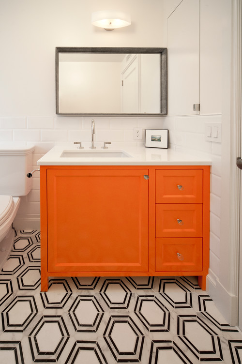
You can even paint the consoles and other bench furniture in this hue!
Have a look at the bathroom vanity here – classic and charming.
Coral on Accessories – Details That Matter
It’s time to have an eye for detail in your home.
It’s quite a possibility that you don’t end up using this color on your walls and furniture.
And that is when you can best make use of this color through accessories – curtains, rugs, and throw pillows.
And trust me, it equally plays classic!
So, let’s check out some of these pieces that would make a lovely coral accent in your home.

Rugs, like the one pictured above, have the potential to tie your entire room together into a single picture.
And note that they play a major decorative accent in our living rooms and bedrooms.
So, in case you want to introduce a coral vibe – rug is a number one way to do it!

To add a vertical dimension in your space, incorporate a coral-toned curtain that adds value and character!
Check out curtains like the above (and other funky colorful styles!)

What better way to introduce coral hue if not on some accent-perfect throw pillows?
Well, let your off-white toned couches shine bright with this intriguing color on board!
Check out the pillow above now – it’s on sale! Buy here

See this artwork on sale here.
Lastly, for a cohesive palette, you must ensure to add a touch of coral through your artwork.
This way, you can even add on other hues to create an eye-catchy contrast!
Summing it Up
Coral can play phenomenally in a number of ways!
However, the extreme embedded warmth is what you must take care of!
But at the same time, pair it with cool colors and observe the magic happen, right in your living room (that’s the beauty of a color palette)
So, are you excited to incorporate a touch of coral into your home?
I would love to know how best you incorporate this color in your home! Do let me know your experiences in the comments below!


Leave a comment