
Named after the beautiful mallow wildflower, mauve is a pale purple color that is quite unique and softened.
Not a mainstream purple but this particular color has deflections towards a neutral tone with a gray tint.
I usually classify this color as one of the most calming and soothing paint colors for home!
However, regardless of that, this hue is also highly used in women’s fashion and cosmetics.
Well, nowadays more and more homeowners are becoming attracted to this quirky and unique paint color.
But it’s really not the first time this color plays mainstream – since it was majorly adorned in ancient Victorian, Rococo, and Neoclassical styles.

And in today’s world, in case you’re designing your kid’s rooms (specifically daughter) – then this color is a great recommendation since it possess rich feminine qualities.
Or even your wedding color theme can revolve around mauves and their soothing tones!
Trust me, even too much of this color isn’t an issue!
So, are you excited to incorporate a touch of mauve in your home (apart from those fairy dresses and fancy cosmetics)?
It’s clear that mauve has a perfect take on antique, rich, feminine, and quirky vibes!
Other than that, if you try to locate this color on the color wheel – you will find it somewhere between the pinks and violet!
And in case you’re wondering about the composition of this pretty color – well, it’s simply a slight addition of white to a mixture of red and blue.
It genuinely contains more gray and blue than a pale tint of the magenta color.
So, are you excited to know what the color mauve has for you?
Let’s get started!
The Color of Divine Beauty – Mauve

Before we move ahead with what this color has to offer, let’s first discuss the basic specifications and details of the mauve color category!
Remember, every category is associated with certain underlying theories and facts that make it equally unique and distinctive!
After all, there is something that differs the mauves from violets, and purples from pinks!
And if you have used a couple of mauves in your life ever before – you must have heard of regal purples, royal ruby, raspberry, and imperial purple.
Yes, they’re all cousins!
Whether it’s the undertones or the certain RGB values that describe what the color is composed of, here are certain terminologies to look upon!
Also note, light reflectance values can differ for each typology and face!
Pantone Code= 250 C
Cyan= 12%
Magenta= 31%
Yellow= 0%
Black= 0%
Red= 88%
Green= 69%
Blue= 100%
HEX Code= #E0B0FF
This particular light and the pretty mauve color are bound to exhibit a regal and rich ambiance.
And after all, the proportions are what helps in differing from shade to shade and tone to tone!
These above-mentioned percentages will help you in the classification of the color and how it is truly made!
The Five Faces of Mauve – From Loud to Pastel

Every color is associated with various faces – depending upon the variance in the undertones, proportion of mixes, and reflectivity.
Further elaborating, these faces can be categorized as the tints, tones, and shades of that particular color.
Like I already mentioned about the variety, you must know that mauve has a wide array of appearances (a few shades of purple if you will). And some are almost a deeper purple, some loud, some light, and some pastels! (That’s a beauty of each and every tone though)
Further diving into the details let’s discuss some very common color terms here!
‘Tones’ are basically the results formed by adding gray to a mauve paint color!
The result is a more muted and soothing shade – well, something like opera mauve!
‘Tints’ on the other hand are the amalgamation of white with a mauve paint color.
The result is something like light purple!
Whereas ‘Shades’ are the results formed by adding some black to mauve paint color.
The result is quite dark – something like royal ruby and regal purple!
Further discussing these details and faces – the color mauve is best known for five major tones as follows.
Mauve (Crayola)

A tone of vivid purple – this light and soothing color have quite a few hidden answers!
A lighter shade of this particular face is a must in baby daughter’s bedrooms and play areas.
And if you’re wondering, try best pairing it with golden hues and cream accents to further create a soothing experience.
Mauve (Pourpre)

With a slight touch of magenta, this particular tone has a deep tone of mauve.
One of the best ways to make use of this color is through accents in your home. Also, this is less saturated – so, quite a great recommendation for the home decor industry.
The best colors to pair with are whites and yellows!
Opera Mauve
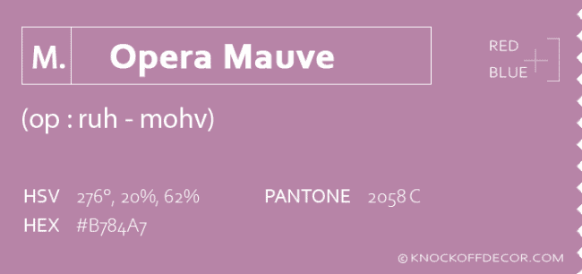
The subtle and soothing tone of mauve, it’s one of the most used in the home decor industry.
It has a little reddish-purple touch that feels absolutely timeless and fantastic when used appropriately.
Furthermore, you can even pair it with golden tints, creams, off-whites, and lighter pinks.
Mauve Taupe

A perfect touch of grayish purplish red, this darker and bolder tone of mauve is quite attractive and eye-catchy.
With its daring look, it should definitely be used as an accent.
If you want to give character to your walls, using wallpaper in this particular tone is good!
Old Mauve
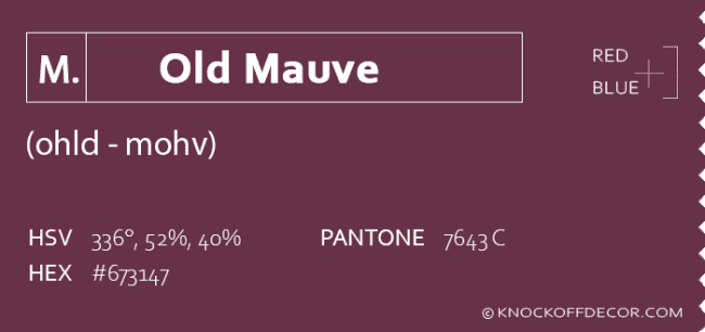
A tone of dark purplish red, this rich and boutique color is only good to go for decorative accessories.
Just a tinge of the beauty of this color is bound to take a long run!
Must complement with golden accents and lighter tones of pink.
Similar Colors
Now that we have discussed the five notable faces of this light mauve – let’s get talking with the similar colors that are closely related to it.
And can play cousins of mauves!
So, the first of them is Wisteria!

This is a lighter-toned mauve that plays a great soothing paint color. This can basically be formed by adding whites to purple paint color.
On the other hand, fuchsia is a similar color to mauve.
It feels more like saturated purple!
Next in the line is the color Royal Purple that is rich and elegant.
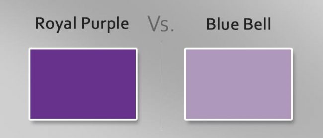
It is loud and can be best paired with yellows.
Lastly, blue bell is a subtle tone of mauve that is formed by adding a greater proportion of blues and grays.
It varies in reflectivity so you can always use this with a tinge of yellow and even lighter greens.
What Goes with Mauve?

Choosing coordinating colors for this specific category is one of the most intriguing.
So, here I am going to spill some Mauve beans – are you excited to know what they are?
Well, regardless of the different faces of mauve – colors that will definitely complement are goldens, yellows, lighter greens, and lighter pinks.
Furthermore, you can always add neutrals like off-whites, whites, and lighter pinks to further complete your palette!
In terms of accent, darker tones of mauves play absolutely flawless!
A Background Rich in Compassion, Style and
Mauve – A source of Inspiration
Feelings of love, nostalgia, and tenderness are evoked by the color mauve.
In French, it is called ‘malva’, which means mallow flower.
Mallow was thought to help individuals rise beyond their desires and passions, making it a vital antidote for love potions.
As such, a sixth sense has formed in mauve, which speaks well for the ability to understand and be at peace.

With the moodiness of a darker purple color, it creates sentiments of purity and devotion.
Mauve will give both encouragement and inspiration, depending on what you need. It’s said that when you associate with mauve, your self-confidence will soar.
This colors lends to the assurance that our goals can be achieved.
Like purple, mauve is a vibrant color. It carries a lot of curiosity, and it’s easy to attract people to it.
Mauve, on the other hand, maybe extremely timid as well.
Overall, it is a gentle, pleasant, and compassionate color.
An Accidentally Created Hue
It wasn’t until 1859 that the synthetic color mauve was given its name.
The 18-year-old William Henry Perkin attempted to synthesize quinine in 1856, which was used to treat malaria at the time.
His attention was drawn to an unexpected residue, which turned out to be the world’s first aniline dye.
Originally called Tyrian purple, the dye industry renamed mauve in 1859 after it was introduced to the market.
Mauveine or aniline purple are increasingly common names for it.
Mauve became a stylish must-have between 1859 and 1861 when it came to fashion and home decor.

In a monthly magazine ladies who wore purple were characterized as “all soaring country ward, like so many migratory birds of purple paradise”.
As it faded quickly, mauve dye’s success was short-lived, and other synthetic methods took its place by 1873.
Mauve is now perceived as a lighter, less vibrant color than it was initially.
An Adopted Color from Nature
Mauve can be found in stones like amethyst, spinel, sodalite, and quartz.
Flowers such as aster, anemone, bell heather blossoms, are found to be in shades of mauve. Even coral under the sea is sometimes mauve!

Alexandra Feodorovna, the last Empress of the Russian Empire, loved her mauve room at the renowned Romanov castle.
During the ‘Mauve Decade’ of the 1890s, the unique color of purple changed fashion and became extremely popular.
Because of the bisexual pride flag, which mixes pink (representing homosexuality) and blue (suggestive of heterosexuality), the color mauve is also commonly associated with bisexuality.
Republicans (related with red) and Democrats (associated with blue) are equally represented in a ‘purple state’ in the United States.
The iPhone 12 will also be launched in a beautiful hue of lighter mauve.
Of course, L’Oreal comes with its wondrous shades of mauve lipsticks as well that seem to remain popular year after year.
Using Mauve In Home Décor
The color mauve is known for evoking feelings of purity, devotion, youth, and moodiness.
It proves to be a great color in the home decor industry – over and over again.
Due to its utmost soothing character, this color plays a great role in the kid’s bedrooms and play areas.
However, they can even be used in other adult bedrooms.

So, first, I would highly recommend this paint (whether light or dark) on the accent walls, your accent furniture pieces, and could even be on your focal accessories such as throw pillows and vases or urns!
Try avoiding painting a lot of your walls in the darker shade of mauve (such as plum) – as it is bound to arouse feelings of discomfort.
However, if your space is quite large and grandeur – you might be able to use mauve on all the walls.
I highly recommend the eclectic maximalism and interior design styles like Hollywood Glam, Victorian, and Grandmillenial to incorporate this saturated primary color.
If you are looking for real-time examples from the famous paint manufacturers – I am going to enlist two examples from Sherwin Williams and Benjamin Moore!

Mauve Finery by Sherwin Williams and Deep Mauve by Benjamin Moore are notable examples.
However, know that there may be some notable differences here as well.
For instance, Sherwin Williams Mauve Finery feels too light and soothing! A perfect pastel tone to be used in homes.

On the other hand, Benjamin Moore Deep Mauve is a darker tone that feels luxe and sophisticated both. It has a slight tinge of red in it to offer an identity.
(Don’t worry – you can paint all the walls in this color if your interior design and style allows)
Mauve on Walls
Do you see – you can paint all the walls in a beautiful mauve?
Well absolutely – whether it’s the accent wall or all the walls, you can definitely choose this tone of mauve into your homes.
You can very seamlessly pair it with crisp whites, creamy off-whites, yellows, and certain shades of blues and pinks.
However, note that it can sometimes look slightly pinkish as well.
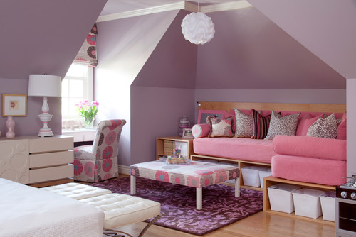
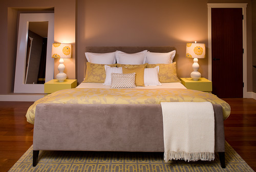
Have a look at this beautiful kids room – isn’t it so soothing and pretty?
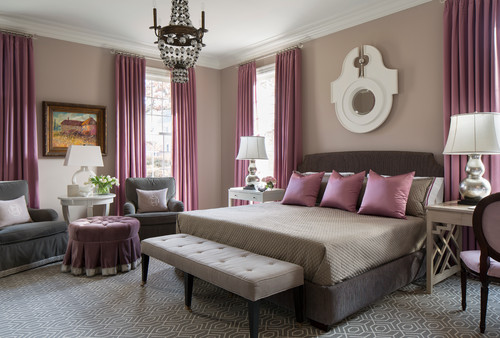
Well, at the same time – you can even create a moody backdrop – like in the bedroom below!
However, note to choose darker tones in that case.
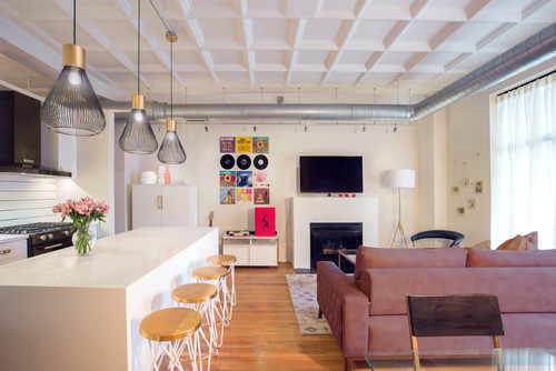
Mauve on Furniture – Hollywood Regency and Art Deco
In some cases, mauve painted on the walls can be too overwhelming!
Or your personal preference doesn’t allow it.
In that case, another way to incorporate this tone in your home is through furniture!
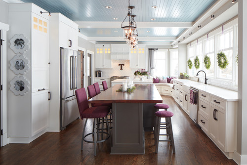
Try pairing it with certain golds, off-whites, and whites to create a focal point in your space through this color.
The highchairs play absolute focal and eye-catchy here!
Well, yes! That’s how best to make use of this color.
Mauve on Accessories – Details That Matter
It’s time to have an eye for detail in your home.
Sometimes, you can best make use of this color through accessories – curtains, rugs, and throw pillows.
Let’s check out some of these pieces that would make a lovely mauve accent in your home.

Mauve colored curtains. See more at Wayfair.
Simply flawless, isn’t it?
Curtains are a great way to add vertical dimension to your space.
And since it’s a necessity in every room – you get to flaunt that pretty mauve right away!

A beautiful mauve-colored rug looks so vibrant without being in your face. See at Wayfair.
A rug is a remarkable way to throw a splash of color in the room.
Whether in the form of a monochromatic or contrasting – this mauve area rug will define your space with utmost luxe and elegance.
Don’t forget to pair it with lighter wall-to-wall carpeting or hardwood floors.

Check out this gorgeous vase here.
Place an accessory like the above vase on your floors or table-tops and sparkle with some pampas grass for a beautiful setback.
It adds identity and character to your room.
Summing it Up
Mauve is considered as one of the finest colors in the home decor industry.
It’s thoughtful and creative – and at the same time, it feels absolutely stunning when used in homes.
Even though it exhibits a warm and cozy feel – at the same time, it feels quite chic and feminine.
If you really have the taste for this color – you must use it (but keep in mind those design beans).
So, are you excited to incorporate a touch of mauve into your home?
I would love to know how best you incorporate this color in your home! Do let me know your experiences in the comments below!

Leave a comment