A potential variation of cyan – an aqua paint color is a cool-toned blue paint color that lays its roots deep in the shallow waters of the sea.
It’s a refreshing cool paint that brings you an inch closer to nature and in a way, calm anxiety while stimulating creativity.
And one such notable aqua is Sherwin Williams Spa that’s majorly a cyan paint color with a deep cooler and crisper background.
This blue is stark and not subtle like SW Interesting Aqua or SW Tradewind! (Note the difference)
And that’s why when used in your home, you must be extra careful and cautious.
Don’t worry – I have got you covered. This color review will exactly help you how and where to use this paint color – and what are the potential repercussions that come with it.
Generally, due to the starkness of this color – it gets quite uncomfortable to the eyes. Yes, it tends to protrude and stand out from the surroundings.
And that’s why, it’s equally important to balance the color with adjacent hues, textures, and materials.
So, are you excited to splash a coat of SW Spa into your homes?
Well, let’s get started!
Sherwin Williams Sea Salt SW 6204 Details and Specifications

There’s a dominant difference between cyan, blue-greens, teals, turquoise, and aquas.
And do you know how to differentiate them all?
Well, it’s the color details and specifications that need to be followed.
And believe it or not, you simply can’t ignore this section – in order to make informed decisions and not end up messing up with your homes.
So, first and foremost, let me introduce you to the concept of Light Reflectance Values or the LRV’s that determine how light or dark the paint color is.
You can easily find that value at the back of the Sherwin Williams paint swatch or even the website!
Here, in this case, the LRV of Sherwin Williams Spa is 64.

And that means it is quite lighter in tone – well, another advantage added to the list.
(Remember, the greater the value, the lighter the paint)
One GREAT way to test a paint color to see what it’ll do in your own home, is to order a sample from Samplize. You can pick one up for Spa!
Secondly, other important associated terms are the RGB and the HEX Values.
Red = 167
Green = 220
Blue = 220
HEX Value = #a7dcdc
You see – the color is composed of equal parts of blue and green!
Now that is enough with the technical and scientific information, let’s get started with the practical aspects of this aqua Sherwin Williams paint.
How Does This Color Feel in a Space?
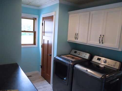
Sherwin Williams Spa is a bright and stark cyan paint color that can make your space feel closer to nature, refreshed, calm, and energetic all at the same time.
Due to the high reflectivity of the paint, this color is also responsible for making your room spacious, airy, light, and lively.
However, simultaneously, SW Spa can end up pricking your eye and make you feel uncomfortable at times. (Due to the solid brightness)
So, I highly recommend limiting the use of this paint color to the focal walls or furniture.
That way, you can achieve the best of both worlds.
Furthermore, if you only have a limited space to deal with – it’s generally best to incorporate this light and airy color since it can make your space look further spacious.
Isn’t that a great way to enhance the space – vertically as well as horizontally?
How Does Light Affect the Color?
Light – whether natural or artificial will always make your space feel airier.
However, in this section, I would like to highlight one of the most important aspects when choosing paint colors – compass directions and sun movement.
So, SW Spa tends to look cooler and crisper when used in the north and east-facing rooms. Whereas slightly warmer and creamier in the west or south-facing rooms!
So, if you give light to this color – it will further look chirpy, fun-loving, and bright.
Yes, they go hand-in-hand!
Also, depending upon the functionality of that particular room – since you wouldn’t want to feel chilly in the west-facing room when you clearly use the room during mornings!
Lastly, you can always balance and neutralize the appearance with the help of warm white or yellow lighting that can introduce warmth and coziness.
If you want to really see how this color will play in your space and with other colors, get some wall samples from Samplize.
What are the Best Coordinating Colors?

Now comes one of the best topics to talk about – color palettes and color schemes!
Since you are now planning to use this paint color in your home – I must tell you, choosing a cohesive color palette is important.
(otherwise, your space might look all messed up)
So, you could either amalgamate colors of the same family to create a monochromatic palette or choose a fun-loving contrasting color palette that creates a sense of depth in your space.
For a beachy paint color like Sherwin Williams Spa, you can best pair it with beiges, light yellows, light blues, crisp whites, lighter grays, and darker teals.
Talking about materials, you can absolutely use glass, metals, wood, and natural textures like rattan, cane, and wicker!
Firstly, I am going to enlist paint colors to be used for a monochromatic palette.
- SW 6766 Mariner
- SW 6767 Aquarium
- SW 6768 Gulfstream

You can definitely mix and blend all of them through paint colors, decorative accents, and upholstery!
Secondly, I am going to enlist paint colors to be used for a contrasting palette.
- SW 6511 Snowdrop
- SW 7688 Sundew
- SW 6679 Full Moon

In the case of ceilings, trims, and moldings – I would recommend using SW High Reflective White and SW Extra White to further protrude this color!
SW Spa Vs Similar Colors

Even though there shouldn’t be a need – but I must tell you that SW Spa in itself is a very pretty color!
You shouldn’t be looking around for alternatives!
However, just in case you are, the two colors closely related are SW 6944 Pool Blue and BM 737 Sonoma Skies.
Let’s see how they differ!
Spa Vs Pool Blue

SW Pool Blue is another stark aqua paint color that feels quite bright and cheerful.
Mimicking the waters of a swimming pool, it’s generally best to pair this color with creamy whites, darker teals, and shades of beiges or taupes.
With an LRV of 70 – this color is lighter as compared to the former paint.
Grab some sample peel and stick sheets here for these colors to see how the color will look in your living spaces.
Spa Vs Sonoma Skies

BM Sonoma Skies is comparatively on the subtle end of the scale. Well, not too stark nor too bright.
With an LRV of 61.97 – this paint equally falls on the lighter end of the scale.
You can best pair this color with creamy white and darker teal.
Get a stick-on samples of these colors to test in your home.
Where to Use Spa?
SW Spa is a beautiful aqua paint color that can add a delightful and fun-loving touch to your space.
Whether it’s the kitchen wall, focal bathroom walls, or the furniture frame – this color proves to make a great statement.
So, talking about the interior design styles, you can use this paint color in Coastal, Caribbean, Transitional, and Traditional interior design styles.
Let’s discuss how to incorporate this paint color into your home!
Spa in Living and Dining Rooms
SW Spa can be used in your beachy living and dining rooms – especially on the accent wall as a pop of hue.
However, it’s best to add a creamy white on the adjacent wall and several teals and beiges to balance the look.
You can also make use of wooden textures and natural woven materials like rattan, wicker, and cane on the furniture frame and lighting fixtures.

Also, make use of shells, macrame, and beads on the artwork frames and wall hangings.
To add a pop of interest, add mustards and magenta pinks.
Using in Bedrooms and Bathrooms
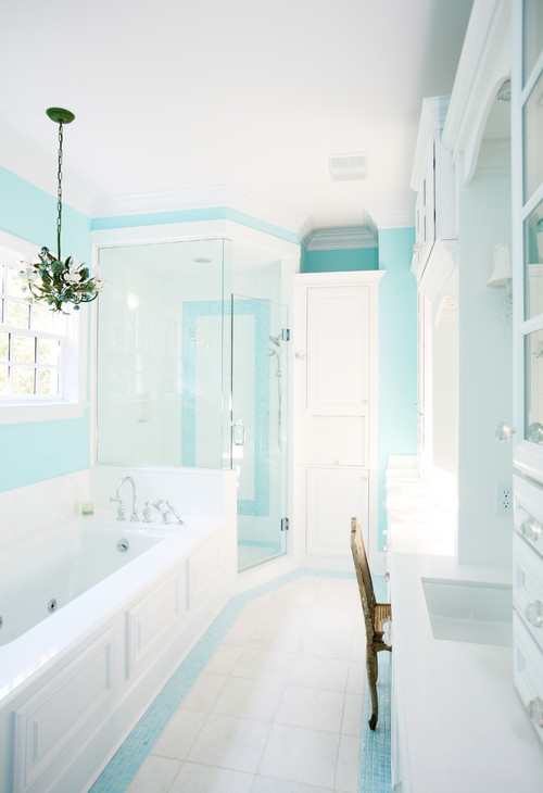
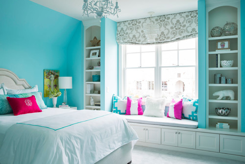
Definitely a blissful color to be used in the bedrooms and bathrooms.
And if these spaces are small, you can further use this color to make the space look airy and enhanced.
Add whites on the adjacent wall, built-in cabinetry, and trims, moldings, and ceilings.
Furthermore, don’t forget to add fresh indoor plants in the corners for a refreshing look.
If you’re upgrading the floors – use white tiles.
Spa in Kitchens
There is no better way to incorporate this paint color in kitchens if it is not on the cabinets or the backdrop wall.
If you have a large and spacious kitchen – using this paint color is definitely good to go!
On the other hand, you can pair it with a white backdrop, white or light gray granite or marble countertop, and chrome or nickel finish fixtures, drawers, and pull handles!
You could also go vice versa and paint the cabinets in stark white to let the airier kitchen play magic!
Using on Exteriors
Playing with SW Spa on exteriors could be quite a tricky yet interesting business.
Especially for beachy and coastal homes – this color plays flawless.
You need to assure pairing it with shades of white to create a cohesive yet attractive exterior color palette.
So, keep in mind to use beiges, off-whites, whites, and darker grays!
But a plus point is that you can use any shade of stone if you are planning to use it!
An Easy Way to Sample This Color!
Instead of picking up a small can, or worse, an entire gallon can, to “”test”” out Spa, you can order a peel-and-stick sample of it from Samplize.
The company is genius – they provide a 12″” x 12″” stick-on square you can put up anywhere in your home to try out a paint color.
For a few bucks, it’s definitely worth the small investment so you can see what the color will do in YOUR unique space, with your own lights and shadows.
So, how do you want to use this color in your homes? Interiors or Exteriors?
Now that you have all the secrets – are you excited about painting your home in Spa?
Should there be any questions or thoughts, let us know in the comments below!


Leave a comment