
The category of light brown colors share tons of similarities to beiges, lighter greiges, and lighter tans.
And believe me, some of them are even very close to off-whites with certain undertones. Yes, they can be confusing!
And one such tricky (but lovely) example is Behr Spun Wool.
This color is a light brown that appears slightly beige and gray – depending upon the lighting conditions.
View this post on Instagram
Well, there are a ton of times that this color can play misleading. On various screens, it appears creamy off-white or warm beige.
Well, let me tell you – it’s neither a warm beige nor a too cool gray.
Yes, it’s the perfect blend of the greige or a very light tone of brown per se.
And since it’s soft and cozy – this color can majorly exhibit a calm and laid-back vibe.
So, are you excited to incorporate a tinge of Behr Spun Wool into your homes?
Well, I must tell you – this color is quite timeless and versatile. Hence, can easily complement any and every design style.
So, if you’re ever in doubt – I highly recommend trying out this swatch!
Now it’s time to sit back, relax, and enjoy this color review with a sip of coffee
Behr Spun Wool OR-W13 Details and Specifications

What is it that differs this light brown from light beiges and light grays?
Well, it’s the details and specifications associated with a paint color.
Before you choose a paint color for your home, you must analyze the underlying theories and facts.
And that is what will help you make informed decisions.
Truly, this is one of the most important aspects that you need to consider!
So, first and foremost, let me introduce you to the concept of Light Reflectance Values or the LRVs that determine how light or dark the paint color is.
You can easily find that value on the Behr website.
Here, in this case, the LRV of the Behr Spun Wool is 73.
And that means it falls on the medium to the lighter end of the scale. (Mainly, lighter)
(Remember, the greater the value, the lighter the paint – on a scale of 1-100)
Also, just in case you wonder where to find the Behr decks – well, simply visit your nearest Home Depot store!
Secondly, other important associated terms are the RGB and the HEX Values.
Red = 227
Green = 222
Blue = 212
HEX Value = #e3ded4
Since we have discussed the technical and scientific information, let’s get started with the practical aspects of this greige Behr paint.
How Does This Color Feel in a Space?
View this post on Instagram
Behr Spun Wool is bound to exhibit extra coziness and a sense of balance to your space.
Since it neither feels too cold nor too warm, this color is highly recommended if you crave a touch of harmony and balance in your space.
Moreover, since it has a high reflectivity value, this color is largely responsible for making the space appear airy and lighter.
(Isn’t that a great way to create an illusion?)
Secondly, I highly recommend incorporating this color in any climatic condition – as I said, it’s versatile and will never disappoint you.
With a tinge of light brown in it, this color will always feel creamy and calm.
How Does Light Affect the Color?
Light has a major role to play here!
First and foremost, this color can largely appear grayish if used in the north or east-facing rooms.
Hence, it’s always better to try a couple of swatches in various lighting conditions to know the true hue.
Secondly, this color can align towards the beiges in the south or west-facing rooms where the sun hits the walls most of the time.
So, it’s always better to know what you’re getting into!
Another pro tip: the paint color should be chosen with the room’s functionality in mind!
This color can also be paired with very little light to create a homely, lively vibe.
So, if you want to make a room feel larger, this color with little light is good to go.
What are the Best Coordinating Colors?

This is one easy color to work with! And I say that with absolute confidence.
You simply can’t pair any random hue with the other.
And, if you have a great command of the color wheel, it’s like a cherry on top.
So, this color will pair beautifully with blues, greens, browns, darker greiges (like Behr Graceful Gray!), mustards, and even rusts and burnt oranges.
Also, if you are planning to introduce material and metallic accents through floating shelves, chandelier, artwork frames, and furniture frames – remember to add tinges of rustic wood, matte black, and brushed brass.
Discussing further, you have the option to choose from either a monochromatic or contrasting color palette!
Here are a few of the colors I would recommend for a monochromatic color palette!
- N220-2 Ashen Tan
- N220-3 Smokestack
- N220-4 Shiitake

Here are a few of the colors I would recommend for a contrasting color palette!
- N470-3 Half Sea Fog
- S170-2 Rosewater
- 75 Polar Bear

For your ceilings, trims, and moldings – you can use Behr Ultra Pure White as it is a true white paint and will further protrude the original adjacent hue.
Behr Spun Wool Vs Similar Colors

Picking similar colors isn’t challenging as long as you know exactly what you want!
They won’t be the same; however. They’ll differ in their respective undertones or reflectivity.
So, the two closely related colors are SW 7014 Eider White and BM OC-23 Classic Gray.
Let’s see how all of them differ.
Spun Wool Vs Eider White

SW Eider White is a perfect alternative that has notable pink undertones. However, it doesn’t feel too cool! Yes, the undertones are what differentiate the two.
Unlike the former paint, which is clearly a creamy color. With an LRV of 73, this color is way too light and airy!
You can best pair it with blues, darker mauves, and crisp whites.
Spun Wool Vs Classic Gray

BM Classic Gray is a neutral off-white that feels slightly refined and crisp.
With an LRV of 73.67, this color is the lightest of them all!
You can best pair it with wooden textures, shades of blue, and sage green. Yes, it’s quite a versatile color and can be used for most interior design styles.
Where to Use Spun Wool?
Behr Spun Wool can be used anywhere and everywhere in your home – because of its versatility and timelessness.
Whether it’s the kitchen cabinets, bathroom and bedroom walls, furniture frame, or the exterior walls – this soft and light brown color is bound to play welcoming and cozy.
You can best make use of this color in the traditional, bohemian, French Country, and modern farmhouse backdrops.
So, let’s see where and how to incorporate this color into your home.
Spun Wool in Living and Dining Rooms
View this post on Instagram
Behr Spun Wool can be used on all the walls of your common spaces – even the hallways and corridors.
You can best pair it with clean whites on the trims, moldings, and ceiling for a refined look.
Furthermore, if you want to spark a sense of visual interest, it’s best to add charcoal blue or dark sage green as an accent.
Lastly, don’t hold back from wooden textures on the furniture frame, floating shelves, and even exposed beams.
Lastly, if you have a fireplace, try incorporating warm gray or greige natural stone to further finish the look.
Using in Bedrooms
You will never regret this paint color in your bedroom. The best is – it will always make you feel calm and poised!
To add depth and interest, you must play with hues and patterns on the accessories like throw pillows, artwork, curtains, and rugs.
If you have a modern, Japandi, or minimalistic interior design style, try to play with monochromatic shades of this soft brown color.
Lastly, don’t hold back from cozy white linens, duvets, and macrame wall hangings for a carefree look.
Spun Wool in Kitchens
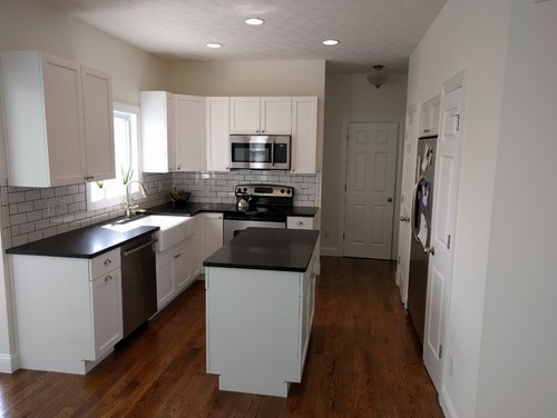
Behr Spun Wool in the kitchens will play absolutely astounding and timeless.
Especially for Modern Farmhouse and French Country kitchens, this soft brown neutral plays a great role on the cabinets as well as the backdrop walls.
You can either choose an all-white kitchen backdrop or slightly alter the design into transitional and pop up shades of blue, gray, or green on the lower cabinets.
To further make it appealing, add golden-tinted pull handles and knobs along with matte black or wooden fixtures.
Using on Exteriors

This versatile soft brown color can be used extensively without worrying much about the style or climate.
You can choose a blend of warmer grays, crisp white, and browns on the fascia, gutters, downspouts, and the soffit.
For the exterior doors, windows, and shutters, you can pick a bold brown, taupe, blue or rust paint color that can pop out and create a striking appearance.
In the case of columns on the patio and porch, you can use natural stone wainscotting to add an authentic, detailed character to this facade!
So, how do you plan to use this color in your home?
Kitchen cabinets or focal console tables? Living room or bedrooms?
Well, trust me! You would never regret using this color in your home. It’s timeless and versatile!
Should there be any questions or thoughts, let me know your thoughts in the comments below!
Spun Wool Undertones
The Warm Greige Base You Need to Understand First
Spun Wool’s dominant undertone is a soft, warm greige that sits right at the intersection of beige and gray.
This greige quality is what gives the color its cozy, grounded appeal, but it also means it’s sensitive to the warmth levels in your space.
Rooms with warm wood tones and amber lighting tend to pull this undertone forward beautifully, making Spun Wool feel rich and intentional.
The Subtle Yellow Undertone That Surfaces Unexpectedly
There’s a quiet yellow undertone sitting beneath Spun Wool’s surface that most people don’t notice until it’s already on the walls.
I’ve seen this color look noticeably golden under warm incandescent or soft white bulbs, which can feel unexpected if you were counting on a more neutral result.
Bright afternoon sun streaming into a south-facing room is one of the most common conditions where this yellow quality becomes hard to ignore!
The Cool Gray Shift That Catches People Off Guard
Spun Wool also carries a cool gray undertone that surfaces under overcast daylight or in north-facing rooms with limited natural light.
I’ve seen this undertone make the color feel noticeably cooler and less warm than expected, which surprises people who chose it specifically for its warmth.
This is exactly why sampling in your actual space across multiple lighting conditions is so important with this color.
How Surrounding Elements Activate These Undertones
Cool gray furniture or flooring can push Spun Wool’s gray undertone to the surface fast.
Warm wood cabinets and rugs work in the opposite direction, drawing out that cozy greige and golden quality that makes this color so inviting!
My 7 Key Tips for Behr Spun Wool
1. Test Spun Wool in different lighting
Spun Wool can look dramatically different depending on the light in your space.
I always test a small section on both north and south-facing walls before committing.
This helps avoid that unpleasant surprise when the evening light makes the color feel flat or too warm.
2. Pair Spun Wool with medium to light wood floors
This color really shines against oak, maple, or bamboo flooring.
I’ve found that the warm undertones of these woods complement the soft, creamy gray of Spun Wool beautifully.
It keeps the room feeling cozy without making it feel dark or heavy.
3. Coordinate with white or cream cabinetry
Spun Wool pairs wonderfully with classic white or off-white cabinets in kitchens and bathrooms.
I often suggest adding brushed nickel or matte black hardware to complete the look.
This combination keeps the space feeling fresh while giving subtle contrast.
4. Use Spun Wool on exteriors strategically
This color works beautifully on siding or trim when paired with natural stone or brick accents.
I recommend testing it against your roof color first because it can read slightly warmer outdoors in sunlight.
It’s especially charming on front porches and entryways where you want a soft, welcoming vibe.
5. Avoid pairing with overly cool grays
Spun Wool has gentle warmth, so placing it next to very cool grays can make the space feel off-balance.
I usually stick to neutral or warm tones nearby to keep the color feeling soft and inviting.
6. Great for bedrooms and living rooms
I love using Spun Wool in bedrooms and living rooms because it creates a calm, soothing backdrop.
It also reflects natural light beautifully, which can make smaller rooms feel airier and more open.
A few pops of muted color in furniture or textiles really bring the walls to life!
7. Prep your surfaces carefully
Spun Wool is subtle, so any imperfections on walls can stand out more than darker colors.
I always sand lightly, patch holes, and use a quality primer before rolling or brushing.
This ensures a perfectly smooth finish and saves time on touch-ups later.

Leave a comment