
One of the most popular, Sherwin Williams Rainwashed is a beautiful green paint color that is extremely soothing and at the same time, proves to be nature’s own color.
Mimicking the plants and ultimately nature, this light-toned paint color is a muted and subtle option that can easily add a natural vibe to your home.
Hence, just in case if you are an apartment dweller and usually lack the feel of trees and nature around, this color will perfectly add a perfect vibe in your homes.
Some of my clients usually question if this is a green or a blue paint color? Well, it is clearly a green paint color but if your room doesn’t receive direct sunlight, it may look grayish-green.
This is absolutely one of my favorites – and there have been many times I have recommended this paint color to my clients.
So, if you are planning to use this – I would say – definitely, yes!
You can use this color in any or every corner of your home – whether it is the hallways, kids’ rooms, nursery, bedroom, or the bathroom – this color will definitely add a tranquilizing vibe in your homes.
Here, in this article, I will help you determine if this is the correct color for your home or not! So, let’s get started!
Sherwin Williams Rainwashed SW 6211 Details and Specifications

Before choosing a paint color, it is crucial to analyze the backlog information and details associated with the paint color.
Most of the homeowners generally look at how the color looks and feels like, but the fact is that you should always understand what the color is truly made of.
Ignoring this will lead to a major mess in your home – and who wants that right?
So, first and foremost, analyze the importance of Light Reflectance Values or the LRV’s that help in determining how light or dark the paint is.
In this case, the LRV of Rainwashed is 59. And that means it falls on the middle to the lighter end of the scale.
What I like to do is sample Rainwashed under different lights where I’m going to use it. I use Samplize stick-on samples. Get some samples now!

(You can easily find this value at the back of the paint swatch)!
Secondly, other important associated terminologies are the RGB and HEX Values that further tell us what the color is made of.
Red = 194
Green = 205
Blue = 197
HEX Value = #c2cdc5
Now that we have discussed enough about the technical and scientific information, let’s get started with the practical aspects of this green Sherwin Williams paint.
How Does this Color Feel in a Space?
This paint color perfectly mimics nature! It feels pure, pious, natural, airy, and extremely cool and crisp when used in a space.
This color reminds me of nature and soothing trees! So, just in case if you have smaller spaces, this color can create an illusion of making your space look larger.
I recommend any and every climate to use this color (and especially warmer and tropical regions). This color exhibits a cool vibe – after a long day at work, this will feel absolutely tranquilizing and relaxing.
For very small spaces, I recommend pairing this color with stark whites that have a reflective value over 75.
This color opposes the concept of ‘coziness’ – so, avoid it if you crave for that specific aura.
How Does Light Affect the Color?
Light has a major role to play here.
Now that you understand the color, look around the space you intend to use it in. Does it receive too much light? Or does it receive no light at all?
Well, if your room receives ample natural light – it is bound to look lighter than it is. Moreover, if your room doesn’t receive any light, it may appear darker.
Furthermore, you can always play with the artificial lighting – mainly warm whites and warm yellows to create a desired aura. You can also place wall sconces and chandeliers to enlighten your home with a magical spark.
As I mentioned before, you can try out this color with real paint, (but without the mess) using stick-on samples from Samplize.
What are the Best Coordinating Colors?
Choosing a complementary scheme is important. Because if you randomly choose colors that don’t align with each other, it may end up messing up with your space.
You can either choose a contrasting or a monochromatic color palette – depending on your interior design style.
So, with such a soothing green aligns either darker or lighter greys, creamy or crisp whites, black, greiges, and lighter yellows.
Well, here are a few of the colors I would recommend for a monochromatic palette!
- SW 6212 Quietude – see my full guide here!
- SW 6213 Halcyon Green – see my full guide here!
- SW 9133 Jasper Stone

On the other hand, here are a few of the colors I would recommend for a contrasting color palette!
- SW 7004 Snowbound
- SW 6659 Captivating Cream
- SW 6215 Rocky River

For your ceilings, trims, and moldings – I would recommend using SW Pure White to further achieve a creamier look or else if you want a crisp look, choose SW High Reflectance White.
SW Rainwashed Vs Similar Colors
I would simply not recommend looking for alternatives as this color is one of the best! It is popular and at the same time, a perfect blend of what a soothing color should have.
However, I am going to list down the two most similar-looking options that you could consider – SW Sea Spray and SW Copen Blue.
Let’s see how all of these differ!
Rainwashed Vs Copen Blue

The name is misleading – since, this color doesn’t even have a tint of blue at all. It is a pure green paint color with an amazing lighter tone.
With an LRV of 59, this color too falls on the lighter end of the scale. So, you can absolutely use this color – however, remember that it is only an ‘interior only’ color!
If you want to test the subtle differences in your house, get some wall samples of each here.
Rainwashed Vs Sea Spray

With an LRV of 61, this color is more inclined towards sage greens! An ‘interior only’ paint, this color looks slightly green and gray.
You can think of using this color in some corners of your home.
Test these colors side-by-side to see the differences in “real life” INSIDE your home, with some wall-stick samples. Order here!
Where to Use Rainwashed?
You can use this color anywhere and everywhere in homes!
However, I would recommend using it in either south or west-facing rooms! Since the pure green will easily neutralize with the yellow incoming sunshine.
Especially for interior design styles such as traditional, transitional, coastal, and contemporary – this color is good to go!
Let’s see where and how to incorporate this beautiful green color in your homes.
Rainwashed in Living and Dining Rooms
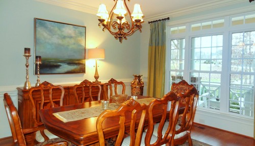
Rainwashed living and dining rooms are absolutely beautiful and soothing. You can pair it with tremendous whites, off-whites, and grays to create an eye-catchy palette.
You can also pair it with wooden textures while incorporating tons of metals – mainly bronze, golds, and even chromes.
In the case of a fireplace, I recommend using marble or exposed brick surrounding it. Furthermore, use gray or black curtains to touch upon interior details.

Using in Bedrooms
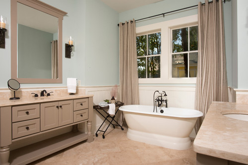
Why not? Well, Rainwashed bedrooms are one of the best! They will exhibit a nice crisp texture into your rooms and help you feel relaxed when you come back to your rooms tired.
Furthermore, I recommend incorporating tons of whites in the form of bed frames, nightstands, and even dressers. Wooden textures are not a bad option too!
Moreover, using black chandeliers would further help in refining the look of your bedroom.
Rainwashed in Kitchen
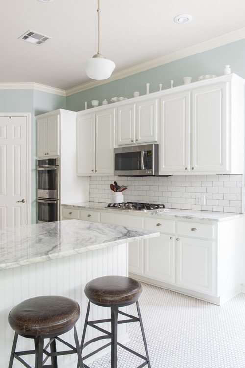
Especially for the open concept plans, if you like a nice tint of cool shade in your kitchen, you can absolutely incorporate this on the cabinetries.
Try pairing it with a white marble countertop, white hexagonal glossy backsplash, and chrome-tinted fixtures and pull handles.
You can also choose the other way around by painting the backdrop wall in this color and letting the cabinets in pure white.
If you have lush hardwood floors installed, it is a plus point!
Using on Exteriors
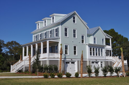
Rainwashed on exteriors will further make the color look lighter than it is. I recommend using this paint on Cape Cod, Craftsman, and Caribbean-styled homes.
Pair it with white, gray, or off-white shaded trims and moldings!
Yes – that way you make a great contrast in your home exteriors! Also, you can do the other way round, by using pure whites on the decorative moldings!
How to Best Sample This Color?
I need to share my favorite tip for testing out a color like Rainwashed – go over and order a peel-and-stick sample from Samplize.
These folks are nifty because they figured out a convenient way for us to sample colors way more easily. Just stick up a temporary square sample and forget the small jar of actual wet paint.
For only a few dollars you’ll receive a perfect sized square you can stick up temporarily anywhere you want to “try” on a paint color and any possible coordinating hues you like. It’s the best!
So, how do you want to use this color in your homes? Interiors or Exteriors? Now that you have all the secrets – are you excited about painting your home in Rainwashed? Should there be any questions or thoughts, let us know in the comments below!

Hello,
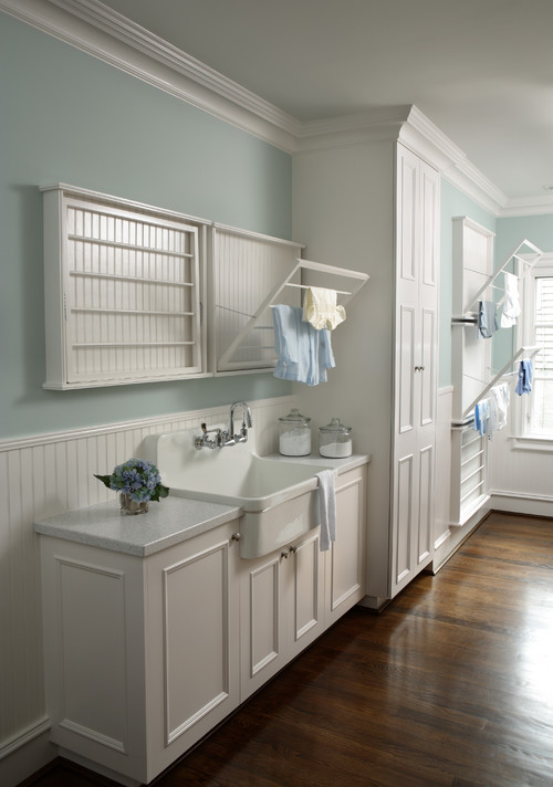
Do you like this in utility room (washer/dryer) with no windows? Or what do you recommend?
Hi Chad, Definitely yes! SW Rainwashed is a great color for the utility room.