
From the endless varieties of whites – do you know which one is the one for you?
Some are warm, some are cool, and some are neutral.
And further, some are comparatively lighter and some bolder.
Some appear absolutely airy, and some appear weighted down. Whew!
One such noteworthy example is Sherwin-Williams Pearly White, which is a white and, well, an off-white paint color!
It is neither too warm nor too cool – however, aligning somewhere towards the colors peach and pink under certain lighting conditions.
It is absolutely beautiful and is simply a perfect mimic of pearls!

So, if you are looking to add this timeless off-white paint to your home, I must say you go ahead!
However, since this white has certain undertones, you have to be very careful about picking the best complementary hues.
Also, let me tell you, this color can play a great chameleon.
It will tend to look cooler in some rooms and warmer in some – and that is why I am here to help you make informed decisions.
So, sit back and relax!
I am going to spill some Pearly beans here!
Sherwin-Williams Pearly White SW 7009 Details and Specifications

Before picking a paint color, you should always be careful and understand the true hue and specifications.
If you are wondering how to figure out the best one for your home, I say, you read this section very carefully.
So, every color has a story to tell – and that story majorly differs from any other color!
To make it easier for you, here are a few terminologies that you must consider.
First and foremost, look at the back of your paint swatches to determine the Light Reflectance Values or the LRV’s of the paint color.
This value helps in determining how light or dark the paint is.
Remember, the greater the value, the lighter the paint and vice versa!
So, the LRV of Sherwin-Williams Pearly White is 77.

And that means it is an extremely light-toned paint color (After all, it comes from the Sherwin-Williams White and Off-White Collection).
Because paint colors can change in different environments, I recommend you also just try Pearly White out at home with a peel-and-stick sample from Samplize. Order some samples now!
Secondly, other important associated terminologies are the RGB and HEX Values that further tell us what the color is comprised of.
Red = 232
Green = 227
Blue = 217
HEX Value = #e8e3d9
Since we have discussed the technical and scientific information, let’s get started with the practical aspects of this pretty white Sherwin-Williams paint.
How Does this Color Feel in a Space?
Sherwin-Williams Pearly White will make your space feel airy, warm, calm, and relaxed!
Or should I say – warm and cool both (but I will reveal those secrets later)!
So, this color plays a great neutral and base in your home!
Furthermore, this color makes a great statement in extremely small, small, and even medium-sized homes.
It will create an illusion of making a space look larger and enhanced!
I would also not restrict this paint to a particular climate!
Whether it is 100 degrees or 40 degrees, you can use this paint everywhere!
How Does Light Affect the Color?
Light has some role to play here!
Since the paint color is already extremely light, it will tend to wash away the undertones when used in the east or west-facing rooms!
Now here is another trick – look around and observe your space!
If you get ample natural light, it will tend to look much lighter and brighter! (Use eggshell finish in that case)
Otherwise, this paint is good to go for even the rooms with little to no natural light.
Also note that this paint will appear slightly warmer in east, west, and south-facing rooms, whereas cooler in the north-facing rooms!
I’ll say this again – get some wall samples to try on this color in your own home and confirm if it’ll work or if you need to try something else.
What are the Best Coordinating Colors?

Choosing the best complementary colors is the key, and that can only happen if you study the paint very well.
Remember, if you mess up with these palettes and schemes, you end up messing with your home (especially if you use it as a neutral or the base)!
And you don’t want that, right?
So, I will recommend a few options that you could consider pairing up with this tricky white paint.
First and foremost, you could either choose from a contrasting or a monochromatic color palette – depending upon your interior design style.
In the case of contrasts, since the paint has slightly peachy and pink undertones – I recommend pairing it with taupes, mauves, dusty pinks, dusty reds, and even blush (what color is blush, anyway?), charcoal blue, and grays!
Well, almost everything!
So, check out these few colors I would recommend for a monochromatic palette!
- SW 7030 Anew Gray
- SW 7031 Mega Greige
- SW 7032 Warm Stone
On the other hand, here are a few of the colors I would recommend for a contrasting color palette!
- SW 6043 Unfussy Beige
- SW 6045 Emerging Taupe
- SW 6039 Poised Taupe

Now, here is a twist: Use the same SW Pearly White on the walls and the ceilings and the trims at the same time!
SW Pearly White Vs Similar Colors

There are quite a few alternate examples that you could choose from!
Even though they might differ in undertones or reflectivity, some characteristics will make them look similar!
So, the two closely related examples are SW 6070 Heron Plume and SW 7013 Ivory Lace.
Pearly White Vs Heron Plume

With an LRV of 75, this off-white paint is beautiful and absolutely timeless!
Although, unlike the SW Pearly White shade, this one feels warmer in almost every condition.
I recommend you not use this paint on the ceilings and trims with medium-toned paints!
If you want to test the subtle differences in your house, get some wall samples of each here.
Pearly White Vs Ivory Lace

Another creamy shade of whites, this warmer tone makes a dashing statement to your spaces.
With an LRV of 79, this is comparatively lighter than the former.
Try avoiding warmer states and west-facing rooms as it may appear too overwhelming in such cases.
Test these colors side-by-side to see the differences in “real life” INSIDE your home, with some wall-stick samples. Order here!
Where to Use Pearly White?
Sherwin-Williams Pearly White can absolutely be used anywhere in your home – whether the hallways, living rooms, formal rooms, kitchens, or exteriors.
The best part about the paint is that it specifically doesn’t align to a particular style – you can use it in Modern Farmhouse as well as the Modern and Contemporary!
Let’s see where and how to incorporate this beautiful white color into your home.
Pearly White in Living and Dining Rooms

Absolutely yes!
Try pairing it with bolder paints like deep blues and taupes to create stunning contrast.
If your living room faces the north, you can consider using a semi-gloss finish or the cashmere pearl; eggshell is one of the best options.
This paint will make your living room look larger and more compact – so keep a note of the compass directions and then use it strategically!
In the north, it will look cooler, so try pairing with warmer tones to balance the appearance!
Using in Bedrooms and Bathrooms
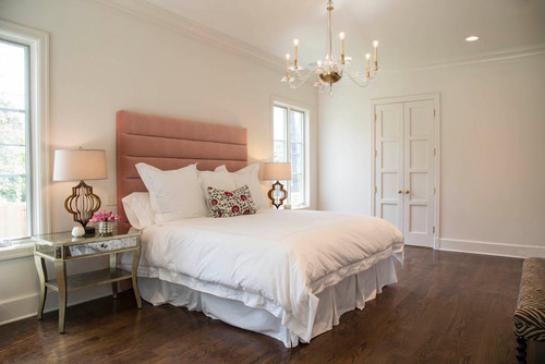
Why not?
Use this paint as the neutral or base in your bedroom and choose a darker paint for the accent wall.
You can even use this paint on all the walls and choose heavy furniture to add depth to your space.
Use bold blackout curtains with hues like beiges and taupes to add the vertical statement!

Plus, to create a cohesive touch, you can also continue this hue in the bathrooms and pair some authentic brass or matte black light fixtures to go!
Avoid choosing a bold color in the bathroom! Rather stick to SW Pearly White for a transitional style look.
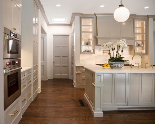
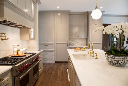
Pearly White in Kitchens
Kitchens are the heart of our homes!
So, if you want a warmer-toned kitchen and have tons and tons of natural light – this is probably one of the best options!
Try pairing with rose-gold and brass fixtures and pull handles while choosing a dramatic backsplash tile to play with the overall mood of your kitchen.
Using on Exteriors
SW Pearly White is timeless – and that is why you can use it for most of the exterior designs!
You can either pair it with black or grey accents through trims, moldings, and door and window frames.
You can also use natural stone wainscotting for the patio columns and surroundings!
If you plan to use a darker color on the facade, then choose SW Pearly White for the doors for a great contrasting experience!
How to Best Sample This Color?
I need to share my favorite tip for testing out a color like Pearly White – go over and order a peel-and-stick sample from Samplize.
These folks are nifty because they figured out a convenient way for us to sample colors way more easily. Just stick up a temporary square sample and forget the small jar of actual wet paint.
For only a few dollars you’ll receive a perfect sized square you can stick up temporarily anywhere you want to “try” on a paint color and any possible coordinating hues you like. It’s the best!
The Best Wall Spots to Sample Pearly White
Don’t just stick your sample in one spot and call it done.
Test Pearly White on a sun-drenched wall, a shadowed corner, a narrow section beside trim, and a large uninterrupted surface.
I’ve seen this color look noticeably creamier in low-light corners versus walls with direct afternoon sun hitting them.
Also test it next to your flooring, cabinetry, and any large furniture pieces to see how those relationships actually play out.
When to Observe Your Sample Throughout the Day
Timing your observations matters more than people realize with a color like this.
Check Pearly White in soft morning light, harsh midday sun, overcast daylight, and again under your evening lamps and recessed lighting.
Warm bulbs tend to push this color toward a richer cream, while cooler LEDs can pull it closer to a flat white.
How Your Room’s Elements Influence the Color
Wood floors and warm-toned cabinets can amplify the creamy quality of this color in ways a paint chip never shows you.
If your space has windows facing greenery outside, that reflected natural green can subtly cool down how Pearly White reads on the wall.
Nearby wall colors in open floor plans are worth watching too, since they bleed into your perception of this color!
Why Larger Samples Are Non-Negotiable
A tiny paint chip simply can’t show you what Pearly White looks like across a full wall.
Using Samplize (link above) lets you move a large sample around the room to test every location and condition easily.
Give the Sample Time to Speak
Leave your sample up for at least two full days before deciding.
With Pearly White specifically, you’ll want to catch that evening light shift that can make it feel warmer and more cream-forward than you expected!
My 7 Key Tips for SW Pearly White
1. Test Pearly White in different lighting
Pearly White can read differently depending on natural light, warm bulbs, or cool LED lighting.
I always paint a large sample on the wall and watch it throughout the day.
This helps avoid any surprises and ensures the soft, creamy undertones come through beautifully!
2. Pair it carefully with flooring
This color works wonderfully with light oak, maple, or soft beige floors.
I love how the warmth of Pearly White complements natural wood tones without feeling too stark.
If your floors are very dark, consider adding lighter rugs to balance the room and keep it bright.
3. Coordinate with cabinetry
Pearly White looks amazing with classic white shaker cabinets or soft gray tones in kitchens and bathrooms.
I often pair it with natural wood cabinets for a subtle contrast that keeps spaces cozy and inviting.
Testing a small wall near your cabinetry helps see how the undertones work with your finishes.
4. Perfect for rooms needing brightness
This color is fantastic for smaller rooms, hallways, or bathrooms that need a light, airy feel.
I’ve found it makes spaces feel open and clean while still having a soft, creamy warmth.
It works well in living areas too when layered with colorful accents and textures!
5. Trim and ceiling considerations
Pearly White pairs beautifully with crisp white ceilings and trim for a clean frame.
I like using slightly warmer or soft beige trim to add subtle depth and avoid a flat look.
This approach keeps the room feeling light and balanced without overpowering the walls.
6. Exterior uses
Pearly White is a great choice for front doors, siding, and porch accents on exterior spaces.
I recommend testing it next to your roof and stonework to make sure the undertones harmonize with your exterior palette.
It really pops with black, deep gray, or navy shutters for classic curb appeal!
7. Layer with accent colors
I love pairing Pearly White with soft pastels, muted blues, or warm taupes in furnishings and décor.
This creates a layered, welcoming feel while keeping the walls neutral and versatile.
Small metallics like brushed gold or matte black accents really pop against Pearly White walls and add visual interest!

I painted my exterior bricks of my entire home pearly white. What color do you recommend for the door and shutters?
Hi Ashley, grays would make a great pair! Otherwise, you can spice things up with a more quirky color contrast like blush or sage green.
Can you use pearly white on the walls trim cabinets and ceiling. If so, could you use wall street by sherwin Williams for the island. The walls are only 8 foot
Hello Becky, Yes absolutely 🙂 As far as you have a smaller island to deal with – SW Wall Street would work as an accent!
My new cabinets are about to be installed and they are SW Pearly White. I was told the trim through the rest of the house should be the same white as the cabinets. I’m struggling with this because cream seems weird to use on all my floor trim and door moldings. Is there another white you can recommend that compliments these cabinets, but won’t make them look too colored when butted up to the trim?
Hello there! Using SW Pearly White all the way on all your trims and moldings is something I wouldn’t recommend unless you are choosing a dark and daring palette with pink or beige accents. However, you must choose SW Pure White against SW Pearly White as it is also not too white!
Hi! My kitchen cabinets are Grecian ivory by SW. Would pearly white be okay to use on the walls?
Yes! Absolutely Sarah – you can go ahead with it!!
I am trying to choose between Sherwin Williams Pearly White or Benjamin Moore White Dove. My woodwork is alabaster by Sherwin Williams
Both these paints would have their own charm – however, I recommend BM White Dove since it doesn’t necessarily incline towards a particular hue when paired opposite the woodwork!