Looking for a gray and beige with a neutral backdrop? Well, let me introduce you to one of the most popular greiges: Sherwin-Williams Mega Greige, which is absolutely warm and welcoming.
So, if you are looking for a bold, greige paint option, this color is as good as gold (…well, gray-beige)!
With slightly warmer undertones, you are quite likely to detect some red-pink shades underneath the paint color.
Also, since the color is pretty dark-toned, you must be very careful with how you use it. Remember, darker tones can bring unanticipated challenges vs lighter colors.
Furthermore, it is also important to analyze the incoming natural light to truly understand if the paint color is good for your space or not! Or if you really need this color in your home.
But if it’s time to throw some greige magic into your spaces, don’t worry! I am going to unveil all the information about this bold color and help you make the best use of it.
So, sit back and relax! Maybe reach for a glass of wine as this review is going to make you a ‘greige’ expert!
Let’s get started!
Sherwin-Williams Mega Greige SW 7031 Details and Specifications

I’m going to begin with the basics! Before you choose a paint color for your home, it is crucial to understand the background knowledge and theories linked with the color.
Because trust me, my friend, without understanding this, it may be a total mess!
Hence, first and foremost, do remember to consider the Light Reflectance Values or the LRV’s of the paint color you choose.
This value helps in determining how light or dark the color is. And just in case you’re wondering where to find that value – well, simply look at the back of the paint swatch!
So, the LRV of Sherwin-Williams Mega Greige is 37. And that means the color falls somewhere between the dark and mid-toned shade.

Well, depending on this, can we further decide where to use the color.
Most often, it’s best to sample a paint color in your home to confirm it’s going to work how you expect. You can do this easily using Samplize. Grab one now for Mega Greige!
Other important associated terms to consider are the RGB and HEX Values that are as follows!
Red = 173
Green = 162
Blue = 149
HEX Value = #ada295
Now that we have discussed enough about the technical and scientific information, let’s get started with the practical aspects of this bold Sherwin-Williams paint.
How Does this Color Feel in a Space?
This Sherwin-Williams paint feels absolutely bold, authentic, warm, daring, and cozy when used in a space.
Hence, if you have an oversized bedroom or a living room, you can use this color to make your space look enclosed and characteristic.
Since this color has low reflectivity, it tends to absorb most of the incoming light while adding depth to any space.
I wouldn’t say it creates an illusion of making your space look larger – instead, it does the opposite!
I will recommend colder regions to incorporate this color, as it adds a feeling of warmth and welcome.
Even though many warmer states like this color – but I would say, try to balance the cooler tones in that case!
By the way, feel free to check out my list of favorite SW Greige colors to see where this one falls!
How Does Light Affect the Color?
Even before picking a paint, just look around and analyze the amount of incoming light in your space. Is it too much? Or is it too little? Or is it adequate enough?
Well, if you have a small-sized room with little to no natural light – I wouldn’t recommend using the paint. Or else if your space receives ample natural daylight – this color is good to go!
But don’t worry! You can always play the card of artificial lighting. Use warm whites and warm yellows to create a desired mood in your space!
Without ample light, SW Mega Greige may feel darker than it already is – or vice versa!
Again, I really recommend you try out some wall samples because colors will look different in every location.
What are the Best Coordinating Colors?

Now that we have analyzed the true theory behind the color, its light reflectance values, how it truly feels, and the effects of light, let’s first look at what best suits the paint color.
This is the next major step to take when choosing a paint color.
So, you can either choose from a monochromatic or a contrasting color palette in your home. Depending on the specific interior design style, the color palette may vary.
Well, here are a few of the colors I would recommend for a monochromatic palette!
- SW 7029 Agreeable Gray (See my article on this here!)
- SW 7030 Anew Gray
- SW 7032 Warm Stone

On the other hand, here are a few of the colors I would recommend for a contrasting color palette!
- SW 9166 Drift of Mist
- SW 6038 Truly Taupe
- SW 6040 Less Brown

For your ceilings, trims, and moldings – I would recommend using SW Pure White to further achieve a creamier look, or else if you want a crisp look, choose SW High Reflectance White.
SW Mega Greige Vs Similar Colors
Choosing a similar-looking option might be daunting since the color may ‘look’ similar even if they aren’t! Remember, no two colors are the same; they may always differ in undertones and lightness.
So, the two closely related paint colors are SW 7633 Tony Taupe and SW 7045 Intellectual Gray. Let’s see how all these differ!
Mega Greige Vs Tony Taupe

One of my favorite taupes, Tony Taupe shares quite some similarities with the paint.
With an LRV of 37, this color too falls on the darker side of the scale.
With deep red undertones, this color is inclined more towards the brown reds.
You can absolutely use this paint in homes as a perfect alternative to SW Mega Greige!
However, remember to pair it with red-brown undertones.
Find out what works best in your home’s environment and lighting by putting up some temporary samples and observing. Get some wall samples from Samplize.
Mega Greige Vs Intellectual Gray

Not a greige but actually a gray, this paint is not very similar to Mega Greige. Hence, this neutral has deep gray undertones that appear somewhat green in certain lighting conditions.
With an LRV of 36, this paint is almost an equal shade in lightness and darkness.
Order a wall-stick sample of Mega Greige here to help you compare these colors in your own space.
Where to Use Mega Greige for Interiors?
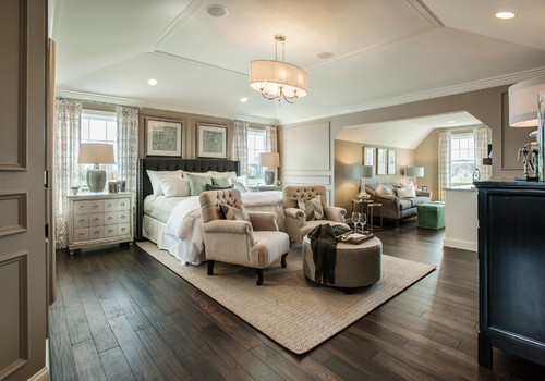
You can use this color absolutely anywhere in homes. Whether it is the foyers, bedrooms, or the corridors – I wouldn’t recommend holding back from this color.
And especially in the traditional, transitional, mid-century modern, and Modern farmhouse interior design styles – this paint is definitely good to go!
Let’s see where and how to incorporate this beautiful greige color in your homes.
Mega Greige in Living and Dining Rooms
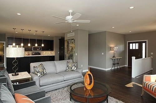
To invite a sense of coziness and welcomingness, I would recommend using this shade of greige. However, it may be challenging if you are tight on space.
Nevertheless, you can always pair it with lighter shades of beiges, off-whites, creamy whites, lighter browns, and muted taupes to create a perfect backdrop in homes.
To further make your space lively and airy, add white sheer curtains! Moreover, I would recommend painting only the focal wall in this color and leaving the rest in muted and lighter tones.

Using in Bedrooms
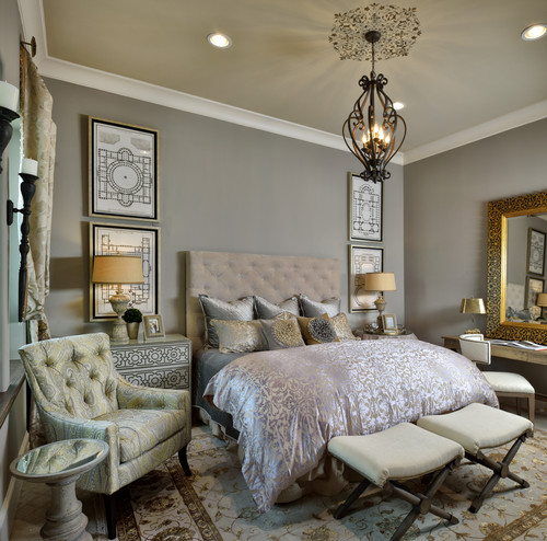
Choosing paint for bedrooms can be absolutely personal. It depends on your personal choice, whether or not you like greiges!
However, if you do, try to paint only a single wall in this color. (Maybe the headboard wall or the wall with the fireplace)
Secondly, choose neutral-toned upholstery and fabrics to further add depth to your bedroom.
Mega Greige in Kitchens
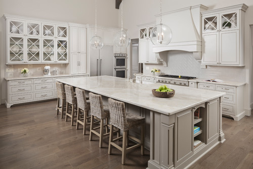
If you have an open concept kitchen style, do go for this color. However, make sure to pair it with similar tones in the connected living or dining space.
Secondly, you can also do the opposite by painting the backdrop wall in this color and leaving the rest for lighter shades or paint the cabinets in SW Mega Greige.
Nevertheless, choose white or off-white marble countertops and white backsplash tiles. In the case of accents through pull handles and fixtures, choose a chrome finish!
Using on Exteriors
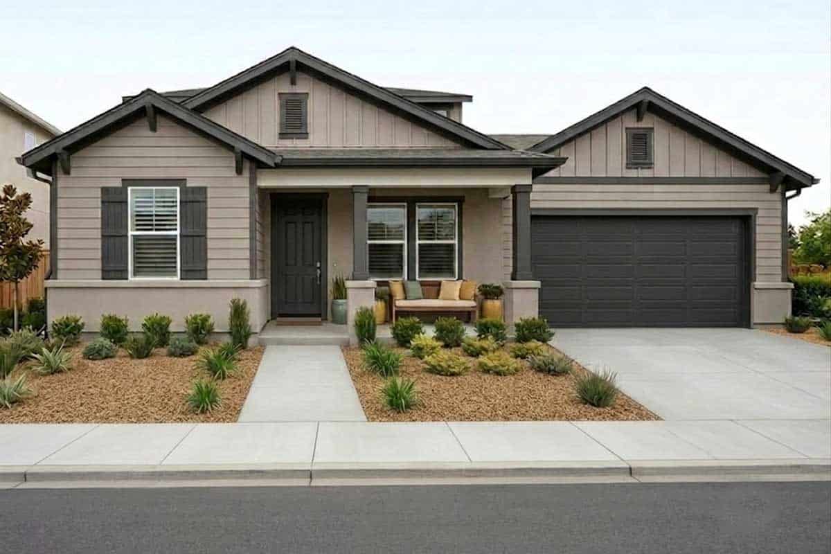
I personally LOVE the feel of greiges on the exterior walls. You can always pair it with beiges and off-whites through decorative moldings, trims, and door and window frames.
Have a look at the image above! Do you like the natural stone cladding and the gray roof tiles? Well, I love the exterior color palette here!
My Favorite Way to Sample Colors
I can’t say enough about how easy it is to use a peel-and-stick paint sample to give a color like Oyster Bay a try. The absolute best way is to order a sample from Samplize.
You can check it out right on your wall and move it around. Also, try it along with another couple of colors to test pairing possibilities.
This is WAY easier than having to open up little cans of paint and rolling/brushing on. Forget the mess and use these helpful temporary sample squares to test location, lighting options, etc.
Mega Greige Undertones
The Primary Undertone Driving Everything
Sherwin-Williams Mega Greige lives in that interesting space between warm beige and cool gray, and its dominant undertone is a soft, dusty taupe that anchors the whole color.
This taupe base is what gives Mega Greige its versatility, but it’s also what makes it reactive to its surroundings in ways that can genuinely surprise you.
In rooms with warm natural light, that taupe reads closer to beige, feeling grounded and cozy.
The Secondary Undertone You Need to Watch
Beneath that taupe base, there’s a quiet violet-gray undertone in Mega Greige that surfaces under certain lighting conditions.
I’ve seen this color shift noticeably cooler and almost lavender-adjacent in rooms with north-facing light or under bright cool LED bulbs, and it catches people completely off guard!
If your space has a lot of cool-toned finishes or bluish-gray accents nearby, that violet undertone will become much more visible than you’d expect.
A Third Undertone That Shows Up in Shadows
In darker corners or on walls receiving minimal natural light, Mega Greige can reveal a subtle greenish-gray cast as a third undertone.
It’s not dramatic, but it’s worth knowing before you commit, especially in rooms with heavy tree coverage outside the windows reflecting green light inward.
How Surrounding Elements Pull Each Undertone Forward
Warm wood floors tend to suppress the cooler undertones and push Mega Greige toward its warmer beige side.
Cooler stone countertops or stainless finishes do the opposite, pulling that violet-gray quality right to the surface.
Use your sampling process to observe all three undertones across different walls and times of day before finalizing this color!
My 7 Key Tips for SW Mega Greige
1. Test Mega Greige in both natural and artificial light before committing
Mega Greige has a complex balance of warm beige and soft gray that shifts noticeably depending on light.
I always test it on multiple walls because north-facing rooms can pull out its cooler gray side, while warm bulbs make it read cozier.
Check it in the morning, afternoon, and at night to avoid surprises once the whole room is painted!!!
2. Choose the finish carefully to avoid highlighting wall flaws
This color has enough depth that higher-sheen finishes can spotlight drywall seams or texture issues.
I usually recommend eggshell or satin for interiors to keep the look smooth and forgiving.
On exteriors, a satin finish helps Mega Greige hold its richness without showing every imperfection.
3. Pair Mega Greige thoughtfully with wood flooring tones
This shade looks especially grounded with medium oak, hickory, or engineered floors that lean warm.
Cool gray floors can make Mega Greige feel heavier and slightly muddy if the undertones clash.
I like using a warmer rug or runner to bridge the gap if cooler flooring is already in place.
4. Coordinate cabinetry colors to keep the space balanced
Mega Greige works beautifully with creamy white cabinets, mushroom tones, or light taupe finishes.
Bright white cabinets can look stark next to it unless the white has a soft, warm undertone.
I often use brushed brass or champagne hardware to add warmth and prevent the room from feeling flat!!!
5. Mind the trim color to avoid a dingy contrast
Pure white trim can feel too sharp against Mega Greige and make the walls look darker.
I prefer a slightly softened white like a warm off-white for trim and doors.
This keeps the transition clean without stealing attention from the wall color.
6. Use Mega Greige strategically in specific rooms
I find it especially strong in open-concept living areas where it creates continuity without feeling cold.
In bedrooms, it delivers a calm, grounded mood when paired with layered textiles.
For small bathrooms, I recommend plenty of warm lighting so it does not read overly shadowy.
7. Prep thoroughly for exterior applications
On exteriors, Mega Greige can emphasize uneven siding or old paint lines.
I always take extra time to prime and repair surfaces so the color looks even and intentional.
When paired with stone, brick, or dark bronze accents, it delivers a polished exterior that holds up beautifully!!!