
Great cousins of beiges and greiges, taupes are relatively new and undoubtedly, one of the trendiest in the interior design market today.
They are mainly dark gray, brown colors that have a slighter bold and dim appearance on the walls.
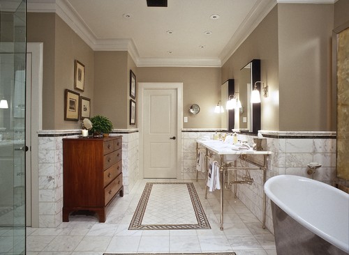
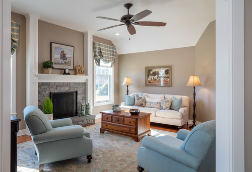
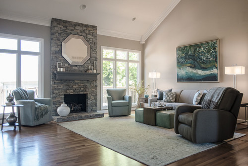
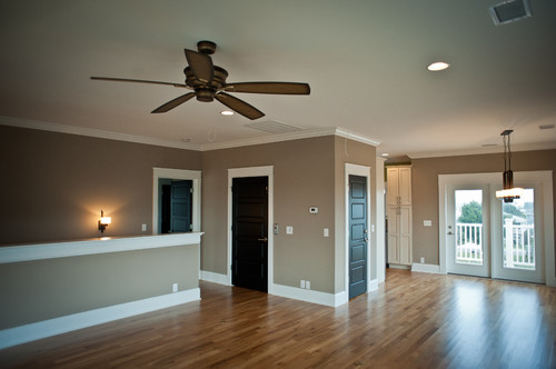
So, if you really are in favor of using taupes in your home, let me introduce you to one you could call the Queen – Sherwin-Williams Tony Taupe.
It is one of the upcoming and most popular beige/taupe paint colors by the manufacturer.
It tends to exhibit a smooth and warm texture yet dark and daring in some cases.
But most of the time if used carefully, it will look absolutely beautiful and gorgeous!
I must say, this color is not easy to deal with – there should be some experimentations here and there before finally picking this paint!
Don’t worry!
I am going to reveal all the associated secrets to ensure if you should really use this paint in your living spaces or not!
Mainly due to its dark and bold character, the color tends to alter its looks – but not if used strategically!
So, sit back and relax!
In no time – you will be a Tony Taupe pro.
Sherwin-Williams Tony Taupe SW 7038 Details and Specifications

Before you pick this queen taupe, it is important to know the underlying theory and specifications.
Mainly, what the color is truly made of, its undertones, and how reflective it is! Without knowing these – you might end up messing up with your space, and you wouldn’t want that right?
Hence, know that every color is different – even though they appear ‘similar’!
So, first and foremost, you must acquaint with the concept of Light Reflectance Values or the LRVs.
This value helps in determining how light or dark the paint is.
(And just in case if you are looking to find this value – well, simply look at the back of the paint swatch)!
Here, the LRV of Sherwin-Williams Tony Taupe is 37 – making it fall on the darker end of the scale!
One GREAT way to test a paint color to see what it’ll do in your own home, is to order a sample from Samplize. You can pick one up for Tony Taupe!

Secondly, it is important to get acquainted with the RGB and HEX Values, which are as follows!
Red = 177
Green = 162
Blue = 144
HEX Value = #b1a290
Now that we have read through the color details and specifications, let’s get hands on some of the practical aspects and applications of this beige/taupe paint color.
How Does this Color Feel in a Space?
Tony Taupe makes your space feel ‘weighted down’, dark, enclosed, and bold!
You are quite likely to feel extremely warm and, at the same time, confused if there is plenty of taupe on your walls!
(And that is why I mentioned that you need to be extra careful when using this paint in your home)
I recommend using this paint only in the colder regions where the warmth of the paint can neutralize the cool incoming vibes from the climate.
Furthermore, you should only use this color in spaces that are large enough to accommodate the depth of the paint!
And most importantly, it is a definite no-no for smaller or even medium-sized rooms!
How Does Light Affect the Color?
Well, light can indeed play some role in this paint color – but only up to some extent!
So, firstly, you must look around and observe if your room receives plenty of natural light and is large enough!
If yes, then definitely go for this color!
Otherwise, try to avoid it in rooms that are deprived of light and ample size!
Furthermore, it is a plus point if you incorporate this paint in spaces that are at least double-height!
Talking about compass directions, you should try using this paint in only the north-facing rooms!
A pro tip: Avoid south, west, and east-facing rooms!
Like I said, the best way to see this color in action before you paint is to buy some paint samples you can easily stick on your wall. It’ll definitely give you some clarity if you’re unsure!
What are the Best Coordinating Colors?

Choosing the best complementary colors for this darker taupe is quite a challenge!
However, you still need to understand and consider the true hue and complement the best paint colors as per the reflectivity and undertones.
And especially for a challenging color like this, choosing a color palette becomes one of the favorite tasks!
In this case, I would recommend choosing either a monochromatic or a contrasting color palette – depending upon the interior design style.
So, if you are looking for a monochromatic palette (or warm minimalism), I would recommend the following colors:
- SW 7036 Accessible Beige
- SW 7037 Balanced Beige
- SW 9174 Moth Wing

On the other hand, if you are looking for a contrasting theme, I would highly recommend incorporating lighter greys, lighter blues, natural greens, and whites.
You can also use mustard yellow as an accent!
So, to enlist a palette, I would recommend the following paint colors:
- SW 9166 Drift of Mist
- SW 6120 Believable Buff
- SW 9054 Little Boy Blu

In the case of ceilings, trims, and moldings, I would recommend using SW High Reflectance White to balance the warmth with a slightly crisper look.
SW Tony Taupe Vs Similar Colors

There are quite a few similar colors associated with this taupe.
Even if they look similar, note that they may either differ in reflectivity or the undertones!
So, the two closely related examples are SW 7505 Stone Lion and SW 9612 Perfect Khaki.
Tony Taupe Vs Stone Lion

Comparatively lighter than Tony Taupe, Stone Lion has an LRV of 38 – making it fall on the very dark end of the scale.
It has deep red undertones – thus, exhibiting a very warm texture all day long!
However, you can use it as an accent!
Grab some stick-on samples of both these colors here to see how the color will look in your living spaces.
Tony Taupe Vs Perfect Khaki

An ‘interior only’ paint alternative, you can absolutely use it in your home as far as you pair it with lighter beiges and whites!
This color has an LRV of 38 – hence, remember to be careful around the amount of paint you intend to use in your space.
Get a stick-on sample sheet for both of these colors to test in your home.
Where to Use Tony Taupe?
Tony taupe is a great paint color option for your home – only if size and lighting conditions allow!
So, in case if your space isn’t blessed with those factors, should you still use the paint?
Well, why not?
Here I am going to disclose some tips and tricks to use the paint in even the smallest spaces!
So, firstly, this color can be used in traditional, transitional, and glam-styled interior design homes!
For contemporary designs, use it as an accent with darker tones!
Let’s discuss how to incorporate this paint color in your home!
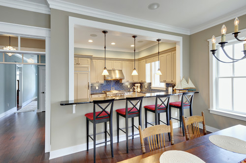
Tony Taupe in Living and Dining Rooms
If you want a warm and cozy experience in the living spaces, you can incorporate this taupe!
It is dark and bold – and that is why you should use it only as an accent!

Well, maybe on the focal accent wall – or in some cases, as an accent on the wall paneling!
You can also use lighter beiges on walls and let the furniture upholstery shine in this beautiful paint color.
In the case of renovation and refurbishment, try replacing the hardwood floors with something lighter-hued, like wall-to-wall carpeting and porcelain beige tiles to feel airier and lighter!
For the fireplace wall, use white exposed brick to create a striking contrast!
Using in Kitchens
You can paint your kitchen cabinets in this paint color (only if the kitchen has a good amount of space), else it will make your space feel congested!
Or else, you can also paint the backdrop wall in this paint – and let the cabinetry systems in SW Pure White!
Furthermore, you can pair stainless steel with silver on the fixtures and pull handles to neutralize the darkness!
Last but not least, use a white countertop and white backsplash tiles – could be veined or even patterned!
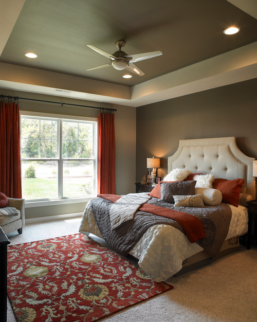
Tony Taupe in Bedrooms
Your bedrooms deserve tranquility and peace!
And that is why you should only use this on the headboard wall or the focal accent wall!
Try pairing it with lighter-toned beiges and white bed covers and duvets!
You can also add a tinge of gray through the rugs and sheer curtains!
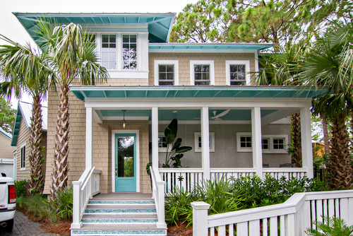
Using on Exteriors
This paint color is a great alternative for exteriors. Although it is going to look much lighter and warmer than it is!
You can pair it with either grey or white trims, moldings, and door and window frames.
Natural stone wainscotting is a win-win situation!
For Spanish-styled Southern homes and Mid-Century Modern style, this color is definitely going to look majestic!
It somehow will appear brownish and yellowish outdoors due to extreme natural daylight – but don’t worry!
Just pair it will cooler whites and neutrals on the door and window frames.
What’s the Best Way to Sample This Color?
So now my favorite tip when it comes to testing out a versatile color like Tony Taupe – go and order a peel-and-stick sample from Samplize.
They’ve created an awesome way to sample colors with real paint, but no mess. Simply stick on your paint sample instead of having to get a test can of actual wet paint.
For only a few dollars you get a good sized square to throw up temporarily anywhere you want to “try” on your color, other similar colors, and any possible coordinating hues you like. It’s great!
What NOT to Pair with This Color
Color Pairings That Ruin the Look of Tony Taupe
Tony Taupe’s warm, greige character gets thrown off by colors carrying strong cool or stark contrast.
Icy blues, cool grays, stark whites with strong blue undertones, and heavily saturated cool purples all fight against Tony Taupe’s warmth.
I’ve seen this color look genuinely unsettled when cool-toned colors crowd its naturally warm, earthy quality.
Decor Styles You DON’T Want to Pair with Tony Taupe
Ultra-modern minimalist spaces heavy with cool grays, stark whites, and chrome finishes clash directly with Tony Taupe’s warmth.
Cool industrial-style interiors loaded with raw concrete tones and cold metal accents completely undermine what makes this color work!
Coastal styles built around crisp whites and cool aqua tones also create a tension that leaves Tony Taupe feeling out of place.
Trim and Accent Colors That Do NOT Work with Tony Taupe
Cool bright whites, blue-toned off-whites, stark gray trim, and lavender-based accents all conflict with Tony Taupe’s warm base.
I always flag cool-toned trim as one of the quickest ways to make this color’s undertones look muddy and unresolved.
Furniture That Never Works with Tony Taupe
Heavily cool gray upholstery, stark white furniture pieces, and chrome-heavy accent chairs create jarring contrast against Tony Taupe’s warmth.
Furniture with strong blue-gray or cool charcoal tones pulls the eye in completely the wrong direction with this color!
Indoor and Outdoor Finishes That Never Suit Tony Taupe
Cool slate tile, blue-gray stone, stark white concrete, cool porcelain, chrome fixtures, and gray-toned decking all undermine Tony Taupe’s warm, grounded character both inside and out!
My 7 Key Tips for SW Tony Taupe
1. Test Tony Taupe in both natural and artificial light before committing
Tony Taupe reads as a warm greige that can tilt slightly mushroom in lower light.
I have seen it look moodier on north-facing walls.
Check it morning, afternoon, and evening to confirm the shifts are appealing.
2. Mind sheen level to avoid exaggerated shadows
Because Tony Taupe is gently warm, glossier finishes can create sharp corner contrasts.
I usually recommend eggshell indoors so the color stays soft and balanced.
Outside, satin works well for durability without giving a plastic look.
3. Pair Tony Taupe thoughtfully with flooring materials
On pale oak or natural maple flooring, the color reads relaxed and breezy.
On dark espresso hardwoods, it becomes richer and more formal which I love in dining rooms.
Warm mid-tone LVP can nudge it slightly tan so test a large swatch across the floor first.
4. Coordinate cabinetry colors with Tony Taupe in kitchens and baths
Tony Taupe works beautifully with creamy off-white cabinetry like Alabaster or Chantilly Lace.
With natural walnut cabinets it feels earthy and sophisticated.
I tend to skip pairing it with strong honey oak cabinetry because that combo can make the walls look dull.
5. Use Tony Taupe to unify open floor plans
The mellow undertone helps rooms flow smoothly from living to kitchen spaces.
It keeps a warm backdrop while still allowing art and decor to shine.
I have used it to visually connect narrow halls to larger rooms with great results.
6. Consider Tony Taupe for exterior stucco and trim combinations
It performs beautifully on stucco where the warmth adds depth without turning muddy.
Pair with crisp white trim for beachy homes or a quiet greige trim for traditional cottages.
I find it resistant to looking flat in strong sunlight which always makes me happy!!!
7. Style Tony Taupe with textiles and metals for better balance
Cooler metals like brushed nickel and chrome sharpen its warm undertones.
Brushed brass and woven textures make the color feel natural and inviting.
I like using charcoal drapery or a deep olive rug to keep the palette grounded!!!

Leave a comment