
Just like the name suggests, Sherwin-Williams Latte is a perfect warm neutral beige that is bound to add a feeling of warmth to your home!
Yes, this time the name is not deceiving, and the paint color actually looks like your morning or evening latte!
Well, I love latte (the drink, latte) – do you too?
Well, if you do…you’ll love the paint latte as well!
It is a smooth color with orange and brownish undertones and a highly creamy texture when painted on the walls.
However, the color is to be used only as accents but not bases due to its mid to dark tone appearance.
So, if you are planning to use this color in your home, go ahead with it, but there are a few do’s and don’ts that you must acquaint yourself with.
How, when, and where to use latte paint is of utmost importance. It is not a very easy-going shade, so be careful here with this one.
Due to its properties, there are a few rules and restrictions that must be taken care of, so read ahead to see what Sherwin-Williams Latte has to offer you!
Sherwin-Williams Latte SW 6108 Details and Specifications

If you are a newcomer in the world of color psychology, let me tell you there is a lot waiting for you ahead!
Every color is linked to theories that help determine how, where, and when to use the paint color.
The most important term is Light Reflectance Value or LRV, which helps in determining how light or dark the color is!
For Latte, the LRV is 38.
That is neither too dark nor too light, so falling somewhere between the mid to dark tone.
Now, if you’re wondering where that information will be used, well, the LRV of a paint color helps you in deciding which specific rooms and walls a color needs to be used on.

It determines how much light the paint color will reflect, thus making the room lighter or darker!
Another tip: If you want to easily try out Latte to see how it will show, you can with a peel-and-stick sample from Samplize. Pick up your samples here!
Other associated values are RGB and HEX Values that are as follows:
Red = 186
Green = 161
Blue = 133
HEX Value = #baa185
Okay, enough of the technical data about the color – let’s move ahead with the practical aspects of it!
How Does Latte Feel in a Space?

SW Latte makes the space look bold and daring
Latte definitely makes your room look bold, daring, and smaller.
Yes, due to its low reflectivity, it tends to make a room look smaller than it! Hence, it is important to balance the notion and temperature of the color.
I would highly recommend using this paint color in cooler northern states or colder areas, where the climate is usually dry and grey, and the absence of sunlight makes people crave it.
Due to orange and beige undertones, there is a bright and warm feeling of the sun, which makes space look warmer and welcoming.
However, too much latte is definitely a NO, as it might make your space look cluttered and heavy.
How Does Light Affect the Color?

Carolina from Sitting Shotgun remodels and paints the family room in SW Latte
Ample natural light is bound to make the color look lighter!
Well, light has a major role to play in color psychology.
If you use latte in a stuffed space with no natural light and very faint artificial light, it is quite likely that your space will look dull and dingy (more because it is a warm shade)!
So, given that lesson, use this color only when you have ample natural lighting hitting the walls!
If you paint the south-facing walls in latte, it will appear to be even more yellow and beige, whereas north-facing rooms may appear crisp, darker beige!
Otherwise, you might have to forget it. It may appear dark brown; let’s say something like SW Steady Brown in the absence of light! And I am sure you wouldn’t want that!
An alternative here is to opt for the lighter beige SW Macadamia, which will help avoid the dark brown issue.
I’ll have to say again, the absolutely coolest way to check a color like this out in your home is with a wall sample from Samplize. Buy yours here.
What are the Coordinating Colors for Sherwin-Williams Latte?

Don’t shy away if you really want to use the color.
You can absolutely use it as long as you pair it with the best possible accents, neutrals, and bases.
Since the color is quite warm, I would recommend lighter-toned neutrals and strong cool bases to create a sense of harmony throughout the room.
I have a few recommendations for you here in a monochromatic and contrasting scheme that you could use in your home.
For a monochromatic palette, creatively use the following:
- Kilim Beige SW 6106 (see my detailed review here)
- Nomadic Desert SW 6107
- Double Latte SW 9108
I also like SW Turkish Coffee if you want a dark, almost brown to complement the beige of Latte.
Similarly, for a contrasting theme, I would recommend using greys, off-whites, and deep blues to create depth in the room. Consider the following Sherwin-Williams paints:
- Ivory Lace SW 7013
- Inky Blue SW 9149
- Steamed Milk SW 7554

This contrasting scheme is definitely worth it – I promise!
In all these cases, I would recommend creamy white paint on the trims and moldings – something like SW Pure White would do the job!
Sherwin-Williams Latte Vs. Similar Colors
Latte has a refined look. It is warm, sophisticated, and creamy. Thus, with beiges, there is an advantage that you can actually find tons of other paint colors that look similar.
Even though there are no two colors that are exactly similar, cousins still exist!
If you are looking for other similar options here, I would mainly recommend the two of them as SW Woven Wicker and SW Beige Intenso.
Latte Vs. Woven Wicker

With an LRV of 34, woven wicker is comparatively a darker solution to the latte.
With a creamy texture and utmost warmth, this color exhibits a traditional look if you prefer that particular design style.
However, to exactly know the difference, I would recommend buying real-time paint swatches and samples to determine the realistic look.
Order a stick-on sample of Woven Wicker here to help you compare these colors in your own living spaces.
Latte Vs. Beige Intenso

Beige Intenso is a crisp beige with red and brown undertones.
It is lighter than Woven wicker and latte both with an LRV of 42. You could consider using this paint color if you’re looking for a unique warm texture in your home.
However, all these shades would best suit in colder areas where continuous warmth is required to feel homey and cozy.
Try out the looks of these colors in your own home with a some temporary wall samples. You can find them here!
Where to Use Latte in Homes?
Sherwin-Williams Latte could be used in your home as far as you understand where and how to use it!
If you love beiges, don’t hold back!
Simply, use this color anywhere you feel like. Especially if you have a traditional taste in interior design – this color is absolutely good to go!
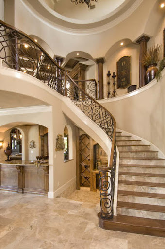
It is time to pair it with wooden balustrades and iron railings, off-white shades, warm neutral upholstery, and darker and cooler accents!
However, if you use too much of it – your home might feel too overwhelming and unnecessarily warm.
Latte in Living Rooms
In the above photo, you can really see how this color lends to the perfect traditional look.
This paint color is very commonly used in traditional, transitional, and French country-styled homes.
If you have a large and spacious living room, try latte on the accent wall or by the wall of the fireplace. You could also pair it with a brick-finish fireplace or black slate!
For the furniture, I would highly recommend wooden frames in walnut stain to create a perfect beige contrast! Somehow, if it is too bold, calm it down by using glass tabletops and partitions.
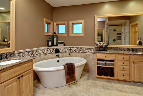
Latte in Kitchens
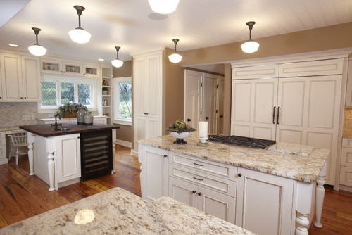
Above is a perfect example of how great the kitchen can look!
Definitely a yes if you have an open space concept in your home.
I would recommend painting the cabinets in SW Alabaster or any off-white neutral to balance the appearance.
Furthermore, add decorative molded pull handles in browns to create a sense of depth in your kitchen!
If you already have wooden planks on the floors, it’s good, however, lighter tiles would be a good option too!
Latte in Bedrooms
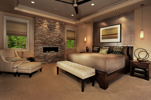
I love the look of this sophisticated and rich bedroom above.
I personally am not a BEIGE person in bedrooms but if you are, make sure that the color is not putting down weight in your bedroom.
It is supposed to make your room feel big and bright, hence – use plenty of off-whites in upholstery, bedframes, and rugs!
Also, make sure there is plenty of natural light hanging in there!
Latte on Exteriors
Above, you can see how to best pair Latte with natural stone cladding
Quite commonly used, latte on the exteriors will be much lighter than the original color.
If you prefer stone wainscoting, choose the ones that are darker and more of grey than reds or browns (to create contrast)!
Also, pair off-whites on door and window frames, trims, moldings, and also decorative façade features!
What’s the Best Way to Sample This Color?
So now my favorite tip when it comes to testing out a versatile color like Latte – go and order a peel-and-stick sample from Samplize.
They’ve created an awesome way to sample colors with real paint, but no mess. Simply stick on your paint sample instead of having to get a test can of actual wet paint.
For only a few dollars you get a good sized square to throw up temporarily anywhere you want to “try” on your color, other similar colors, and any possible coordinating hues you like. It’s great!
What NOT to Pair with This Color
Color Pairings That Work Against SW Latte
Cool, stark colors like icy blues, pure grays, and crisp cool greens create an uncomfortable tension with Latte’s warm, creamy brown character.
They pull in completely opposite directions, making the whole room feel unresolved and disconnected.
Bright, saturated colors like vivid orange or bold red also overwhelm Latte’s quiet, understated warmth instantly.
3 Decor Styles That Fight This Color’s Natural Character
Ultra-modern, industrial, and stark minimalist decor styles don’t sit comfortably with SW Latte.
Those styles rely on cool, clean contrasts that conflict with Latte’s soft, warm coziness.
The result feels mismatched, like two completely different design conversations happening at once!
Trim and Accent Colors That Undermine Latte
Bright white trims with strong blue or pink undertones are a difficult pairing with Latte.
They make Latte’s warm undertones look muddy and dull rather than intentional and refined.
Cool greige or blue-gray accent walls nearby create a similar problem, pulling warmth right out of the space.
Furniture Finishes That Conflict with SW Latte
Cool-toned metal finishes like chrome and brushed nickel feel disconnected against Latte’s warmth.
I’ve seen stark black furniture make this color feel heavy and flat rather than warm and inviting!
Gray-washed or whitewashed furniture pieces also strip away the cozy character that makes Latte so appealing.
Flooring and Exterior Finishes That Don’t Complement Latte
Cool gray flooring creates an awkward undertone conflict with Latte’s warmth.
Heavily weathered or ashy wood finishes have a similar effect, making the color feel disconnected from its surroundings.


Leave a comment