Apparently, blues are making big strides to be one of the best paint colors to use at home.
Apart from their sheer aesthetics and absolute beauty – this family is a great symbol of freedom, inspiration, trust, depth, and loyalty.
Well, if you have ever been in a room with blue walls – do you feel a certain sense of calm and confidence?
So, today, let me introduce you to a blue paint color that would grab the attention of your guests!
Sherwin Williams Jubilee is a subtle blue paint that is formed by adding portions of gray to true blue paint color.
And if you have read my article on Sherwin Williams Blues – you would know that there is quite a wide array of variety!
From darker to lighter, saturated to subtle, and undertones ranging from green, yellow, to gray – the choices are simply endless.
So, are you looking forward to incorporating this color in your home?
Well, this color review includes some insights and theories that would help you make informed decisions.
And let me tell you – post reading this article, you would even know exactly if you should or shouldn’t use this paint color!
So, time to get on board!
Sherwin Williams Jubilee SW 6248 Details and Specifications

Choosing a paint color is something more than what meets the eye!
Yes, you really have got to go through the underlying facts, theories, and basics before choosing a paint color for your space.
Trust me, it is not all about what and how you perceive!
Even though most of the homebuyers end up ignoring this section – it is a must that you keep in mind various aspects of a paint color before choosing it.
So, first and foremost – remember to consider how dark or light the paint color is.
And you will be able to identify if you have the Light Reflectance Value in hand.
(You can find this value behind the paint swatch or on the Sherwin Williams website)
So, the LRV of Jubilee is 45.

(Which means it is somewhere in the medium tone)
So, based on this information can we figure out if it has to be used in a specific room or not.
Because paint colors can change in different environments, I recommend you also just try Jubilee out at home with a peel-and-stick sample from Samplize. Order some samples now!
Other associated terms that you must acquaint yourself with are the RGB and HEX Values!
Red = 173
Green = 181
Blue = 185
HEX Value = #adb5b9
Now that we have read through the color specifications, let’s read on to some of the practical aspects and applications of this beautiful blue paint color.
How Does This Color Feel in a Space?
Undoubtedly, Sherwin Williams Jubilee will add a tranquilizing vibe while making your space seem larger than it is.
Not only due to medium light reflectivity but also the cool and calm undertones that result in creating an illusion of pushing away the walls.
Yes! It plays multiple roles here.
Apart from that, I recommend warmer regions to incorporate this hue as it will balance the saturation while releasing those relaxed vibes when you feel burnt out!
You might find tons of southern states using this color on the exteriors as well – because it truly reflects away the incoming light.
How Does Light Affect the Color?
Light plays up to some levels of excitement here!
Of course, it makes your space look larger, enhanced, and spacious – but also it is responsible for creating a certain mood.
For instance, if you plan to use this paint in the south or west-facing rooms – it will appear slightly warmer and washed off (but not completely).
Whereas in the north-facing rooms, it may exhibit chill vibes due to cool incoming rays.
Either way, artificial lighting can help you!
I’ll say this again – get some wall samples to try on this color in your own home and confirm if it’ll work or if you need to try something else.
What are the Best Coordinating Colors?

Now comes one of the best parts to talk about – color palettes and color schemes!
Since you are now planning to use this paint color in your home – I must tell you, choosing a cohesive color palette is important.
(otherwise, your space might look all messed up)
So, you could either amalgamate colors of the same family to create a monochromatic palette or choose a fun-loving contrasting color palette that creates a sense of depth and excitement in your space.
Firstly, I am going to enlist paint colors to be used for a monochromatic palette.
- SW 6247 Krypton – see my full guide here
- SW 9152 Let it Rain
- SW 6249 Storm Cloud – see my full guide here

You can definitely mix and blend all of them through paint colors, decorative accents like throws and artwork, and upholstery!
Secondly, I am going to enlist paint colors to be used for a contrasting palette.
- SW 7006 Extra White – see my guide on Extra White here
- SW 6282 Mauve Finery
- SW 6129 Restrained Gold

In the case of ceilings, trims, and moldings – I would recommend using SW Pure White or SW High Reflectance White to further understand the true hue and its undertones.
SW Jubilee Vs Similar Colors
Looking for an alternative is a recommended thing to do.
However, you must know that the colors are never exactly the same – even if they look alike.
Well, they either differ in undertones or reflectivity! (The former being more common)
So, the two most similar paint colors to Jubilee are SW 9138 Stardew and SW 7072 Online.
Let’s discuss to see if it is a good match for you or not!
Jubilee Vs Stardew

At first glance, they may appear quite similar!
However, know that they are not!
Sherwin Williams Stardew feels more watery and bluish-gray than the former.
It has an LRV of 43 – that makes it darker and deeper!
Order a wall-stick sample of Jubilee here to help you better compare these colors in your own house.
Jubilee Vs Online

The major difference here is the portions of undertones amalgamated!
So, comparatively, Sherwin Williams Online feels more inclined towards the grays than the blues.
Unlike the former, that truly feels blue in most of the conditions.
It has an LRV of 45!
Equal to that of SW Jubilee!
Also, don’t forget about buying real-time samples to determine the tonality of the paint in your home’s lighting. Pick samples up from here.
Where to Use Jubilee?
You can use this paint color in homes where the areas are large enough to accommodate the depth of this paint color.
Even though it is not very dark – it can still feel ‘weighted’ in certain conditions.
So, talking about the interior design styles, you can use this paint color in modern, contemporary, coastal, farmhouse, and Caribbean-styled spaces.
Let’s discuss how to incorporate this paint color in your home!
Jubilee in Living and Dining Rooms
Definitely a great option!
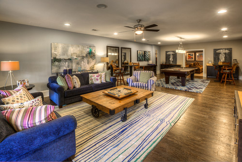
You have the opportunity to paint an accent wall in this color or pair it with subtle and creamy whites in the form of upholstery and accents.
You can also add various accents through your throw pillows, blankets, and accent accessories and furniture.

In the case of a fireplace – you can choose natural stone cladding, indeed.
Using in Kitchens
There is no better way to incorporate this paint color in kitchens if it is not on the cabinets.
If you have a large and spacious kitchen – using this paint color is definitely good to go!
On the other hand, you can pair it with a beige or white backdrop, black granite or marble countertop, and chrome or brass finish fixtures, drawers, and pull handles!
You could also go vice versa and let the airier kitchen play magic with white cabinets on board!
Jubilee in Bedrooms and Bathrooms
I always say, your bedroom is your most personal possession.
It should really define you, your personality, and what you want!
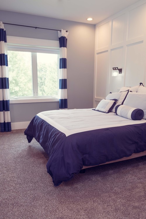
So, if you plan to use this paint color – make sure to only use it on the accent wall or the headboard wall if it is a smaller room.
Else, you are free to paint all the walls.
Furthermore, you can use bright chandeliers and knitted lampshades to add a natural context to your bedroom.
Using on Exteriors
Playing with Jubilee on exteriors could be quite a fun business.
You need to assure pairing it with lighter shades like whites on trims and columns to create a cohesive yet attractive exterior color palette.
So, keep in mind to use lighter beiges, off-whites, whites, and greys!
But a plus point is that you can use any shade of stone if you are planning to use it!
I Recommend Sampling Jubilee!
If you’re on the fence and need a bit of convincing, try this color on for size by ordering a peel-and-stick sample from Samplize.
These are my favorite way to test colors in a space and to see how they work with other coordinating colors.
It doesn’t cost all that much, and you can temporarily place these handy 12″ x 12″ squares that are true to color around your house. I love them!
So, how do you want to use this color in your homes? Interiors or Exteriors?
Now that you have all the goods on this color – are you excited about painting your home in Jubilee?
Should there be any questions or thoughts, let us know in the comments below!


Leave a comment