

Off-whites and neutrals truly are limitless.
And after all, why shouldn’t they be?
Since they are mostly used in our homes, they are the ones we often look forward to!
One such beautiful example is Sherwin-Williams Drift of Mist, which is purely warm-toned and widely considered in off-white and pastel categories.
And let me tell you – I recommend this paint color quite often to my clients.
This color definitely has some magic to it – it has the ability to act timeless and complementary to most of the other cool-toned and warm-toned hues on the swatch.
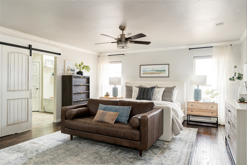
Unlike other off-whites like SW Greek Villa and SW Snowbound, this color plays slightly differently based on the undertones and actual appearances.
So, are you looking at what this color has to offer?
Well, I am going to be revealing all the goods on this one here: dos, don’ts, similar hues, complementary color palettes, and what the paint color truly feels like.
Don’t worry! In no time, you will feel confident if you want to use this particular color in your home or not.
Ok, let’s go!
Click to see 30+ color palettes you can use with Drift of Mist!
Sherwin-Williams Drift of Mist SW 9166 Details and Specifications

Before you finalize a paint swatch for your home, it’s crucial that you study the underlying theories and facts.
A color may appear different on walls than perceived on the screens – and that is why you must experiment with real-time swatches.
Because even though the color feels lighter on the screen, it may actually be quite dark on your walls.
However, if you want to avoid that mess, just simply go through the basics of a paint color that will help you determine if the color is a must-use or not!
So, first and foremost, let me introduce you to the concept of Light Reflectance Values or the LRVs that determine how light or dark the paint color is.
You can easily find that value at the back of the Sherwin-Williams paint swatch!
Here, in this case, the LRV of Sherwin-Williams Drift of Mist is 69.

And that means it is pretty light-toned – well, almost an off-white!
(The greater the value, the lighter the paint)
Most often, it’s best to sample a paint color in your home to confirm it’s going to work how you expect. You can do this easily using Samplize. Grab one now for Drift of Mist!
Secondly, other important associated terms are the RGB and the HEX Values.
Red = 220
Green = 216
Blue = 208
HEX Value = #dcd8d0
Now that is enough with the technical and scientific information, let’s get started with the practical aspects of this off-white and pastel Sherwin-Williams paint.
How Does this Color Feel in a Space?

- Sheepskin Pillow Cover and Insert
- Handmade Natural Fiber Svana Jute Rug
- Solid Wood Frame Coffee Table
- Modern Farmhouse Cordless Bamboo Shade
SW Drift of Mist is bound to feel cozier, warmer, airier, lighter, and absolutely delightful when used in the home.
And let me tell you – it also plays the best of both worlds.
It is purely a warmer-toned paint, but definitely doesn’t feel too creamy like SW Greek Villa or SW Alabaster!
I would say it is rather a very calm off-white paint, that also feels balanced.
Furthermore, due to its lighter tone and slightly creamier appearance, it further tends to make your space seem larger and expanded but at the same time, cozy.
So, for all the northern states and colder regions, this color is a great option for your home as it tends to add a warmer vibe to make your home feel cozy at all times.
When using in the interiors, I recommend painting the north-facing and south-facing walls in this particular color – the reason being obvious balance!
You can also use this paint in the east and west-facing rooms since the paint is not too warm to get all uncomfortable!
How Does Light Affect the Color?
Light has tons and tons of roles to play here!
Obviously, due to the lighter tone, this color is bound to feel further light!
Plus, in the case of smaller-sized rooms, this color is good to go – since it will further enhance and enlarge.
Nevertheless, you can always play with artificial light in the form of pendant lights and wall sconces to further create a desired aura.
You can use warm whites and cooler saturated yellow here!
Again, I really recommend you try out some wall samples because colors will look different in every location.
What are the Best Drift of Mist Coordinating Colors?

Sherwin-Williams Drift of Mist is one of the BIGGEST chameleon paint colors that I know!
It tends to appear warmer (which it truly is); however, in certain lighting conditions, it may come out as a cool gray paint color.
So, you see, it requires tons of attention and experimentation at all times.
When paired with other complementary hues, the task becomes even more challenging!
But don’t worry because I have got your back here.
Sherwin-Williams Drift of Mist can be best paired with true white, medium to darker beige, greige, gray, midnight blues, navy blues, and taupes.
In terms of metallic accents, choose matte black, antique copper, or oil-rubbed bronze to go!
Here are the following two color palette suggestions – monochromatic and coordinating!
Monochromatic Color Palette

The complementary colors for the monochromatic palette are as follows –
- SW 9167 Polished Concrete
- SW 9168 Elephant Ear
- SW 9169 Chatura Gray
This monochromatic palette is calm, serene, and extremely warm, so, you must ensure to use it in cold weather spaces.
Try styling with pampas grass to further bring a sense of nature and beauty to the room.
Contrasting Color Palette (Cool)

The complementary colors for the contrasting palette are as follows –
- SW 9171 Felted Wool
- SW 7605 Gale Force
- SW 9173 Shiitake
This cool-toned palette isn’t too cool to give you chills! Yes, you can merge the shades of beige to create a sense of balance and harmony in the room.
The bold blue color must be used as an accent to add that touch of depth and character to the room.
Add metallic tints of matte black or rattan to further complete the look of your room.
Contrasting Color Palette (Warm)

The complementary colors for the contrasting palette are as follows (warm) –
- SW 7543 Avenue Tan
- SW 9147 Favorite Jeans
- SW 9132 Acacia Haze
This warm-toned palette allows various contrasts to play an accent in the room.
Styling with matte black, oil-rubbed bronze, or satin brass is ideal! You must also introduce various fresh elements to make your room feel rejuvenated.
On the other hand, here are a few of the colors I would recommend for a contrasting color palette!
- SW 9167 Polished Concrete
- SW 7663 Monorail Silver
- SW 6990 Caviar (see my full guide here)

For your ceilings, trims, and moldings – SW Extra White or SW Pure White in itself makes a great option!
More Color Palettes!
For a ton more color pairing options, check out my gallery of hand-picked color palettes Drift of Mist works amazingly well with:


