
It’s time to refresh your home one of the most trendiest splash of style!
Yep, we’re talking about robin’s egg blue paint.
So, what’s all the fuss? What really is this paint color? And why are interior designers obsessing over this one?
Well to start…
It has a soft, calm, clean, and a cool tone to it that can potentially transform your space into heavenly bliss.
This beautiful light and dusty blue color comes in a wide array of shades and tints.
And here’s the best part:
Each of these variations has to potential to create an magical and extraordinary touch.

The power of this blue-green paint is much more than the eye can see.
It’s easy for you to detect a bit of gray and green shade in this specific blue.
This muted tone, when used indoors, can truly transform the entire environment.
The whimsical and natural – Robin’s Egg Blue works well to bring your space closer to calm and tranquility.
The striking balance between calming blue and nurturing green is what makes this paint hue outstanding.
This restful and restorative hue of nature is what will help you heal against any uncertainty.
So, let’s see what this beautiful piece of muted tone has for you!
Finding the Right Robin’s Egg Blue Paint
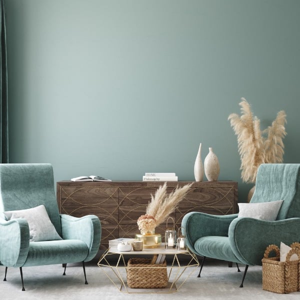
I’ll be honest:
Picking just the right tone for Robin’s Egg Blue for your home can be challenging.
There are various blue-greens, teals, turquoise, cyans, and aquamarines that it can be compared with.
That said, none of these is too straightforward as compared to what the bird eggshell in the physical world truly has!
So here’s my greatest advice…
Don’t choose a Robin’s Egg blue paint in general. Rather, determine what’s best for your home, its existing colors and of course your personal style.
At the same time, it’s important to consider a version that isn’t too distracting. One of the characteristics of this color is how subtle and low-key it can be when used correctly.
In fact, I’d say it’s real power comes when it’s not in your face and when the color itself isn’t noticed, but the environment it helps create.
Don’t worry – we’re going to go through plenty of paint color examples from the various manufacturers for you to pick from.
Technical Information and Specifications

This particular tone of blue-green is largely associated with a soothing and tranquilizing vibe.
Mostly encased in blue or green, the undertones are quite likely to vary from cool to warm.
So, slightly brown, plumb, or earthy for the warm-toned blue hues, otherwise icy or baby blue for the cool-toned ones.
Let’s say, some are comparatively darker and some light! (Depending upon the light reflectance values)
And the LRV can majorly differ from somewhere high at 70-80 to something low at 20-30!
Here is a list of various specifications and other data that you must have a look at.
LRV = 63.13%
Red= 176
Green= 216
Blue= 216
HEX Code= #B0D8D8
This particular light and pretty blue paint color can make your space feel calmer than ever – and especially for dense areas and city dwellers, it’s quite a pretty paint to consider.
And now that you see the average LRV falls on the lighter to the medium end of the scale. This category will help make your room appear larger and enhanced.
These above-mentioned percentages will help you in the classification of the color and how it is truly made!
What Does Light Do to this Paint Color?

Lighting is another aspect that must be paid attention to.
In general, immense light can make this paint color feel light, airy, and extremely beautiful. (Just for records, Not washing the undertones)
In a room with little or no natural light, the color can feel dull and unexciting.
So, you must ensure to pair the Robin’s Egg Blue with natural light to perfectly feel the true beauty of the duo.
Best Places to Use Robin’s Egg Blue Paint in your Home

There are endless reasons to use Robin’s Egg Blue paint in your home.
And especially when it comes to a specific area, you simply can’t hold back from this paint for utmost creativity!
So, whether it’s the kitchen cabinets, bedroom feature walls, living room built-in cabinetry, or the building exteriors – this color truly has the answer to each and every inch!
And to further induce a fun-loving background, you can splash this color category on the furniture frames such as console tables and bed frames.
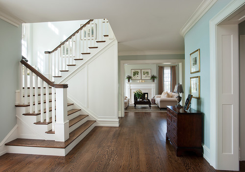
You can use this color on all the walls in the living and dining room to create a casual experience. Blues can look great in your living room! And similar is the situation for bedrooms!
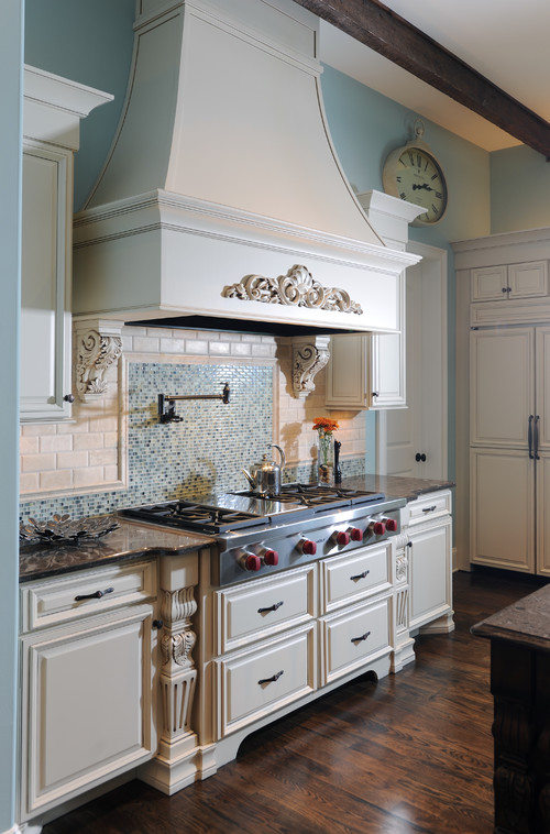
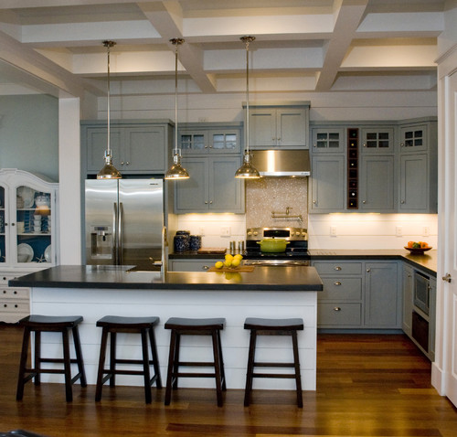
However, in the kitchens – you can play drama and coat a fresh paint on the cabinets.

Lastly, for the exteriors, it’s generally best to paint this hue as an “accent” color on doors, gates, fences, steps or sparingly on trim work.
Furthermore, when it comes to specific compass directions, this color can be used almost everywhere.
Yes, you need not worry as far as you pair it with ample natural light to go!
10 Best Robin’s Egg Blue Paint Colors
Isn’t this something you have been waiting for?
Well, I too am. So, for this article, I am not just going to restrict to Sherwin Williams hues but also rather take inspiration from other renowned manufacturers like Benjamin Moore, Behr, Farrow and Ball, and Valspar.
So, let’s have a look at these 11 best Robin’s Egg Blue Paint Colors to take inspiration from.
Sherwin Williams Watery
Sherwin Williams Watery is a cool-toned paint color that feels just like the waters of the Caribbean Sea!
This blue is very closely related to Robin’s Egg Blue Paint color and can exhibit quite a subtle and soothing effect.
Introducing a coastal bliss indoors, this serene hue can be best paired with creamy whites and crisp whites to create a welcoming appeal.
With an LRV of 57, this paint falls on the medium end of the scale – thus, neither too dark nor too light!
Lastly, you can best pair with cedar or pine wood textures with this paint.
Benjamin Moore Bird’s Egg
This particular paint from the blue collection is something very close to American Robin’s Egg.
Closely related to cyan and aquamarine, this paint can equally feel vibrant and refreshing.
With a bit of visual pop, the stark character of this paint helps revive your home and induce every inch of rejuvenation.
It’s generally best to pair this hue with clean and true whites, and tremendous darker blues or greens per se.
It has an LRV of 68.14, which is quite a lighter-toned, airy, and spacious color option.
Behr Delicate Mist
As soft and soothing as a delicate feather, Behr Delicate Mist is one step ahead to make your homes feel blissful than ever.
It has an LRV of 74 – thus, proves to be one of the lightest in the category.
You can best pair it with whites and textures of woods that can truly create a flabbergasting experience on the whole.
Secondly, you must ensure to use this paint in the west or south-facing rooms to create a sense of balance (regarding warmth and coziness).
Avoid using the paint in the north-facing rooms!
Farrow and Ball Teresa’s Green
Hinting majorly upon the greens, this particular Robin’s Egg paint is quite charming and blissful.
Unlike the other Robin’s Egg Blue paint colors, this one particularly feels warm and welcoming with deep green undertones.
Hence, can definitely be used in your home – wherever possible.
Furthermore, this color is associated with creating calming and therapeutic effects to touch upon utmost softness in the space.
With an LRV of 72, this color falls on the very lighter end of the scale. Thus, good enough to keep your space feeling breezy!
You can best pair this color with lighter greens, creamy whites, and natural and organic woods.
Valspar Aqua Glow
This is quite a stark tone of Robin’s Egg Blue!
With deep green undertones and an appearance so mesmerizing, this color is something to look forward to.
Since it feels quite saturated, you must use it only in limited amounts – especially on the featured and accent walls.
And generally, it’s best to pair this color with mustard, lighter grays, off-whites, and tones of matte black.
This color has an LRV of 68.94 – thus, falling on the medium to the lighter end of the scale.
Lastly, you must ensure to use this paint on the focal console tables.
Sherwin Williams Sea Salt
Another beautiful calming blue-green from the Sherwin Williams collection, Sea Salt is a medium to lighter-toned paint that feels quite soothing.
It tends to revive and rejuvenate your room while exhibiting positive and motivating vibes.
With an LRV of 63, this paint color falls on the lighter end of the scale. And you should definitely use it in every compass direction of your home!
Furthermore, try blending this color with wooden textures, whites, and ample light and dark beiges to go.
Even burnt oranges and mustards tend to pop out with a notable visual interest.
Be sure to check out my full SW Sea Salt review here!
Finally, one other SW color to check out is Sleepy Blue (you’ll love this one too!).
Benjamin Moore Woodlawn Blue
This particular Robin’s Egg Blue paint is magical as always. Check our my full guide on BM Woodlawn Blue!
Adding a sense of character and bliss to the room, this truest form of blue has the utmost charm and beauty.
With an LRV of 60.74 – this paint can truly make your room feel airy and spacious.
Since it can easily reflect tons and tons of light – the walls are bound to push away – thus, further creating an illusion.
It’s best to pair this hue with wooden textures – however, you can even pick distressed finishes in the form of Shabby Chic style.
This color palette best complements the coastal and Caribbean styles.
Behr Balmy Seas
Especially for the kid’s rooms or play areas, this cheerful and chirpy color tone plays utmost playfully and lively.
It has an LRV of 66 – which makes the color quite much on the lighter end of the scale.
Apart from light wooden textures, this particular tone pairs beautifully with reds, oranges, sakura pinks, and various warm-toned hues.
Even mint greens and turquoise blues complement the Behr paint color.
Lastly, don’t hold back from using crisp whites like Behr Ultra Pure White on the window trims and moldings along with the ceilings.
For the flooring, red cedar hardwood works tremendously well with this setup.
Farrow and Ball Blue Ground
A cool and charming paint, this hue of coastal and Caribbean style is something that you must look forward to.
This clean mid-toned blue is quite optimistic and friendly – hence, makes a remarkable statement in your home.
It generally pairs best with lighter beiges, crisp whites, hot pinks, and darker and navy blues.
This refreshing blue is bound to do wonders. And especially if you coat fresh paint, it’s a given how much you’ll love it!
In terms of material accents, pick distressed wood, quirky wallpapers, matte black metals, and ample brushed bronze!
Valspar Blue Twilight
The grayish-blue with deep cool undertones, Valspar Blue Twilight is pretty soothing paint color.
It plays blissfully with your mind and tends to release stress-free vibes.
So, after a long day at work – you would love to embrace this paint.
And you can best pair it with off-whites and ample lighter beiges to go.
Lastly, this paint has an LRV of 30 – which can help create a moody environment.
Falling on the darker to the medium end of the scale, this particular blue truly mimics the true hue of the ocean and the gulf.
Robin’s Egg Blue Decor Ideas
Sherwin Williams Blue Sky makes a wonderful popping hue on the exterior door of the facade.
It can be best paired with crisp white on the shiplap walls and gray on the trims, moldings, and slate tiles on the roof.
Benjamin Moore Healing Aloe is a beautiful Robin’s Egg blue-green paint that can be used on the accent walls of the living and dining room.
Especially for traditional, transitional, coastal, and contemporary-styled homes, this color is a must recommend.
Sherwin Williams Maxi Teal is comparatively a saturated tone of Robin’s Egg Blue that is bound to feel stark and extremely contrasting.
You can even have this paint color on the wall paneling (especially wood)!
Generally, this hue works best with tan leather couches and ample multi-hued artworks.
Not just the accent but you can consider painting the Robin’s Egg Blue paint on all the walls.
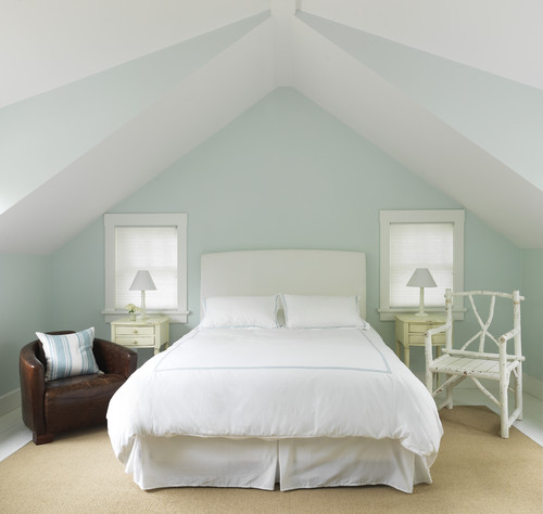
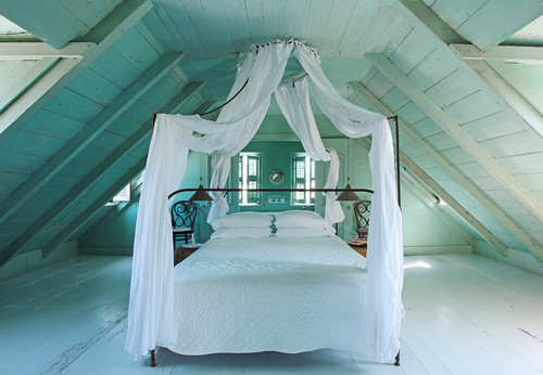
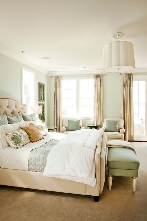
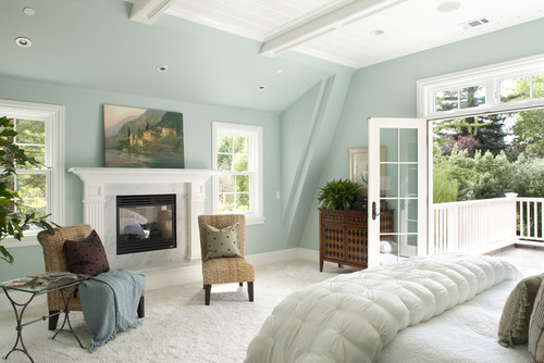
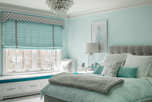
Just like in the bedroom above, Sherwin Williams Swimming blends with the existing blue decor to create a calming and seamless bliss.
You can also pick a monochromatic palette with this paint color.
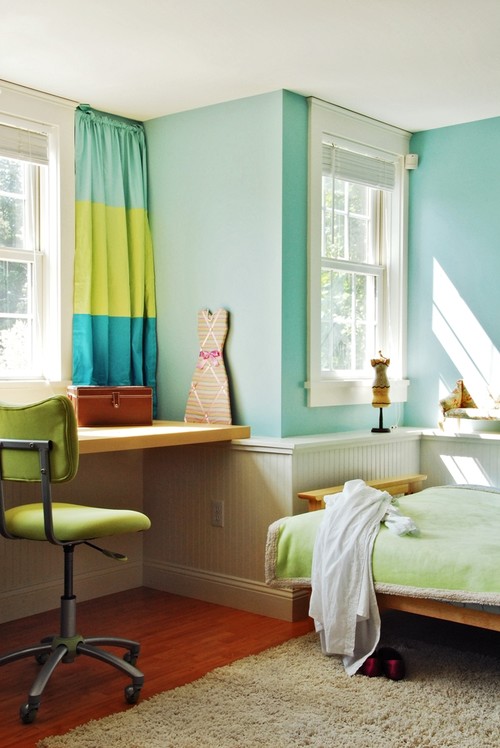
This tone of Robin’s Egg Blue paint plays a wonderful statement in the kid’s rooms and play areas.
Works beautifully with tints of golden and mustards, this tone has soft undertones to transform your home into absolute bliss.
Isn’t this truly gorgeous paint?
This dining room is somewhere you would love to have a lovely meal in. Especially for the moldings and trims – this color plays flawlessly.
And further, if you pair it with mauves and mustards, the result will totally be fabulous.
However, with this intriguing contrast, you must choose lighter-toned upholstery and decoratives.
Apart from the interior and exterior walls, one area where Robin’s Egg Blue paint plays a phenomenal role is the furniture frames and console tables.
This way, you’re making the furniture protrude out and dominantly play a sense of focus.
It also adds a cool playful vibe!
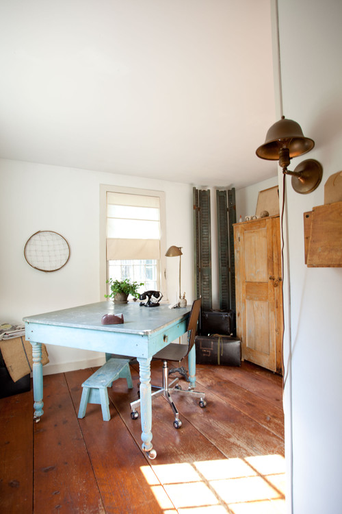
This beautiful, eye-catchy eclectic bedroom displays the true hues of Robin’s Egg Blue.
In the form of interior decor, the details here are something that can’t be ignored.
For instance, the shutter board and reclaimed wooden plywood play important details here.
Robin’s Egg Blue: Last Words
The joyous tones of Robin’s Egg Blue tend to play a soft and soothing character in any interior space or function.
Adding an extra dose of drama and delight, this pure blue-green paint can introduce a tinge of vibrant and vivid vibes.
So, if you crave a sense of renewal in your home, these tones are great to feel revitalized. These colors truly share synonyms with crisp, bright, enchanting, and chic.
Now that we have discussed every aspect of this color category along with manufacturer examples and decor ideas – are you looking to incorporate a striking instance?
Do let me know your thoughts in the comments below!

Leave a comment