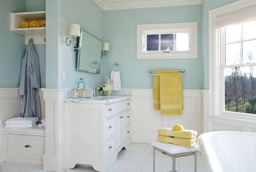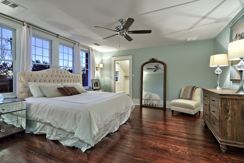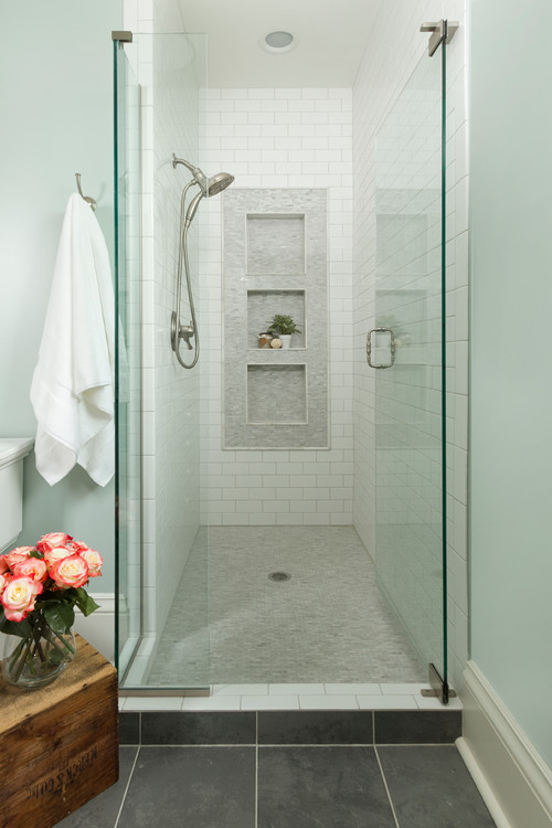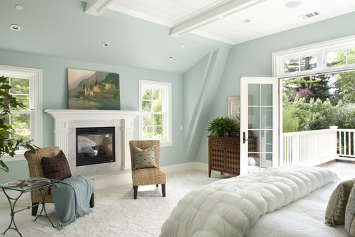
Now that pastels are coming up as the ultimate solution to creating calmer spaces – one such notable Benjamin Moore paint color example is Woodlawn Blue.
Well, there have been a couple of times that I have recommended this paint color to my E-Design and Color Consultation clients.
And believe it or not – mostly every time this color was embraced and loved by those homeowners.
After all, why not?
It’s so soft, soothing, delicate, calm, and peaceful that it feels just so blissful when used in our homes.
And since it’s neither inclined to blue or green majorly, it’s one of the best blue-green neutrals to choose from.
So, what makes this paint color so special? Is it just the fragility or any other beautiful characteristic as well?
Don’t worry! I have got it all covered for you!
This color review will exactly help you know where, how, and when to use the paint color.
Moreover, you’d know if you truly want this paint in your home or not. (Well, I definitely know that you’d love it)
So, let’s get started!
Benjamin Moore Woodlawn Blue HC-147 Details and Specifications

What is it that makes this color so unique and different from the other blue greens?
Well, the fact that it’s clearly neutral and can easily alter its appearances.
(Yes, a big-time chameleon)
So, how do you differentiate all the kinds of blue greens, icy blues, or light sage greens?
Well, the one and only secret to knowing the true value of the color is color details and specifications.
Hence, before choosing a paint color for your home – you must understand the underlying theories and facts.
So, first and foremost, let me introduce you to the concept of Light Reflectance Values or the LRV’s that determine how light or dark the paint color is.
You can easily find that value at the end of your Benjamin Moore paint swatch or even the website!
Here, in this case, the LRV of Benjamin Moore Woodlawn Blue is 60.65.

And that means it falls on the lighter end of the scale – which is a given how light and blissful the color feels.
(Remember, the greater the value, the lighter the paint – on a scale of 1-100)
Want to try this color out without having to paint your wall? Use some nifty peel-and-stick samples: Pick one up now from Samplize!
Secondly, other important associated terms are the RGB and the HEX Values.
Red = 193
Green = 207
Blue = 201
HEX Value = #C1CFC9
Since we have discussed the technical and scientific information, let’s get started with the practical aspects of this blue-green Benjamin Moore paint.
How Does This Color Feel in a Space?
Undeniably, Benjamin Moore Woodlawn Blue will make your space feel calm, relaxed, cool, crisp, formal, laid-back, and joyful.
Yes, you will even feel energetic and refreshed when surrounded with this color.
And due to the high reflectivity of the paint, it’s bound to push the walls and make your room feel larger, enhanced, and airier.
So, if you’re confined with a little space in your home – this color can truly do wonders.
Secondly, you’re bound to feel an inch closer to nature with this paint color. Yes, since it has deep roots in the hues of nature.
Also, this color can make a great statement in the warmer states where you need that kinda vibe.
In smaller rooms, you can use this color to go along the lines of a coastal vibe.
How Does Light Affect the Color?
Natural light will always have an impact on this paint color.
First and foremost – this color is a total chameleon!
So, if you plan to use it in the north or east-facing rooms, the result will be slightly cool and crisp, blue or little gray.
Else, in the south or west-facing rooms, this color will feel warmer and more inclined towards the greens.
So, I highly recommend testing the swatch of this color in various lighting conditions to know the true undertone.
Furthermore, when light hits the walls of BM Woodlawn Blue – it will feel brighter and airier.
As I already mentioned, do yourself a favor and get some wall samples to test out this color and any others. The stick-on kind are a no-brainer from Samplize, and will give you some answers ahead of time. Get yours now!
What are the Best Coordinating Colors?

It’s important that you pair Benjamin Moore Woodlawn Blue cohesively and creatively to know its utmost beauty.
And that is why you have to be careful when choosing complementary color schemes!
You can best pair this soothing paint with crisp whites (on trims and moldings), lemon yellows, shades of beige and off-white, darker blues, and grays.
You can also incorporate any of the metallic tints as accents here – like matte black, gold, and brass.
Furthermore, you can either choose from a monochromatic or a contrasting color palette – depending upon the interior design style and your preference.
So, here are a few of the colors I would recommend for a monochromatic palette!
- HC-146 Wedgewood Gray
- HC-145 Van Courtland Blue
- HC-159 Philipsburg Blue

On the other hand, here are a few of the colors I would recommend for a contrasting color palette!
- CC-90 Natural Linen
- CC-96 Flower Pot
- OC-65 Chantilly Lace

For your ceilings, trims, and moldings – you can use BM Chantilly Lace as it is a true white paint and will further protrude the original adjacent hue.
BM Woodlawn Blue Vs Similar Colors

This generic minty green paint tends to share tons of similarities with many other neutral-toned greens and blues.
Whether it’s the undertones or reflectivity – BM Woodlawn Blue can be compared to a couple of other BM and SW hues.
So, let’s discuss the major ones – HC-144 Palladian Blue and SW 6211 Rainwashed.
And see how they all differ.
Woodlawn Blue Vs Palladian Blue

Unlike the former paint color, BM Palladian Blue is a neutral blue-green paint color aligning with green undertones, primarily. (Yes, the difference is undertones)
With an LRV of 60.4 – the two colors have equal light reflectivity values.
On the other hand, this color equally feels calm and comfortable – so, it’s highly recommended.
Order a wall-stick sample of Palladian Blue here to help you compare colors in your own space.
Woodlawn Blue Vs Rainwashed

SW Rainwashed is another pretty soft paint blue-green paint color that has deep green undertones. Yes, the undertone is quite notable.
With an LRV of 59 – this color is comparatively darker.
Yes, you can best use this color in amalgamation with lemon yellow, crisp white, and light gray.
Do yourself a favor and grab some stick-on sample sheets of these two colors and see what looks best in your home.
Where to Use Woodlawn Blue?
Whether it’s the home office or the living room, bedroom or the kitchen – this paint color can be considered in all the spaces of your home.
And why not?
Since it clearly relates to a sense of positivity – this color is a great recommendation for a healthy mindset.
When talking about styles, this color must be used in coastal, Caribbean, and modern farmhouse interior design styles!
Let’s see where and how to incorporate this green-blue paint color in your home.
Woodlawn Blue in Living and Dining Rooms
This color will never disappoint your living and dining room – of course, because of the soft and calm look.
You can consider painting this color in amalgamation with creamy whites on the trims and ceiling.
I highly recommend infusing touches of pine wood or oak and glass in this space.
Secondly, you can even use walnut finish for a traditional or farmhouse look.
In the case of a fireplace, choose natural stone or brick cladding!
Using in Bedrooms
Especially if you have a sea-facing bedroom, this calming color is a must.
Also, if you reside in warmer regions – this color will help bring a cool and crisp touch to the home.
It will feel absolutely blissful and you can consider painting all the walls in this color.

Pair it with creamy whites or beiges on your upholstery, fabrics, and decorative accents.
Choose either a natural theme with jute, seagrass, and rattan – else, off-whites for curtains, rugs, and throw pillows.
In terms of color accents – you can pick dark gray and lemon yellow to further streamline the palette.
Woodlawn Blue in Kitchens
This blissful color is bound to look awe-inspiring on the cabinets of your kitchen.
You can choose to paint it on all the walls and have soothing white paint on the upper cabinets. Else, paint all the cabinets in this color.
Furthermore, to create a contrast, you can pick wooden accents for floating shelves and cabinets.
Lastly, ensure to add white glossy tiles for backsplash, white marble, and brushed brass-finish pull handles and drawers.
Got pendant lights and wall sconces – well, pick brass or gold!
Using on Exteriors
Especially for beachy and Coastal homes – this color makes a wonderful statement.
This color can be used on the exterior walls with whites on the trims, moldings, and special architectural features. (Or only on the trims and moldings)
To create a contrast, you can pick a bold blue color, coral, or lemon yellow for the doors and shutters. (Can also choose gray, white, or sage green)
Your roof tiles could be gray, black, or even blue!
The Best Way to Sample Woodlawn Blue
I used to “”try”” out paint like every other designer: Buying several small cans of various colors, pouring them each into small trays and rolling them onto different sections of a wall.
I haven’t done this in some time now, ever since Samplize came up with their awesome way of sticking up a temporary sample that’s true to the color. I just order a peel-and-stick sample and let the next phase of the color selection process begin. It’s so easy.
I love these 12″” x 12″” squares because I can move them around and see what happens in different lighting and what dialogue they’ll have with the other colors in a client’s home.
You can order yours now for Woodlawn Blue and any others you’re considering – they even have a coupon for first-time buyers!
So, did this color review bring you an inch closer to this paint?
Do you want to use it in your home? Exteriors or interiors? Walls or cabinets?
Well, I would love to know your thoughts! Do let me know in the comments below!


This was super helpful, thank you. I can’t believe how excited I feel about the prospect of painting my butler’s pantry cabinets this color!
Hi, I have 2 paint colors I’m looking at. WoodLawn Blue, Beach Glass. Can’t make up my mind. I have a dining room that is north facing/south facing.Love these 2 colors. I think samples will help me decide. 🙂