

How many of you just refuse to get bored of the timeless and versatile feel of beiges, taupes, and greiges?
I’m telling you this color category should always be a top consideration, because when it’s done right, it won’t feel like a lost trend or look out of place!
Browns, taupes, greiges, and beiges – all share a ton of similarities but with only a very little difference. And that, my friend is the undertones!
So today, let’s discuss a color category that’s equally blissful, calm, and characteristic – taupes!
And Behr Creamy Mushroom is one such example!
This paint color is warm, cozy, and soft with a major hint of browns. It’s a medium to a light shade that’s neither a base nor neutral like off-whites nor a dominant brown like SW Urbane Bronze.
Well, somewhere in the mediocre with a dominant pink undertone!

Most builders tend to paint home interiors in this specific paint color. And do you know why?
Well, that’s because it’s quite versatile. This standard color will always play one for all, and not something that will look awkward or “weird”.
Even though you have the opportunity to change it anytime you want!
So, if you’re looking to consider this paint color for your home, this color review will exactly help you know all the solutions to your questions.
Let’s see if this is the choice!
Click to see 30+ color palettes you can use with Creamy Mushroom!
Behr Creamy Mushroom PPU5-13 Details and Specifications

This taupe paint color differentiates from the bronze, brown, greiges, and beiges. And do you know what sets them apart?
Well, it’s the details and specifications associated with a paint color.
Before you choose a paint color for your home, you must analyze the underlying theories and facts.
And that’s what will help you make informed decisions.
Truly, this is one of the most important aspects that you need to consider!
So, first and foremost, let me introduce you to the concept of Light Reflectance Values, or the LRVs that determine how light or dark the paint color is.
You can easily find that value on the Behr website.
Here, in this case, the LRV of the Behr Creamy Mushroom is 52.
And that means it falls on the medium to the lighter end of the scale. (Mainly, medium)
(Remember, the greater the value, the lighter the paint – on a scale of 1-100)
Also, just in case you wonder where to find the Behr decks – well, simply visit your nearest Home Depot store!
Secondly, other important associated terms are the RGB and the HEX Values.
Red = 202
Green = 189
Blue = 174
HEX Value = #cabdae
Since we have discussed the technical and scientific information, let’s get started with the practical aspects of this medium taupe Behr paint.
How Does This Color Feel in a Space?
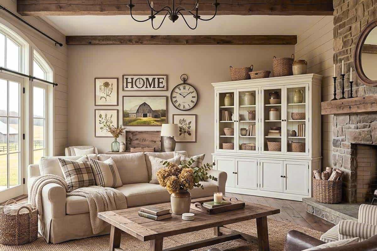
Behr Creamy Mushroom has a sense of depth and character to it, which can make your walls look quite soft, medium-dark, and cozy.
Yes, when you place it against a pure white color swatch, you’ll see how bold the color appears.
So, in medium and larger-sized rooms, this color can make a great statement on all the walls.
Secondly, try not to use this color in very small and confined spaces. Well, that can further lead to a dull and dingy atmosphere.
On the other hand, I highly recommend incorporating this paint color in the colder regions to imbibe a sense of warmth, coziness, and welcomeness in the space.
How Does Light Affect the Color?
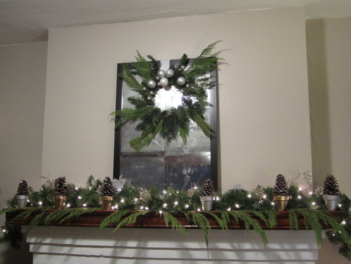
Natural as well as artificial light will always have a role to play in the paint color.
Since this paint color has a medium-light reflectance value, it can only reflect away 50% of the incoming natural light.
So this makes your room feel slightly darker. You’ll want to make sure to have a good amount of light sources (preferably windows), to let the color on this wall feel easy and breezy.
I have to say, this color can slightly feel different in different lighting conditions.
Yes, in the morning, it appears smooth and crisp. But in the late afternoons, it’s warmer and cozier than you may think.
With a ton of incoming natural light, this paint color might also feel light beige during the early afternoons.
Lastly, you can always alter the appearance using artificial light in the form of wall sconces, pendant lights, and chandeliers.
What are the Best Coordinating Colors?

Taupes aren’t as easy to work with as they seem!
Well, yes – you have to be careful around pairing them with the best complementary hues since a little mistake can affect the overall aura of your room.
And I say that with absolute confidence.
So, if you have a great command of the color wheel, it’s like a cherry on top.
This color will pair beautifully with lighter beiges, creamy whites, darker blues, shades of dark gray, plum, and crisp white.
Also, if you are planning to introduce material and metallic accents through floating shelves, chandeliers, artwork frames, and furniture frames – remember to add tinges of rustic wood, matte black, and brushed brass.
Discussing further, you have the option to choose from either a monochromatic or contrasting color palette!
Here are a few of the colors I would recommend for a monochromatic color palette!
- PPU5-14 Mesa Taupe
- PPU5-16 Earthnut
- PPU5-18 Chocolate Swirl

Here are a few of the colors I would recommend for a contrasting color palette!
- N570-4 Classy Plum
- PPU15-17 Monet
- 75 Polar Bear

For your ceilings, trims, and moldings, you can use Behr Ultra Pure White as it’s a true white paint and will further protrude the original adjacent hue.
More Color Palettes!
For a ton more color pairing options, check out my gallery of hand-picked color palettes Creamy Mushroom works wonderfully with:


Behr Creamy Mushroom Vs Similar Colors

Picking similar colors isn’t challenging as long as you know exactly what you want!
They won’t be the same; however, they’ll differ in the undertones or reflectivity.
For example, a lighter “beige” like this is Shoelace from Behr. It has a neutral undertone and a bit higher LRV.
So, the two closely related colors are SW 7511 Bungalow Beige and BM AC-31 Hot Spring Stones.
Let’s see how all of them differ.
Creamy Mushroom Vs Hot Spring Stones

These two taupe tones have a wide array of differences, and yet tend to look similar.
When observed closely, you’re quite likely to detect a pink undertone in the former paint color as compared to the latter.
With an LRV of 50.72 – this color is comparatively darker!
And note that it falls on the neutral end of the scale.
Creamy Mushroom Vs Bungalow Beige
