
There is a certain charm that this blue-green paint plays on our brain as well as our living spaces!
It’s been shown time and again that these soothing colors play a major role in calming and tranquilizing our brain and aura!
And that’s why you find today they aren’t only trendy but also in high demand (especially now that many of us are working from home)!
Benjamin Moore Wythe Blue is clearly a blue-green paint that neither feels too cool nor too warm – thus, a perfect definition of balance.
With a blend of both blue and green, this paint reminds me of the waters of the gulfs and northern lakes in Canada!
Whether it’s used on exteriors or interiors, this paint color truly brings a lot to the table.
So, just in case if you’re looking to add a tone of Wythe Blue in your home, you must read this color review very carefully!
I’m going to list how to best make use of this paint in your home, along with color schemes, coordinations, and similar colors you can consider!
So, sit back and relax!
It is time that you enjoy this teaspoon of Wythe Blue!
Benjamin Moore Wythe Blue HC-143 Details and Specifications

Before I spill all the design beans, it is necessary that you come across the basics of this beautiful and serene paint color.
Remember, a color has various faces that may only be understood once you analyze the swatch in various lighting conditions.
And that is when you need to understand these terminologies that define a paint color and set it apart from other various hues.
So, first and foremost, let me introduce you to the concept of Light Reflectance Values or the LRV’s that determine how light or dark the paint color is.
Here, in this case, the LRV of Benjamin Moore Wythe Blue is 48.69.

And that means it falls on the medium end of the scale – hence, neither too light nor too dark!
(Remember, the greater the value, the lighter the paint – on a scale of 1-100)
If you want to see how Wythe Blue will look in your unique environment, I highly suggest ordering a peel-and-stick paint sample from Samplize here!
Secondly, other important associated terms are the RGB and the HEX Values.
Red = 170
Green = 190
Blue = 180
HEX Value = #aabeb4
Now that is enough with the technical and scientific information, let’s get started with the practical aspects of this blue-green Benjamin Moore paint.
How Does This Color Feel in a Space?
Undoubtedly, Benjamin Moore Wythe Blue makes your space feel refreshed, relaxed, cooler, calmer, and tranquil!
It definitely exhibits a vibe that will make you feel much closer to nature.
So, it is a great paint color if you want to add a touch of nature indoors (especially for all the city dwellers)!
Apart from this, since the color is quite balanced in terms of saturation, it can be used anywhere and in any direction!
Of course, it will feel warmer and cooler depending upon the compass direction – but it doesn’t restrict you at all!
That said, we did include it in our list of the best warm paint colors – check it out here!
You can either paint all the walls in this color or even choose it as an accent, whether on the furniture frame or door and window frames!
How Does Light Affect the Color?
Light always has a major role to play here!
So, in the case of ample natural light, this color is bound to feel extra light and refreshing!
On the other hand, in the case of no natural light, this color will still feel calm and not too bold!
So, regardless of the situation, this paint color is good to go!
Furthermore, you can always add artificial lighting in the form of wall sconces, chandeliers, and pendant lights for a desired aura.
I recommend choosing warmer whites or even warmer yellows too!
As I said, the best way to see this color in action before you paint is to buy some paint samples you can easily stick on your wall. It’ll definitely give you some clarity if you’re unsure!
What are the Best Coordinating Colors?

Now here is a secret – you have to be slightly careful about choosing complementary colors with this blue-green paint.
Of course, you don’t want to mess up your space, right?
So, analyze this color scheme and the whole idea of pairing colors!
Remember to note the saturation and reflectivity values of all the complementary colors.
So, you can best pair this hue with true whites, wooden textures, yellows, black, grays, and even browns and greiges!
You can either choose from a monochromatic or a contrasting color palette, depending upon the interior design style and your preference.
So, here are a few of the colors I would recommend for a monochromatic palette!
- 1584 Pale Smoke
- 2123-30 Sea Star
- HC-160 Knoxville Gray
On the other hand, here are a few of the colors I would recommend for a contrasting color palette!
- OC-117 Simply White
- HC-21 Huntington Beige
- 2155-70 Cotton Tail

For your ceilings, trims, and moldings, you can use BM Chantilly Lace as it is a true white paint and will further enhance the original adjacent hue.
BM Wythe Blue Vs Similar Colors
There are quite a few similar-looking options with this green-blue paint color!
However, know that there may be some differences – whether in the form of undertones or reflectivity!
But no two colors can exactly be the same.
So, regardless of that, the two colors closely related are 703 Catalina Blue and 689 Rhine River.
Let’s see how they differ.
Wythe Blue Vs Catalina Blue

These two colors share tons of similarities!
The only difference being the undertones – the former inclining more towards the blues, unlike the latter that inclines towards the greens!
This paint has an LRV of 48.69 – thus, falling on the medium end of the scale. However, note that it is not too bold!
Get stick-on samples of Wythe Blue and Catalina Blue to test in your home.
Wythe Blue Vs Rhine River

A considerable number of differences can be observed in these two colors when noticed closely!
Benjamin Moore Rhine River is a beautiful blue-green paint color that feels tranquilizing and very soothing and bold!
With an LRV of 47.52, this color is the darkest of them all – but doesn’t feel very bold and dark as well!
So, it should be good to go!
They might look very similar on the screen, but the biggest secret is to order samples of the color and then assess the brightness and tones in the environment you’re painting in. Pick up peel-and-stick samples now from Samplize!
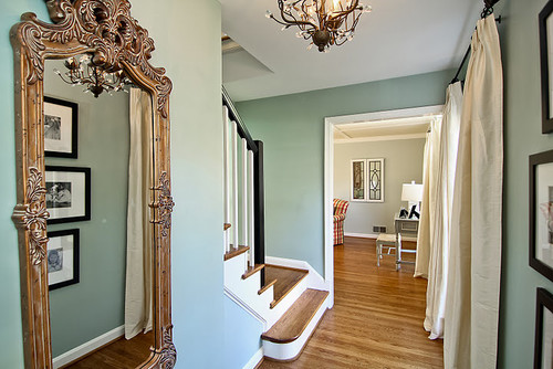
Where to Use Wythe Blue?
Benjamin Moore Wythe Blue can absolutely be used anywhere in your home – whether it is the hallways, entryway doors, living and dining rooms, bedrooms, or kitchens!
You can use it on the accessories and even focal furniture pieces and accent walls.
Especially for the interior design styles such as Modern, Coastal, and the Caribbean, this color would be good to go!
Let’s see where and how to incorporate it in your home.
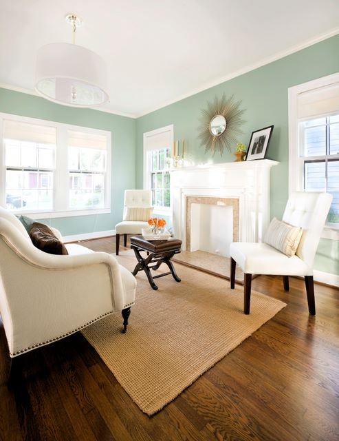
Wythe Blue in Living and Dining Rooms
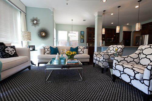
Why not?
You can absolutely use this paint on the accent walls or even paint all the walls in this color.
Try pairing it with wooden textures in the form of flooring, beams, built-in cabinetry, furniture, and door and window frames.

Furthermore, you can use glass, metal, linen upholstery, and wood to complement the soothing of this specific paint color.
In the case of wall molding and paneling, you should absolutely use this paint.
Using in Bedrooms
Bedrooms deserve a soothing and tranquilizing aura!
And this paint proves to be one of the best in terms of providing that value and aura in the space.
You can pair it with burnt oranges and linen upholstery to create a seamless, contrasting experience.
Furthermore, if you are a big fan of metals, you should use golden tints, matte blacks, or even chromes!
Lastly, consider the above-mentioned color palette for your bedroom.
Wythe Blue in Kitchens
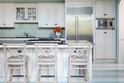
Definitely a recommendation!
I love the feeling of Wythe Blue on the cabinets – and trust me, you too will!
So, definitely give it a try – and pair it with creamy whites, white veined marble countertop, and white backsplash tiles to create a beautiful backdrop.
Furthermore, you also have an option to pair it with an off-white on the upper cabinets.
In the case of pendant lights, use nickel instead!
Using on Exteriors

Whether you have a Ranch-style, Coastal, Cape-Cod, or Modern home, this paint on the exterior is bound to add a stunning touch.
You can either add blacks and whites or even a tinge of contrasting black as an accent or go vice versa for the trims, moldings, and door and window frames.
In the case of columns on the patio and porch, you can use natural stone wainscotting to add a detailed character to this facade!
An Easy Way to Sample This Color!
Instead of picking up a small can, or worse, an entire gallon can, to “test” out Wythe Blue, you can order a peel-and-stick sample of it from Samplize.
The company is genius – they provide a 12″ x 12″ stick-on square you can put up anywhere in your home to try out a paint color.
For a few bucks, it’s definitely worth the small investment so you can see what the color will do in YOUR unique space, with your own lights and shadows.
Wythe Blue Undertones
The Green Undertone That Catches People Off Guard
Wythe Blue’s most surprising undertone is green, and it’s the one that tends to surface most unexpectedly once this color is on the wall.
In rooms with natural light coming through windows surrounded by trees or landscaping, that reflected greenery can pull this undertone forward significantly.
I’ve seen Wythe Blue look almost sage-like in spaces where outdoor greenery dominates the view, so it’s worth knowing before you commit!
The Gray Undertone That Shifts the Whole Mood
Wythe Blue also carries a quiet gray undertone that becomes more prominent under cooler lighting conditions and on overcast days.
This is the undertone that makes this color feel more reserved and less blue than expected in north-facing rooms or spaces with limited warm light.
It’s a beautiful quality when you’re prepared for it, but it can feel like a different color entirely if you aren’t watching for it.
The Soft Blue That Anchors Everything
The primary blue undertone in Wythe Blue is soft and historically inspired rather than bold or saturated, which is exactly what gives it such timeless appeal.
Under warm artificial lighting in the evening, this blue tone can settle into something almost dusty and muted.
That shift is one reason sampling this color under your actual home lighting conditions matters so much with this particular color!
How Surrounding Colors Activate These Undertones
Warm wood tones and creamy whites nearby tend to emphasize the green undertone in Wythe Blue.
Cool whites and gray accents push the gray undertone forward instead, giving the color a noticeably different character depending on what surrounds it.

Leave a comment