
Believe me or not – this is one “white” paint color that you won’t regret!
The utmost timelessness and versatility of this paint are what make it a number one option to choose when picking a great off-white for your home.
During the day – it’ll feel like a beautiful warm paint color – and at night, somehow a tinge of light yellow with a pretty, shadowy cast.
And let me tell you – this is one of the most admired off-white neutrals from the Benjamin Moore collection.
Do you know why?
Well, let’s discuss this soft and calm paint color.
Benjamin Moore Soft Chamois is a soothing white paint color with a touch of warmth and delicateness.
Almost exhibiting a feel of a retreat, this calming color is a must-try for most of the areas of your home.
And not to forget, it comes with a baggage of do’s and don’ts, challenges and benefits, and an endless list of inspirations and design ideas.
So, if you’re looking to introduce this paint color to your home, check out what it really has to offer you!
In this color review, I’ll recommend alternative color options, complementary palettes, and endless ways to design with this paint color.
So, let’s get started!
Benjamin Moore Soft Chamois OC-13 Details and Specifications

There’s an endless list of off-whites (soft and warm) on the BM, SW, as well as Behr palettes.
And how do you differentiate them all?
Well, the only secret to knowing the true value of the color is the color’s details and specifications.
And, before choosing a paint color for your home, you must understand the underlying theories and facts.
So, first and foremost, let me cover the concept of Light Reflectance Values or the LRVs, that determine how light or dark the paint color is.
Here, in this case, the LRV of Benjamin Moore Soft Chamois is 77.4.

And that means it falls on the lighter end of the scale – yes, just like a pale and faded white.
(Remember, the greater the value, the lighter the paint – on a scale of 0-100)
Now, if you want to try out Soft Chamois on your walls ahead of time, you can easily with a peel-and-stick square from Samplize. Give them a try now!
Secondly, other important associated terms are the RGB and the HEX Values.
Red = 230
Green = 227
Blue = 214
HEX Value = #E6E3D6
Since we have discussed the technical and scientific information, let’s get started with the practical aspects of this soft off-white Benjamin Moore paint.
How Does This Color Feel in a Space?
Soft Chamois has a perfect touch of beige and gray – yes, almost resulting in a form of greige.
This light, airy, and spa-like color will undeniably add a soothing and tranquilizing statement to your homes.
Some designers say that this paint has a tinge of green but I totally believe that this paint color has a touch of yellow in it.
Yes, and that’s not very dominant, though.
At the same time, this off-white paint is responsible for creating an illusion of a larger, airier, and brighter space.
Yes – if you crave a soothing statement with a warm-toned color with minimal deflecting undertones – BM Soft Chamois is something to have an eye on.
Furthermore, this paint color is so versatile that you can almost use it in any climatic condition!
How Does Light Affect the Color?
Light will play a significant role here.
So, here’s something you must know – paint colors tend to alter their appearances in various lighting conditions and compass directions.
They’re also majorly influenced by the view from your windows. So, let’s say, if you have a window facing the front lawn, the off-white paint color might showcase a little green base.
Hence, I highly recommend that my clients examine the color swatch in various lighting conditions to know the true undertone and worth.
Secondly, this paint color may slightly appear differently based on the incoming light in the room.
For instance, the north-facing rooms receive grayish cool rays – which can make this color appear slightly warm grayish.
Simultaneously, if there’s ample natural light, the light is quite likely to wash the undertones.
One way to help find out how this color looks in your home is to buy some temporary wall samples and put them up wherever you want to paint. You can get these easily from Samplize.
What are the Best Coordinating Colors?

It’s important that you pair Benjamin Moore Soft Chamois with colors that further enhance its beauty and make the room feel cohesive and balanced.
However, you have an advantage here! Well, this color can beautifully pair with a ton of colors out there!
You name it and can have it.
So, you can best pair this gorgeous light greige with crisp whites (on trims and moldings), dark sage green, cobalt blues, darker grays, tomato reds, browns, taupes, and darker greige.
You can also incorporate any of the metallic tints as accents here – like matte black, gold, and brass.
Furthermore, you can either choose from a monochromatic or a contrasting color palette, depending upon the interior design style and your preference.
All this while, let me tell you – it all boils down to the vibe and ambiance you’re trying to create.
A color palette may differ for different interior design styles.
So, here are a few of the colors I would recommend for a monochromatic palette!
- 1529 Stingray
- 1530 Senora Gray
- 1531 Victorian Garden

On the other hand, here are a few of the colors I would recommend for a contrasting color palette!
- HC-67 Clinton Brown
- CC-980 Purple Haze
- AF-225 Firenze

For your ceilings, trims, and moldings – you can use BM Chantilly Lace as it is a true white paint and will further protrude the original adjacent hue.
BM Soft Chamois Vs Similar Colors

This popular light greige paint tends to share tons of similarities with many other neutral-toned warm grays and beiges.
Whether it’s the undertones or reflectivity, BM Soft Chamois can be compared to a couple of other BM and SW hues.
So, let’s discuss the major ones – OC-19 Seapearl and SW 7042 Shoji White.
And see how they all differ.
Soft Chamois Vs Seapearl

These two soft off-white paints share a ton of similarities.
However, the latter paint feels slightly pinkish in various lighting conditions.
Secondly, with an LRV of 76.43, this color is equally lighter with a tinge of gray undertone.
You can also check out BM White Dove, which is a touch lighter while still maintaining that cozy element as far as a white.
Find out what works best in your home’s environment and lighting by putting up some temporary samples and observing. Get samples from Samplize.
Soft Chamois Vs Shoji White

SW Shoji White is a calm and soothing off-white that doesn’t incline to any particular undertone.
Yes, it feels creamy and quite versatile and timeless.
I have worked with this color and observed how beautiful it comes out to be.
Lastly, this color has an LRV of 74 – it equally feels light and airy.
Order wall-stick samples for these two colors here to help you compare these colors in your own space.
Where to Use Soft Chamois?
BM Soft Chamois is a beautiful soft and off-white color that can be used in any corner of your home.
The versatility is what makes this color a number one option to be used on kitchen cabinets, living room walls, and exterior shiplaps.
So, let’s see where and how to incorporate this soft off-white paint color in your home.
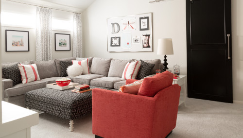
Soft Chamois in Living and Dining Rooms
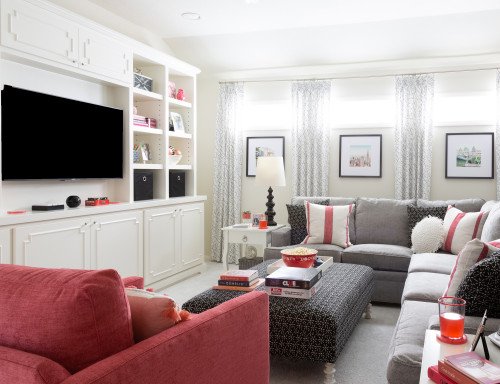
Soft Chamois can be used on all the walls of your living room – to exhibit a sense of calmness and airiness.
You can further complement this color with wooden textures on floating shelves, exposed beams, and furniture frames.

If you’d like to splash a sense of visual interest, try using a tone of dark gray or charcoal blue on the focal wall.
Around the fireplace, you can either choose exposed brick for a rustic touch, clean marble for a glam look, or simply plaster for a traditional or transitional look.
Using in Bedrooms
Your bedrooms deserve to be calm and relaxing!
Hence, regardless of the interior design style, this color will always play flawlessly on the walls and other elements.
You can either infuse a touch of contrasting color on the accent wall or add a couple of accessories to create a stunning appeal.
Metal (especially powder-coated black or brushed bronze) would work the best with this color.
Lastly, don’t feel shy about using clean white for the trims and a vintage rug for the floors.
Soft Chamois in Kitchens
View this post on Instagram
Undeniably, this color will look balanced and soothing when painted on the cabinets.
For the backdrop wall, I forbid the use of clean and crisp white – and rather add a tone of lighter greiges to create a monochromatic appeal.
If you want to create a contrast, you can pick either dark blue or green accents for the lower cabinets.
Lastly, ensure to add a contrasting color or dark greige color on the glossy tiles for the backsplash, white marble, and chrome-finish or brushed brass pull handles and drawers.
Got pendant lights and wall sconces – well, pick brass or gold!
Using on Exteriors
This color can be used on the exterior walls with whites on the trims, moldings, and special architectural features.
To create a contrast, you can pick a bold mauve, blue, rust, or green color for the entryway door.
Your roof tiles could be gray, black, or even blue!
In the case of a deck, choose walnut wood stains for a cohesive appeal.
How to Best Sample This Color?
Here’s my favorite tip when it comes to testing out a color like Soft Chamois. Go and order a peel-and-stick sample from Samplize.
This little company has nailed down the best way to sample colors much more easily. Simply stick on a 12″ x 12″ square instead of having to get a small can of actual wet paint on your walls.
For a few bucks you get a big enough sized sample to evaluate anywhere you want to “try” on a paint color and any possible coordinating hues you like.
It’s temporary, so move it around and test location and lighting options.
My 7 Key Tips for Soft Chamois
1. Embrace Soft Chamois in Rooms That Get Warm Natural Light
This color absolutely thrives in spaces that receive warm, golden natural light.
South and west-facing rooms are where Soft Chamois really comes alive, so prioritize those spaces first if you’re deciding where to use it.
In north-facing rooms, it can read a little flat, so sample it carefully before committing!
2. Pair It with the Right White Trim
Soft Chamois needs a warm white trim to feel intentional and polished.
I’ve seen cool, bright whites next to this color create an uncomfortable contrast that makes the wall color look dingy.
Stick with creamy whites like Benjamin Moore White Dove or Navajo White for trim and it’ll look beautifully cohesive.
3. Match It Carefully with Your Flooring
Soft Chamois pairs beautifully with medium to dark warm wood floors like walnut, hickory, or honey oak.
If your flooring has strong pink or red undertones, like some cherry woods or certain terracotta tiles, this color can amplify those tones in a way that feels overdone.
Grey-toned or cool wood floors are also a tricky combination worth sampling carefully first.
4. Consider Your Cabinet Color Before Painting Kitchens
Soft Chamois works wonderfully in kitchens with white, cream, or warm wood cabinetry.
I’ve seen it look especially stunning behind natural maple or light oak cabinets, creating a warm, welcoming kitchen feel that’s hard to beat!
Avoid pairing it with grey or stark white cabinets, as the contrast can make the walls feel yellowed rather than warmly neutral.
5. Use a Satin Finish for Living Areas and Kitchens
A satin finish on Soft Chamois gives it a subtle warmth and gentle sheen that suits its creamy character perfectly.
Flat finishes tend to make it look chalky and muted, which works against the inviting quality this color is known for.
6. Be Thoughtful When Using It on Exteriors
Soft Chamois is a genuinely lovely exterior color, especially on homes surrounded by natural landscaping and warm stone or brick accents.
Pair it with deep brown, bronze, or warm charcoal shutters and trim for a classic, grounded look that feels timeless.
Avoid pairing it with cool grey or black exterior trim, as that combination can make the body color look unexpectedly yellow in direct sunlight.
7. Layer Warm Textures to Bring Out Its Best Qualities
Soft Chamois responds beautifully to layered warm textures like linen, jute, and natural cotton in your decor.
These materials echo its soft, organic warmth and create a space that feels genuinely inviting rather than just painted.
Cool, sleek materials like polished chrome or icy blue accents will work against it, so keep your accessories warm and natural for the best result!

Thanks for the helpful soft chamois review!