

There is something so magical about the off-whites that you are bound to feel welcome around them!
Yes! And one such versatile beauty is Benjamin Moore Silver Satin, which totally evokes a sense of tranquility and serenity in your space.
Endlessly elegant and sophisticated, this color will totally take your space to the next level of comfort and coziness.
So, in case you’re looking for a paint that falls on the medium end of the scale – well, neither too cool nor too warm – you must consider something likewise.
Truly, this light neutral is a go-to paint for most of the areas in your home.
And you know the best part?
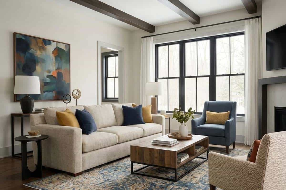
Well, this color has the potential to not look too white while totally offering the benefits of a lighter-toned neutral.
I wouldn’t say it is too cool or warm, rather, it has deep warm gray undertones that foster a sense of comfort and balance in your room.
And with ample natural light in the room, you’re quite likely to detect a slightly silverish touch on the walls.
So, are you looking to add this milky gray paint to your home?
Well, let’s get started with this pretty color on board!
Benjamin Moore Silver Satin OC-26 Details and Specifications

Color theory and specifications are quite unique from color to color and category to category.
After all, there is something that differentiates this particular off-white from all of the other silver and gray, right?
So, when choosing a paint color, you must understand the underlying theories and facts that are related to each one of them.
And that will truly help you understand what that specific color is composed of.
So, first and foremost, let me introduce you to the concept of Light Reflectance Values or the LRVs, that determine how light or dark the paint color is.
Here, in this case, the LRV of the Benjamin Moore Silver Satin is 76.35.

And that means it falls on the lighter end of the scale – hence, clearly a recommendation for bases and neutrals!
(Remember, the greater the value, the lighter the paint – on a scale of 1-100)
Most often, it’s best to sample a paint color in your home to confirm it’s going to work how you expect. You can do this easily using Samplize. Grab one now for Silver Satin!
Secondly, other important associated terms are the RGB and the HEX Values.
Red = 227
Green = 226
Blue = 218
HEX Value = #e3e2da
Since we have discussed the technical and scientific information, let’s get started with the practical aspects of this balanced off-white Benjamin Moore paint.
How Does This Color Feel in a Space?
Benjamin Moore Silver Satin feels quite cozy, comfortable, and balanced when used in the home.
Although it can feel silver at times, this color is bound to add that majestic charm to your space.
With a high reflectivity value, this paint will push the walls away to make your room look more spacious and bright.
On the other hand, this color will add depth to your room without feeling too overwhelmed and adds some character!
Also, a great solution to small city apartments and lofts in urban areas!
How Does Light Affect the Color?
Direct natural light has the potential to make a space feel lighter and brighter!
And that’s why this is one aspect you should always consider when choosing a paint color.
So, if your room receives ample natural light, you can use this paint to further feel light and airy!
Moreover, it feels chic and shiny during some hours of the day!
The deep warm gray undertones in this paint color will not wash out unless subjected to direct ample natural light.
So, in terms of compass directions, I would recommend this paint in any direction – whether north, south, east, or west.
However, it may appear differently in the south-facing rooms as well as north-facing rooms.
It can feel very warm in the south-facing rooms, whereas cooler in the north-facing rooms.
Yes, quite a chameleon, right?
Other than that, you always have the opportunity to play with artificial lighting!
Again, I really recommend you try out some wall samples because colors will look different in every location.
What are the Best Coordinating Colors?

It’s important that you pair Benjamin Moore Silver Satin with commendable true whites and cool-toned or warm-toned opposites to feel the true hue of this color.
And that is why you have to be careful when choosing complementary color schemes!
So, you must analyze this color scheme and the whole idea of pairing colors!
You can best pair this gray base hue with true whites (in the case of trims and moldings etc), darker blues, mauves, black, darker grays, taupes, and even greiges!
You can also incorporate any of the metallic tints as accents here – like brushed nickel, brass, gold, or chrome!
Furthermore, you can either choose from a monochromatic or a contrasting color palette – depending upon the interior design style and your preference.
So, here are a few of the colors I would recommend for a monochromatic palette!
- 1550 Cumulus Cloud
- 1551 La Paloma Gray
- 1552 River Reflections
On the other hand, here are a few of the colors I would recommend for a contrasting color palette!
- 2121-20 Steel Wool
- 1648 Slate Blue
- 1007 Beigewood

For your ceilings, trims, and moldings – you can use BM Simply White or BM Chantilly Lace as it is a true white paint and will further protrude the original adjacent hue.
BM Silver Satin Vs Similar Colors
Looking for similar colors can be equally challenging! As there might be a slight alteration in the undertones or the reflectivity.
Well, in either of the cases, let me tell you – it’s difficult to find something exactly the same.
So, here are the two colors closely related to Silver Satin: 2111-70 Calm and SW 7014 Eider White.
Let’s see how they differ.
Silver Satin Vs Calm

Sharing a few similarities, BM Silver Satin has similar undertones to BM Calm.
Although you are quite likely to detect slightly pinkish undertones in the latter, the chances of similarities in ample natural light are quite high!
With an LRV of 77.7, this color falls on the lighter end of the scale!
Find out what works best in your home’s environment and lighting by putting up some temporary samples and observe. Get sample squares from Samplize.
Silver Satin Vs Eider White

Sherwin-Williams Eider White is another beautiful off-white paint that feels quite lively and enlightening!
This paint is a must-recommend for neutrals and bases in your home.
See my full review on BM Eider White here to find out more!
With an LRV of 73, this color will make your room look spacious and airier!
Order a wall-stick sample of Silver Satin here to help you compare these colors in your own space.
Where to Use Silver Satin?
Benjamin Moore Silver Satin is a must-use paint in the home if you crave a charming and warmer appeal.
Whether you have a traditional style or transitional, modern, contemporary, farmhouse, and bohemian, this color is quite good to go!
Let’s see where and how to incorporate it in your home.
Silver Satin in Living and Dining Rooms
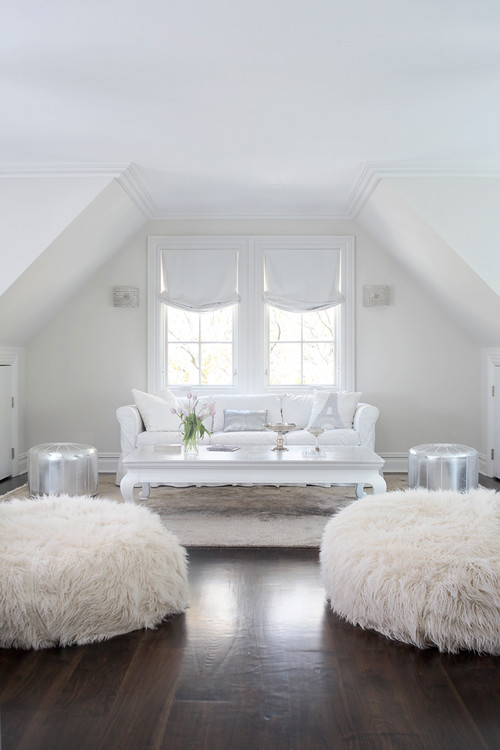
Undoubtedly, you can use this paint in your common spaces and pair it with darker blues and mauves on the accent wall.
In case you have wall paneling and moldings, it is best to use true whites to help the color stand out!

Furthermore, you can always add beige and white sheer curtains, metallic chandeliers, and a couple of mauve, blue, and mustard throw pillows for a flabbergasting look.
In the case of metal accents, you can choose matte black, chrome, nickel, gold, and brass.
For furniture, you can add linens (of course), cotton, faux leather, flannel, and even velvet!
Using in Bedrooms
You can choose to either paint all the walls in this color or pair it with bold accents on the headboard wall.
For smaller-sized rooms, this color is a great way to add some charm and spark.
Apart from that, try pairing this color with matte black, gold, and brass finishes in the form of a chandelier/fandelier, wall sconces, and table lamps.
In the bedrooms, try blending materials like velvet, wood, and cotton on the upholstery.
Silver Satin in Kitchens
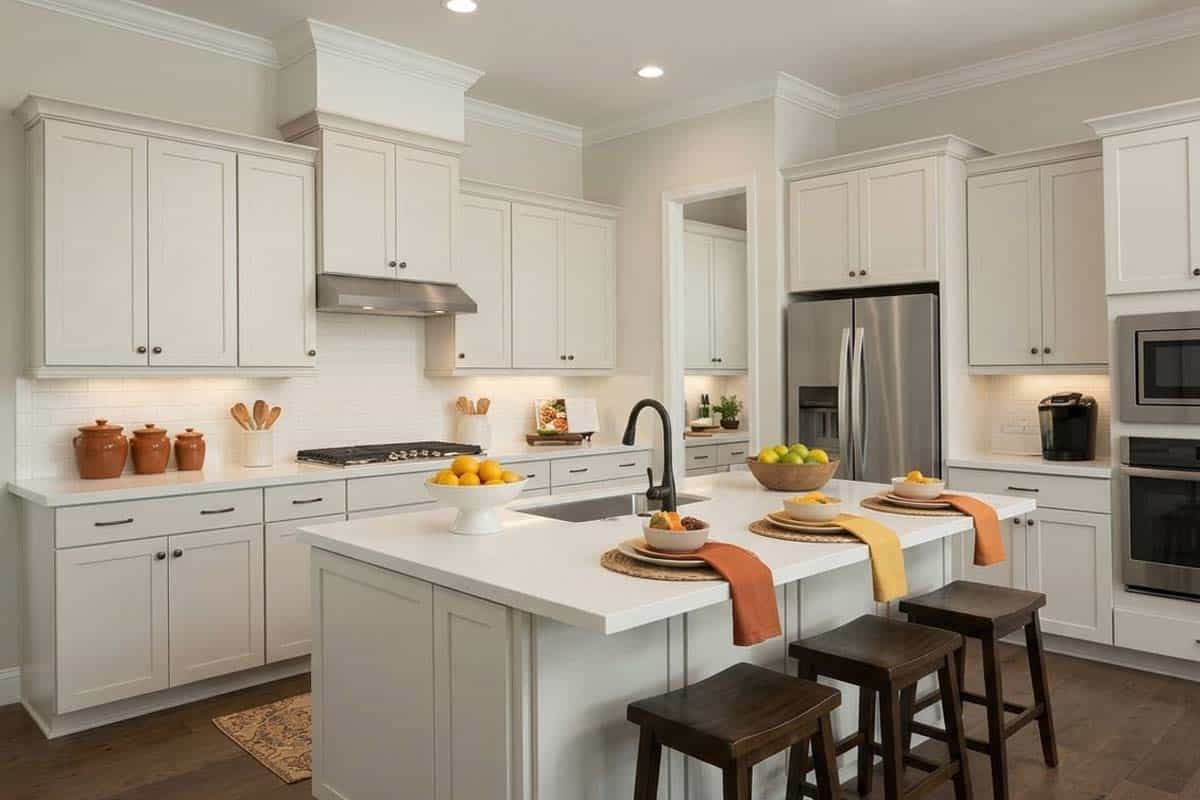
Trust me, there’s something absolutely magical about off-white and gray-based kitchens.
Not only do they look light and bright but also tend to exhibit a warmer and welcoming appeal.
You can choose wooden textured floating shelves, hexagonal glossy white backsplash tiles, and brass, matte black, or nickel pull handles for drawers.
You can also infuse color by splashing some hues like blues on the lower cabinets!
Using on Exteriors
Whether you have a Ranch-style, Craftsman, Mid-Century Modern, Contemporary, or Modern style, this warm gray and off-white paint will never disappoint you!
You can either add whites, blacks, and darker grays or even a tinge of wooden-themed textures as an accent or go vice versa for the trims, moldings, and door and window frames.
In the case of columns on the patio and porch, you can use natural stone wainscoting and tile cladding to add a detailed character to this facade!
My Favorite Way to Sample Colors
I can’t say enough about how easy it is to use a peel-and-stick paint sample to give a color like Silver Satin a try. The absolute best way is to order a sample from Samplize.
You can check it out right on your wall and move it around. Also, try it along with another couple of colors to test pairing possibilities.
This is WAY easier than having to open up little cans of paint and rolling/brushing on. Forget the mess and use these helpful temporary sample squares to test location, lighting options, etc.
My 7 Key Tips for Silver Satin
1. Lean Into Silver Satin’s Soft Depth in North-Facing Rooms
Silver Satin is one of those colors that genuinely thrives in north-facing rooms where light stays consistent throughout the day.
Its cool, silvery gray quality stays balanced in lower light rather than shifting muddy or flat the way warmer neutrals tend to.
If you’re painting a home office or bedroom that faces north, this is one of the best fits you’ll find!
2. Match Your Sheen Level to the Wall’s Purpose
For main living areas, I always recommend an eggshell finish with Silver Satin because it adds just enough subtle dimension without amplifying imperfections.
In bathrooms or kitchens, bump up to a satin finish to protect the walls while keeping that cool, polished character intact.
3. Pair It Carefully with Wood Flooring Tones
Silver Satin works beautifully with cool-toned or whitewashed hardwood floors, where the silvery quality of the paint carries through naturally.
I’ve seen it look visually disconnected when placed over orange-toned or heavily red mahogany floors, so if that’s what you’re working with, bring in a warm area rug to bridge the gap.
4. Consider Your Cabinet Colors Before Committing
White and off-white cabinetry pair seamlessly with Silver Satin, especially in kitchens where you want a clean, airy feel without going stark.
Dark navy or charcoal cabinets also work surprisingly well with this color because Silver Satin’s cool undertones complement deeper hues without competing.
Avoid honey-toned or golden oak cabinets, though, as they pull the warm undertones in Silver Satin forward in an unflattering way.
5. Use Two Coats and Don’t Rush the First One
Silver Satin is a mid-tone color that can look patchy and uneven if the first coat isn’t fully dry before the second goes on.
I always give it a full 24 hours between coats to get that smooth, consistent finish this color deserves!
6. Test It on Your Exterior Before Painting the Full Surface
Silver Satin is a genuinely strong exterior choice for shaded elevations or covered porches where direct sun won’t wash it out.
On sun-drenched south-facing exteriors, it can read lighter and less substantial than expected, so always sample it on the actual surface first.
7. Choose Hardware and Fixtures That Reinforce Its Cool Character
Brushed nickel, polished chrome, and matte black fixtures all complement Silver Satin’s cool, refined tone beautifully.
Brass or gold-toned hardware can work in small doses, but too much warm metal pulls against the color’s natural personality and creates a visual tension you’ll notice every time you walk in the room.

Leave a comment