
Are you craving a paint color that is tranquilizing and at the same time beautiful?
Well, if pastels are your thing, I would like to introduce you to a perfect soothing paint color for your home – Benjamin Moore Quiet Moments 1563.
Quiet Moments from BM is a light-toned paint color with deep blue-gray undertones to give a perfect sense of tranquility and serenity in your home.
I would absolutely recommend this paint color to those of you who are seeking a quiet environment as the backdrop to your daily life.
This paint color also makes a good solution to small-sized spaces since it makes them look even bigger and brighter.
However, if you are planning to use this paint color in your living spaces, you could either use it as a base or a neutral.
In some cases, if you are looking for more intimacy in the home, this paint color could even play as an accent!
Well, it all depends on your personal design preference and style.
Before diverting from the topic, let me tell you – there are a few how’s, where’s, and when’s about this paint color which I want to acquaint you with.
So, let’s get it started!
Benjamin Moore Quiet Moments 1563 Details and Specifications

Before you choose a paint color, I would highly recommend considering the backstories and theories associated. Well, every color has a story to tell!
And remember, no two colors are similar!
Hence, to not regret later about the mess created, you would want to understand what the color really speaks and indicates.
So, first and foremost, you must know about the Light Reflectance Values or LRV’s.
This value helps in determining how light or dark the paint color is.
And, in this case, the LRV of Benjamin Moore Quiet Moments is 61.87!

Which means the color is pretty light-toned.
(Remember, the higher the value – the lighter the paint color)
This means that color will tend to reflect away most of the incoming light, making your room feel fresh and bright at all times- really.
What I like to do is sample Quiet Moments under different lights where I’m going to use it. I use Samplize stick-on samples.
Other terms that you might want to acquaint yourself with are RGB and HEX Values.
Red = 199
Green = 207
Blue = 200
HEX Value = #c7cfc8
Now that we’ve covered the technical details, let’s talk about how this paint color actually works in real spaces and where you can use it.
How Does Quiet Moments Feel in a Space?
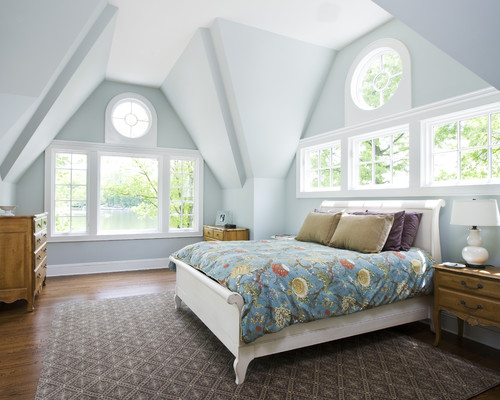
(Quiet Moments brightens the appearance of the bedroom)
Benjamin Moore Quiet Moments is bound to make your space feel more spacious, enlightened, and most importantly, cooler and airier.
Due to its cool-toned texture, this paint color further helps in pushing back the walls while making your room feel bigger.
So, if you live in the southern states of Arizona, Florida, or Texas, this paint color is a great way to introduce some cool vibes in your home while you’re sweating off on your way from work.
This color also brings a soothing, restful feel. If you do yoga, meditation, or home workouts, painting your walls Quiet Moments works really well.
How Does Light Affect the Color?
Light plays a major role in paints.
Don’t believe it? Well, try to examine paint samples in different light conditions and at different times of the day – and you will see the change for yourself.
Well, in this case, due to Quiet Moments’ high reflectivity, most of the natural light is reflected away, while only a little is absorbed.
You could use this paint color in spaces that face west or east directions to create a perfect balance of warmth with cool.
Furthermore, you can also play with artificial warm-yellow or warm-white lighting to create an aura you desire.
As I mentioned before, you can try out this color with real paint (but without the mess) using stick-on samples from Samplize.
What are the Coordinating Colors for Benjamin Moore Quiet Moments?

So, are you finally thinking about using this paint color?
But what should you pair it with?
Don’t worry. I can help you with the coordinating options here!
Since this color is so light and bright, you can best pair it with gray or black as an accent and warmer beige as a base!
Here I enlist a few from Benjamin Moore palettes,
- Abyss 2128-20
- White Marigold 2149-60
- Gray Cloud 2126-60

A mix and blend of the above will create a perfect contrasting scheme. Let’s have a look at the monochromatic shades if you are more of a minimalist preacher!
- Beach Glass 1564 (Learn more about Beach Glass!)
- Mount Saint Anne 1565
- Stony Brook 1566
This is going to give a perfect, classy appearance.
Meanwhile, about the trims and moldings – I would highly recommend using Benjamin Moore Decorator’s White to further protrude out the paint color.
Benjamin Moore Quiet Moments Vs Similar Colors
If you are looking for similar color alternatives for Quiet Moments, I can recommend some to you.
You can also check out my list of BM grays here!
Even though I don’t think it should be required considering the beauty and timelessness of this paint color, but to name a few, you could consider BM Arctic Gray and BM Gray Cashmere.
However, they are not exactly the same – remember, I told you – no two colors are exactly the same!
Let’s see if you like some color in particular.
Quiet Moments Vs Arctic Gray

Benjamin Moore Arctic Gray is a beautiful and timeless gray with deep green undertones if observed closely.
With an LRV of 61.79, this paint color shares almost the same textures and hue similarities with the other.
This could absolutely make a great alternative, so it is definitely a YES-YES on my end.
If you want to test the subtle differences in your house, get some wall samples of each here.
Finally, if you like this hue but want something a touch brighter and more saturated, I recommend Woodlawn Blue by Benjamin Moore.
Quiet Moments Vs Gray Cashmere

Benjamin Moore Gray Cashmere is another great alternative to Quiet Moments. This beautiful gray has deep green undertones but mainly, in ample sunlight, it appears true green.
In the absence of light, this color appears lighter gray. With an LRV of 65.57, this is a comparatively lighter-toned paint color so makes a great solution for small-sized rooms.
Test these colors side-by-side in your home with some wall-stick samples. Order here!
Where to Use Benjamin Moore Quiet Moments in Your Home?

Rachel from her blog Rachel Parcell reveals BM Quiet Moments on her home’s pantry door
You can absolutely use it ANYWHERE indoors, except the home gyms of course!
(Home gyms deserve a more energetic and bright paint color)
So, you can use this paint color for homes that preach coastal interior design, Scandinavian, Modern and minimalist, mid-century modern as well as bohemian!
I highly recommend this paint color to all my clients who have a similar serene personality, as the colors should really speak to who the person is.
Let’s see where you should specifically use this paint color.
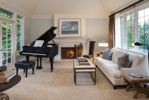
Quiet Moments in Living Rooms
Piousness is exhibited through BM Quiet Moments.
If you want your living room to feel cool and crisp, you can paint it in Quiet Moments. However, since it is not a warm paint color, it will not give cozy vibes.
You can pair it with the coordinating colors I recommended and add a few patterns and mixes.
Overall, buy neutral-toned furniture pieces and some wooden textured accents through side tables and coffee tables for a perfectly cohesive look.
For the fireplace wall, natural stone is absolutely going to look great, or else you can also use white-painted exposed bricks.
Using in Kitchens

Well, it is true that you spend most of the time in kitchens (especially if you like to cook)
So, if you are looking for a big, bright, and happy-go-lucky kitchen, don’t negate the power of quiet moments.
Pair it with stark white cabinets and black pull handles as an accent or vice versa.
Make sure that you use white glossy hexagonal backsplash tiles and a white marble countertop to further make your kitchen stand out!
Quiet Moments in Meditation Rooms
Not generally a meditation room, but perhaps if you have a corner in your home where you like to work out or do meditation or yoga, this beautiful color is definitely a recommendation.
Here, you can paint the ceilings in pure white shades!
I especially like this paint color in basement updates where the space required some interest without being too over the top.
Using in Bedrooms
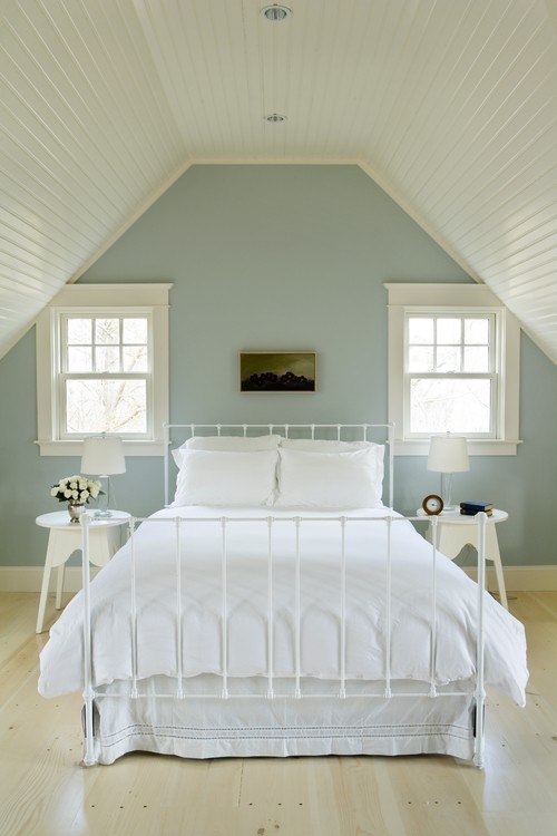
Benjamin Moore Quiet Moments really makes a bedroom feel calm and restful.
Bedrooms are personal. They should feel like you.
If your style leans into that quiet moments philosophy, I say go for it.
Pair this paint color with white sheer curtains, a metallic headboard, and some contrast through your upholstery and rugs. That mix keeps it peaceful but still interesting.
Quiet Moments on Exteriors

Quiet Moments gets way brighter and lighter outside thanks to all that natural light.
If you’re into that airy, white-haven vibe, paint your trims, doors, and window frames a crisp white.
That gives you a soft, monochromatic look that works great outdoors too.
Or flip it. Go with darker accents if you want more contrast and punch.
What’s the Best Way to Sample This Color?
So now my favorite tip when it comes to testing out a versatile color like QM is to go and order a peel-and-stick sample from Samplize.
They’ve created an awesome way to sample colors with real paint, but no mess. Simply stick on your paint sample instead of having to get a test can of actual wet paint.
For only a few dollars you get a good sized square to throw up temporarily anywhere you want to “try” on your color, other similar colors, and any possible coordinating hues you like. It’s great!
BM Quiet Moments Undertones
The Primary Undertone That Defines This Color
Quiet Moments carries a soft blue undertone as its most dominant characteristic, and it’s what gives this color its calm, airy quality.
In rooms with good natural light, that blue reads beautifully as a clean, restful hue that feels intentional and polished.
I’ve seen this undertone strengthen significantly in north-facing rooms, where it can push noticeably cooler than expected.
The Green Undertone That Catches People Off Guard
Quiet Moments also carries a quiet green undertone that surfaces in certain lighting conditions, and this is the one that surprises people most.
In rooms surrounded by outdoor greenery, that reflected light pulls the green undertone forward in a way that can feel unexpected!
If your space has warm wood tones or earthy textiles nearby, keep a close eye on how this undertone interacts.
The Violet Shift You Should Watch For
Under warm artificial lighting, Quiet Moments can develop a subtle violet cast that shifts its entire mood considerably.
I’ve seen this color read almost lavender-adjacent under incandescent bulbs, which is a very different result than its daytime appearance.
Cooler LED lighting tends to suppress this shift and keeps the color reading truer to its blue-green base.
How to Assess All Three Undertones Accurately
The best way to catch all three undertones is to observe your sample across multiple lighting conditions and times of day.
When you’re sampling Quiet Moments, pay special attention to evening lighting since that’s when the violet shift tends to appear most dramatically!
My 7 Key Tips for BM Quiet Moment
1. Test Quiet Moments in multiple light conditions before committing
Quiet Moments is a soft blue green that shifts noticeably with natural and artificial light.
I always test it on at least two walls because morning light pulls out more blue while evening light brings forward the green.
South facing rooms keep it airy, while north facing spaces can make it read cooler and slightly grayer.
This step alone prevents surprise undertones after the full room is painted!!!
2. Choose finishes carefully to avoid a washed-out look
Quiet Moments has a delicate, spa-like quality that can disappear in overly flat finishes.
I prefer eggshell or satin on walls so the color reflects just enough light to stay fresh.
For exterior siding, satin helps the color hold its clarity through changing daylight.
Too-flat finishes can make Quiet Moments look dull or chalky, especially on larger surfaces.
3. Pair it thoughtfully with flooring to maintain balance
Quiet Moments works beautifully with light oak, white oak, and pale maple floors.
I am careful using it with yellow-toned hardwoods because the warmth can clash with its cool base.
On tile, soft gray stone or warm limestone keeps the palette calm and intentional.
This pairing choice keeps the space feeling serene instead of mismatched.
4. Be strategic when using Quiet Moments with cabinetry
I love Quiet Moments alongside crisp white cabinets like Benjamin Moore Chantilly Lace.
It also pairs well with soft gray cabinetry or pale natural wood finishes.
I avoid pairing it with dark espresso or red-toned woods, which can make the walls feel icy.
In kitchens and baths, this balance keeps the color soothing and not sterile.
5. Use it intentionally in rooms meant for rest and reset
Quiet Moments shines in bedrooms, bathrooms, and calm home offices.
I often recommend it for primary bathrooms where it supports a relaxed, spa-like mood.
In busy family rooms, it can feel too gentle unless layered with warmer textiles.
Choosing the right room saves frustration later!!!
6. Watch exterior surroundings before painting outdoors
On exteriors, this color reacts strongly to nearby landscaping and stone.
I have seen it lean greener near lush plants and bluer near gray concrete or pavers.
Testing near trim and roofing materials is essential.
This avoids repainting when the color shifts unexpectedly once applied full-scale.
7. Use contrast wisely with trim and accents
This shade benefits from clean, light trim colors to stay defined.
I typically use bright whites or very pale grays for doors and trim.
Dark trim can overpower its softness and shrink the space visually.
Clear contrast keeps Quiet Moments calm, fresh, and intentionally styled!!!


I spent hours deciding on the perfect paint color for the guest room our grands use and after buying a sample pint, chose Quiet Moments .my painter husband prefers BM Aura – the color is far darker, bluer and more intense than the pictures I viewed on line and my sample board. The paint store said it was because we bought Aura and not Regal. I’m disappointed and my husband is willing to repaint but I have no idea what to choose now.
Hi Mary, I totally understand your confusion!! May I know what you’re looking for exactly? A soothing green? Blue? Light? Dark? Let me know 🙂