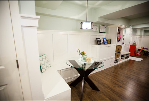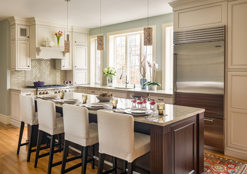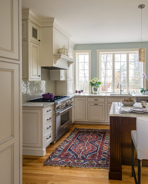
Colors are dynamic. Colors are thoughtful. Colors are vast.
And some of them are neither black nor white, but rather some kind of in between gray!
And one such confusing chameleon paint color is Benjamin Moore Gray Cashmere, that’s typically a gray paint color with deep blue or green undertones.
It’s a pretty light and airy paint color that will bring strong soothing and calming vibes from nature, indoors.
Yes – it’s a highly recommended paint color no mater the size of space you’re working with.
And one of the biggest characteristics that the color holds is it’s ability to appear slightly different depending the type and amount of light; hence the chameleon quality.
When you compare it with a true white paint swatch, you’re quite likely to detect a notable blue or green undertone – depending upon the natural light and compass directions.
And sometimes, even purple or a blend of all of them!
Exciting, right?
With these major advantages, you must also ensure to pair this color with the appropriate complementary colors.
But not to worry – I’m going to help you out with this.
So, sit back and try out that Gray Cashmere swatch in different rooms and different lighting conditions to seek out the best of it.
For now, I’ll be your guide as you get ready to decide on this color for your next painting project.
Benjamin Moore Gray Cashmere 2138-60 Details and Specifications

This section kicks us off, and it oh so important to discuss!
And do you know why?
Well, if you want to avoid a potential mess (you know, like having to repaint!), it’s ideal to thoroughly read through the details and specifications to understand every inch of this color.
So, first and foremost, let me introduce you to the concept of Light Reflectance Value or the LRV that designates how light or dark the paint color is.
You can always find that value at the end of your Benjamin Moore paint swatch or online (on their site or this page!).
Here, in this case, the LRV of Benjamin Moore Gray Cashmere is 65.57.

And that means it falls on the lighter end of the scale – but not too light (as compared to white).
(Remember, greater the value, lighter the paint – on a scale of 1-100)
Now, if you want to try out Gray Cashmere on your walls ahead of time, you can easily with a peel-and-stick square from Samplize. Give them a try now!
Secondly, other important associated terms are the RGB and the HEX Values.
Red = 206
Green = 211
Blue = 204
HEX Value = #CED3CC
Since we have discussed the technical and scientific information, let’s get started with the practical aspects of this gray-green-blue Benjamin Moore paint.
How Does This Color Feel in a Space?
BM Gray Cashmere is bound to make your space feel refreshed, airy, light, calm, and comfortable.
It will definitely make you feel stress-free and relaxed – while, at the same time, calming against anxiety.
Moreover, if you reside in a warmer region – this color will totally make your space feel cool and crisp.
Hence, all the Floridians and Arizonians – the solution for your space is right here!
Secondly, this color can also play an illusion of making your space appear larger and airier.
Yes, that’s the magic it can play.
A pro tip: Avoid using this color in the colder regions as it can feel too uncomfortable.
How Does Light Affect the Color?
Natural light has some tricky roles to play with this paint color.
First and foremost, it’s always better that your space receives ample natural light. This way, the color can protrude its true beauty and undertones.
And at the same time, make your room more lively and homely.
The second aspect to consider is the compass directions of your space. In the north and east-facing rooms, this color can totally feel slightly blue and cool.
On the other hand, in the south and west-facing rooms, it feels slightly warm and greenish.
But you must examine the swatch in different rooms to picturize what your space will appear like.
Lastly, there are other aspects that equally hold a major role in the way this paint appears.
For instance, if you have a living room facing the front lawn, this paint will majorly look greenish.
Want to see what Gray Cashmere looks like in your own living space? Pick up a wall sample now from Samplize!
What are the Best Coordinating Colors?

Choosing coordinating colors is one of the best tasks!
And with this chameleon gray paint, you must be extra cautious when creating that color palette. (Of Course due to the confusing undertones)
Generally, this gray paint color will best pair with dark blue, dark sage green, olive green, darker grays, crisp whites, and lighter taupes.
In terms of metallic accents, you can choose chrome or even golden accents.
Furthermore, you can either choose from a monochromatic or a contrasting color palette – depending upon the interior design style and your preference.
So, here are a few of the colors I would recommend for a monochromatic palette!
- 2138-50 Misted Green
- 2138-40 Carolina Gull
- 2138-30 Mohegan Sage

On the other hand, here are a few of the colors I would recommend for a contrasting color palette!
- 2108-60 Abalone
- 2121-70 Chantilly Lace
- 2114-50 Victorian Mauve

For your ceilings, trims, and moldings – you can use BM Chantilly Lace as it will further protrude the original adjacent hue.
BM Gray Cashmere Vs Similar Colors

This gorgeous gray paint tends to share tons of similarities with other like hues. In fact, check out my list of best Benjamin Moore Grays!
Whether it’s the undertones or reflectivity – BM Gray Cashmere can be compared to a couple of other BM and SW hues.
Some of the notable examples are BM CC-700 Smoky Green and SW 6204 Sea Salt.
Let’s see how they all differ.
Gray Cashmere Vs Smoky Green

These two calm and comforting paint colors share a ton of similarities.
The former is a gray paint color with deep green undertones whereas the latter paint color is majorly a pastel green paint.
It equally feels light and delightful – and thus, with an LRV of 61.87 – this color falls on the medium to the lighter end of the scale.
Order a stick-on sample of Gray Cashmere and Smoky Green to see what works best in your home.
Gray Cashmere Vs Sea Salt

Another beautiful grayish-green paint color, SW Sea Salt is also one of the most popular calming paint colors in the industry.
It pairs beautifully with wooden textures, crisp whites, and ample burnt umber or blush pink.
With an LRV of 64 – this color is comparatively lighter than the others.
Since digital screens can be deceiving, I highly suggest you get some actual samples of these two colors from Samplize. Buy here!
Where to Use Gray Cashmere?
BM Gray Cashmere makes a wonderful statement – wherever used in your home.
Whether it’s the kitchen cabinets, all the walls of your room, furniture frame, kid’s bedrooms, nursery, or the exterior walls – this tranquilizing gray paint has the answers to most of your doubts.
Especially in Shabby Chic, modern farmhouse, Coastal, and transitional style design – this color truly plays flawlessly.
So, let’s see where and how to incorporate this light gray paint color in your home.
Gray Cashmere in Living and Dining Rooms
BM Gray Cashmere is a potential gray-green paint color that can be used on all the walls of your living and dining room.
If you have wall moldings, you can prefer a crisp white paint on them as well as the ceiling and trims.

I highly recommend throwing lighter beiges on your furniture upholstery to neutralize the cool color with a warm vibe.
Secondly, you must use accents like wooden textures on the furniture and floating shelves to give a sort of raw look to the space.
Using in Bedrooms
Your bedrooms deserve a paint color like BM Gray Cashmere.
After a long, hard-working day – wouldn’t you want to calm down here?
Well, regardless of the size and space – you can consider painting all the walls in this color and further complementing creamy whites, steely blues, and darker grays.
Metal and wood will both work for the frames and accent.
If you crave a natural and refreshing look – add indoor plants in amalgamation with macrame and woven textures like rattan and wicker.
Gray Cashmere in Kitchens
Who doesn’t love an easy breezy gray-green kitchen, right?
Well, not only does it make your space feel welcoming and crisp but also feel a sense of enlargement and spaciousness.
Especially for the coastal kitchens, this color in amalgamation with crisp white on the walls and backsplash tiles would work wonderfully.
You can also add brushed brass knobs and pull handles for an ultimate transformation!
If you have hardwood floors – it’s a blessing! Else, tiled floors would work too.
Lastly, don’t forget to lay out a classic runner.
Using on Exteriors
This color can be used on the exterior walls with white or light wooden textures on the shutters, trims, and moldings.
If not the walls, you can also pick this color for the focal entry door and paint the shiplap walls in pure white or extreme dark gray color. (This is what I highly recommend)
On the other hand, if you choose this paint color on the exterior shiplap, choose steely blue, pastel pink, or dark gray on the entryway door.
How to Best Sample This Color?
Here’s my favorite tip when it comes to testing out a color like Gray Cashmere – go and order a peel-and-stick sample from Samplize.
This little company has nailed down the best way to sample colors much more easily. Simply stick on a 12″” x 12″” square instead of having to get a small can of actual wet paint on your walls.
For a few bucks you get a big enough sized sample to evaluate anywhere you want to “”try”” on a paint color and any possible coordinating hues you like.
It’s temporary, so move it around and test location and lighting options.
So, did this color review bring you an inch closer to this paint?
Do you want to use it in your home? Exteriors or interiors? Walls or cabinets?
Well, I would love to know your thoughts! Do let me know in the comments below!


Leave a comment